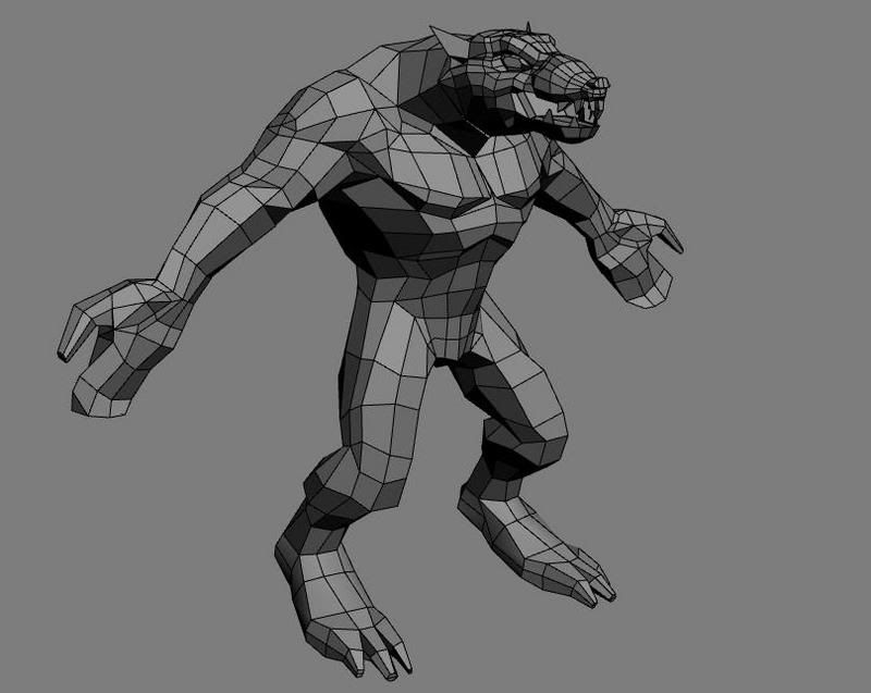
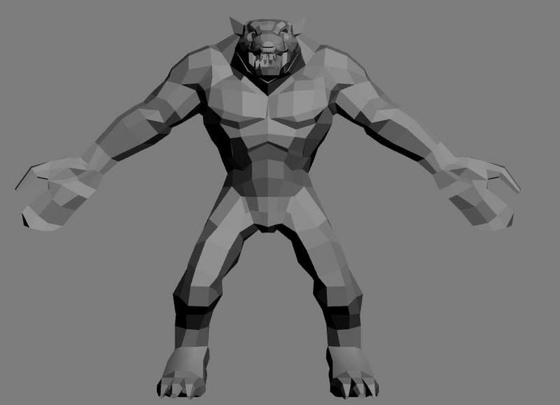
Rat Monster
After being inspired by culturedbum's model of a concept from the new warhammer game, i decided i would try and model one of these concepts. Im not sure who the artist is but i got the concept from the warhammeronline site. Im pretty much finished with the modeling but i still need to optimize him. I also plan on adding the weapons and clothing on to him but i wanted to get some crits before i get into that from you guys.


and here is the original concept..


and here is the original concept..

Replies
Im gonna try my very hardest xeno, i sure would like to keep my face unmelted if possible.
Im finished with the model onto the unwrapping phase.
You could have alpha hair tufts sticking out over his armbands, off his calves, over his claws, ect...
Doesn't look much like the concept at all though. Not that it needs to.
http://www.bobotheseal.com/published_art.htm
any tips or crits?
It's still a bit muddy right now, then again, you're just getting started. Don't be afraid to play with darker shadows and brighter highlights/placement of shadows and highlights to gain more depth. Also, if you haven't already clicked through the screenshots on warhammeronline.com, they help a lot with capturing the style. Good idea to do a WAR concept with all the guys making the game hanging out here, not too often you get a chance to get feedback from people actually working on the real thing.
Keep it up, this is a big improvement over the last one.
oglemeanimations: ill try adding some better shadows i think that it looks pretty flat.Thanks for the help. Its difficult trying to make it look not too muddy when the concept has a muddy style but it comes out looking clean. (don't really know how to describe it)
Here i have the cuts added in.
edit: It's better to suck ass at making textures and telling us that you sourced the concept, than to rip it and proceed to tell us you didn't.
Here's a close up of the head concept, it might help
doc_rob: thanks for the praise it means tons. Ive been taking my time and trying to make it as best i can i would appreciate any more advice and guidance that you can give.
this new pic i added more shadows and highlights to the right breast. Im going to do the same thing to the other side.thanks alot for the face pic... i was getting a little nervous because the face was a little small and it was difficult to see. This should help tons.
Your stitching looks frighteningly similar. I did check that too but it also came out as a non-match. So... you've fooled me once or fooled me twice... i hope you only fooled me the first time.
True to the concept. Frighteningly so even.
BUT, the original "new" texture has a very large chunk on his left pectoral that is directly from the concept. Maybe you forgot to hide that ref layer when you saved it, but it is exact to the concept.
Carry on.
Aesir hit your main problem right on the head, but you're going to have to be much more drastic than that. Make a duplicate flattened layer of this, and just start painting out detail and define the musculature without thinking about any surface detail. Once you have your main forms defined, THEN start thinking about dirtying and ripping him up. Its easy to let yourself get pulled into thinking about surface detail too soon, but don't give in. You'll just end up spending a bunch of time on detail you probably won't be able to use later.
I'd suggest hiding the color reference and only focusing on the B&W ortho views. Always work from General to specific, and work the whole model at once. That'll help keep you from getting stuck on one particular area, and getting pulled into too much detail too soon.
the noise is great, it captures the texture in the concept fairly well. you need to better define the forms of the muscles. see the forms in the concept (it has really fun anatomy forms) and exaggerate them.
lightening from dark-mid values is easiest for me: