Critique my game environment please!
 I’ve posted both in water / out of water. It’s a pool game
 I just am looking for honest feedback on what could be improvement , what was well, etc.
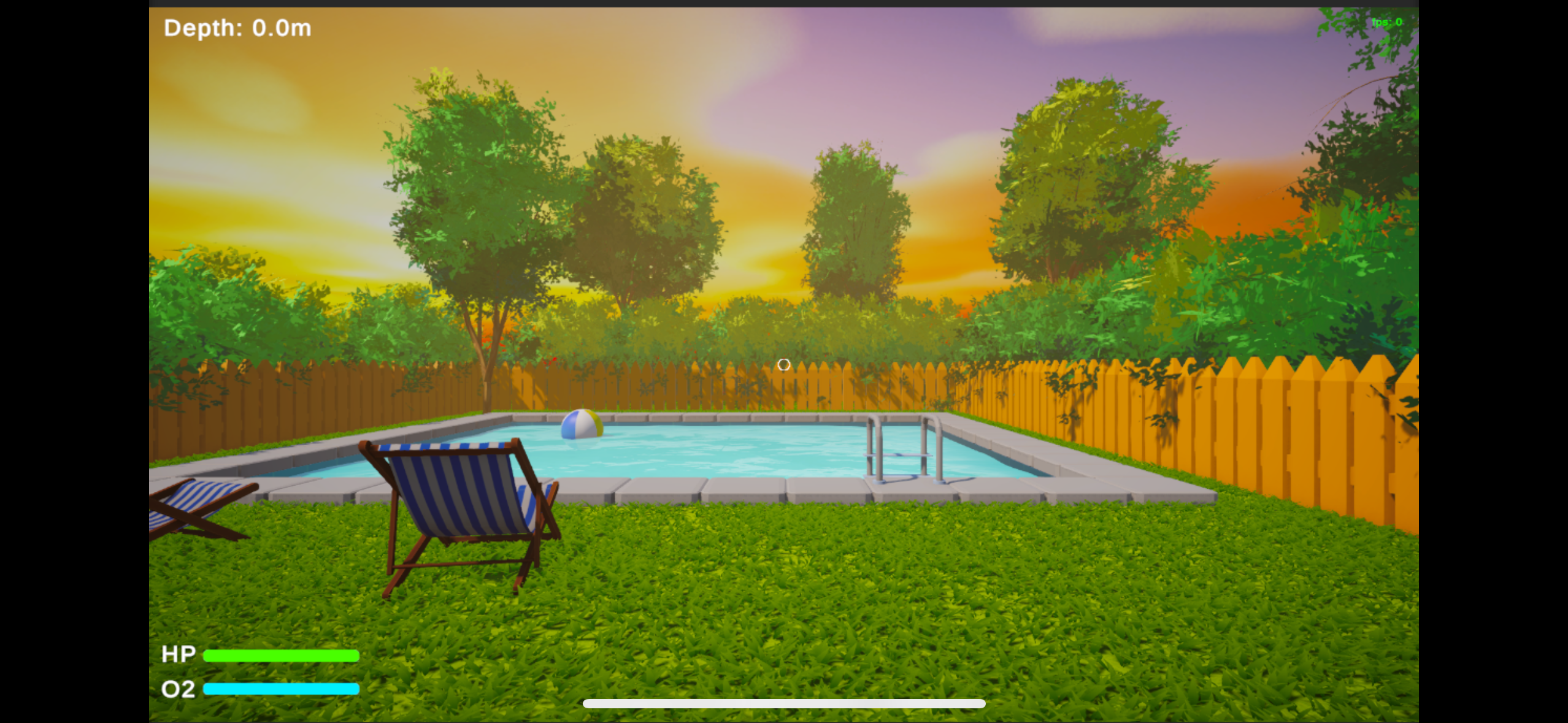
i am going for that low poly + realistic lighting kind of feel. I got inspiration from lighting/colors from hello neighbor.
Thanks!
Replies
Looking at Hello Neighbor, I think you could increase the amount of quirkiness in your assets to give the scene more visual appeal. Your fence is kind of bland, as are the tiles around the pool, and the chairs could use more interesting shapes. Push it further!
The grass probably shouldn't be casting shadows, since it makes them look less connected with the ground color.
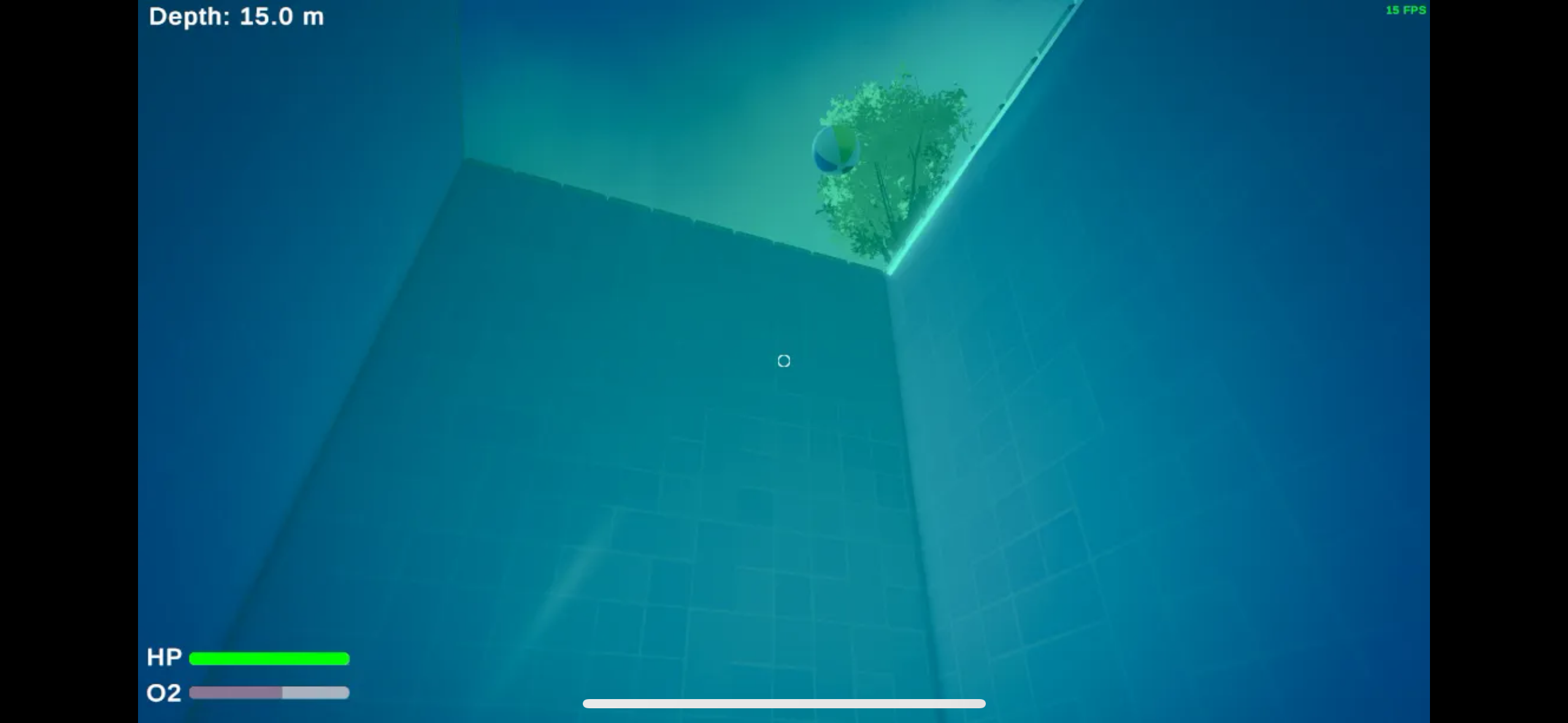
It would be nice to be able to see into the water from outside it. It's very different from the in-water view of the sky.
Otherwise, keep going!
Looking closer, I think he shape of the fence boards looks a bit odd, the tip being sharpened on the flat sides (top face beveled with unapplied scale?) and they are quite thick. The fence would benefit in some slight variance in board placement and color as well. Most fences I have seen have their boards screwed or nailed onto the horizontal beams, facing to the outside, away from the property. In certain distances there are vertical beams anchored in the ground, holding the horizontal beams. That way the boards don't get in contact with the ground which would lead to them soaking up water and break. Oy, getting carried away here, what I mean to say is take a moment to look up how a fence is constructed.
Agree with what Eric commented on the gras. Distribution and size of grass could be varied as well, for example it being taller in places that are harder to reach with the mower.
Perhaps the surrounding hedges could be a bit taller to block more of the view, since the horizon looks a bit empty. It could however increase the feeling of being isolated. I wonder, if looking back does one see a house or entrance? Personally I like the idea that it's an isolated place.
Depending how you want it to feel, the space could use some more elements to make it feel lived in. For example a low table with a book or drink, a garden gnome.
Haven't looked up the art style of 'Hello Neighbor' and hence can't comment on that. It would help if you included references in your post.
Keep it up!
I wanted to give more context and post the update:
the game is simply diving for fish to collect, then sell them to purchase upgrades to reach the bottom. So far I have 3 zones created with (hopefully) their own unique feel. My limitations are through using Unity's URP where certain post processing/fog effects cant be used per volume. But my main goal here is really the artstyle/enviroment feedback!
@Fabi_G and @Eric Chadwick I read both your comments and really appreciate the feedback. I haven't gotten to really changing some of the things with the grass / fence yet - but do plan to in the future to see if that improves the look - I have been occupied with finishing these other zones I have in mind.
I did increase the vertical size of the bushes though like suggested to make it feel less empty, and I agree that it does help. For the overall scene, I have also tried my best at implementing more color theory to make it feel better - as compared to the first image I posted I think the improvement is very noticeable. Below I have attached more images, including from the back so you can see what I've done there. I added a truck to sell the fish and a workstation for the upgrades. Both those models are actually not created by me due to a lack of skill in Blender! Although I am proud of everything else which was created by me.
I've added 3 different zones so far to the pool in the game.
Zone 1: "The Deep End"
Going for a "normal" pool feel. Just deeper, adding some pipes a bit further down.
Zone 2: "The Drowned Ravine"
Wanted it to feel more "Oceany". I think I got the feel right but the add-ons like coral, plants, etc. feel off and im not sure how or why
I like it- it definitely needs work and id love feedback for this part.
Zone 3: "Lumina Drift"
An open-mystical feel. Added main fish to catch as Jellyfish. Maybe it feels TOO open? Im not sure. I like it though, i think.
Here is the grass without casting shadows. I think in this case maybe the shadows do make the scene look better? Let me know.
And I meant more in terms of lighting for my reference of hello neighbor. In terms of the assets , I do like the low poly / realism feel I have going? I dont know how to explain it because its not "realism" but the vibe is more realistic.
Before/after:
Yeah, I agree something is off about the lighting/shadows. I've tried my best to get something looking good, but I can't seem to quite make it feel any better than this.
I spent today learning how to actually make my own trees using the resources you sent me. @TheRedFish Due to me making them myself they actually use in Unity what we call a Lit texture from the Universal Render Pipeline which means they can actually cast shadows - which was an issue you mentioned before.
I think they turned out pretty good. As you can tell I removed all the other foliage (Because they were from the asset store and I want to make them myself and learn how to do it).
I will make other presets of the tree so they're not all the same (different branches, tree sizes, etc.) and also some bushes to put behind the fences.
I then will need to learn how to do some sort of slight wind animation for them! But if you have the time let me know what you think of these new trees.
Will post before and after-
Before:
After:
Created some hedges. Will play around with tree placements a bit more.
Will probably redo grass next.
@TheRedFish and @Eric Chadwick I think the improvements (especially forcing me to create my own tree and foliage!) really made a huge difference in the scene / game. Also, did not realize just how bad the colors were between the grass. uniforming those colors really improved it a lot as well.
I think the leaves clipping through the fence look a bit odd. You could create some leaves modules that fit the fence, so it looks like they press through the gaps etc. Speaking of fence, that of remains a sore spot for me
Lighting wise the areas in shadow look a bit dark. I don't know what lighting setup you have there, if it's dynamic there's possibly a indirect/ skylight setting in the Lighting tab. If you feel lost with the lighting setup, could check out sample projects, how they're setup.
update #idk fixed the grass and shadows.