Home 3D Art Showcase & Critiques
The BRAWL² Tournament Challenge has been announced!

It starts May 12, and ends Oct 17. Let's see what you got!

https://polycount.com/discussion/237047/the-brawl²-tournament

[Finished] Stylized Coastal Outpost – Real-Time Environment (Unity)

Offline / Send Message
Pinned

Hi everyone 👋
I’m sharing this environment piece I’ve been working on and would love to get some feedback from this awesome community.

🔗 ArtStation Link:
https://www.artstation.com/artwork/98dZER

🎨 About the Piece

This is a stylized coastal outpost environment created for real-time in Unity.
The goal was to capture a lively, atmospheric look with a stylized aesthetic — inspired by seaside settlements and exploration vibes.

I’m using this project to refine my environment storytelling, silhouette language, and texturing approach.

🧠 Goals / What I’m Focusing On

  • Composition & scene readability

  • Lighting mood and color harmony

  • Material stylization / shader balance

  • Real-time friendly art pipeline

❓ Feedback I’d Love

  1. Does the overall composition work well for a focused focal point?

  2. Any suggestions to improve lighting contrast or silhouette clarity?

  3. Are there areas that feel visually flat or distracting?

  4. Unity-specific optimization or shader suggestions welcome too

🛠️ Tools / Pipeline

  • Unity 

  • Maya 

  • Substance Painter 

  • Photoshop 

Thanks in advance for any critique or advice — it really helps me grow! 🙏
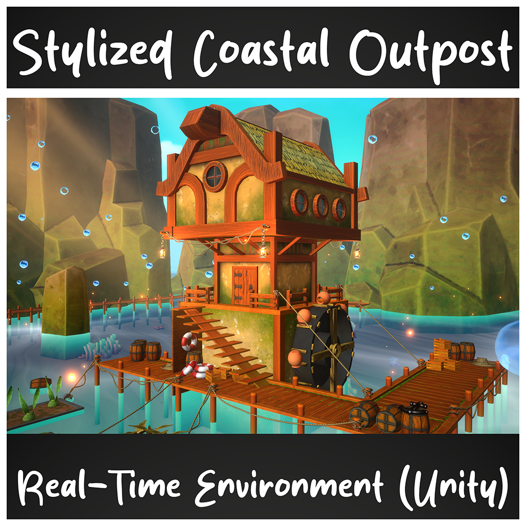
Replies

  • sacboi
    Offline / Send Message
    sacboi godlike master sticky
    Aesthetically imo this environment you've created fits within target genre  :+1: 

    However being trained to gauge scale simply by eyeballing over many years as a HS modeler so my gaze was immediately drawn to the diagonal staircase which seems slightly disproportionate, compared to most objects in the scene.      

  • Fabi_G
    Offline / Send Message
    Fabi_G godlike master sticky
    Hi! Overall the scene has a nice mood :+1:

    On second look, some notes:

    • Did you work off references and/ or concept? Would share those too, for context.
    • Proportions look a bit unbalanced to me. For example the beams holding the roof look massive in comparison to other elements, making it look very top heavy. The direction of wood grain seems strange, would expect it to follow length of beams. Overall structures could use some more irregularities to break up straight lines/ edges.
    • If you made use of trim sheets, it's not clear from the presentation.
    • Since the house is located in water, it leaving more more of an imprint would be cool. Overgrowth, damage and repairs.
    • The water material could use some foam strip where it intersects with other elements.
    • The lighting in the cover image looks like it's missing shadows compared to the renders on AS. When creating a thread, I would consider sharing some more images and going into more detail, else you could share in 'what are you working on'.

     Keep it up!
Sign In or Register to comment.