Nuclear Bunker Office Environment Art (WIP)
triangle
Hello! I’m a second year uni student aiming to specialise in environment art. This is the link to my portfolio: https://solo_m.artstation.com/
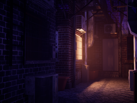
I’m making a nuclear bunker office set during the Cold War era as a part of my assignment. My main inspiration comes from CoD Cold War, other inspiration comes from Poppy Playtime and Cyberpunk 2077 (for lighting and mood).
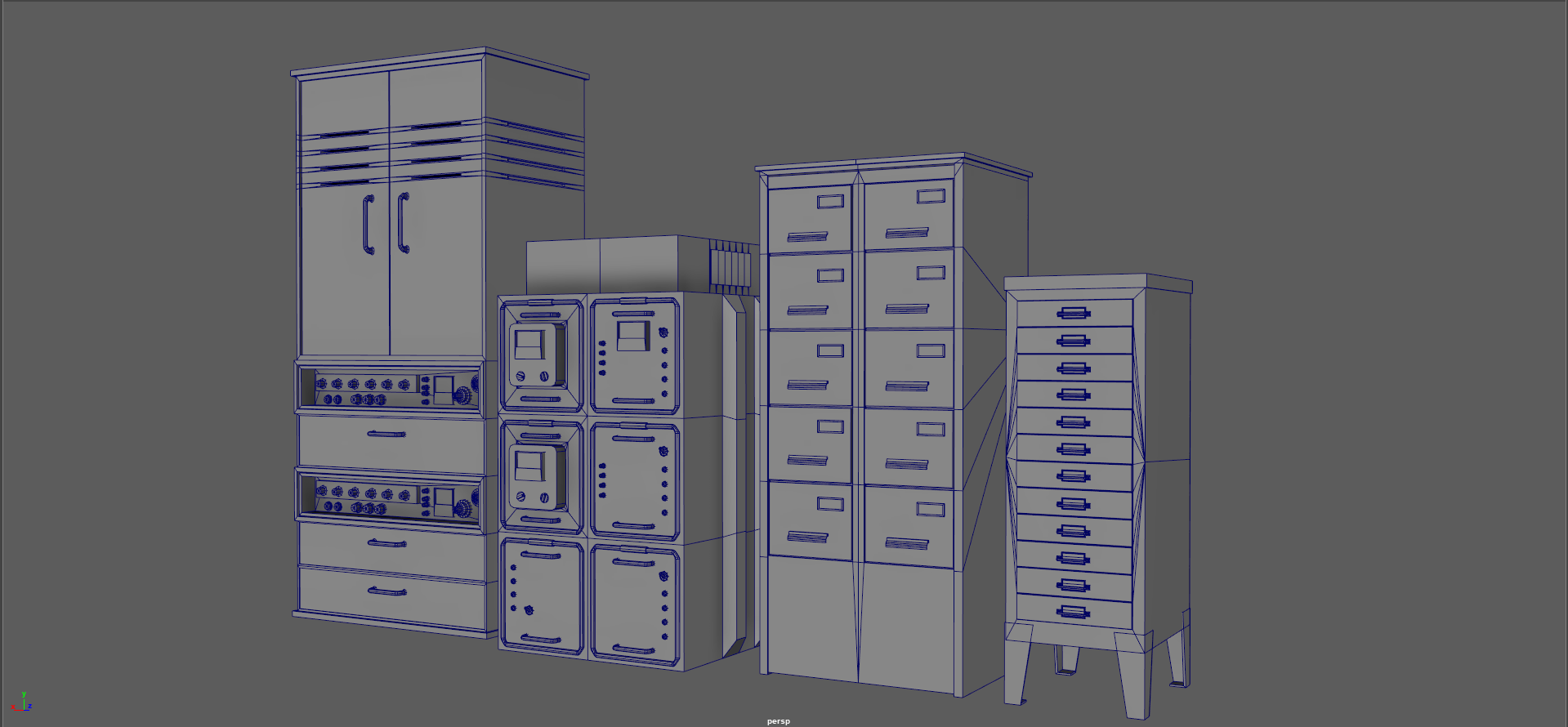
I have started with props and I have made a bunch of radios, cabinets as my back ground assets. My hero assets would be a desk of objects with the two computers being the focal point.
So far I have received feedbacks that some of the knobs on the radios are too low poly, I’ve been trying to be more generous with the poly count on my other models whilst trying to fix the knobs. (will update when done)
Any additional feedback will be greatly appreciated!
(modelled in maya and textured in substance)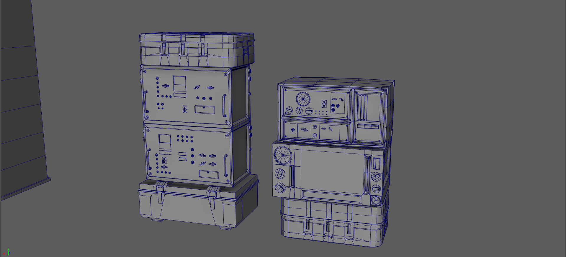
I’m making a nuclear bunker office set during the Cold War era as a part of my assignment. My main inspiration comes from CoD Cold War, other inspiration comes from Poppy Playtime and Cyberpunk 2077 (for lighting and mood).
I have started with props and I have made a bunch of radios, cabinets as my back ground assets. My hero assets would be a desk of objects with the two computers being the focal point.
So far I have received feedbacks that some of the knobs on the radios are too low poly, I’ve been trying to be more generous with the poly count on my other models whilst trying to fix the knobs. (will update when done)
Any additional feedback will be greatly appreciated!
(modelled in maya and textured in substance)
Replies
(there will be more props on the desk in the future, right now it looks very empty)
Update:
I’ve made curve ceilings (and added pipes) and adjusted lighting. I have prepared the wall for a tiling texture and the supports for trim sheets. I used a texted density of 10.80 with 4k resolution.
The pieces are modular, I had a thought of doing this in PCG but for the scale I’m going for it’s not worth it atm. I might do it just to try it out if I have the time.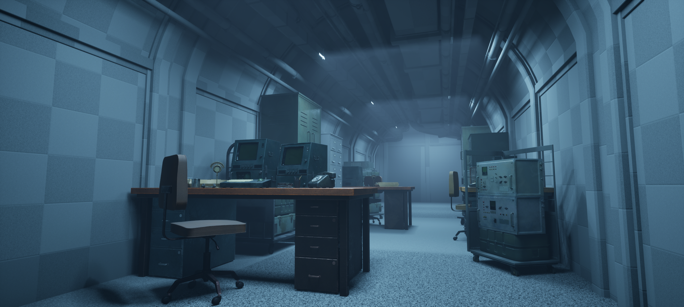
Help needed:
I used spline meshes for the pipes. By default they had nanite on and it took away all my subdivision for the deformation. I disabled nanite and now the optimisation view mode seem to have a problem with my topology?
The price I payed for this is that now I have huge amount of poly sitting on top of the ceiling, can I leave them like that? If not, how can I optimise this?
my only idea is to set up HLOD but I don’t know how to do that. I tried to increase the LOD but don’t know how to control the render distance for my liking, it’s pretty deep for me at the moment.
Could also convert the entire thing to a static mesh and set up nanite on those? I don’t want to try too much stuff until I got another opinion.
Please help, thank you.
If you’re up for it, consider adding a bit more story "gamification" to make the piece even more engaging. Try to tie your creative decisions back to function and context. For your bunker scene, this means ensuring each object reads clearly from the player’s viewpoint, that the environment supports a narrative or gameplay moment rather than being purely decorative, and that your material and lighting choices not only look great but also feel authentic to a Cold War–era facility — think worn concrete, analog controls, and grime consistent with long-term use.
Ideas
Who used this bunker? Military, scientists, civilians?
What’s happening now? Abandoned, recently evacuated, still active?
Tone: Is it eerie and desolate, or sterile and functional?
And if you’re ready to push further (you know you want to)
Indiana Jones and The Great Circle - Shanghai Environment Breakdowns by Vytautas Katarzis - https://www.artstation.com/artwork/P6k3G3.
Indiana Jones and The Great Circle - Wooden Scaffolding Kit by Pawel Kostecki - https://www.artstation.com/artwork/vbmOba.
Notice how professionally they present their work. This presentation takes time but it makes all the difference
But with that said, what you have so far for a second year student is looking great!
P.S. If you want to add even more, lol!
Make a Video with Story Hooks
To make it memorable:
An old intercom with a faint voice crackling through.
A control panel frozen mid-countdown.
A single flickering light over an old map.
A propaganda poster peeling away to reveal graffiti.
Small narrative touches elevate mood into emotion.
i will also add content to some computer screens.
Any additional feedback will be greatly appreciated!
Interior done (for now), please do give any feedback on this, thank you!
One major mistake I made is that I used a lot of 4k texture early on and now I’m running out of texture streaming budget. I’m currently getting the shimmering texture artefact on some of the props.
I tried changing the anti-aliasing setting as well as the lumen settings to make them stabilise. I have converted some decals into 2k (although some of them probably should be fine at 1k) and I will focus on texture optimisation where I can.
I have another lighting scenario with the emergency lights.

For my main lighting scene I’ve generally kept it the same, but I have did tried different lighting scenes (see video) (I hope it plays)
Also this is the final (?) version after trying a bunch of stuff properly rendered:
https://youtu.be/s-0_iajWPUY?si=VYUksNfiPq_kBKe6
Also for reason, I like seeing maya's default blue wireframe and clean topology on a gray background. Gives me a sense of peace and hope
You should just be able to post the link from YouTube like this.
While I'm here there is a box moving around at 18 seconds, you must have added and keyed it in your time line, easy mistake to make
Have you thought about doing an FPS - Fish Eye Cam? FTW!!
And interactivity, this could be useful - https://www.fab.com/listings/3225fc4e-f90e-48a8-821e-e1efdd44ad7f
The thing was a chair, it’s intentional so it seems like it’s haunted! I might try to make it more obvious through lighting/audio.
FPS could be cool, might have some more cinematic just to test the concept more.
Really cool subject for a student scene, a bunker like this gives you a lot of room to flex both art direction and tech. I’d really lean into the desk + computers as the clear hero – treat it like a film shot: highest texel density and detail there, and let the cabinet/radio wall sit a bit quieter in saturation and contrast so it doesn’t fight for attention. You can use cables and table edges as little arrows pointing towards the monitors. In the background, try to keep those long rows from feeling like a cloned asset pack – mix heights a bit, pull out a drawer, throw in a chair or some papers, hide part of a prop behind something else so it feels designed, not copy–pasted.
For the ceiling pipes, don’t kill yourself over every triangle – simplify the long straight segments, keep more geo only on bends, and rely on lower–poly LODs with good normals further down the corridor. Same with textures: reserve the highest resolution for the hero desk + computers, let background stuff drop down instead of running 4K on everything. I’d also add 2–3 strong “story props” in frame – a pinned map, a stack of tapes, a single desk lamp hitting documents – that instantly sells the idea that people actually worked here. For a second–year student your workflow already feels very production–minded; now it’s mostly about keeping the focal point clean and not overspending texture budget where simple tiling + decals will do.
I have attempted to resolve the problem through lighting, since it seems to be the part I have got the most feedback on. I dimmed the lights a little bit and for the end of the corridor, I have made the colour of the light colder and slightly darker to try and make the lights themselves less eye catching and create a second focal point that is the end of the hallway (instead of trying to make it darker, which according to other feedbacks I receive, would be unrealistic) which uses a colder tone of lighting.
I’ve attempted to make the scene more sophisticated through an alternative lighting set up as well as a short cinematic.
I’ve included the videos here: https://www.artstation.com/artwork/eRBgEG
Unfortunately I will have to move on from this project given I have other uni projects going on.
For future projects I will pay attention to texture resolution and try to optimise where I can, as well as attempt to develop the story more and improve my set dressing skills. I don’t take feedbacks like these for granted so thank you so much!
https://polycount.com/discussion/63361/information-about-polycount-new-member-introductions/p1#tricks
This is my finished cinematic:
https://www.youtube.com/watch?v=oCukV_jKRSA
Maybe you are using the URL button by mistake?
You should instead just paste the youtube address without any formatting.
Then you can try the Preview button to see if it worked, before hitting Post Reply.
As a last resort if it's still not working, you could try editing the raw post code by using the Toggle HTML View button