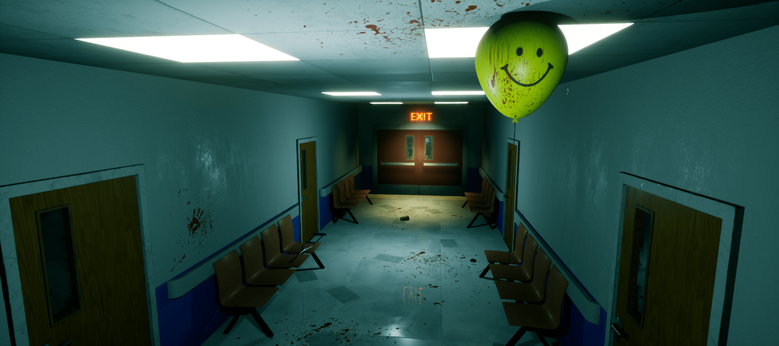
[UE4] A Normal Night in a Normal Hospital

Hello Everyone! Here's my latest environment project. This scene took me about 3 weeks to finish from start. I created all the assets for the scene.
I wanted to create a horror scene focused on background storytelling.
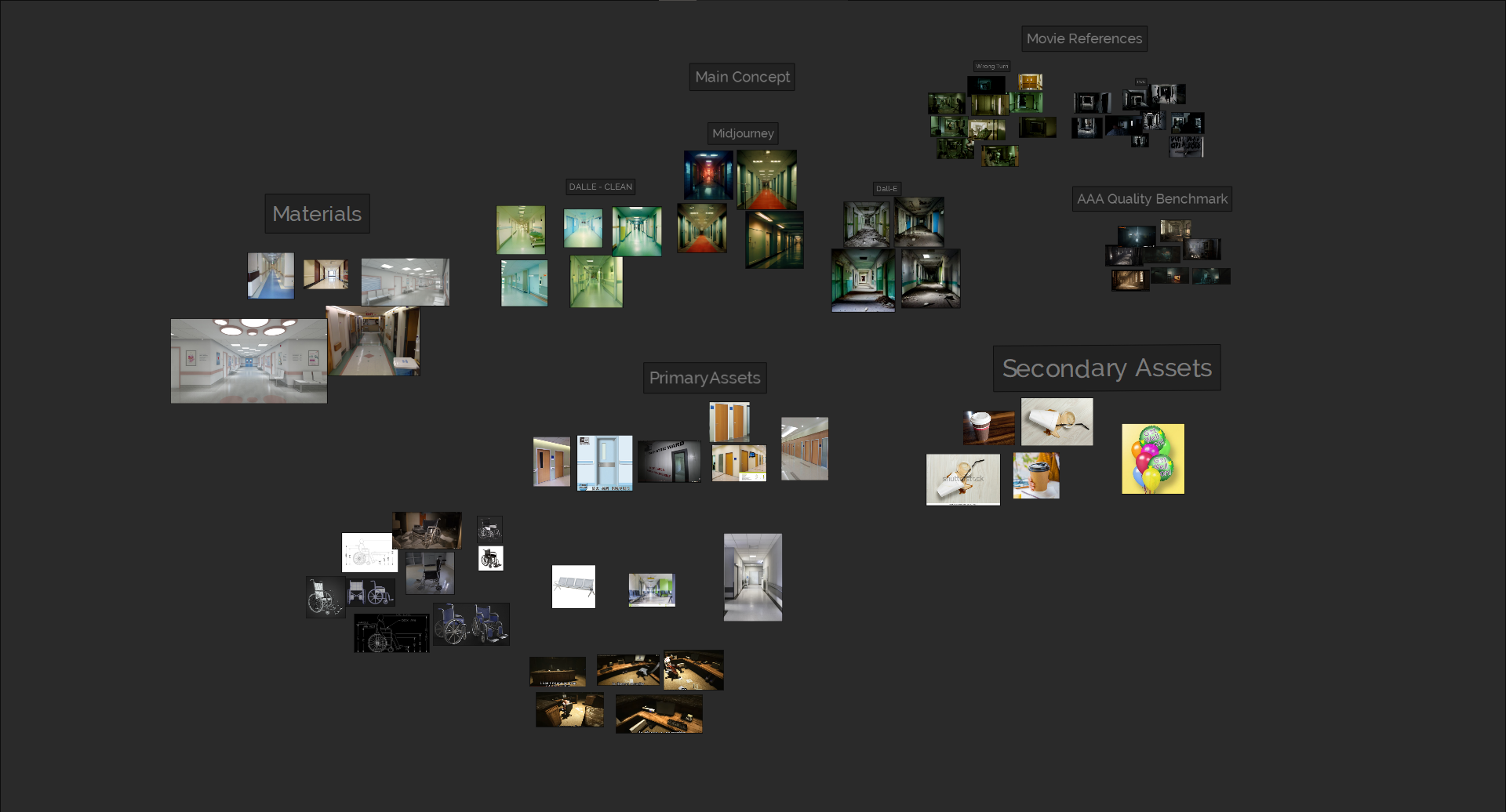
However I had no specific concept to begin with. So I used Midjourney and Dall-E AI Modules to gather some ideas for the concept. And the rest was just me trying different things.
Used softwares - Unreal Engine 4, Blender, Substance Suite & Photoshop
Artstation Post - https://www.artstation.com/artwork/039OQE


Reference Board

Thank you for reading the post!
I'm a beginner artist doing self studies on environment art. So it'll be huge for me, if you can give honest feedback on what to improve, What have I done wrong and What Should I focus more on next projects <3
Replies
Hi 🙂 Some critique on the scene:
I think the area around the wheelchair is lit up too much, works against shadows and makes this area look a bit flat. The humanoid shadow on the wall is too stiff. Maybe some subtle atmospheric effects could enhance scene depth.
I believe with a room this simple, subtle details are relevant. I would look up references how walls, ceiling and floor connect. E.g. some small shadow gap between hanged ceiling and the walls, some of the ceiling panels could be displaced or offset (maybe exposing the structure above, likely cables running there). Skirting along Wall/Floor transition. Dust and dirt built up in corners, floor material more worn towards center where people constantly walk.
Balloons look a bit to solid, some transparency or light transmission would help communicate the material.
Some of the blood decals seem a bit large. The color of the blood is quite dark and the roughness value high, which looks more like old, dried blood. With the splats on the counter I would expect some puddles on the ground too.
The papers on the floor being almost evenly distributed become a pattern. Try grouping more, like a folder with files dropped, leading to a concentration of papers at this location. Maybe have some of the papers ruffled.
From a composition point of view, I think early versions worked better when the corridor was continuing into the foreground (centric, looking down a tunnel). With the current room, it seems off balance and maybe the camera has to be adjusted.
That's all I could think of, hope some of it makes sense. Keep going 💪
I think its a bit odd that all the lights are working but there are a lot of shadows everywhere.
Thank you so much for taking your valuable time to provide such a detailed feedback. Now that I'm looking at it, you are right. Really appreciate as I had no idea on a lot of the things you mentioned.
I was already called this project a done deal. But after reading your comment I realised that I have missed so much things. So, I'll readjust the scenes with the points you mentioned.
Thanks again for helping <3
Hmmm.. Yeah it makes no sense now. Haven't thought it that way :(
I think it'll be good If I remove some of Ceiling lights randomly to look them as broken.
Thank you for feedback!