The Bi-Monthly Environment Art Challenge | September - October (80)

Hey everyone! Welcome one and all to the 80th Bi-Monthly Environment Art Challenge for the months of September and October!
This challenge is a way for real-time 3D artists to test their skills and create a piece of work based on concepts provided. It's open to those of all skill levels and we do our best to provide meaningful feedback along the way so everyone can come away from the challenge with actionable points on which they can improve their craft!
Anyone is welcome in this challenge no matter your skill level! It's a test of your own ability not a competition between members. We're all here to improve as artists and learn from each other.
- ENVIRONMENTS -
HARD SURFACE ENVIRONMENT:
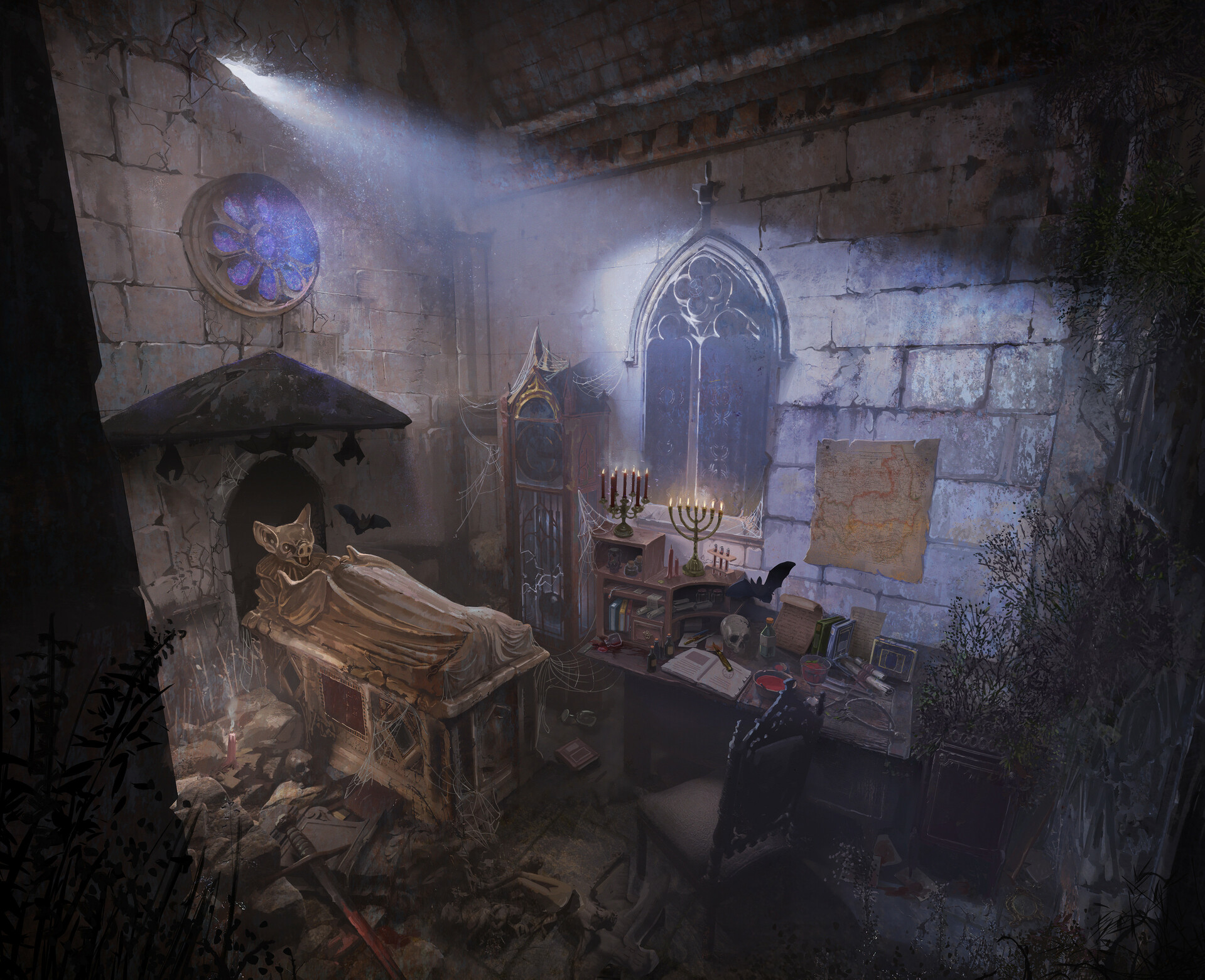
Where Dracula Hides - Concept Art by Antonio Rizzatti
https://www.artstation.com/artwork/mzb6BY
STYLIZED ENVIRONMENT:
The Reach: Dungeon Adventures by Andrew Porter
https://www.artstation.com/artwork/Pex9v3
- PROPS -
HARD SURFACE PROP:
Aether by Filip Bazarewski
https://www.artstation.com/artwork/o2Gzgq

STYLIZED PROP:
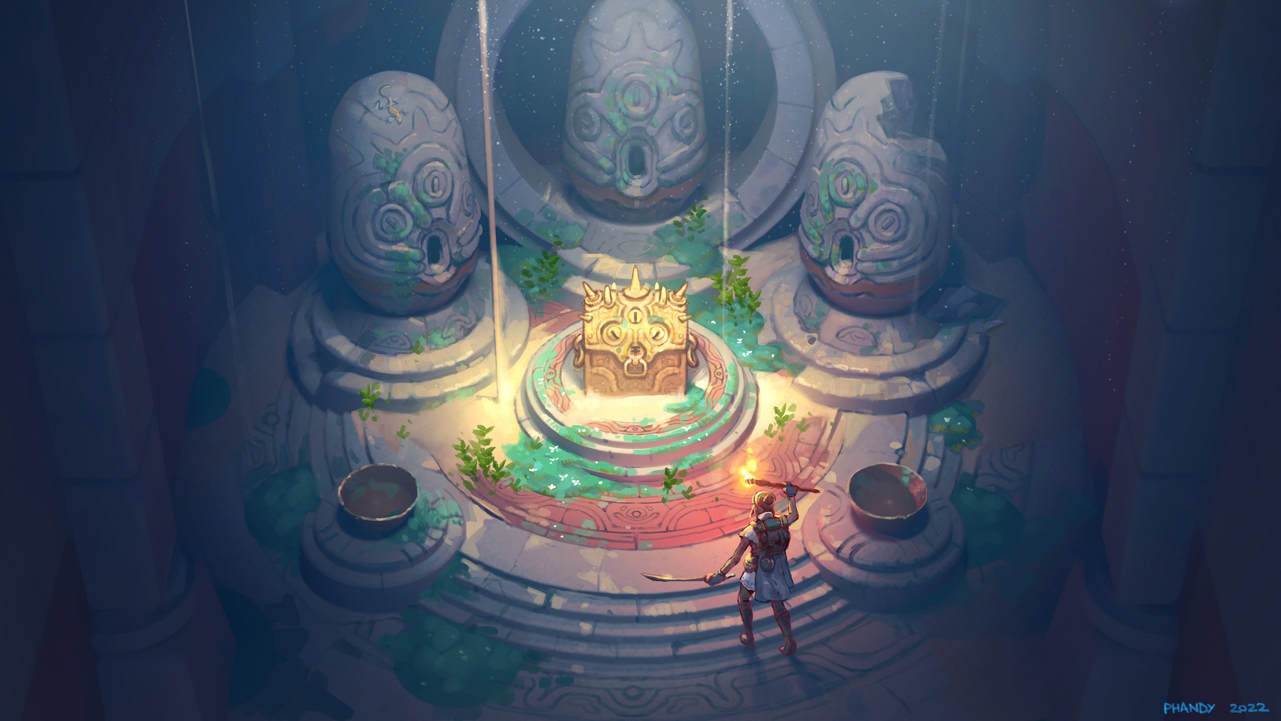
Stations, Traps and Shrine Concepts by Ayhan Aydogan
https://www.artstation.com/artwork/Je9ERz

- RULES -
Please read all the rules before starting:
- Try to post at least one critique for every post that you make. This will make for a better learning environment and help us all grow as artists.
- Try your best to finish as much as you can in the time frame provided, but remember even if you don't finish by the end of the challenge we encourage you to keep pushing and finish your piece!
- Post what you are working on in this thread so that way it's a more centralized place for advice and critique. Please avoid creating a new thread as we don't want to spam out the forums.
- It is recommended to use a game engine to present your work. Unreal Engine, Unity, and CryEngine are very common engines that can be used but feel free to use any alternatives that you want. (Marmoset Toolbag for example.)
- Feel free to change up your chosen concept a bit if you want! Interpret these concepts to your liking, especially if your aim is to add storytelling elements.
- If you finish your project and decide to post it to Artstation, make sure you give credit to the concept artist in the form of a link to their profile. Additionally, it is recommended to ask a concept artist for their permission to post a 3D piece based on their work before doing so.
- RECOMMENDATIONS -
- When you are just starting out making a scene, it can seem complicated or imposing. Take your time planning and blocking out, it will set you up for success later on.
- Think about how you can re-use assets, re-use textures, break it down as simple as possible and plan it out. A lot of people will break it down in their own way when they start out their challenge. Gather some reference images as well for different parts of the scene, don't be afraid to make it your own.
- We strongly encourage you to go and look at other games and see how they make their assets as well as get concept art to give it your own feel.
The goal is to learn and grow both artistically and in your ability to both give and receive critique, but don't stress about it and remember to have fun!
Good luck!
Replies
Think I'm gonna give this one a try!
Going to try this one. Looking forward to see everyone's work!
So far what I've worked on, any feedback or critique is appreciated. I'm excited to get to the sculpting phase but slowly but surely the blockout is coming together.
@Skrupps
Glad to see someone else taking the plunge. Thats a solid blockout! Proportionally its pretty close but the reference seems slightly more narrow. Also at this point it may be tempting to add supporting edge loops but I find things easier to tweak if I hold off until later. Keep up the good work!
So far I've got my blockout and a light test in unity. Took a while to match the reference until I said good enough. Pretty happy with the light test so far but am feeling its a little flat. Could be the lack of textures as well. Working on a trim sheet now but I need a break
Thanks for that! After not looking at the model for some hours i can see that yea it needs some tweaking, so I'll work on that. And yea I should hold back on support edges this early on, but thanks for the feedback!
Its looking really good, I think the textures will definitely help with it looking less flat. Other than that I look forward to seeing the progress!
I'm a fan of this environment too, I made a start on my blockout and played around with a little sculpting on the statues. I think the blockout of the room does need to be tightened up a bit more though as it feels a bit too spacious. Thoughts? :)
@LloydScribble
Right on! Proportions on main stage look good. Don’t forget about the pillars in the foreground. Those will definitely help capture the scale of the whole room. The sculpt on the statues is looking nice and clean. Excited to see someone else working on the same concept
@squarebender
Thanks for the positive feedback. You are right about the pillars, I'll add those in. Can't wait to see everyone give their own take on the environment. :)
I've also picked this one and here's the blockout.
I've found some resources for the falling sand (for UE);
and this one
https://www.artstation.com/artwork/Yag5aX
I am going for the forge (stylized prop).
So far I did the block out and started playing with lights and adding some details. But now I realized the sides don't look quite right and might to need to revisit it.
@LloydScribble what process did you follow when sculpting the statues? It looks great!
Cool WIP images so far!
@Esselle I would be careful that the edges don't become too soft/undefined.
I want to create some assets for Draculas' crypt. Most interesting assets for me is the sarcophagus, clock and chair. Did a blockout of the environment to figure out the scale.
Hello everyone! This is my first post on this forum, I'm very excited 😊 I wanted to challenge myself with the stylized prop and I thought it would be fun to chat with you guys
You are all doing amazing it's super nice to see
@Fabi_G The coffin looks amazing! But I think it feels kind of small in the room especially if you look at the concept. I would reduce the room's proportions and tweak the scale of the props so it looks more like a closed flooded by stuff small space
@Fabi_G I think I see what you mean. I sharpened the edges a bit, even though now I feel I can't get nice highlights on the edges easily. Yours is looking good as well! But I do agree with @SORENU that it feels like there is too much space between the coffin and the rest of the room so it doesn't give the same sense of closed space.
I worked a bit more, tried to fix the sides but still can't get it right. Also sculpting the rest. I feel it could use some more details and cracks, but at the same I am a bit afraid of overdoing it.
It looks great @Esselle ! I think you got enough cracks in the sculpting (for the rock at least), the texturing will do the rest of the detailing!
Thanks for the feedback people, much appreciated 🙏 Adjusted scale of some elements and fleshed out some areas more, will continue to make adjustments. Got a bit sidetracked with the overall scene, really want to focus on the sarcophagus first! <- Note to self!
Probably target sketchfab as "platform", but wouldn't hurt to get a first person look of the scene/assets in unreal.
@Esselle nice progress!
I agree, you could add non silhouette relevant details during texturing - and instead focus more on breaking up the silhouette. Here I painted in some of the "important" (imo) edge damage:
When sculpting such objects, I sometimes like to bevel the blockout mesh to start with light catching edge. Then will use some trim lasso or boolean operations to add large damage (sometimes cutting the structure into chunks), followed by a sculpting pass. With a sculpting brush that keeps the sampled starting plane, one can reconstruct damage. However, everyone has to find out what works best for them, just my personal approach as someone spending more time modeling than sculpting.
Keep it up ⚒️
It looks way better @Fabi_G , well done! All the details you added look super great 👌
I did most of the work for my blockout, what do you think guys?
@SORENU thanks!
While some element are still missing, the shapes you blocked in look right imo. Then I think you could go one detail level up with your blockout, cutting out chunks, add and refine metal edges and fixture.
What is your general approach? Will you do highpoly - lowpoly workflow? Or lowpoly style asset? Keep it up!
Hi @Fabi_G , thank you for the feedback!
To be honest, I'm still not sure about my general approach. I usually go highpoly-lowpoly by default because I'm not used to other workflows but maybe it would be a nice time to try something else. Do you have examples of low poly style assets?
@SORENU Asked out of general curiosity :) Creating a highpoly model to bake from seems quite common today.
Albion Online and the Torchlight games are examples of games that make good use of lowpoly/hard edges look combined with hand painted textures imo.
There is also the method of painting everything in the diffuse texture and using an unlit shader. Couple of small scenes like that on sketchfab, but can't think of any particular game that uses this kind of shading.
Edit: Hopefully enhanced readability of my post :P and uploaded sarcophagus wip
https://sketchfab.com/models/1dc37bbde3ba4bb79e0fe3347e35f0c9#UNIQSKFBVANILLA
@Fabi_G The sarcophagus looks nice!
Some updates for my piece:
@Fabi_G Thank you so much for the tips! I think I'll try going without sculpting, I'll show an update soon 😉
@creepyhooman It looks super cool 👌 Would you mind showing your trim sheet? Btw it's the first time I see someone doing a sketch texture, it's a very smart move
@creepyhooman
wow I have to agree with @SORENU I really like your approach to planning the trimsheet. Your three statues behind the treasure chest are coming through very sharp. Did you start with a sculpt? That part is stumping me atm I would appreciate any tips you might have. Also are you planning on going stylized or more realistic? Great job so far excited to see more progress
Some updates to the scene I'm working on. I am going to try and stick with the handpainted look of the reference as best I can. Spent probably too long blocking out my trimsheet. Added some subdivisions and went straight to baking to see what it looks like. Think I'm going to hold off on the hipoly sculpt on the trim for the time being while I continue to block things out. Any feedback greatly appreciated!
Hey, nice progress 👍️
I continued with the clock. I will deviate from the design in the concept (from what I interpreted) and break up silhouette more:
@Fabi_G Great progress and planned changes. One thing that comes to mind is the panels on the side, the patterns aren't clear to me what they are due to how dark they are appearing. At first, they look like they are carved out then I see the light bouncing off the extrusion. The reference looks like they are wood but it might look nice in the gold texture
@SORENU
Here's my trimsheet, but it's not yet finished.
@squarebender
I would say that the blockout is top notch, try going for with the chest or the statues.
About the sharp thingies, I guess I'll have to smooth the edges a bit more and add a bit more supporting edge loops. I'll be going for the more generic "substance painter style" stylized look.
The process for the egg statues explained with a picture. I made a simple (AAA class ;d) alpha from the concept, projected it on a egg shape so I could get basic form, sculpting, few times exported wip egg to the Unreal to get the feel if the shapes are working, and then at the end I eliminated the wobbly surface with booleans.
@creepyhooman
What I really meant to say is that the egg shaped thing looks great! I guess I should have clarified by saying its sharp if it was a bad thing or not. I'm super impressed by how smooth it is and how you managed to get all the details so I hope what I said doesnt push you to change it too much. Thanks for giving some back ground and showing a break down of how you got your result, it's super helpful.
Ah sorry for the misunderstanding. But on the other side, it was useful lapsus from my end, because while looking at that picture I've found before mentioned mistakes :d.
@atunnard your right, thanks a lot for the feedback 👍️ I made some adjustments, but there is still room for improvements.
Updated model on sketchfab
Nice process and breakdown, creepyhooman!
It's looking great @Fabi_G! Is it the final version or still WIP? I think the bottom could use some more breakdown of the shape like you did in the overpaint.
Then I have a question for both you and @creepyhooman. What's your texturing workflow? Substance painter or photoshop?
I continued my prop, sculpting it again to give it more damages and better edges. I think I will move on to texturing for now. After some research I decided to try the camera projected workflow to get a handpainted look.
@Esselle Many thanks for the feedback 👍️ I would call it done for the most part, but I'm sure I will give it another pass before the end of the challenge. Nice progress on your side too. I think adding some gradients and color variation based on planes, as well as some tweaks to color and saturation would push it further:
About texturing process: Currently using a lot of Painter, plus some blender and photoshop for hand-painted textures. When the model has reached a certain state, I like to build a layer stack in Painter, mixing/modulating surface layers with object maps, then continue iterating the mesh and reimport. Probably also good to check the result in engine sooner than later to avoid a surprise 😅 Once the model close to being finished, there is adding some touches by hand.
Thank you so much for the actionable feedback @Fabi_G !! What do you mean exactly with "appropriate shader for artstyle"?
Thank you @creepyhooman for sharing! What do you mean by when you say you used booleans to remove the wobbling surface? I don't see how you can do that with booleans
@Fabi_G The clock looks great! Are you planning to add some dust in the engine? And thank you for the feedback you gave to Esselle, I'll take it into account too
I am almost done with the modelization of my prop, I still need to do some swords, rocks, and stuff but the main element is finished, what do you think?
@Esselle with "use appropriate shader for artstyle" I just meant, thinking about the presentation, how it's rendered and lit. Depending on the shader used, different texture maps are required.
On sketchfab for example, one has the choice between specular and metalness workflow. With either workflow the emissive slot could be used to achieve an unlit effect. Just experimenting and adjusting maps is also a possibility.
If one had to create the model for an existing game, the texture map types required by the specific shaders in use, would have been predefined (e.g. dota2 texture maps guidelines).
@SORENU Thanks, some dust sounds like a good idea. Maybe I will build a small scene in UE.
I think the shapes turned out real nice, looking forward to see what you do with the textures.
Keep it up!
//edited for better english 🙃
I see what you mean now, but it's still not super clear to me how specular/roughness could be improved. Putting aside the gold, for now the rock is using a dark sharpened version of the diffuse for specular and a bright version of it for roughness. Once the diffuse is done, I was thinking of adding more scratches and noise only to the specular, and do a second pass of scultping for cracks and other details that I can bake as normal map (and blend in some noise normal maps too). Perhaps specular could be even darker and roughness brighter?
@SORENU I am very excited to see your progress!
I am having a look at the stylized prop (Forge). Kudos to all those submissions , they are all good and showing different approaches which I admire. Everyone appears to have made the model symmetrical (I did this at first attempt) but looking at the reference closely , I see it is not symmetrical at the base , the left side lacks the gold base and is pulled back further than the right side. Do you think the piece works better with perfect symmetry or as per the concept?
@esselle
Nice work on the prop so far! Did you do projection master in zbrush or something similar? I like the effect you got where it looks like a painting. Interested to see where you take it once you add specular/roughness. From the looks of it though you may not even need them if you are able to paint all your highlights and shadows into the albedo map. @Fabi_G that is one heck of a paint over! Those are super helpful/insightful btw even for someone who is working from a totally different reference.
I have added my egg statues! I may have gone over a bit on the highlights and may bring the contrast down. Trying not to get too hung up on one part and may need to just move on and come back. Treasure chest next!
@PaulJChris
my two cents on your question regarding symmetry is that maybe it got painted out and the artist didn't catch it? That is a very astute observation. You could always mock it up both ways and use your artistic license on which you think looks better 😉
*I personally would probably include it. I feel it might look like a mistake on my part if I didn't include. If you think you could get away with it go for it!
@PaulJChris I would interpret it the way it makes sense most sense to you - it's interesting to see different takes on the same concept. I think everyone has to set their personal goals with this challenges (e.g. how rigorous to follow the concept). Sometimes diverging might benefit the asset in 3d. The metal frame missing on one edge could be an oversight (honestly didn't notice it 😅). If it was for a production, this would be a good question for the lead and there probably would be some feedback and approval of the initial blockout.
@squarebender Looks really good 👍️ I would note that the gaps/line widths have different widths across different elements (quite thin on steps and altar). Also the lines are very clean overall (could use filters to bleed out, rough up). But I understand it's wip and you might be well aware. Keep it up 🚀
Made some progress with assets. Kept it pretty simple. In painter, baked down bevels, added patterns, applied and modified smart materials and texture-sets from Polyhaven. Also started a scene in unreal. Used some unreal starter content for this, too (materials, foliage). Ideally I will use existing assets where possible free time for the custom ones.
I feel the project exploded a bit, shifted from extracting a few selected assets towards making a environment. On the other hand viewing the assets placed in a scene pointed out some flaws. Maybe need to take a step back and think about priorities/approach 😛
Hi! I am back with progress 😊 I decided to go fully handpainted, I started to work on the stone and gold but I feel like something is off with the stone, it doesn't feel as shiny as the reference... Maybe I should add more contrast? What do you think I could improve?
You guys did nice progress too!
@squarebender I love what you did with the egg statues, they look very handpainted it's super nice 😄 To make them even better maybe you could add some spot of handpainted light as we can see on the reference
@Fabi_G Wow you did a lot of progress, did you do all the props? They look nice! I feel like the image is a little bit too contrasted in comparison with the reference but maybe you're not done with lighting yet
Blockout finally finished in 3dsmax at the 3rd attempt. Plan was to keep the elements separate and then sculpt them individually in Zbrush for the damage /stone chips etc. 10K polys in the scene with 21 pieces. Still easy to adjust proportions at the moment. For the record I did decide to go non symmetrical as per the reference just to try see how it turned out.
Great progress guys! It's nice to see others sticking more to the reference! I felt asymmetry could have definitely helped making the result more interesting, but I got lazy.
I have so many questions about your work :)
@PaulJChris How do you manage many objects in a scene? I feel overwhelmed when using blender and decided to have just few different pieces which is still quite annoying to deal with
@squarebender I projected the UVs from the view in blender, baked ao and curvature and used it as a base to paint the diffuse in gimp. Are you using a similar method?
@SORENU I interpreted the stone in the reference as being bright/brightly lit but not shiny. I think mine is too shiny for example, as it can be seen in the overpaint that Fabi_G did how making it less shiny would probably look better. I think Fabi_G overpaint is an amazing reference on how to improve our work!
@Fabi_G impressive how fast you completed the environment! I actually prefer your lighting more than the reference because it feels more like a night scene. The reference is quite bright and I still can't tell if it's supposed to be a scene light by sun rays coming in or by the moonlight (I think the latter because of the dark window, but who knows)
Unfortunately I didn't have much free time in the past few days. I started implementing the advice from Fabi_G. I need to not be afraid of overdoing it :) For example the edges are still overly white and I couldn't add damage/blocky breakup that didn't look too artificial/flat. I think I will leave the rest for later so that I can continue. I added a fire which I need to bring closer to the reference, right now it looks too bubbly. I experimented a bit on texturing the hammer and the vases. I feel they look out of place when textured separately instead of sharing the diffuse with the stone blocks, but of course that does not give much room to later changes in the position of the objects. Maybe that can be solved with better lighting. I also tried using cycles rendering engine instead of eevee for blender. To be honest I can't tell which one yields a better result. The gold in cycles (left) looks better to me and it's higher contrast (too high contrast?).
Thanks for the feedback 🙏 Lighting is definitely something I still have to improve - And all of the assets too ofc 🤓
@SORENU If you don't already, you could use the different planes as masks to push color/value range and readability:
@PaulJChris hi! I think it looks good overall, although I find it a bit hard to read with the different colors.
Some nitpicks: I would interpret the concept so that the ground plate on the right extends to the wall of the forge, some larger chips could already be tackled in blockout, curvature of the the lavapools appear to be more pointy, lava-channels appear are bit narrow. Might be changes you made deliberately, just saying 🙂. If you are going the highpoly - lowpoly route, I wouldn't care to much about polycount at this stage, as one would likely do a retopo anyways. More polys, less facetted look - unless you apply subdiv modifier. Or do you plan to keep the blockout as the lowpoly? Keep it up!
@Esselle I think it would be cool to see the model set up in a game engine or 3d viewer. I like to use sketchfab, as it's pretty simple (not so many settings to get lost in).
edit: added most recent screenshots
Been doing this on Nomad sculpt on the iPad learning how to use the program
Small update, re-topologized all my separate parts with roughly even density using 3dsmax's relatively new retopology modifier:
Then made sure they were all intersecting slightly in preparation for a Boolean operation. Never used Booleans in max much before as they were far too messy and the topology clean up afterwards never seemed worth the effort. But now using the subdivide modifier followed by the Retopology modifier , almost perfect quad topology ready for sculpting in about 10 mins:
now have many fewer objects and good topology. After 1 subdivision gives a reasonable starting position for sculpting the chips:
@csprance oh cool, turned out nice. Do you plan to develop it further?
@PaulJChris I think keeping parts separate until the end might help with sculpting in occluded and narrow areas. But to each their own, curious to see how it will turn out. Keep it up 👍️
Todays progress:
@Fabi_G
Ohh yes I see the line width issue now. I think that will definitely help so thank you for pointing that out. Your scene has come such a far way in such a short amount of time! It looks so good. One thing thats sticking out to me is that shaft of light coming from the crack in the wall. Since vampires don't go in the daylight and the lighting plays into the whole vampire narrative it might be worth it to try to include in your scene. I saw you said you're using unreal. Are you doing dynamic lighting? Are you able to bake light maps as well? It might help where the furniture meets the ground to have some sort of AO baked in through light maps if you haven't already. I gotta say wow though because this is really great for one months work. Good job!
@SORENU
Thank you for your feedback as well. Still getting the hang of the whole handpainted thing so I'm glad to hear that you like it! I will try to add some of those goodies you've pointed out in that photo as well. I'm glad to see you're trying for the handpainted look as well! If I've learned anything about handpainting its that theres a lot of layering. @Fabi_G makes a good point with the feedback about the planes. Break it up some to add some depth to the overall piece. Once thats done you can add more depth by adding tiny break ups to each plane a little further by adding the cracks and simulating some of the uneven surfaces. Try to resist blending too much. Atleast thats what I tell myself 😉
@Esselle
Thats pretty smart to do the uv projection. So far I've tried to match the model with an image plane and do all the textures from scratch. I'm thinking what you did would save some time so thats smart. Both of your renders do look similar as youve mentioned. Is your goal to go real time? I think the baked in lighting you've painting comes through slightly more clear in the Eevee one but its hard to say. I really like how you've added your own rim light to the piece. Seems more lively that way. If your goal is to go your own style then I wouldn't change much. Some spots so seem kind of smooth/rounded though. If you want a somewhat more chiseled look you could tighten up some of the edge highlights and make them thinner. However, not totally necessary. I like what you've done a lot already.
@csprance
Whoa. Thats awesome. I didn't even know that was a thing. Hope to see more updates! Maybe rendered in an engine or something?