Antinatalism themed video game | various highly detailed 2D environments and other content |
A V G
The following art and other content is from a game project I've been occupied with for about 4-5 years now. In short, the game is antinatalism themed and has a quite pessimistic story. It would have various settings, from Earth in the near future (not shown in this post) to various alien planets and megastructures in space.
Most settings have a dominant shape specific to them. For example, a setting with a circle as the dominant shape would have mostly circular designs, from architecture, vehicles, props to even plants and animals, making it unique and distinguishable from others.
Without further ado, here are various 2D pixelart/pixelated creations, all WIP. Everything (except some plants in setting 4) is entirely hand drawn/pixelled, including skies, terrains...
---
S E T T I N G 2 | retro-futuristic, circle as the dominant shape |
The image shows a scene which would come later during this setting. You can also see how the vehicles would look like in this world.
The image shows what would be the very first scene in the 2nd setting. The protagonists Sam and Obe would appear inside the big teleport, coming from the Earth.
This is a comic music video showing the events at the beginning of this setting, with a dramatic ending.
A close up view of the background environment. These backgrounds can and would be nearly or just as good fidelity and animation wise as the foregrounds.
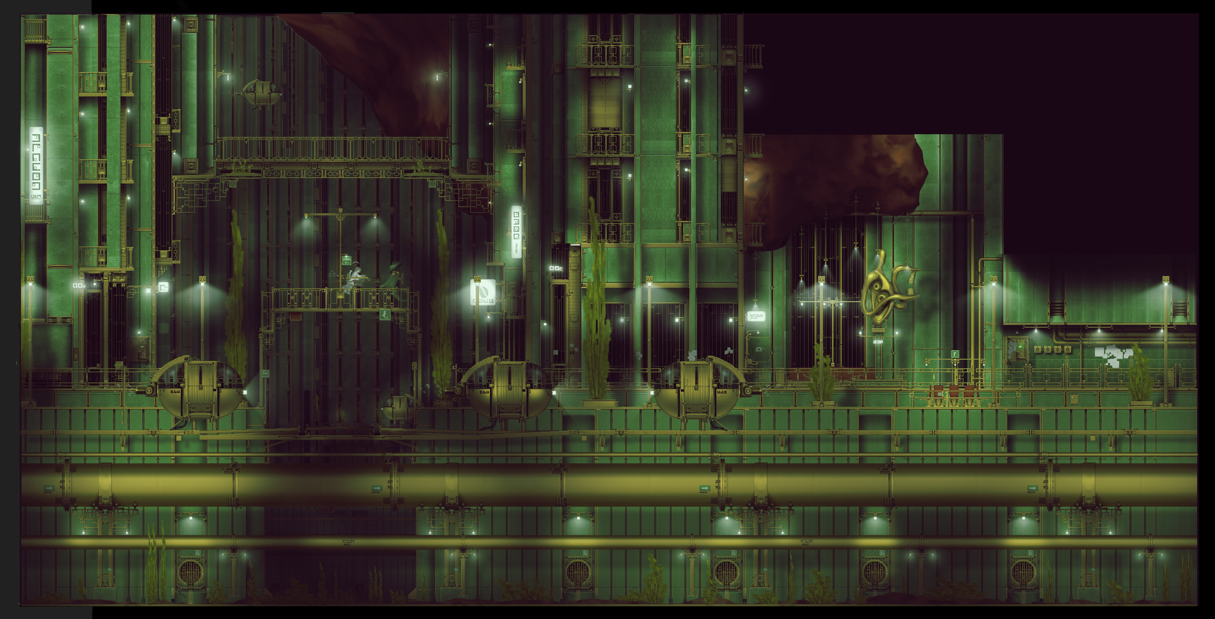
S E T T I N G 3 | retro-futuristic, aquatic, square as the dominant shape |
The image shows what would be the very first scene in the 3rd setting. Sam and Obe would appear inside the big teleport, coming from the previous setting.
This is a comic music video showing the events at the beginning of this setting.
The image shows a downtown scene, one of, which would come later during this setting.
The image shows the same scene but populated, or how that might look like.
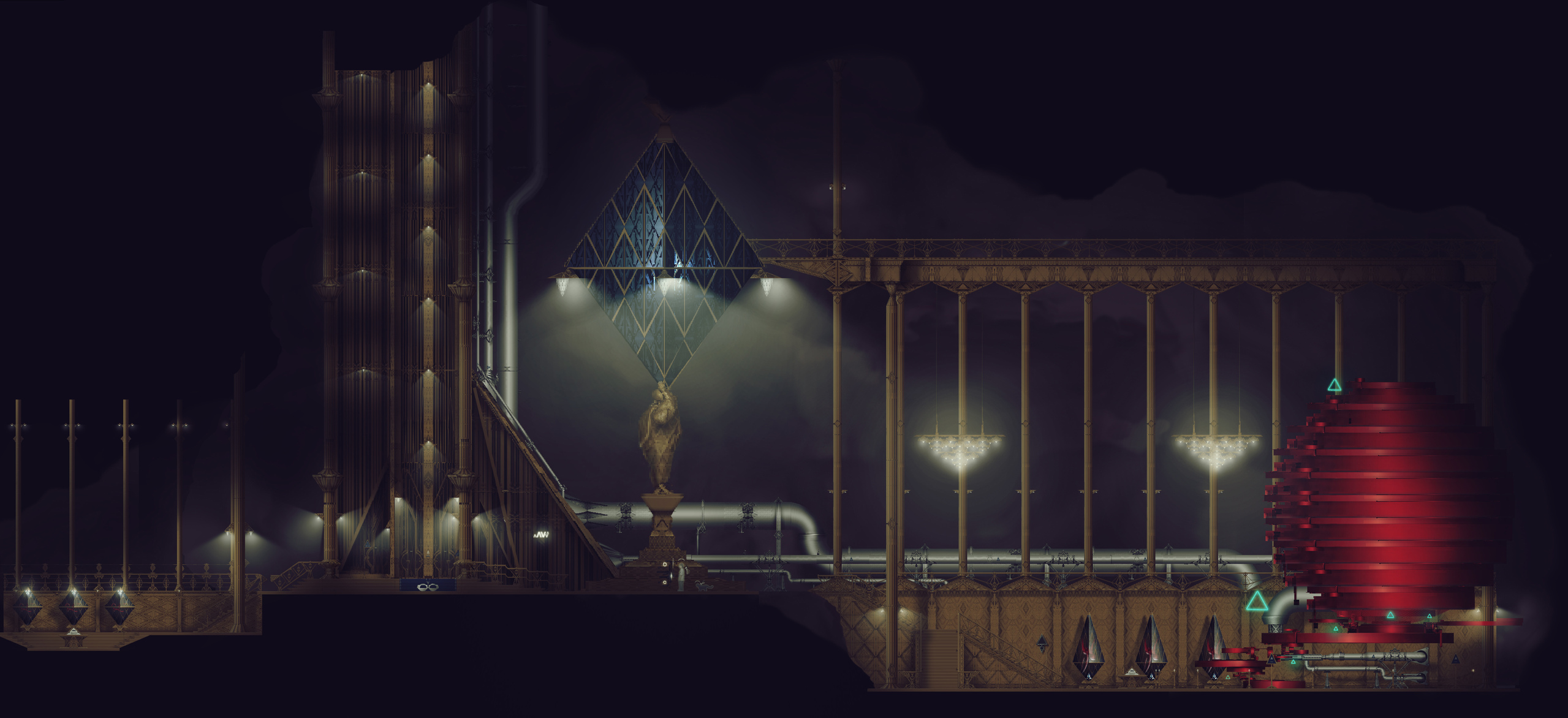
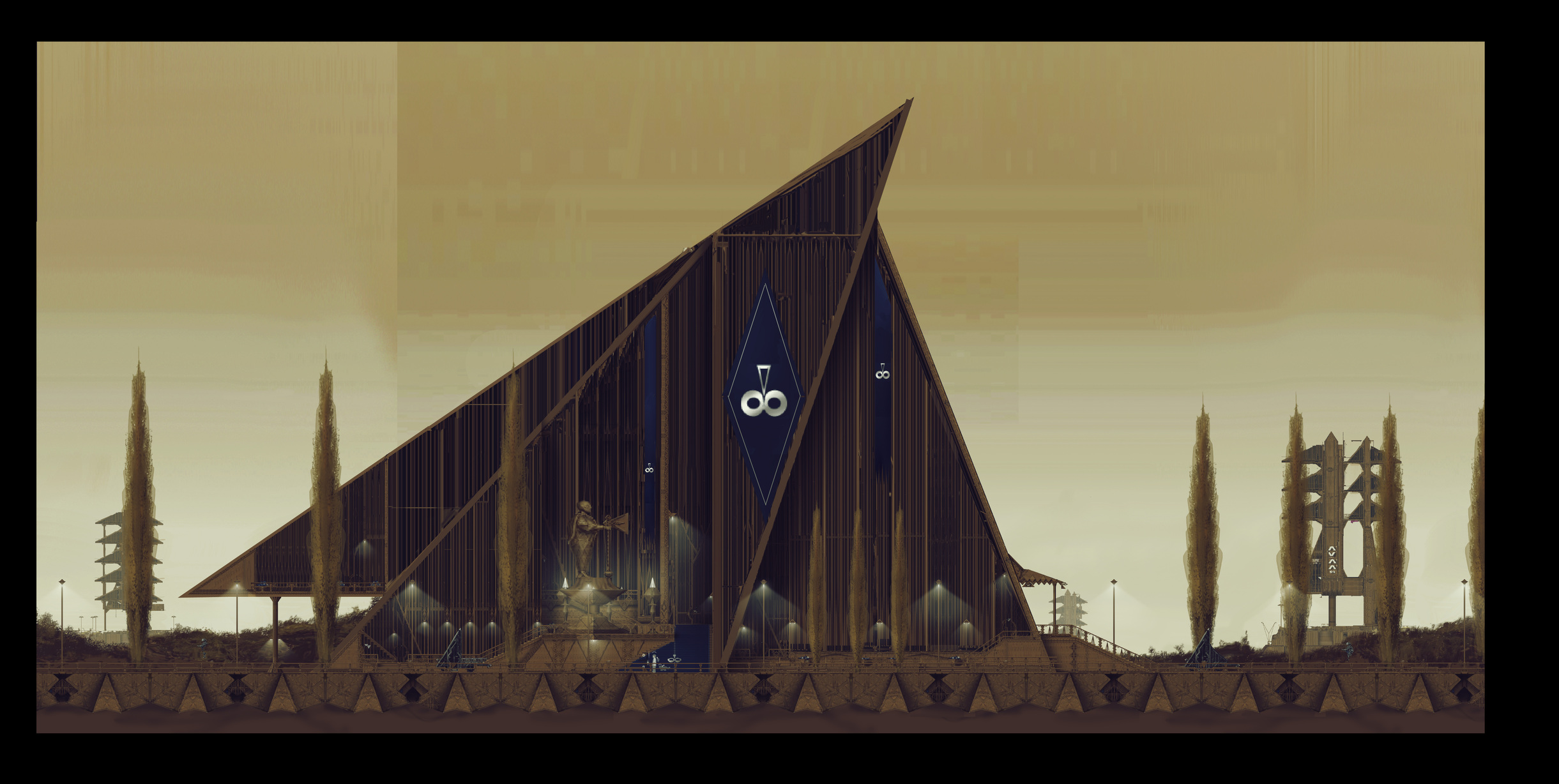
S E T T I N G 4 | retro-futuristic, triangle as the dominant shape |
The image shows the humanoids of this planet. In suit would be the Lead Antinatalist.
The image shows what would be the very first scene in the 4th setting. Sam and Obe would appear inside the big teleport, coming from the previous setting. It's a big cave. Above it, a huge palace.
The image shows what would be the palace interior, one of.
The image shows what would be the palace interior, one of.
The image shows the palace exterior.
The image shows some residential buildings.
The image shows the Science Institute interior, one of, containing the AI.
S E T T I N G 5 | sci-fi, Mars mine, rectangle as the dominant shape |
The image shows the mine accommodation complex, just a smaller section of it.
The image shows the mine itself, interior of one of the tunnels.
The video shows a partial concept of the core gameplay specific to this setting. It also shows a tramway connecting the accommodation complex with the mine itself some distance away.
S E T T I N G 6 | alien, Black Beings' homeworld |
The image shows some kind of vault containing planets or planetary utopias established by these beings, throughout the cosmos.
C U T C O N T E N T
This was the previous idea, or one of, for the setting 5, to have some kind of diesel punkish alien world but the decision was made to go with a more standard sci-fi setting.
--------------------------------------------------------
That would be all. The 1st setting was skipped, a lot of scenes there exist as updated only in Unity, you can check them on the YT channel if you want to, lots of videos for this setting, as the following one:
Project's twitter: https://twitter.com/AntinatalismVG (contains links to other platforms)
I hope the post was worth your time.
IPcreator


Replies
Hi there,
Short version is that you've got incredible 2D work that's far in excess of the vast majority of 1st release 2D games (for example the tree shadowing on the modern setting video you posted is a simple but uniquely applied technique that I've not seen to date), but it's not properly integrated into a game space. My advice is that you now focus primarily on the game aspect of what you're creating, and let the art now follow suit. To that end, my main criticism is that the navigability is extremely unclear—in the modern setting video you walk up a ramp at 1:15 and walk off the sidewalk edge at 2:06: I guarantee you that the majority of your audience won't understand either of these without seeing a guide—there's a reason that 2D games resort to a stair-step navigation in both of the scenarios I mentioned above.
I don't know how far into development you are, but if you're not playtesting this already, that needs to be your first priority. Listen to what 1st time players have to tell you, because they're going to be far more representative of your average buyer than the player who can intuit the various problems you present. It's a painful process, I know, and it always will be. You're going to have to learn how to sort player feedback vs authorial intent, and it's a balancing act. But i've been there—I shipped a game with an obscure control scheme and everyone lost their shit over it.
So, all that said, I think your art is already far above par for the market you're trying to reach, so you need to instead be putting all your effort towards refining and shipping this game. Without that, you just end up spinning your wheels in the dark forever. You need to ship games to get feedback and learn in a meaningful way to apply towards future productions, no matter how long that first rodeo has taken you. Took me 6 years to ship our first game, and believe me when I say that I regret taking that long to ship our first title, proud of it as I am.
This is my first polycount post in ages, so feel free to reach me at my email or on twitter @HughSJ otherwise, I'll be much more responsive at either of those.
Good luck,
Hugh
Hi Hugh, appreciate the lengthy reply. Regarding your navigability criticism, it's in place of course. As the scenes are actual 3D spaces with pretty correct depth of objects/colliders, but we have an orthographic cam view, it creates a navigation problem. There is a mini-map implemented in one of the setting 1 scenes which presents a solution to this. It's an easy obvious solution that works but maybe there is a cleverer less obvious less distracting way of doing it while keeping the game as it is.
Regarding playtesting, none has been done so far because the game is in a conceptual state, despite many years of development. Should the project receive needed funding, I know it's mostly pain and suffering afterwards of all kinds, or should I say, continuation of.
So, there's not much of the actual game done, just bits and pieces of the 1st setting, empty/unfinished scenes and such, one you saw, while the rest of it is just conceptually done. It's a long story. Slow development (just drawing this pixelart with photo-realistic aesthetics took me years to master), major story changes (producing lots of cut content) until the desired one was created (I'm more than happy with, kind of was worth the wait) etc.
It's a pure passion project, that came out of desire to create a very unique and very high quality "pixelart" game, not just visually but in other aspects too. Not into it for the money or career switching (working as a professional in the industry already) and this may very well be a one timer, if it succeeds. The point being, I took the time with it for the stated reason.
The entire game is now conceptually more or less complete and being prepared for the Kickstarter, with the campaign start (no repeat) in few months or so, hopefully. Not sure what to expect due to unusual very pessimistic story and lack of actual in-game gameplay but we'll see.
Btw, checked your game, looks fun as hell. Lovely highly detailed environments too. I'm glad you succeeded shipping it.
Good luck with your future projects,
IPcreator
wow, heavy design work, very nice. the style really invites you to see the details. because it's so layered and packed with intention, it's rather overwhelming to see in a developmental state, it would take many hours to digest a single scene but so great to see so much thought put into everything. awesome work.
Thanks man, glad you like it. Yeah, an insane amount of design work has gone into this so far. Very hard at times leading to thoughts of cancelation of the project. Should be easier going forward (if it comes to it), once you establish all the principles which is where the biggest struggle lies, just the matter of following them onward.