[UE5] - Stylized Environment/ Rock Study

Hey everyone, I recently started going over condensing my future projects for learning environment art. Learning from my previous project I was a little 'too' ambitious, especially for starting out and never making an environment before. Though through that frustration I learned a lot and screw it, if there is no struggle are you really learning?
Anyways, starting simple enough but focusing on key aspects that could be fun and make a sick portfolio piece(s) in the end. I'm doing a few rock studies with the idea of being in different environments (Desert, sea, forest, etc.) while tackling stylized textures and shaders inside UE5. A good excuse to hone all sorts of skills and to not have the stress of making stupidly big environments.
Found some cool concepts through Artstation/Pinterest of neat rock studies. I select one, build up more references to make that rock belong in its surrounding environment from real life reference:

Starting out I chose to do a desert scene. picking a style of rock I think fits the mood I want to set.
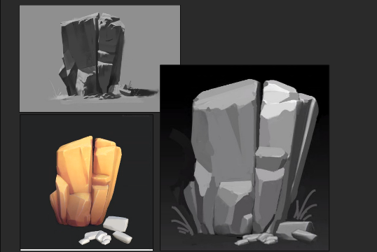
I sculpted the rocks out in ZBrush, Retopod in Blender to be a game asset, baked textures and did a lot of hand painting and generators inside Substance Painter to create a decent looking color flow that looked cool. Never really done this, working on a focused stylized piece is really fun though.
Now it was also time to sketch out a diorama look that flows well with what I'm trying to show inside UE5. Most rock studies are really cool in 3D but I wanted to do a little more than just show a untextured rock in free floating space. Instead I wanted to try making this study have an stylized environment to complement it. and 'maybe' include some creatures (cause why not?) give it personality..

(simple paintover with my setup in UE5)
Finally at my current point in this rock study, I created a mix of different types of foliage, a mix of textured and node based grass. I also took a lot of inspiration from Sea of Thieves with their sand and how it glistens in the sun thinking it was very neat. Granted this is a desert, but I studied an article on Journeys sand as well and recreating a sort of altered flowing noise texture across my sand. Will it work? I don't know, but screw it I'm gonna try anyways and see if it works well with a flowing dust cloud (which I'm still working on). End of the day I just want to make some cool stuff for a game portfolio.

Currently I'm at this point. Not sure if I'm happy quite yet with the color and grass placement, but including some simple lights (rim and front light) I feel its getting there.
If you have feedback I'd love to hear it, otherwise i'm just rolling with it and gonna make it happen. I will be adding all my rock studies in this post and eventually a final post with all 3 styles that will be included as separate pieces on my Artstation. I feel each one should be its own thing as i'm trying a lot of different things for each one :)
Replies
really cool study, strong use of color. those cute geckos in your paint over steal the show for me.
@killnpc Hey there! thanks for stopping by :) really appreciate the kind words. uhh... question though because I'm a bit confused (sorry if I sound dumb here) are the Geckos too much in a bad way? or do you mean its a good thing because of the look?
Just making sure :) I always appreciate feedback
i wouldn't think so; they're great and your diorama looks great.
Oh okay! Thank you very much.
Got around to finally implementing a neat Niagara particle effect to simulate blowing sand off the sharp curves in my dunes :) Included now is blowing sand and slight god rays to hopefully draw the eye but not be too distracting. I can't take credit for the god rays however as that is "LazyGodRay" by Devin Chiu made using UE4, that I worked around with to make usable in UE5. My initial attempts at making god rays were pretty garbage and I couldn't find any good tutorials on faking god rays. As relying on real time lighting and volumetric fog would mess up the nice lighting I setup.
Sadly, because I can't really upload videos you can't see the blowing sand that well but the images should give that impression, as it's very subtle and suppose to flow with the grass.
Really happy with where this is going. Pushing a bit more I messed with the post process volume to add a vignette to just give a cool focus to this diorama. I plan on tweaking my post processing in the engine as final touches when I finish adding things.
Next thing is adding my Geckos into the scene, with them being a contrast to my orange rock and giving more life to the overall scene.
Cool. I added these placements as a test for my textures and lighting. Overall.... this didn't look good, the colors looked washed out, the geckos... well, they didn't look like Geckos.. more like blue squirrels in the desert? ugh.
So I went back and reworked the textures and body shape of the Geckos to make them more to what I was hoping for in the concept. Making them more flat bodied and giving more bright colors to the skin + emissive to make them shine a bit (at least that was the goal). Doing my best to strike a balance in my scene without being too noisy.
Neat. The geckos actually look quite nice now (imo) next thing will be just small tweaks in the god ray. Making it shimmer more and ease up on the cloud texture as it looks to take up too much attention still. Finally I want to add the crown for our top 'King' gecko using a simple plane, and making it billboard for the camera as it moves in the final render. Other than that it's just small post processing volume changes to add that extra little push :D
Really loving this project, Can't wait to do two more of these studies of different environments and upping my stylized game for my portfolio.
Hey, I think the assets look very nice 👍️
the scene looks a bit cut out imo. You could expand the ground mesh so the chunk feels more grounded - and the shadows of the cool shape can show nicely too. Currently the shadows look pretty dark, in an outside environment I would expect some bounce light or assume it's night (Well, since there is currently no ground, it might be accurate as is)
Here is an overpaint to illustrate
Keep it up 🚀
Hey there @Fabi_G Thanks for stopping by :) Appreciate your feedback a lot and you even did a cool draw over, which I appreciate that a lot as well so thank you. I do agree that my shadows are a bit too dark still and I will be making those changes :) whether its through another light adjustment or through my post process volume in UE, thank you for calling that out though!
As for the background I realize that I never stated the background was gonna be the final color (whoops) however the gradient is neat but I may stick to a black background or a very dark blue. Reason being is my goal was to make a really nice rock sculpt, and I squint my eyes a lot when viewing it to see the nice forms I sculpted in. I hope to maintain that and I fear making a wide gradient background would take away from my forms (if that makes sense).
I went back and reworked my shadows a bit as they were too harsh and didn't look good. After fiddeling around with the post processing volume I tweaked my shadows, midtones and the height fog in my scene to make everything pop more. After that I also duplicated my rimlight and kind of just toned it down to have a form of bounce lighting in my shadows behind the rock.
That said, I went back and did a paint over of my current screenshot in UE5, planning out how I would change this design to flow better:
(New altered concept) A bit different from the original but overtime designs change and I felt I could pull this look off while still holding on to making a neat display of a desert environment.
After some debate I decided two Gecko boys was a no go as I felt it was too much. Siding for one instead plus a simple emissive crown :) which I dig a lot. Altered my rim light as well to be more of a purplish/indigo color following a warm to cold tone you would find in a desert setting, so it seems like a nice transition between light and shadow. Finally I was still a bit bothered by my god ray overtime... call it personal taste? but I didn't like how it kind of lingers off to the right.. So I felt I could alter it a bit.
(what I currently have)
So I kept the original god ray but turned the opacity wayyyyy down, keeping those neat little dust particles with a bluish tint, and opted in for a smaller focused light on the crown while not being too powerful. Finally In an attempt to make the edges fade off as shown in the concept (which proved to be very annoying) I edited my landscape opacity map in Photoshop with rough cuts and kept working nondestructively to make a similar look as my new concept. This process was very annoying as I know there is ways to make a beautiful fade out that involves some Niagara system trickery that is beyond my skill level right now... so I'm committing to this instead.
I like the look here though, it feels very punchy. I might tone down the brightness a hair but overall I don't think I can add much more to this in fears of over working it. Accepting any imperfections I think is fine too, I'm sure it could be better but for my skills right now I'd say not bad for a first diorama :) Hope to have the entire project uploaded to Artstation soon.
**Edit- I noticed the image was a bit blurry, turns out I had Chromatic Aberration turned on (whoops) so I disabled that and the mesh looks more crisp again. Sorry about that.
It is done. on to the next one ;)
https://www.artstation.com/artwork/vJdn4x
** Edit - Another note, thank you to everyone and your feedback while I was working on this. Means a lot, seriously. Thank you.