[UE4] Original Spaceship - The Arrow
polycounter lvl 2
Designed some spaceships.

Chose spaceship number 1.

Blocked it out and broke down the some of the looks of the spaceship.


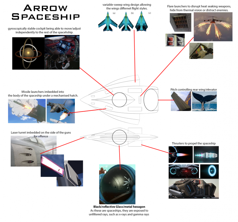
Made the high poly for the outside of the spaceship. Changed the design a bit and added some exposed weapons, like the wings guns and the front hole blasters.

Now I need to work on the cockpit.

Replies
Disclaimer - The colours aren't final. Just using any colour to separate things.
Made most of the stuff inside the cockpit.
There are few refinements left, such as the chair and the flying controls.
But as for buttons and things, they'll just be made using floating geometry decals. I also need to sort out where the pilot's feet will rest and place my ladder someone, as that is how you would enter and exit.
https://www.artstation.com/artwork/NxV5Zb https://www.artstation.com/artwork/xJ4zzW
Made the missile hatch. Made the shape of the hatch a rounded a rectangle to follow the soft shape/style of the curved surfaces. Was thinking with making it more pill shaped, so a harsher curve. Practically for the ship and for the model, it wouldn't work as well as a curved rectangle when the hatch has the open and close.
I finished the cockpit interior and added things that allow the pilot to move to and from the cockpit easier while still keeping with the gyroscope idea.
1. Added the wires and tubes to the cockpit to make things look more believable.
2. Completed the chair with padding and finished the joystick control.
3. Made the pedals that help the spaceship fly and placed them on an adjustable platform that doubles as footrests. This platform can fold away when not in use. Under the platform is a retractable handle used to get into the chair from the bottom hatch.
Made a telescopic ladder to enter and exit the cockpit from the top hatch.
Telescopic ladder Animation - https://www.youtube.com/watch?v=Ob-ejh9X3v8&t=1s
I've added ladder bars to assist the pilot in getting into the spaceship from both entrances. Each hatch has an airlock mechanism that doubles as part of the ladder configuration.
Door Hatch animation - https://www.youtube.com/watch?v=bNBpp3Fuyfk
Reduced the polygons for the exterior of the spaceship. The ship has many curved surfaces, so some of the body still has a fair amount of edges to keep the silhouettes.
I reduced the topology of the cockpit. I've left enough for curvature and silhouettes to stay intact.
Increased the edges to the curved edges to make them smoother, as the silhouette revealed hard edges.
I've unwrapped my spaceship. I'm going to use tiling textures for most of my spaceship surfaces, and I'm going to use the other UV channels to add grunge via RGB masks and perhaps liveries. I spoke to Tomas Woodward, and he said his spaceships were 512 per 1 meter, so I'm currently sorting out my spaceship's texel density to match that.
Though, I'm having an issue with my spherical cockpit shell. I want to have a hexagon pattern across the entire sphere, but it gets all messed up in the middle because it's mirrored on both sides (for the entrances). So, trying to unwrap it as a flat rectangle warps the squares, stretching them and making them uneven, which wouldn't be too bad if I used a matte colour for my tiling texture. However, I want a hexagon pattern across the whole sphere.
I could unwrap it as a circle which doesn't warp the squares as much, but it makes it harder to apply tiling hexagons due to its circular shape.
So, a method that I used before, which is a bit longer than normal texturing, is to bake another sphere over the top that has a hexagon pattern modelled. This way, I can get my hexagon pattern across the sphere and pass the awkward shape.
As for the colour and roughness underneath the hexagons, if I use colours in Unreal engine, that would bypass that, and the only issue would be the roughness wrapping a bit, but it would be less noticeable with that.
I finished the cockpit's texel density. The Monitors have higher texel density as I'm going to add some sci-fi screen stuff.
So, like No Man's Sky, I wanted hexagons like these to be on the surface of the cockpit shell.
But, as previously stated, the unwrapping warps the faces and would make the hexagons look bad.
So, I made another sphere, added hexagons across the face, and baked these hexagons over the cockpit shell. This bake will be in the UV channel 2 or 3, whilst the tiling texture will be on the UV1 channel.
So I want the hexagons to be on the White faces (exterior), but there are many random patches across the inner faces.
This is the first pass in Unreal Engine, and it looks good. There are some symmetry issues, but they're not too bad, especially if I hide them via trims. Anyway, since the idea of having the hexagons look fine as the bake it's a success.
Baking errors inside the cockpit shell.
Compared to the hexagon bake, the texture size inconsistencies and the bake have some warping issues. Though the texture looks somewhat better, perhaps the bake needs to be more shallow. Maybe a bake isn't an answer, but instead, an alpha needs to be used to mask the hexagons.
First pass attempt at the roughness pass that will be used across the tiling textures and applied this to a master material controlling the overall roughness, normal maps and colours.
Upon testing the roughness with the master material, it was hard deciding the colours to use for each section and ultimately decide whether the roughness worked. I've partially decided what colours I want, but they're relatively mute right now, and it would be the decals/liveries that add some colour, like how those exposed missiles brighten up the white a bit. So, because I haven't made those decals/liveries yet, it's hard to visualise how the base colours are working right now, so I'm testing some colours.
For reference, the colour scheme would be something like these. 2 main (probably monochrome) colours with decals or logos with other colours to break them up.
Though, all of that said, I'll probably go with the flow a bit. I'll work on the colours as I work on the materials simultaneously.
The seat material with hexagons follows the outer cockpit shell style and makes it look more sci-fi. The chair's base will be pretty plain to balance the noisy padding. There is a woven fabric material underneath the hexagons, so there is depth to the material. So, realistically, the fabric underneath allows for flexibility and breathability, and the harder outer hexagons help with durability and keep the structure of the padding taut.
I worked on the materials, Improved the roughness of things, and started to work on how the cockpit will look—the combination of roughness textures. White seems okay, but the darker colours start looking like stone.
For example, for some of the cables, I wanted them to look as though they had a robust outer section to hold up things but be bendable. So I thought of a segmented shower hose and how the water inside holds the hose up when water flows through it, yet it has a solid outer section. The other cables can be standard ribbed rubber/fabric cables to break up the cockpit design.
I wanted the pedals to have somewhere on them to show they had been used, but they look bland now due to them not having any decals.
I wanted them to look something like this. So a frame with holes in it. I was thinking hard rubber in terms of material, but perhaps that wouldn't be hard enough to be pressed down properly, let alone on a suspended platform.
Made the main cable sections for both variations, rubber/flexible stuff and Metal. So, like the shower hose, the metal cable variation has the grooves and is chrome. However, compared to the shower hose, the chrome is lowered, and the roughness is increased slightly to break up the shine.
Changed the material roughness and colours to test different looks and feels, as the previous roughness looked too much like stone.
The colour scheme for this trial that I liked was from this concept.
Comparing this concept and my spaceship and finding issues and improvements is problematic due to the lack of surface detail present on the spacecraft. I think I will leave the materials for now and start making the mesh decals and stickers, as I haven't designed those yet, and without the surface detail, it's hard to see what is off with the spaceship.
The overall design and making of the stickers and mesh decals are next.
I started making the decal sheet. I think I will make a 50/40 decal sheet, with mesh decals on one side and stickers on the other. So, the right side will be the mesh decals I will be using. The surface and inside the cockpit will be minimalist, so there aren't too many mesh decals. Most of the mesh decal detailing will be the lines and a few vents, and the inside will be mainly touch screen; therefore, only a few rivets types are needed. As for the stickers, I've left about 65% of the decal sheet to allow for better resolution and quality.
Made a paint over of the spaceship. Here are the before and afters of how the spacecraft looked and after. Similar to what was stated previously about the colour scheme, the spacecraft will have a white paint coat across the whole ship with a few livery lines across the edges of the wings, pitch controller, and thrusters. The spaceship was originally going to have more liveries that would stand out, similar to orange spaceships, with their logos and names. However, it's hard to design logos/names, and it doesn't look too good when the spacecraft was not intended to have those liveries from the start.
The original ideas for the liveries were simple lines with white paint, as the livery's inspiration from the start was this car from Need for Speed.
Here is a breakdown of the colour, mesh decals and new meshes added to the spaceship. Overall the colour will stay white with a cool blue and grey livery across the spacecraft. The pitch controller with thrusters inside of it to make it more interesting, and the mesh decal lines will either be grooves in the panel or panel gaps. The cockpit shell will also have lights inside that shine through a translucent surface that looks normal until the lights shine through.
Redesigned the main thrusters into cylindrical shapes instead of the previous design. The style fits better with spacecrafts that are smooth/curved, utopian and clean (both physically and ecologically). This makes more sense since the thrusters will be Ion thrusters rather than regular afterburner types.
New thruster designs
Old thruster design
In terms of fuel, an Ion thruster uses electricity to generate wind to propel the spaceship. This type of thruster would be comparable to a petrol-powered and electric car.
Added thrusters to the Pitch Controller; this is to both make it more exciting. Still, it was also an original idea to place thrusters on the pitch controller to help pitch the spaceship faster and make it faster generally.
Since the liveries will be just lines on the ship's edges, the mesh decal sheet will only have mesh decals on it. Since there won't be many mesh decals, the sheet size/resolution has been decreased.
Made the mesh decal trimsheet. Replaced the pentagon rivet with a hexagon to fit the recurring hexagon theme and replaced the hole rivet with a box that has more applications.
So I made a (from right to left):
Mesh Decals baked
Mesh decals in Unreal Engine 4. The sloped edges don't present too well, but that might be because they are next to each other with no context.
I changed a couple of pieces on the trim sheet. Replaced the extruded cap with the box and replaced the sharp ascending slope edge with a rounded convex edge.
Ambient Occlusion of the mesh decals
Added the floating geometry for mesh decals and livery.
Here are the mesh decals/stickers in Unreal Engine. I think the clean white with the black/grey mesh decals and mechanical bits contrast nicely, and the blue stickers add a nice hint of colour to break it up a bit more. I still need to add the lights to the cockpit shell.
Added the emissive dots.
I Made the landing gear for the spaceship. The legs are telescopic, so like the ladder, they can retract into and from themselves, making it possible for long compact vertical landing gear. The feet of the landing gear are the hatches for the landing gear, so when the feet retract into the spaceship, they become the surface of the spacecraft. There are no landing gear doors.
The landing gear will be present for both sides of the spaceship, meaning the ship can spin to any side to land.
Since the landing gear legs will retract into each other, they will have a concave section at the end of each section. Around each segment of the legs will also have a triangle pattern, like this reference from Christian Grajewski. https://www.artstation.com/artwork/NBVZP
Because of the triangle patterns, I've updated the mesh decal sheet to include a triangle insert for specific uses and a line of triangle inserts in place of the box and rounded line extrusion. The box and round line were 50/50 mesh decals, I thought they could have some uses within the cockpit, but there wasn't a definitive use for them.
Added the triangle pattern to the landing gear legs.
Updated the mesh decal sheet again. I forgot I needed flare launcher mesh decals for my spaceship, so I added the flare launchers in place of the box mesh decal. Besides, the box mesh decal was a bit of a placeholder with possible uses but wasn't necessary. Though the flares are also a bit a 50/50 as the spaceship looks fine without them, in reality, It's a spacecraft built for speed and agility, so it should be able to outrun anti-air missiles, but the flares would be an excellent backup.
I wanted the flares in a space where they're even distributed around the back of the spacecraft. It couldn't be on top of the spaceship, or it would become too noisy.
Lucky there was space on the side, behind the wings, which are both at the back and central.
It's good that the flares are placed near the back, behind the cockpit and central, as the flares would be evenly distributed, they wouldn't blind the pilot, and any explosions would happen naturally behind the spacecraft as it flies.
So I placed two on either side at the back, behind the wings.
Landing gear with textures and the flare launchers in Unreal engine 4.
When all of the exteriors are textured, the colours work well together, but the mesh decal vents and flare launchers look flat. This might be fine later when some specific wear is added. The emissive dots aren't in the best pattern either, but the lights around the cockpit aren't too bad. Overall, I think the spaceship has come together nicely. Now to work on the cockpit and the presentation scene.
I started making the presentation scenes. I had three ideas in mind for the presentation scene:
I liked the clean studio presentation, so I added an infinity wall and decided on some camera angles. However, getting the lighting to light everything evenly was hard, so was getting the background right. Compared to the orange studio spaceship and its complex shapes, my spaceship also felt empty and uninteresting.
I thought adding some stuff would help the spaceship fit in the scene. So, after adding a few things to the scene, I decided to hold off on the studio scene and go for a hanger scene instead. I checked my Epic Games Vault for some free sci-fi props I could use for set dressing and found Modular Scifi Season 2 Starter Bundle by Jonathon Frederick and Scifi Kitbash Level Builder by Denys Rutkovskyi.
This is my first pass at set dressing the scene. It looks way more appealing than the studio scene and looks more attractive. Overall, it's an improvement and not too distracting with the leading lights directed at the spaceship, and the environment around it is darker. However, the darker tones or at least darker walls and assets don't match the clean and white spaceship entirely. So the scene itself is a little mismatched. So, that is something that I want to go back and fix, and the camera angles aren't too appealing, so that I might change them as well.
Hey 🙂 I think the ship design looks unusual and has some retro vibe, which is cool.
However, I think the shapes used in the design make it somewhat hard to read. Due to the rounded edges you don't get clear planes/direction changes present in some of your reference images. Then at the intersections of the shapes, due to the angle, you get very sharp contrast in shading across the ship, which makes the big shape break apart somewhat.
Sorry to give you this kind of opinion at this point. From the looks of it, you don't use individual textures for the hull, so hopefully you can still iterate on the underlying design - should you deem necessary.
Regarding the lighting in the hangar, I would look for a solution to get some indirect lighting and reflections (stands are blacks). Also try enabling contact shadows on spot/directional lights.
Keep it up 🍻
Thanks for the advice. As you said, I'm pretty deep in now, so I don't think I'll do those changes for this spaceship, but I'll keep it in mind more when making other stuff. As for the hanger, the assets and colouring used seemed off compared to my ship, so I wanted to change them the most. As for the lighting, I'll look into that some more.
I used some walls that were more appropriate for my spaceship. So, I changed the borders to walls from Jonathon Frederick's other sci pack, Modular SciFi Season 1 Starter Bundle.
The assets from this pack are more clean and sterile, making it more appealing for a hanger that my spaceship would be docked in. Though I still needed to edit the materials from this new sci-fi pack as they were too shiny or just not blending right. I also went into the old assets and changed the materials to match the recent acquisitions.
I will change the landing gear to a levitation repulse type floating technology. The spaceship will reactively stop itself from getting too close to the ground. Similar to the ship from the movie Flight of the navigator.
For the design of how the floating technology works, I looked into Magnetic levitation on trains.
With this design, moving between objects could become more constant and stable since the floating pads are on both sides of the ship to push against both surfaces making the movement between the gaps smoother and faster.
This image shows what I meant by the spaceship moving through spaces with a constant and stable distance between surfaces.
Made the floating technology pads and placed them where the landing pads were initially. Maglev pads inspired the design with their large magnet surfaces, but this design has three cuts for sci-fi technology reasons and to make it more interesting.
Here is a close up of the floating technology pads and what colour they will be.
Side floating pads.
Front floating pad.
The pads with shinier metallic colours, so the edges are more visible.
This view is the floating pads on the bottom to see how they look from below.
The floating pads in UE4.
I started thinking more about more panel lines and stickers, as suggested by others.
I started with my ship's logo. I named my spaceship Arrow, so I searched for arrow logos to see how arrows were represented. When "arrow" was the only subject, the other options varied too much. There were a few attractive options that could be used for my spaceship, but I felt they didn't match my spaceship's style.
The previous search was too varied, so I added "spaceship" to my inquiry. These were more helpful.
I wanted to make my logo simplistic since my spaceship is, but I wanted to have the logo indicate it was related to a flying vehicle and the theme arrow. Similar in theme to the above images, but simple like the name Saitama on the below ship.
https://www.artstation.com/artwork/qOxJn
The Saitama ship logo works pleasant and straightforward, but I was thinking of a bit more flair and how it could relate to "Arrow" as a theme. Like how the below ship's logo has a circle in it.
https://www.artstation.com/artwork/NBVZP
I thought I'll base the logo on the name Arrow and incorporate the theme arrow into it.
Here are the logos I made.
I prefer the 1st Arrow logo with the Spike coming out of the "A" as if it were a thruster. 1st logo implies a moving object with the thruster "A". Arrow is referenced with the name and "A", and the font reads a futuristic brand. The curves in the font and colour also tie in with the spaceship theme.
I tried to have the word inside a stretched water drop for the other logos since my ship incorporates those flowing elements. I tried to have the shape represent an arrow and the water drop but found it challenging to combine both without ruining the form. The shape and colour also implied a more aquatic theme than a space flyer.
The logo will be placed on
As for the new panel lines, these are my current thoughts on where they would go.
Added the panel gaps into UE4. They add some nice accents to the white body. Something looks off with them, and I think the lines are too thin. From certain angles, they barely appear, such as the pitch thrusters. I tried keeping the width of all the panel lines the same, but I may have to make them wider or have a large lip like the thruster's base.
I applied the logo in UE4 as a deferred decal. The logo looks appropriate with its simplicity. However, it seems a bit empty in the area.
I made the logo larger to cover more area, and I think it looks better, but I think the logo area looks a bit empty. Comparing it to Christian Grajewski's spaceship's many lines and logos, I think having a few more lines around the main body will help, or at least make the lines wider.
https://www.artstation.com/artwork/NBVZP Christian Grajewski
I had a go at making the animations using a simple hierarchy rig. I moved the separated meshes whilst 3DSMax's Autokey was on, placed them in a hierarchy, and then exported them with animations.
It was pretty easy, but not too sure whether I made it right. Also, the animations aren't linear, so they slow and speed up. Not sure if I can change that with the animations already made or if I need to remake them.
https://youtu.be/bJTo3TOy2FE The Simple hierarchy Rig Spacecraft
I made and added thrusters to the pitch controller thrusters.
I made new panel lines along the top of the spacecraft with the help of others. Also, the panel lines were not the same width. Some were thinner than others. So, I re-made them to the same widths.
This gap (red arrow) is supposed to flow into the cockpit shell and come out, making a separate panel, but I think the panel gap coming out is too close to the "entering" panel gap. It makes it look very loose, especially if the cockpit shell is connected. So, I've moved it further back to make it look like it has another edge inside to hold it in place.
I might drop the "entering" panel gap more to cut in earlier.
I'll go with the previous version that follows the curve of the ship more. The lower "entering" panel gap isn't bad but I think it stands out too much and ruins the flow of the ship. The previous "entering" panel gap has smoother look and matches the rest of the ship better.
Made panel lines around the floating pads and led them off. This keeps with the style of the rest of the panel lines and makes the wings a bit more interesting.
Changed the colour of the panels to different shades to break up the ship's colour and matched them to the wings. Dark at the front and light at the back. IThe colour scheme resembles an American police car.
The previous image had the darker shades at the front and the lighter shades at the back. This image below is just two colours, light grey and white. Light colour front and dark colour back.
Different colours and combinations to show the various panels.
More shades of the same colour.
Changed the front shield emissive pattern. The previous one was uneven and wasn't prominent enough.
Before
After
Added scratches, dirt and heat wear onto the ship using material layers. Scratches from debris and enemy weapons. Dirt from the general environment. Heat wear from the floating pads and thrusters.
Made the hexagon material and added the random hexagon colour patches, similar to No Man Sky.
Made a HUD/UI for the cockpit with the help form Adobe illustrator and Stock. I made them as masks to change the colour in the game engine. I also added buttons to the flight controller stick.
Textured the cockpit with the ladder down and up.
The cockpit inside the spacecraft with the ladder up and down.
I made some blaster scorch marks and placed them down as deferred decals.
Beauty Renders
Animations
https://youtu.be/gUbDUdkBoAo
https://youtu.be/Pr979q7_Yqw