Home 3D Art Showcase & Critiques

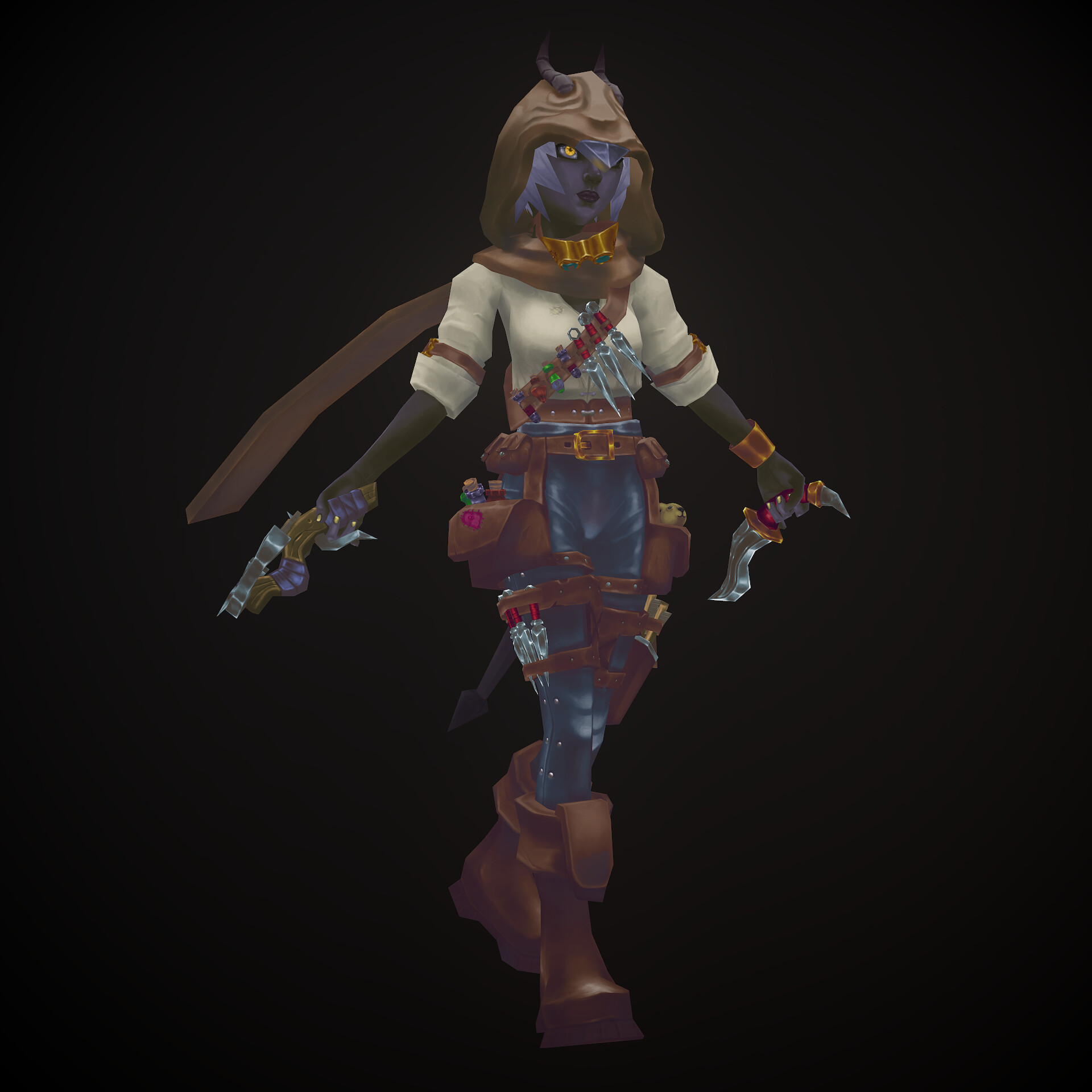
Adventurer Handpainted Character

My last project i did to practice texturing, link to artstation - https://www.artstation.com/artwork/D542AA
I want to know if there something i could do better in future projects <3
Replies

  • Fabi_G
    Online / Send Message
    Fabi_G insane polycounter
    Hey, nice result :)

    Here some tweaks I would suggest:

    Especially in this pose the legs merge together. You could use darker values on the inside of the legs and a highlight following the meshes shape (imagine a line down the front of the leg) to make it more readable when overlapping.

    Guide focus towards face and hands. Imagine a gradient from top to bottom, top/face having the most contrast while bottom least.
    The skin having more pop would also help this (insides of arms uniform brown).

    Small items along belt look a bit noisy from a distance. Maybe the design can be simplified and textures need less contrast? If you referenced a concept, I'd be curious to see it.

    To define shapes better especially in low contrast areas, you could paint in an environment color reflected from the ground. This has to be subtle in my opinion.

    Keep it up :+1:
  • orisys
    Fabi_G said:
    Hey, nice result :)

    Here some tweaks I would suggest:

    Especially in this pose the legs merge together. You could use darker values on the inside of the legs and a highlight following the meshes shape (imagine a line down the front of the leg) to make it more readable when overlapping.

    Guide focus towards face and hands. Imagine a gradient from top to bottom, top/face having the most contrast while bottom least.
    The skin having more pop would also help this (insides of arms uniform brown).

    Small items along belt look a bit noisy from a distance. Maybe the design can be simplified and textures need less contrast? If you referenced a concept, I'd be curious to see it.

    To define shapes better especially in low contrast areas, you could paint in an environment color reflected from the ground. This has to be subtle in my opinion.

    Keep it up :+1:
    I didn't use certain concept, but only references and maybe thats why I overlooked noisiness of small props :c . Environment could be a nice addition to the scene and I could add environment reflections with it, just didn't think about it. Thanks for the feedback! I will use this knowledge in future projects! c:
Sign In or Register to comment.