Metropolis Environment

polycounter lvl 5
Final result:

Reference:

Gif comparison:
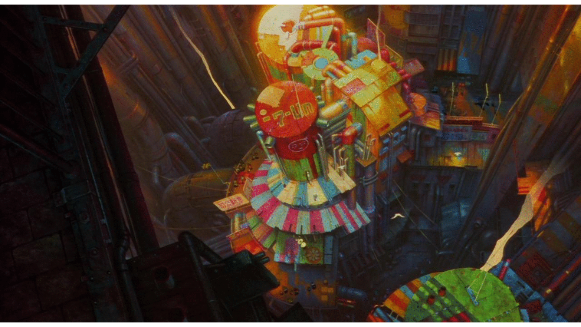 Hi everyone, i want to share my artwork with you in order to get critics and hear your thoughts about what i could improve in the scene. This is my first finished artwotk, i've spent 3 months working on it. The reference is taken from an anime Metropolis(2001).
Reference:
Gif comparison:
Hi everyone, i want to share my artwork with you in order to get critics and hear your thoughts about what i could improve in the scene. This is my first finished artwotk, i've spent 3 months working on it. The reference is taken from an anime Metropolis(2001).The scene was rendered in Blender Cycles with a little post processing in the end.
I used Blender and Substance Painter mostly. But also a little bit of Substance Designer and Zbrush.
All what you see in the picture is textured with SP with it's internal library, only the material of large tubes are made using Blender shading system. Yes i know that it's not the best way of texturing large spaces, but since this is a still shot and from far, i've decided to stick with SP texturing all the objects, altough it's not well optimised because of the amount of textures that are used. My next project i will do in UE4 and i will appear the scene creation process from different (the better and more common one) workflow - using more tileable textures and decals.
Designer was used to create bridge tiles and Zbrush was used to create little damage on metallic parts of the bridge, but since the light here is not intense, the details are hardly visible or not visible at all.
The goal of creating this artwork was:
1.) Create an artwork that i could put in my portfolio
2.) Use all the theory that i've collected through my previous learning
3.) Practice and learn Substance Painter, Substance Designer, Zbrush
There are a lot of missmatches from the reference image, such as object placement and overall scale of the objects, most noticeable - main tanker and the building which is layed to the right of the tanker.
Altough the perfect match between two images wasn't the goal for this artwork, i did understand one more time that planning and blockouting means a lot! So next time i create something, i definetly will put more time in these steps!
During the creation of this piece of art i've tested a lot of things and that's what i really liked about finally creating something instead of simply collecting the theory (which i was doing for the loooong time).
Even though a lot of things that i did was actually wrong or just simply was unneeded, i don't regret any minute spent on this project.
For example, once i appeared the bridge material creation, i've decided that i need to create metal finish (etching-like), so i've spent almost a week just playing with SD and trying to do so. And then after some time i've jumped to the Substance Painter and got to know that there is a couple of metal finishes already! What a dumbass i am haha. But that's a learning process! Atleast i've got a good practice in SD either.
I didn't have much time finishing the surrounding area (walls and tubes). So in my opinion they do have a lack of quality in comparison with other portion of the work. I also did choose a large scene so i think that, in some way, it was my mistake. Next time i will create a smaller scene so that i can put more time on the quality aspect, rather than the size of the scene. But that's not meant to be an excuses, just what i think about the overall quality of the artwork that i've did.
Thank you for reading!
Replies
The perspective is more aggressive on your reference image. You could widen the field of view of your cam to achieve the same effect.