Home 3D Art Showcase & Critiques

UE4 Hacker Barn I did for a Ubisoft Challenge - Roast me until I am crispy

Turband
polycounter lvl 2
Offline / Send Message
Turband polycounter lvl 2
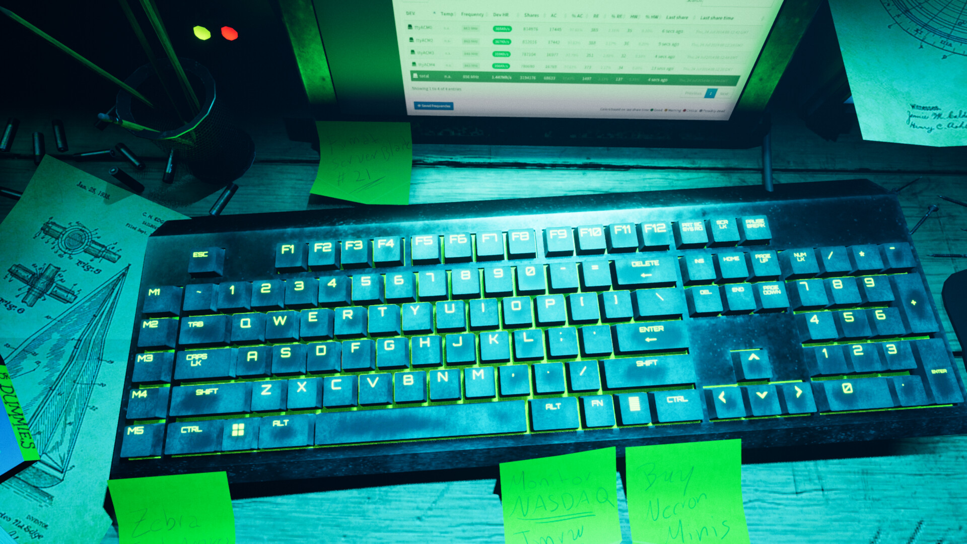
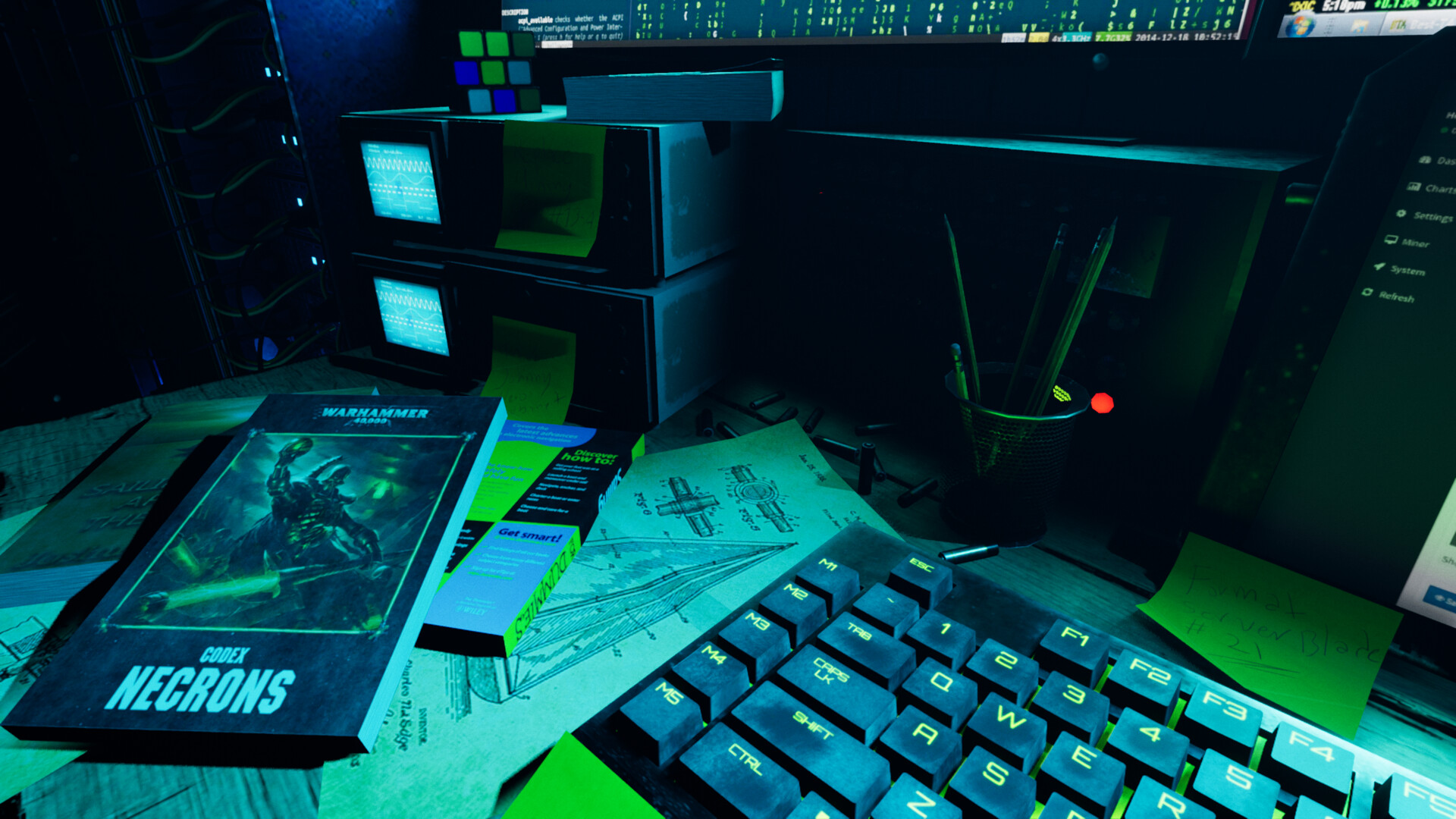
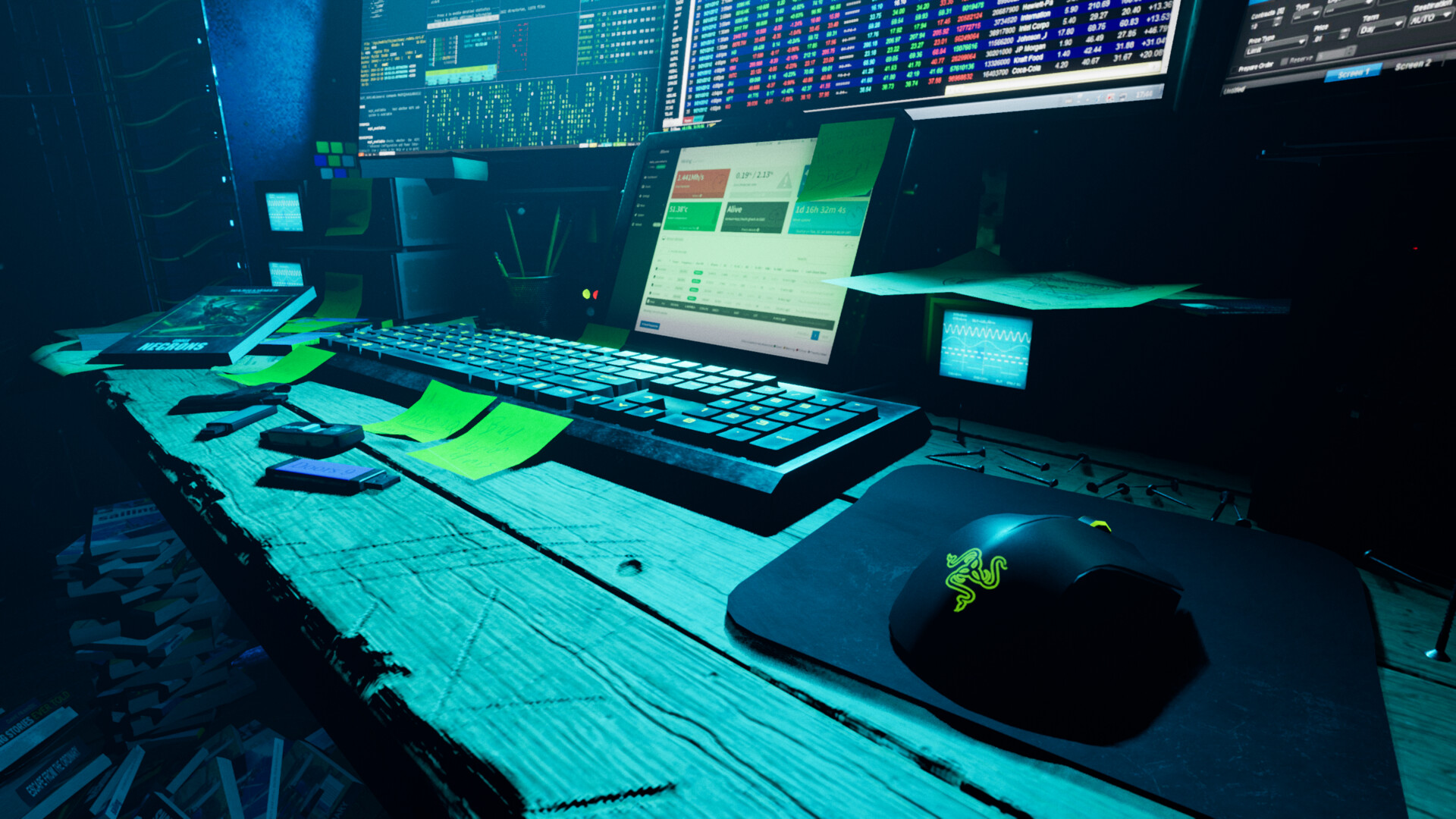
I really want to improve my art so I can get employed, and I need to know everything I'm doing wrong. so here is my only portfolio piece right now.


.


Don't hold back, bring it on.

Thank you for your time,

Andrés.

Edit: I embedded the images

Replies

  • Eric Chadwick
    Options
    Offline / Send Message
    Best way to get responses is to embed your work here on Polycount. Don't make us click a link to see your stuff, that stops lots of people right away, it's a gate. We're on a site where art is embedded all the time. It's the expectation. We've clicked on your thread, expecting to see your artwork, but now we have to click another link.

    As Jon Jones says "Put the art in my face ... Imagine that your target visitor is a tired, indifferent hiring manager whose only desire is to find the shortest path possible to looking at your art."
  • Turband
    Options
    Offline / Send Message
    Turband polycounter lvl 2
    Best way to get responses is to embed your work here on Polycount. Don't make us click a link to see your stuff, that stops lots of people right away, it's a gate. We're on a site where art is embedded all the time. It's the expectation. We've clicked on your thread, expecting to see your artwork, but now we have to click another link.

    As Jon Jones says "Put the art in my face ... Imagine that your target visitor is a tired, indifferent hiring manager whose only desire is to find the shortest path possible to looking at your art."
    Thanks for the tip, it is one now.
  • zachagreg
    Options
    Offline / Send Message
    zachagreg ngon master
    I think the biggest area that needs work is lighting and composition, you've got some solid shots in here but there is a general bad placement of camera angles and lighting. Pictures 1,4,9, and 12 have better compositional arrangements with probably 1 and 4 being the most pleasing IMO. Strong lines leading towards the focus of the shot as well as good lighting that reinforces your focus on those two.

    I know I like to be a cave dweller most of the time in regards to working in the dark or dim light but unfortunately there isn't a whole lot visually pleasing about that situation from an outside view. Sometimes you have to let go of your theme to improve other aspects of your piece. The dark hyper saturated light isn't doing a whole lot of favors and the strong purple light is taking away a lot of the character and drama that the bright monitors would add in contrast to some of the more dim old monitors that are on those game cabinets. You've taken away the juxtaposition between new and bright and old and dingy. A big disservice to yourself as that is a theme that a lot of people have experience with and can relate to.

    I think those two larger areas will give you more bang for your buck than anything else but if we are getting down to assets and general construction, I would say two things. If  you want a prop to be a hero prop and a focus then do that but if you want some assets to just show off your texturing or modeling then let those less important props shine on their own in separate images or breakdown images. Don't muddy up your presentation with close up shots that are badly composed, badly lit for the sake of showing off a non focus object, just take that object and present it well in its own scene in Marmoset or something.

    Second thing is your texturing/material work. I'd say you put the most care into that keyboard I can see finger place and various ware on different keys based upon their use. That is great, everything else looks like it has this general grunge and procedural-ness to it. Also not everything needs to be beat to hell, that used to be a really popular thing of just to grunge everything up but I feel like a lot of game art is moving away from that because with PBR it becomes very noisy very quickly. No one is going to scratch that far back in a game cabinet let flat surfaces come through and let things be semi-clean and clean sometimes. It allows the viewer's eye some rest. It also shows that you put time and consideration into the finer details of these assets which shows you can perform on that extra level to make props sing.

    If look at the quality of texturing in images 2 and 10 next to 6, 7, and 8 you will see a major difference. Painting in different details for roughness and masking out better surfaces doesn't take long but it adds so much more character and life to objects.

    This scene isn't bad either and you have the skills to produce you now need to take the time and refine. Show your art some love and get into it. Look up reference for composition and lighting from movies in the same genre and other art. That will be a good focused way to improve. Same goes for texturing do a side by side with some art that inspires you and is really good and see how they craft their textures, their roughness, and grunge. Lastly, if you're going to show me a keyboard that close up I want to see some bevels on that thing, it's worth making highpolys for hero props.
Sign In or Register to comment.