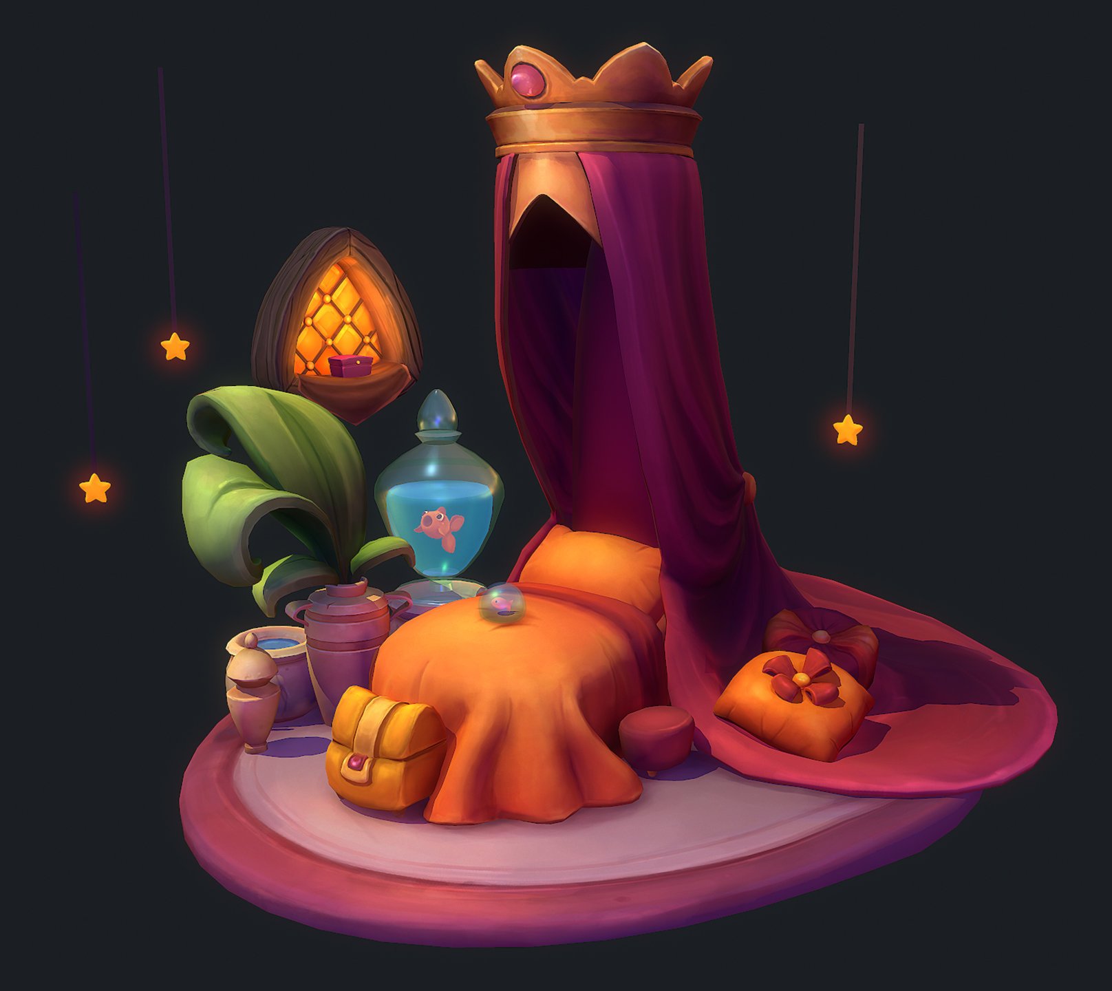
Loving the colour composition! The rich shadows are especially nice.
If there's one thing I'd change, it'd be the leaves, which I think wouldd be improved by some fake SSS.
Right now, the way they go dark at the bottom make them look inorganic, as if no light passes through. If you'd let some of the light bleed through at the bottom, all saturated and green, that would really sell them as being 'alive'!
The lighting on top of the painted in shading does make it worse, so some self-illumination could do wonders there.
Ohh Thanks a lot for the feedback, so true! Looking back at it now, I agree that the shadow on the plant is too dark. I adjusted it a bit in the material settings and applied SSS to it and emission, which I guess fixed the issue.
Just gorgeous ! Love the warmth and colors ! Only minor nitpick: the water in the 'pot' seems very slightly out of place as it looks less textured ?
Hmm.. Since this is lit and I really liked the way the specular settings in marmoset worked to make the glass and water looked stylized and reactive to the environment lights, I preferred that approach compared to painting in details for that. Thanks for the input though, appreciate it!!

Replies
Some parts are sculpted inside Zbrush to create the diffuse base for the textures. Here the sculpt!
Only minor nitpick: the water in the 'pot' seems very slightly out of place as it looks less textured ?
Hmm.. Since this is lit and I really liked the way the specular settings in marmoset worked to make the glass and water looked stylized and reactive to the environment lights, I preferred that approach compared to painting in details for that. Thanks for the input though, appreciate it!!
I also just noticed the blue is actually only like that in the animated gif