Home 3D Art Showcase & Critiques

[WIP] American Diner UE4

polycounter lvl 6
Offline / Send Message
Seal40k polycounter lvl 6
Dear Polycount Team,

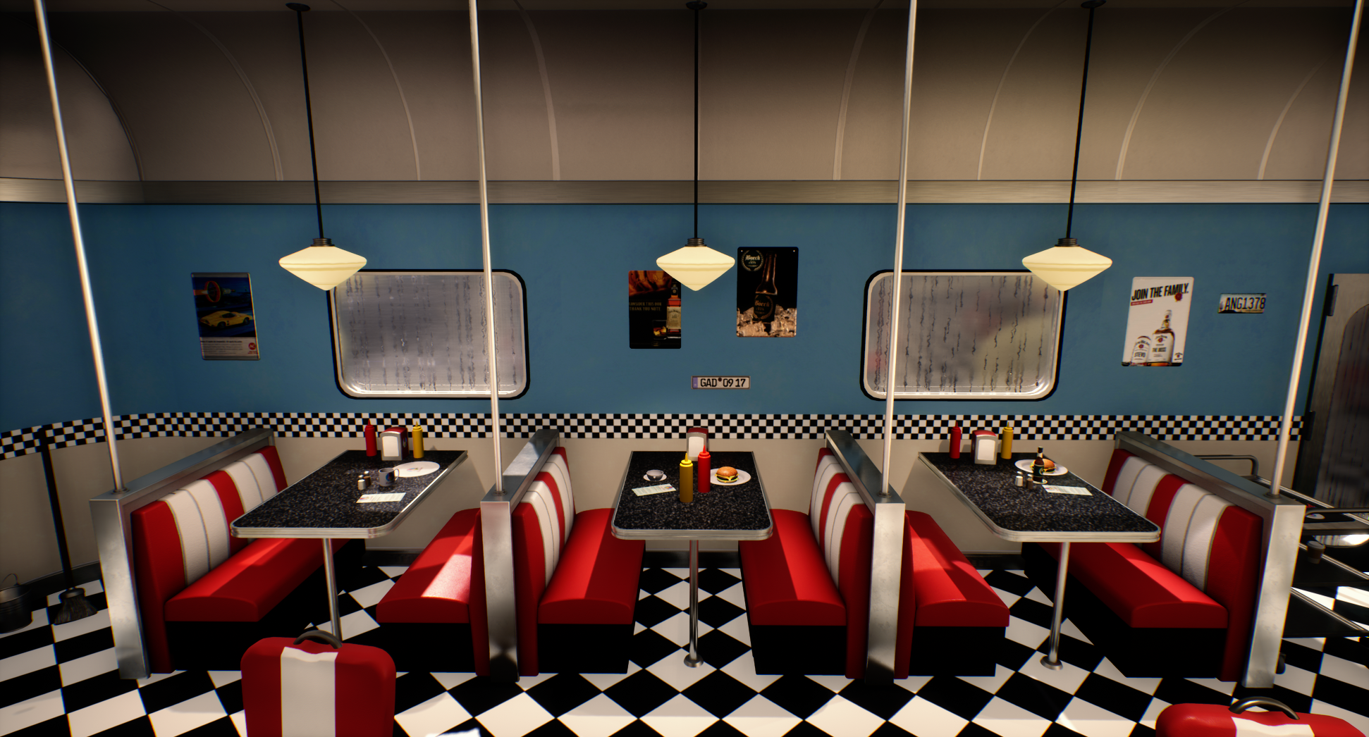
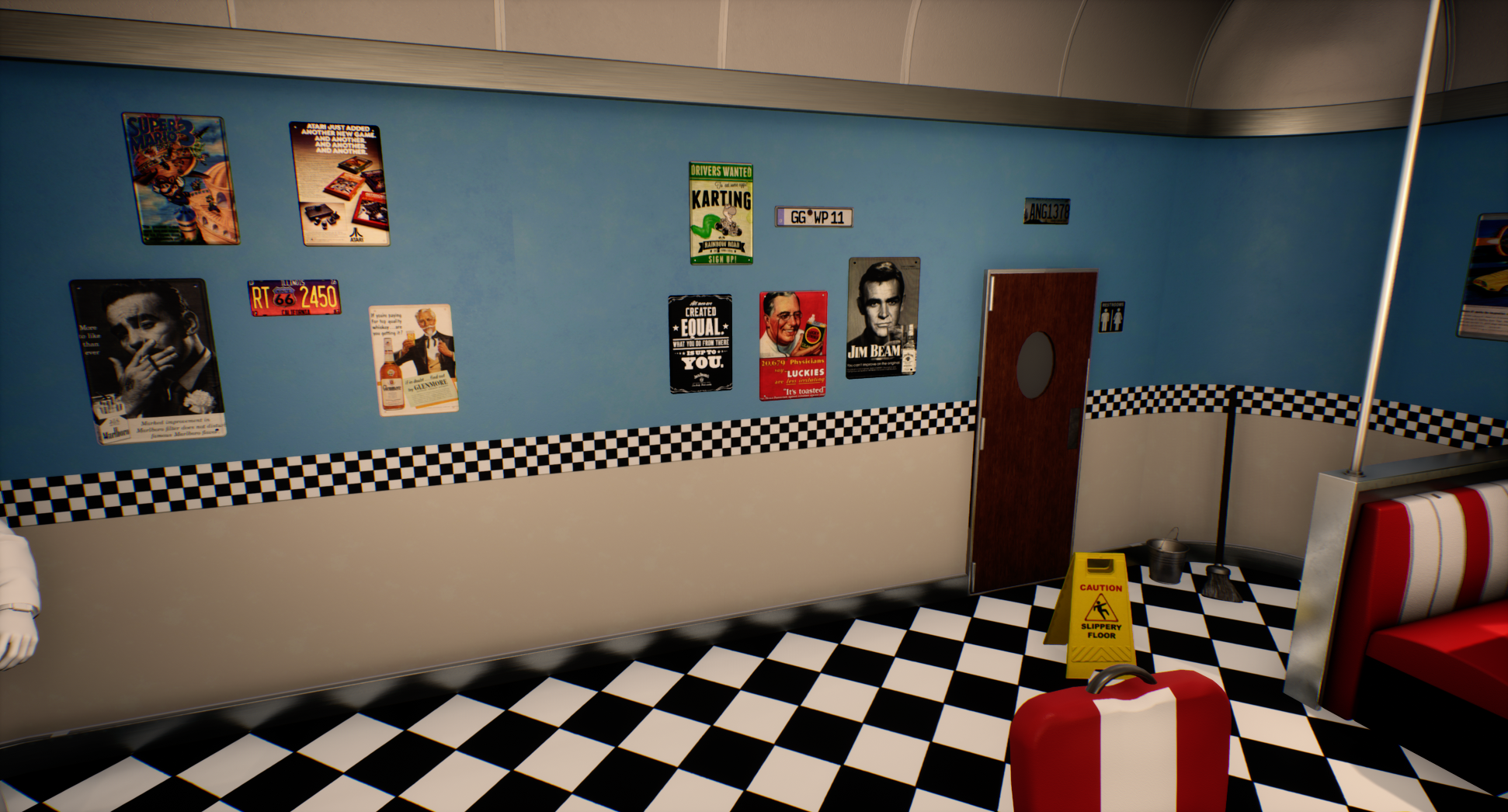
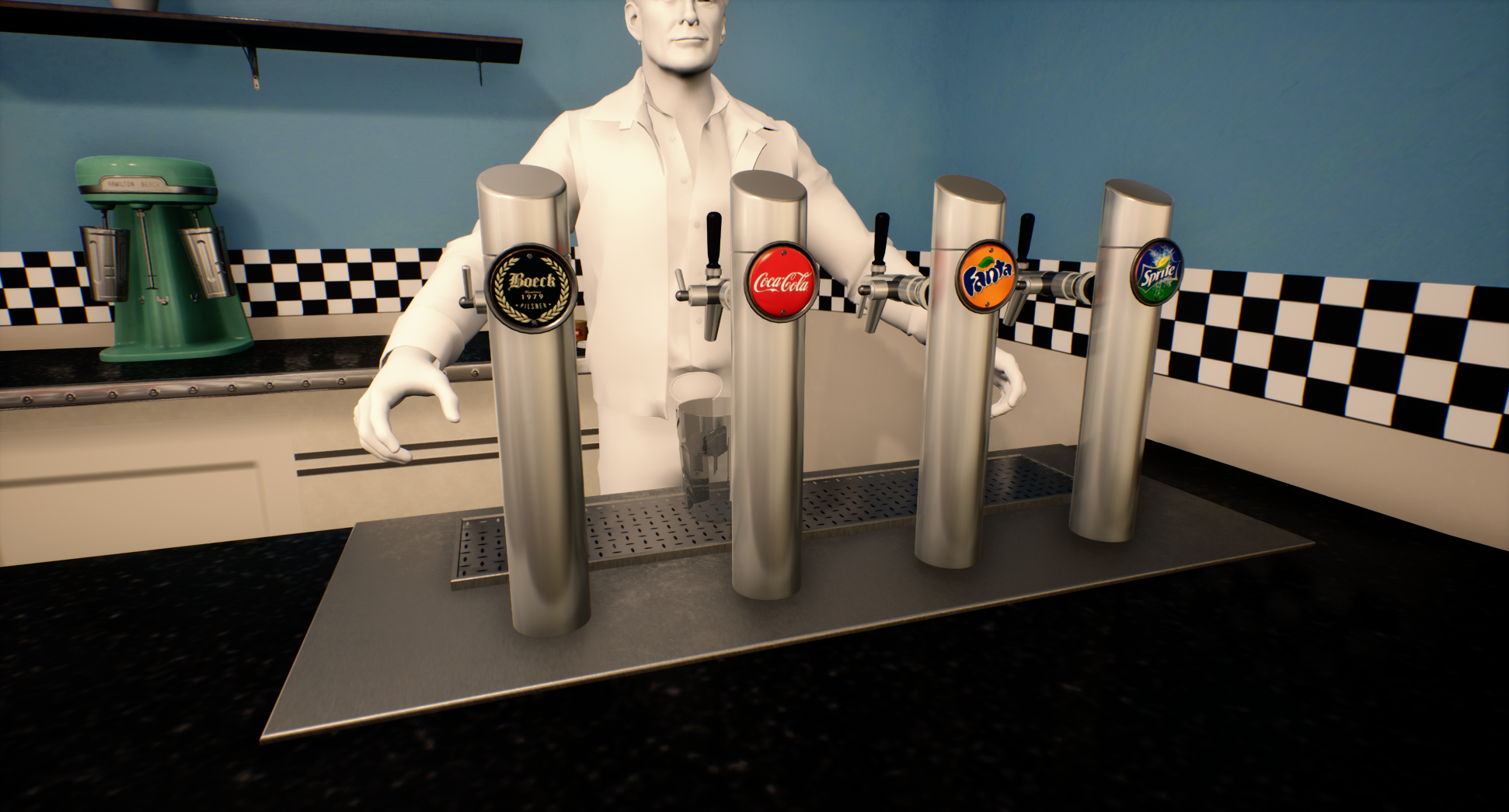
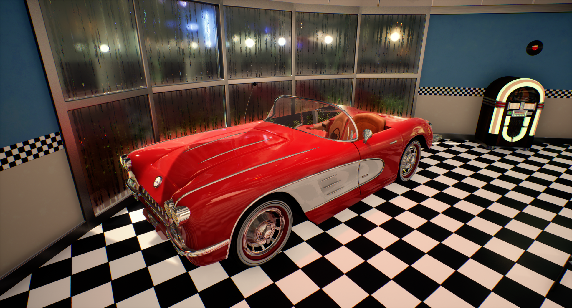
Here are some screenshots from an American Diner in UE4 I am working on. It would be great to get your feedback on the current state of the scene to get some external feedback after staring many hours on my monitor.
My next steps will be to add more details to the scene, especially on the walls as well as the bar, before I move forward to add decals and finilaizing the lighting and post processing.


Also, please find down below some of the references I am referring too and which I use as inspiration:


Looking forward to your feedback.


Best,


Sebastian

Replies

  • alexk
    Offline / Send Message
    alexk polycounter lvl 12
    If not already planned, I would include some of the colored neons in the last reference picture. As it stands right now, the lighting is very flat and the entire environment is nearly 100% fully lit with what seems like only white lights, so having color neons can help. But don't be afraid to add colored lighting to your scene even if there isn't a source for it as long as you keep it subtle and it helps your scene. All your shadows right now are almost non-existent. I would try reducing the radius of your omni's to allow some darker tones in your lighting. Especially since your scene looks like its set at night, you should try to imply that in your overall lighting. It'll be great if you can identify a focus to your diner, like perhaps the car, or the cooking area. Then you can light those areas the brightest to help direct viewers to them. But if not, then go for overall mood. Is it a warm inviting diner on a cold rainy night? Or maybe it's a diner that's sort of past it's prime but still hanging on. Or maybe it's the 50's and the diner is in it's prime. These scenarios help determine the direction for your lighting.

    I think your textures are a little too clean. Almost like its just solid colors for the albedos. Not saying they should be crazy dirty, but try adding very subtle overlays to add color variations to your solid colors. I would also revisit the roughness on your textures to add more variation to it too.

    I think your black textures on the tops of your tables eats up shadows, it's also looking a bit low res compared to the hamburger and beer. Might be worth trying to change the color, or tweak the albedo and roughness values.

    Hope this helps!


  • ChrisFraser
    Offline / Send Message
    ChrisFraser polycounter lvl 5
    I like the overall design but I can't see your shadows or any AO in the scene. 
  • JonJo
    Offline / Send Message
    JonJo interpolator
    Cool scene! lots of fun detail on the props and you've clearly put a lot of time into this! The water drops on the windows are really nice, I can imagine some cool exterior lights coming through them, 

    I would start the lighting from scratch, I can barely see AO or shadows, as the other guys have mentioned. Start by adding some contrast, and maybe study diner scene from movies that have inspired you? The lighting in the Pulp Fiction diner sequence was always really cool to me. The door at the back of the diner looks pretty squished right now. Look how broad your human is in comparison. 

    The posters don't really look like they fit on the wall and feel very out of place without a little dirt or colour variation to break up the blue/white walls. It's really easy to go super clean, so just start pushing your swld to through some decals onto the scene. Something thats really throwing the scene off right now is the inconsistent texel density. Your texture on the table looks super low res compared to the props onto of it which look very high res and pretty. If this is for a portfolio piece, bump up the texture maps so you get a consistent density, else things might not feel like they fit together. 

    Cool scene man, keep it up!
  • Seal40k
    Offline / Send Message
    Seal40k polycounter lvl 6
    Hey guys,

    thanks for all of your feedback. I am currently redoing the lighting. Its not completly done yet, but let me show you what I have in mind:


    appreciate your feedback.


    Best,

    Sebastian
  • alexk
    Offline / Send Message
    alexk polycounter lvl 12
    The lighting is much better!
  • pixelpatron
    Offline / Send Message
    pixelpatron polycounter
    Lighting saving the DAY!!!! Whoo!!! I love those neon tubes outlining the trim overhang of the bar. I'd love to see that element added to your scene. It'd really be some nice frosting so to speak.
  • Seal40k
    Offline / Send Message
    Seal40k polycounter lvl 6
    Here is a little update on my Diner project. The plan from here on is to add even more assets, especially in the bar area. Main Issue atm is still the lighting I believe which is not there so to say, but atm. I am not sure how to improve it. This and the overall clean look. Please let me know your opinion on this and what I might do to improve the scene. Thanks! :


    Best,

    Sebastian
  • Seal40k
    Offline / Send Message
    Seal40k polycounter lvl 6
    So here is a version with optimized lighting which I believe works better:


    Best,

    Sebastian
  • Seal40k
    Offline / Send Message
    Seal40k polycounter lvl 6
    So, I believe I am done with this project. Before I call it fisnished it would be great to get your feedback:


    Thanks in advance!

    Best,

    Sebastian
  • garcellano
    Offline / Send Message
    garcellano greentooth
    Awesome work. Did you also make the female character and the car?
    The stack of cups might be overkill, maybe a little? I'm not quite sure lol. It's like around that point where it might fall off.
    Overall, great job.
  • Seal40k
    Offline / Send Message
    Seal40k polycounter lvl 6
    Hey, thanks for your feedback.
    The Car was done by Marvin Heymann, and the Character by Jonas Ganser:


    2 additional contributers were Bjoern and Evan, I would meantioned them earlier if i knew the project would land on the frontpage of course.


    The whole project was an university assignment.

    Best,

    Sebastian


  • jake1210
    Offline / Send Message
    jake1210 polycounter lvl 4
    Cool concept! Digging the whole asthetic of the scene and how every asset flows together. My only thing I would point out is in the last image with the cups the tiling is quite skewed screen left. Other than that this scene has major character :)
  • Seal40k
    Offline / Send Message
    Seal40k polycounter lvl 6
    As a little addition to our project we decided to animate the Waitress. Pretty happy with the result:


    Best,


    Sebastian
Sign In or Register to comment.