[UE4] Sci-Fi Morgue (now slightly NSFW)
polycounter lvl 6
Hey guys,
Final scene:

ArtStation Link:
https://www.artstation.com/artwork/L2ka80
Trying my hand at a sci-fi scene inspired by Arthur Gurin's concept:
https://cdna.artstation.com/p/assets/images/images/004/572/046/large/arthur-gurin-infected.jpg?1484672981
He also kindly donated his scene to use as reference, so props to him!
The idea behind this is to create the scene first, then flex a bit of character art/sculpting by rendering out some malformations/infection on the cadavers. I felt it would also be a good way to increase my knowledge of the Substance packages a little more, and teach myself some visual design/composition lessons.
Final scene:
ArtStation Link:
https://www.artstation.com/artwork/L2ka80
Trying my hand at a sci-fi scene inspired by Arthur Gurin's concept:
https://cdna.artstation.com/p/assets/images/images/004/572/046/large/arthur-gurin-infected.jpg?1484672981
He also kindly donated his scene to use as reference, so props to him!
The idea behind this is to create the scene first, then flex a bit of character art/sculpting by rendering out some malformations/infection on the cadavers. I felt it would also be a good way to increase my knowledge of the Substance packages a little more, and teach myself some visual design/composition lessons.
Replies
The lighting sticks out for me. Compared to the concept art, you have a bunch of unmotivated lighting -all omnis- placed to light up an area, but theyre not coming from any source. Consider some emissive planes that contribute to the baked lighting (if you're baking), or you could swap them out for some soft spot lights. There's a lot of awesome information in http://http//polycount.com/discussion/190402/ue4-learning-lighting-art#latest this thread.
I decided to take @ParksMarks advice and redo the lighting a little, focusing on getting some colour in there and removing all of the point lights in favour of spot lights. I also made some adjustments to the scene, unifying the top trims with larger, more custom elements and building out a floor trim, which is WIP and will likely be redone as I move forwards.
At the moment the issues I am having include unifying the metals a little in terms of value and also the need to add more details to some of my props. At the moment, I feel as if I am replicating shapes as smoothed assets and skimping on details.
As always, any further critique is more than welcome
Did a bit more work on the scene, finishing the cabinet asset and polishing/rejigging elements:
Added a new door that leads into a planned Quarantine area:
Also began filling out the back shelves of the room:
Any feedback is appreciated
Thanks,
Matt
Just some quick updates:
I made a modular set of roof panels/pieces to replace what I blocked out - the intent was to add detail that was non-distracting and add depth to the scene. I also did another pass on the floor panels to clean up and simplify them.
Next, I will be tackling the door on the left and then the main piece, the incinerators and their accompanying wall pieces.
Comments/critiquie is appreciated!
Did the doors this weekend, mapping the frames and the shutters onto one texture so I could do them all at once. I intended to make them look as receded into the environment as they were in the concept, with just a little visual interest. Attempting to learn level blueprint stuff to get some flashing lights nearby.
As always, feedback is appreciated!
Added some pipes now, with all of them sharing the same texture. Nothing much to add though I have been experimenting with valves, lights and brackets for additional hanging wires.
That's all for now, next is the walls!
This time I've done the walls and crematorium at the same time - the walls will need another set of variants as the read is a bit noisy now, but there's something there, nontheless.
The crematoriums I took two attempts to do, as the first one I designed looked compositionally boring. Here is the first design:
The redesign added new pipes and extra details such as lights, as well as cleaning up details and adjusting proportions:
I also pushed the textures here more than before to get a grungier look, which I will apply to the other assets once I revisit them. I wanted more of a dirty, horror vibe with the assets I have, so that will be what I push for with my revisits.
Comments and critique appreciated!
I designed two types of these guys, each with the idea of an extending piston built inside to lend them a sense of purpose and get some round shapes in there. I also have housing meshes built alongside them so that they can be closed off when the scene needs it.
Here are the smaller ones in action:
And the larger one:
And opened:
I'm keeping it closed for now as it reads a bit too noisy, when what I really wanted was to have the pillar recede into the background of the scene. I may do another pass on these pillars to address some material distribution bugbears I have with it.
In all, I decided I wanted to change the narrative focus of the scene a little, and make it some time after the concept art, when the facility is long abandoned. This will lend itself well to me revisiting and pushing the design and materials in my scene harder, and facilitate well the creature I am planning to make to supplement the scene.
Comments and feedback well appreciated!
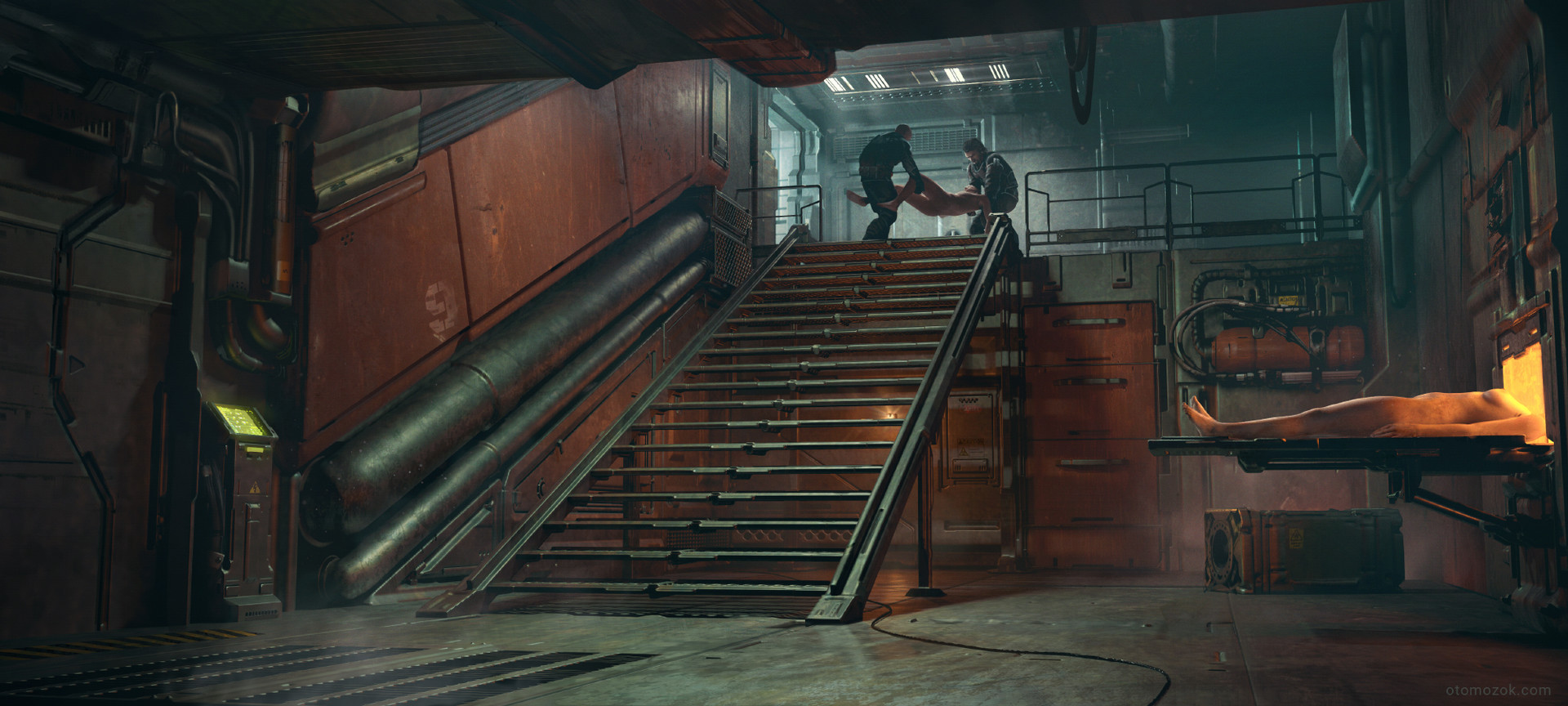
This weekend I focused on cabling, just to address the door area and to get some more organic shapes in the scene. To help this, I read up on tutorials, and then made my variation on a spline placement/deformation blueprint. It's pretty simplistic, but it was new ground for me and allowed me to have a lot of fun placing cabling in the scene.
Here's a shot of the door:
And the back of the room:
Any comments/feedback appreciated!
Art-wise this looks pretty solid - I always like seeing good cables. Maybe consider adding some subtle geometry deformation to the stairs, just to make them look very slightly imperfect, as if they've taken a fair bit of stress over time. Just some swift looping and slightly nudging some verts around can give this effect - helps break up any perfect straight lines.
I textured the fuel canisters and some top walls here, as well as some smaller areas. i also revisited the lighting (as it was broken on 4:20) and it's still wip, but doing my best to make it stronger and more directional.
The top walls here are extensions of the furnace idea, and I will be making variants to address other areas of the scene.
Next I will be addressing more props and getting to blocking out the monster I have as a focal point. Comments and critique appreciated!
This week, I textured two more assets, the upper light fixture and the stretchers, and also added some placeholder cadavers I sculpted.
I plan to work into these sculpts more later, but my next task for now is finishing the props in the scene. I have also yet to prototype the creature I want at the top (stuck a random cadaver there for now instead, which arguably looks interesting on its own.).
The stretchers into the furnaces are textured to be bloodstained (as will be the cadavers), but it isn't showing up too much at the moment, so will require perhaps some decal support.
My next move will be to continue to complete the texturing of assets in the scene, before I add additional props, perform another pass on what is there and start injecting more narrative in the scene.
Comments and feedback appreciated!
If you plan on doing any VFX for this, some embers coming out of the furnaces, and some heat haze, etc would work great in here
This week I textured the terminal, the cage and the railings at the top. Trying to get all my props textured before I do my round of decals and second passes.
The terminal has a placeholder effect of hovering text over the screen as in the concept, planning to elaborate on it further in the future.
The cage and the railings are fairly basic and share the same textures - trying to keep it clean.
Comments/critiques appreciated!
This weekend I made the door in back and also blocked out a creature I am sculpting as the focal point of the environment. The overall idea is to sell a narrative of this creature being a cadaver about to be incinerated, then it mutated into an insectoid being and escaped up the stairs.
Here's a WIP sculpt - i'm no character artist but saw this as a good opportunity to study bones, muscles and the like:
The door in back is pretty simple, features a basic frosted glass material. It was just bugging me, really.
Comments/critique appreciated!
The biggest thing that jumps out to me is the orange wall going up the stairs. It's crying out for more tonal variation. Concept seems to handle the wall material nicely. Are you planning on more work there?
So, after completing the environment props I wasn't happy with the quality, so I remade a few of the worst-looking ones with more of a mindset towards their usage and purpose. In doing so, I noticed that all my texture import settings were washed out due to sRGB lightening them, which made my Substance results and my Unreal results very different.
@Eric Chadwick
That's a valid point, and I still need to work into that texture a bit more, but hopefully this change helps a fair bit, thanks !
I'm in the process now of reauthoring/importing my textures in the scene, which gives them a much more desired material response - can't believe it took me this long to realise this was a problem
As for my prop modifications, here are some before - and -afters:
I will continue to adjust these as I do my pass on the scene of fixing materials.
Comments/critique appreciated!
I've had a long weekend to do some updates, based on your feedback and also the opinions of some of my colleagues/girlfriend. As a result, I've reimported all the washed-out materials and adjusted tone, lighting and response across the board.
here's the scene now:
I removed all the "dark metal" parts of my scene's textures and replaced them with paint, whilst at the same time adding grime on top. It's an ongoing process but it's offering some nice breakup. I'm still working on lighting/comp, but I plan to tone down the spot under the stairs and put all the focus on the creature up top. I also began to add new light fixtures as per @PixelMasher suggested.
here's another shot of how the materials pop now:
I also had the chance to spend a day or two flexing my anatomy knowledge and sculpt my female cadaver. It was a daunting task and not perfect, but it was a fun learning experience:
In the scene I added grunge and made it look like the body had been moved and got dirty before it was due to be cremated:
It was pointed out that the static poses of these bodies make it look like they're shop mannequins, so in future I may rig them to have them in a more dynamic, organic pose, which will also serve to differentiate them.
Next I will continue working on material response/lighting, smaller props/storytelling, decals and then finally get stuck into the creature at the top, and how it travelled around the scene.
Feedback on anything appreciated!
Great atmosphere keep it up!
Not much on the scene itself - added a few additional fog effects which were suggested by my colleagues and toned down the paint on one or two assets to help the scene read better.
I've mostly been working on the creature - I added extra, smaller "arms" formed of the ribcage to give it a more interesting silhouette and make it more spiderlike and imposing, and made it slightly larger in the scene to command more attention.
Here's the sculpt so far. I'm trying to take my time with it since it's so integral to the scene, but at the same time trying my best to avoid overworking it. Any feedback on it specifically is always welcome:
Critique away!
Just a quick update - been adjusting and polypainting this creature;
The consensus so far is that it's really pink, so I'm looking for a way to darken the skin tone a bit (make it more dead/decayed). I'll also be trying to make the blood darker in places it's congealed and having more of a gradient in coverage amongst the secondary rib legs where the ribs began to grow out.
Feedback on anything is appreciated!
I've done some more work on the creature's sculpting and managed to bake out a version for use in the scene.
For the sculpt, I looked at more injury reference and made the skin tone less pink.
Here's the sculpt:
And here is the scene:
The creature up close:
I've added a hit of subsurface scattering to it - the model is very highpoly and urefined but it serves its purpose (for now).
Let me know what you think!
Back after Christmas, and started work again:
I deformed the stairs and started looking at getting some blood smears on the floor to show the passage of the creature - I also added in some puddle decals.
I also tackled a wall at the top of the scene which was using a default texture and mapped it to one of my own creation which fit the scene:
Feedback appreciated as always,
Matt
This weekend, I did small fixes throughout the scene, mainly focusing on body sheets, effects, floor trims and decals.
Here, I remade the floor trims (which were previously using another texture) to use a bespoke one with properly baked edges. I also blocked in some papers, small props to add more disarray, which i will be texturing soon.
For the bodies on the stretchers, I added some body sheets to break them up a bit, generated inside Marvelous designer. I'm not 100% happy with how they turned out, so I may touch them up in Zbrush at some point to add some folds etc. The cadavers are soon to also get some foot tags to really sell that morgue feel. Also, a discarded tarp fro the body that is now the blood-sucking creature up top.
The floor puddles have been updated. They no longer use a decal solution, as I couldn't figure out a way to achieve max smoothness without maximum opacity (causing the decal to resemble oil), so if anyone has any insight into this, I would appreciate it
Finally, I have added light shafts to the topmost area of the scene to add more atmosphere and light up the area behind the creature.
Any and all feedback is appreciated, as is any ideas on what I can add to this.
Thanks for looking!
I think there might be too much lighting on the creature, maybe try something more dramatic. like sidelight maybe
It can be hard to purposefully hide your work but it can look really nice
I took @Kainkun 's advice and toned down the lighting on the creature up top - looks a lot more menacing, but there's a bit of a shadow up there that needs to be adjusted.
I also wasn't happy with the quality of the blankets on the cadavers, so I resimulated them and sculpted in some more purposeful fabric folds. I worry that they may be a bit too strong, but i feel it's a greater improvement.
Other things I did was add some smaller props/light fixtures, such as clipboards, chemical bottles and pens - they have yet to be textured, but that will be amongst one of my final additions before I wrap this beast up and move on.
Feedback still welcome!
In the process of wrapping this up, so here are some semi-final shots:
I took a colleague's advice and simplified the read a little more - there's also some more feedback coming my way which I may action before I call it done, but I'm about ready to move on from this guy and start something new.
Despite this, feedback and constructive criticism is still welcome.