Home 3D Art Showcase & Critiques

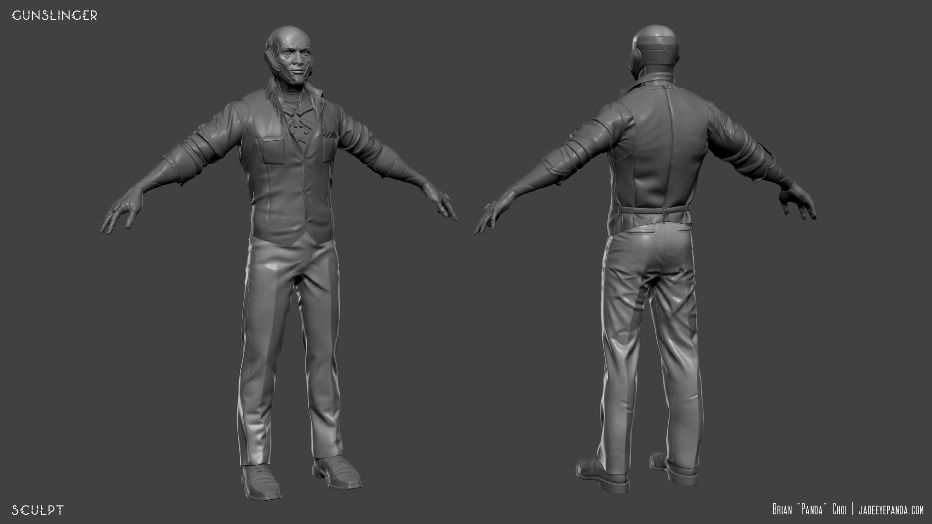
Ernhardt, Gunslinger - Well Dressed Merc for Swagger [VR]

high dynamic range
Offline / Send Message
Brian "Panda" Choi high dynamic range
Hey ya'll, I'm working on fixing this art test I submitted to Survios a while back.

// Current Update


Replies

  • Brian "Panda" Choi
  • Brian "Panda" Choi
  • Brian "Panda" Choi
  • Brian "Panda" Choi
    Offline / Send Message
    Brian "Panda" Choi high dynamic range
    WIP5
    Right now my main concern, based on feedback, is that the upper arms were not exhibiting enough mass and folds like it did in the original concept.

    Right now, I'm not sure if it's the wrong brush/technique I'm using to paint int he custom folds, but it doesn't super feel like a bunched up linen shirt around that area.


  • Brian "Panda" Choi
    Offline / Send Message
    Brian "Panda" Choi high dynamic range
    WIP 6

    Also got feedback that the chest does not follow any particular torso anatomy, so I've reworked it here to finda  design balance between the original concept and accentuating the human torso anatomy.

    Any critiques?


  • Brian "Panda" Choi
    Offline / Send Message
    Brian "Panda" Choi high dynamic range
    WIP7

    Trying to get the chest elements to have more depth overall and conform to the anatomy. Let me know if you see anything that could use improvement.


  • Brian "Panda" Choi
    Offline / Send Message
    Brian "Panda" Choi high dynamic range
    WIP 8

    Adjusted silhouette of biceps to looks fluffier and bigger.

    Still adjusting scratch details of the torso armor.

    Need to reduce polygons of torso and head to be under 8k tris as per original prompt.

    I should probably get an actual pupil sculpt to bake from.  Or get it done in Substance Designer.

    How are the hand details, scratches, and scuffing reading?  Do they make sense?


  • Brian "Panda" Choi
    Offline / Send Message
    Brian "Panda" Choi high dynamic range
    WIP 9

    Refined edge wear and damage on body and face.

    Fixed face errors.  Added eyelashes.

    Still trying to resolve how to get the upper torso to 8k tris without losing silhouette landmarks.

    Any feedback?  Anything that could be improved?  I keep thinking at this back end of the stage, I'm missing how to get this to really pop with the texturing.


  • TheLittleJay
    Offline / Send Message
    TheLittleJay polycounter lvl 5
    Not sure about what could be done to the textures themselves, but perhaps the lighting is the key here - some stronger shadows and highlights could make what you've already got pop a lot more. 


  • Brian "Panda" Choi
    Offline / Send Message
    Brian "Panda" Choi high dynamic range
    WIP 10

    Figuring out the color palatte for the light.  Thank you to @Amsterdam Hilton Hotel for his pistols.  They are dope!

    Any feedback on the textures at this time?


  • Brian "Panda" Choi
    Offline / Send Message
    Brian "Panda" Choi high dynamic range
    WIP 10 c

    Turnarounds 


  • Brian "Panda" Choi
    Offline / Send Message
    Brian "Panda" Choi high dynamic range
    Ah. So I think, in that link, the shirt and vest need some work. I like everything else on the character: hands, shoes, head, all of it looks pretty solid. But my attention is being pulled to the shirt and vest because it's quality, to me, isn't up to the same level as the rest of the character. Now I'm no character artist (environments/props), but I'm thinking the folds on the long sleeves aren't "right." I'm not quite sure what I mean exactly by "right", but they...I don't know, I don't think they're reading as natural folds to me. The vest has good folds across the chest area and the back, but on the back of the left shoulder there's a weird hard fold going across the vest. I also think the vest and shirt could use some extra normal information to vary up how the light is hitting it. Maybe that means a micro normal? Or maybe that means varying up your roughness. The light looks like it's hitting the shirt and vest pretty evenly but when I look at the rest of your model I don't get that same feeling. The rest of it feels pretty solid.

    You also might want to look into the silhouette of your character model. Much like props and environments, you want to have a distinct silhouette. The head's is great, but the torso and arms could probably be messed with (maybe there's an extra accessory or the clothing is bunched/folded differently). I see you did it with the ends of the sleeves near the wrist, but maybe add something asymmetrical to vary up the silhouette. 

    When I go back to improving my old models it's very demotivating for me to change things on the model  But I think working on the normal/roughness values on the shirt and vest could be great.
    Some notes from a coworker, Devon.
  • MetalPanda
    I like the character, getting a very dues ex human revolution vibe. 

    Whats does he have very big feet? is this a design choice? Just seems to stand out, once you notice it, its very distracting. 
  • Brian "Panda" Choi
    Offline / Send Message
    Brian "Panda" Choi high dynamic range
    @MetalPanda
    I formed the shoe mesh around the base mesh I was using.
  • Tectonic
    Offline / Send Message
    Tectonic polycounter lvl 10
    the darkness at the base of the hair is a bit strong, I think it throws off the nice material you have going on for the hair.
  • Aydhe
    Offline / Send Message
    Aydhe polycounter lvl 5
    Looks good, though i feel like metal on hands could use extra details, at the moment it looks bit too flat and boring. Loving the Deus Ex wibe though! :)
  • Brian "Panda" Choi
    Offline / Send Message
    Brian "Panda" Choi high dynamic range
    @Aydhe
    How would you break down the types of details I should be considering/layering?

    off the top of my head, all I have is:
    1) Dirt
    2) Smudging (roughness)
    3) Edgewear/scratchs
    4) Base Fabric Metal
  • Aydhe
    Offline / Send Message
    Aydhe polycounter lvl 5
    @Aydhe
    How would you break down the types of details I should be considering/layering?

    off the top of my head, all I have is:
    1) Dirt
    2) Smudging (roughness)
    3) Edgewear/scratchs
    4) Base Fabric Metal
    Depending on what i work on i always try to keep my tree organized(i suck at naming, so folders basically save my ass)

    -Part name
    --Material type
    ---Base material
    ----Scratches and miscolouration
    -----Text and decals
    ------Roughness variation
    -------Dirt
    --------Additional detail pass
    ---------Extras

  • Brian "Panda" Choi
    Offline / Send Message
    Brian "Panda" Choi high dynamic range
    WIP 11

    • Added more roughness and albedo accentuating of edges/cavities in the shirt, arms, and vest.
    • I need to figre out how to add some version of a rudimentary flow map to the hair.
    • Need to adjust the hairline to be more feathered, either with the texture or mesh.
    I'm hitting against my knowledge extent.  Anything specific I can do to help get this to its best polish?


  • stororokw
    Offline / Send Message
    stororokw polycounter lvl 3
    • I am not sure if marmoset has any sort of ambient occlusion, but I feel like it is missing from this guy specifically around the eyelids, nose, eyes, and the connection between the metal thing and the face.
    • The sclera of the eyes are too red and the transition too strong.
    • I feel the colour of the lips are too similar to the surround stubble area.
    • Collar is paper thin and penetrating through the back of the neck.
    • I would also fake the reflection in the eyes. Not sure if its just me, but they always feel so dead without any.

  • Tectonic
    Offline / Send Message
    Tectonic polycounter lvl 10
    this is kind of the rough idea of how I've learned to do a softer hairline. it helps if you make the bangs mostly out of cards that have fine alphas, instead of bringing the haircap/opaque hair cards right to the hairline, give like an inch of room.
  • Brian "Panda" Choi
    Offline / Send Message
    Brian "Panda" Choi high dynamic range
    WIP 12

    • Fixed the sclera size and transition of the eyes.
    • I think I fixed the Cornea so it picks up reflections more pleasingly.
    • Emphasized the AO around the face.
    • Polishing the hairline
    • added a flow map for the anisotrpic reflectionss on the hair
    • just as FYI, I don't think I'll be able to resolve how flat some of the clothing edges are givent he 8k tri limit for all torso up meshes the prompt originally gave.


  • Sebeuroc
    Offline / Send Message
    Sebeuroc polycounter lvl 13
    I think he's looking good! The AO you added around the face helped tie things together a lot.

    - I'd echo what Tectonic mentioned about the hiarline, I think it could be a much softer transition.
    - This is super minor, but I'd flare eyelashes out at the corner of his eye a little bit. They look kinda unnatural atm.
    - The metal bits clipping into his mouth don't make sense to me. Maybe the fix would be as simple as painting in some skin in the corner of his mouth so the metal doesn't intersect there?
    - The cloth does look paper thin in several areas. If you're not adding geo, then maybe you could push areas like the vest around shoulders out some more with a height map? Though honestly, if this is for you portfolio it would look better to model in those details and there isn't really a reason not to.
    - I think the pants and shoes look really sharp. The character has a little bit of a dishonored feel to me, so I think it would tie the consistency together to simplify the fine wrinkles in the shirt slightly - especially around the elbow joints.
    - Somehow the small horizontal wrinkles in the vest look more like skin wrinkles to me than cloth? I can't tell if it's the normal map, or the roughness of the material that's doing that. I'm not sure what material the vest is supposed to be? Also, the back center seam of the vest looks a lot more intense than the other seams.
    - Are you using a fuzz map on the cloth? If not, a really subtle one could help define that material.

    I hope this helps! Cheers
  • Nuclear Angel
    Offline / Send Message
    Nuclear Angel polycounter
    Great job Brians, I have totally missed this thread up until now.
    I fully agree with Sebeuroc on all the points. I would also like to add some points as well. 

    -I think you should add more geo to smooth out his silhuette. His fingers look really low poly and his shoulders and arms look a bit blocky. 
    - The folds on the arm or the rolled up sleeve does not affect the silhouette at all, I think it would add a lot if you modelled it out and gave the rolled up sleeve more form. 
    https://amp.businessinsider.com/images/5322158069bedd201529bd77-750-563.jpg

    - I think you should break up the silhouette of the hair with more flyaway cards, as the hair is really flat right now when not looking head on. 
    -The lightning is really flat right now and does not give a good focalpoint. As the lighting is very blue it is washing out the image. 

    Lastly I think you can push the pose a lot. Right now it just looks like he is falling from a TPose. I think it would help him if you added torque from his Hips rotating up through his chest, almost like he would be dancing. And maybe try pull in his Right arm as he is moving it towards where he is aiming but in the midst of that movement. 

    Quick paintover to visualise. 


    Good luck man, he is coming along really well.
  • Brian "Panda" Choi
    Offline / Send Message
    Brian "Panda" Choi high dynamic range
    WIP 13a

    • Polishing eyes.
    • Adjsuted skin roughness and stubble.
    • Trying to fix the hairline as best i can give the poly count limit (I'm working with only 8k above the pants).  Do I need to float the cards ABOVE the head surfacec mesh to make it LOOK ok?
    • Trying to trick the clothing edge thickness with a height map
    • Need to fix some of the decals, but I'll do that later since it's minute issues.
    • Adjusted noise normals on the vest. Hopefully it looks "sharper" and more acute.


  • Brian "Panda" Choi
    Offline / Send Message
    Brian "Panda" Choi high dynamic range
    WIP 14
    • Using this wonderful tutorial by Saurabh, rebaked the eyes, tightened up a bunch of tiny details with the face.
    • I think the hair should be more blended given the technical limitations.
    • Added in cavity maps for the textures.
    I think I'm close to calling this done and moving on.  Probably just going to get my beauty shots and then get it all comped.  Still need to optimize the mesh.

    Thank you everyone for getting me this far!  Let me know if there's anything else that stands out!


  • Brian "Panda" Choi
    Offline / Send Message
    Brian "Panda" Choi high dynamic range
    Notes from Discord colleagues:

    is it supposed to be "realistic"?
    paint the hair on the scalp
    so it blends nicer
    add some white hair strands on the eyebrows
    eyeballs are too white
    pupil too big
    has that mass effect look
    consider maybe using textureXYZ or surface mimic for the facial details.. might be a bit late tho
    also the hair... id consider darkening it
  • Brian "Panda" Choi
  • Brian "Panda" Choi
    Offline / Send Message
    Brian "Panda" Choi high dynamic range
    WIP 16.

    Figuring out the beauty shot


  • Brian "Panda" Choi
    Offline / Send Message
    Brian "Panda" Choi high dynamic range
  • CrackRockSteady
    I think this would benefit from a simpler presentation.  The background is really busy and detracts from the actual character presentation.
  • Brian "Panda" Choi
    Offline / Send Message
    Brian "Panda" Choi high dynamic range
    Let me see what I can jimmy.  

    Do away with the embers?
  • PyrZern
    Offline / Send Message
    PyrZern polycounter lvl 12
    I like those particles floating around. Not so much for the huge logo in the middle... I can't even read what it says.
  • Brian "Panda" Choi
    Offline / Send Message
    Brian "Panda" Choi high dynamic range
    Simplified the poster
  • Stealth23
    Offline / Send Message
    Stealth23 polycounter lvl 7
    I like the idea of the poster and model a lot but don't think the pose and focal point are working.

    The straight on camera angle along with the focal point on the chest makes the pose feel a bit odd, I think if he were rotated slightly to his left so the arm was easier to read that would help make it more striking.

    Also, I liked the original version that was entirely in focus compared to this one, it just feels very odd when the blurred sections such as the middle pistol are on top of a flat graphic and it hides the beautiful model underneath.
Sign In or Register to comment.