Zombie$ Art Test - Runner Zombie (nsfw)

high dynamic range
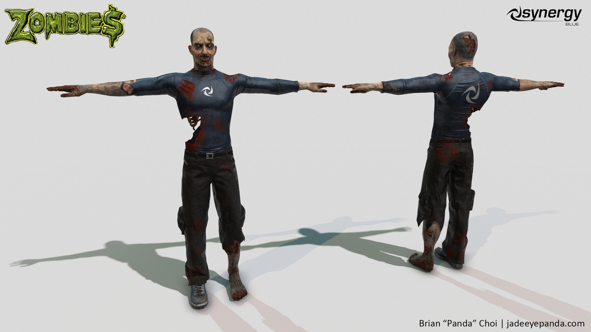
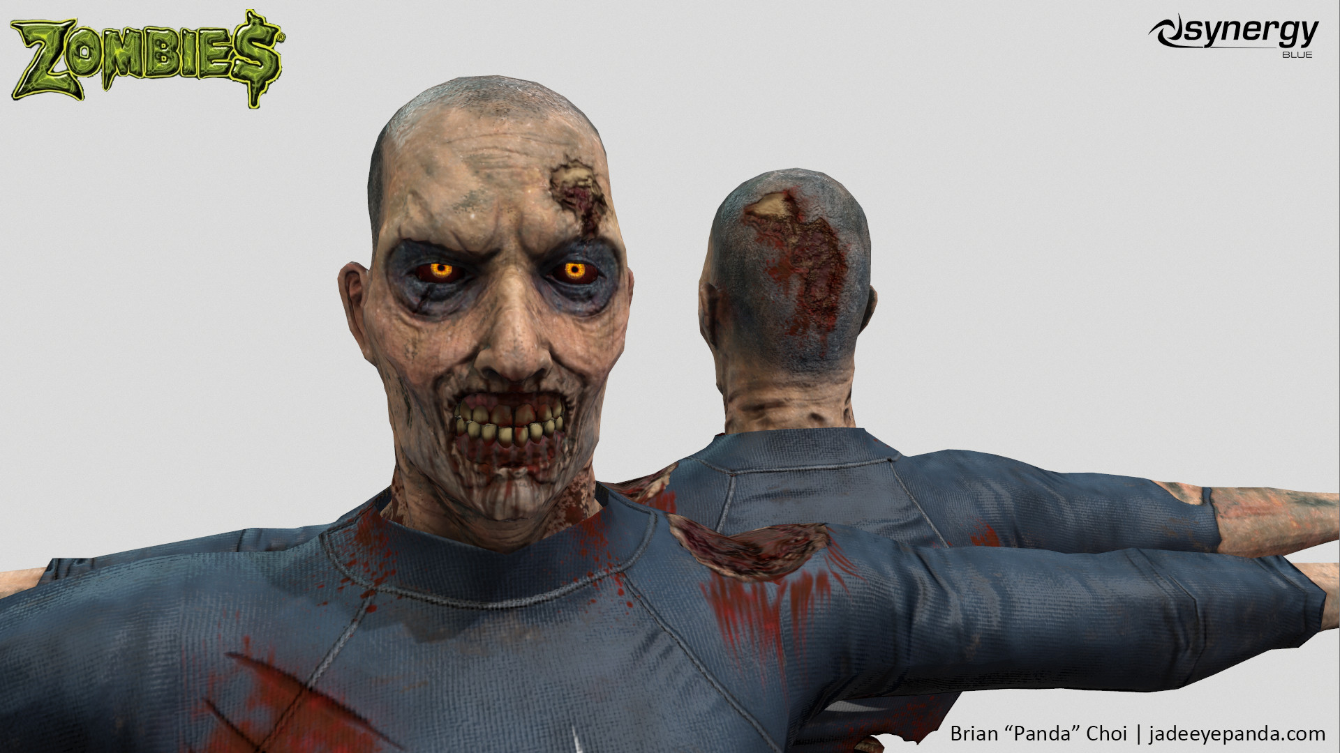
An art test I completed for Synergy Blue.
Art test was succesful.
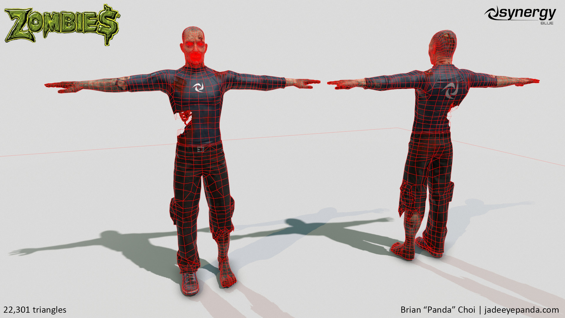
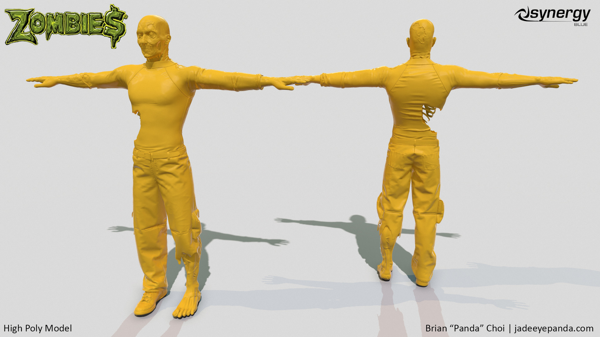
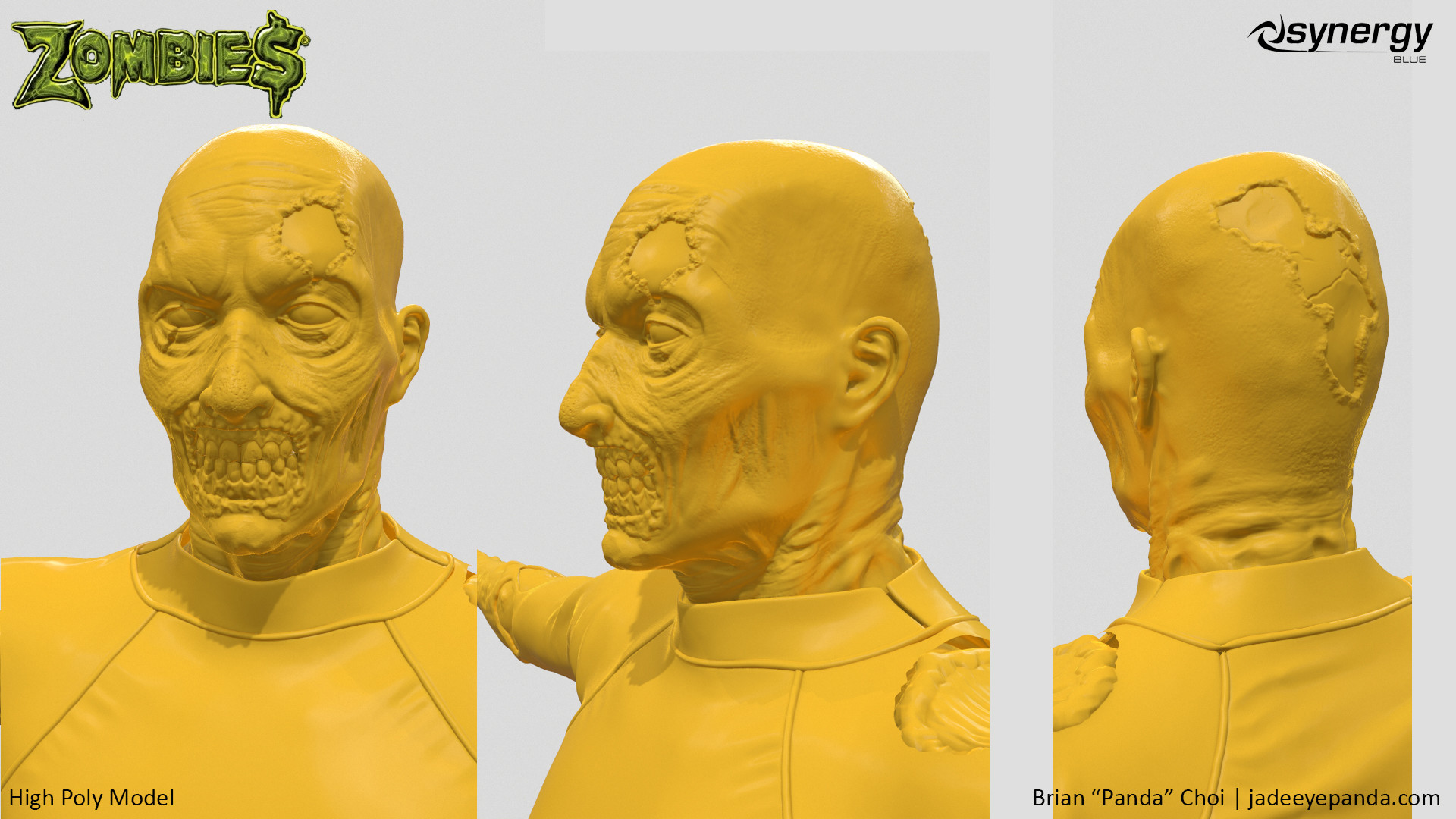
Had 30,000 triangles to work with.
2048 textures, Legacy shader (Non-PBR)
Completed this in six days, was given 2 weeks.

Art test was succesful.
Had 30,000 triangles to work with.
2048 textures, Legacy shader (Non-PBR)
Completed this in six days, was given 2 weeks.
Replies
There's some fairly solid work here man, but honestly... given that you've got 4 working days left, i would absolutely have spent more time working and polishing this up.
It LOOKS rushed, the most evident areas for this, are in things like cloth folds, which have tension across areas that are torn or missing, especially the middle of the back, there's even a part of the bottom of his left pant leg that should just be dangling freely, but has a pressure fold, as if the rest of the pant leg was still there.
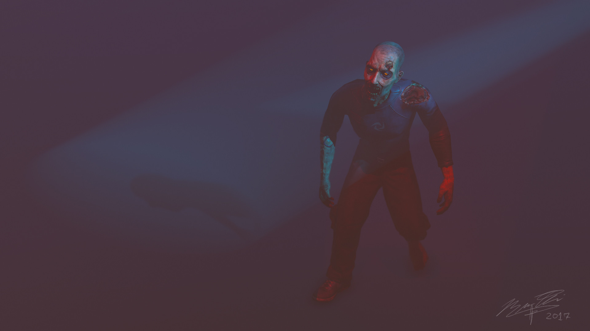
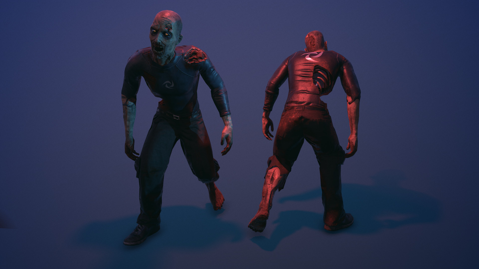
The beauty shots are awful, in the first shot there's too much fog, and too much empty/wasted space. In the second shot, you're missing things like a solid rimlight to help sell the silhouette, as well as having no real focal point in the render, the face just looks like a dark mess, for example.
Good job getting it done, but i would spend the next 4 days really pushing this.
Let me see what I can do to get on the feedback, gir. Might be a while admittedly given competing projects.
Did they at least paid you ?
They did not pay me. I asked them if I could just skip the art test altogether since I personally felt I had comparable art work in my portfolio already at the time.
In retrospect, I should have asked them to send the test at a later time since I knew it was going to involve me burning time during Christmas, which was NOT a good time for me. At the same time, I don't know if I should feel good that this got the green light given how much time I did give to it.
- Shirt folds are generally not very strong, and they in no way seem to adhere to the holed in it.
- No fraying around torn shirt.
- Too symmetrical in the mouth area.
- Head shape is off and too thin, there is no space for a brain in the cranium as it's way too narrow.
- Topology density is too concentrated on the head (unless this was some special requirement), especially the teeth. I'm not saying that head and body should be equally dense but this is too concentrated on the head to an extent where the body really suffers.
- The material isn't too good but what especially jumps out at me is the blood, In my eyes it has a way too fresh color compared to the rest of the zombie and especially the way you painted it around the shoulder with some sort of drip brush is just a big no no.
In regards to blood splattering, if it's not drip, what adjective am I looking for in Google Search to find the right alphas or tool operations to get it to a more accurate spread?
Im not even sure I'd use an alpha for that but "blood splatter" as a search term would probably serve you better, but rather i'd recommend looking at references of bloody shirts.
Here is one example of a pretty nice looking blood splattered shirt:
I realize that you went for some sort of training fabric or something but the main thing is that you're better off just painting that blood even if you want drips because the result one of those drip brushes gives is not very convincing. You might be able to tweak it to a better result but personally I've never found them very useful.
but this shirt's gloss value is still lower than what brian has. you can tell by the size of the specular highlights. brian's shirt looks wet its so glossy.