[UE4] Underground Sewer Haven

polycounter lvl 9
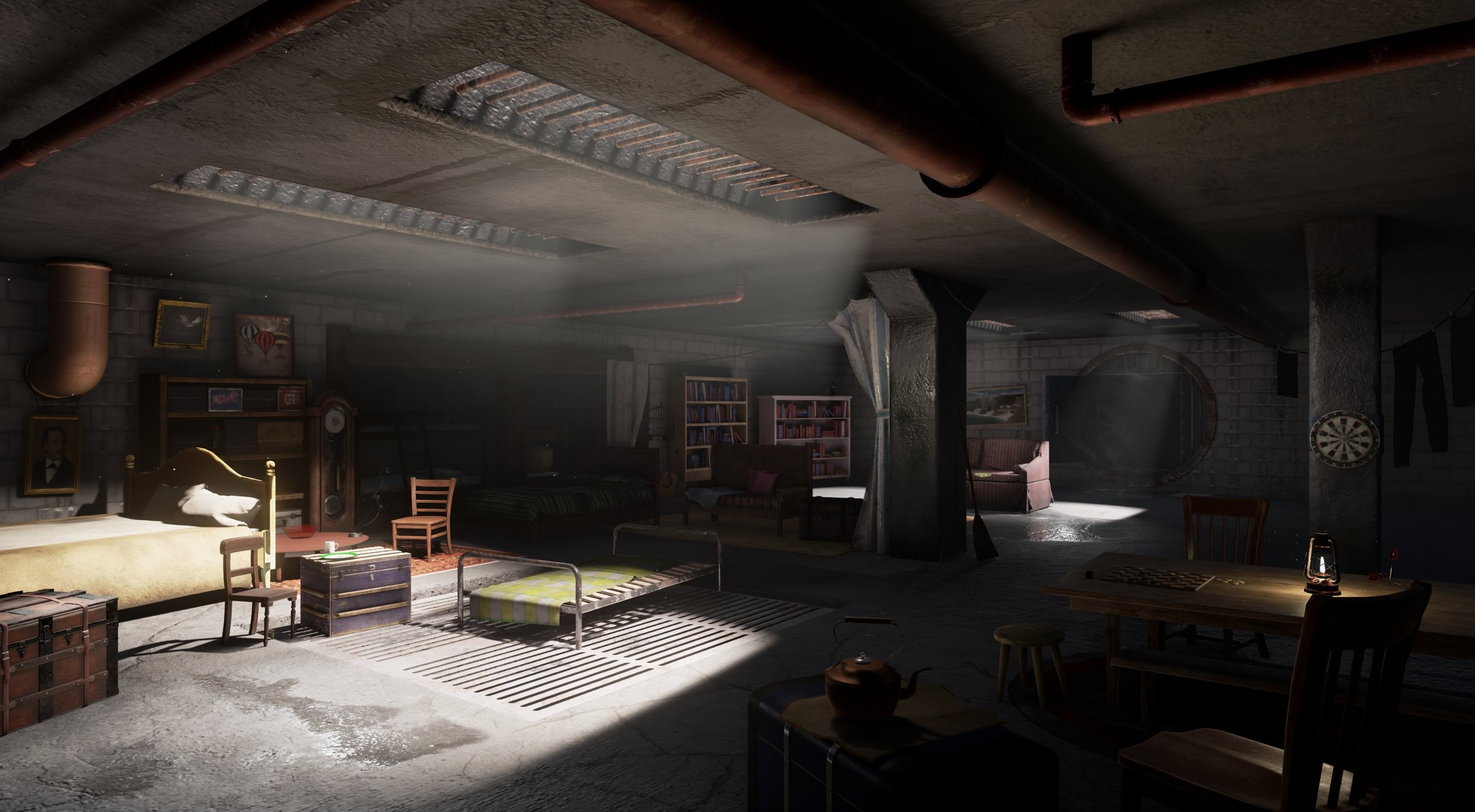
Latest update;
-Work in progress-
Hey guys, Im gearing up to produce my first environment from concept. Ive chosen this underground sewer haven concept by Jim Martin (I cant find a bigger version so I had to scale it up. Should be fine.) I think it was done for an Insomniac game, Resistance 2 maybe?

I really like the characteristic lighting and the lived in and 'makeshift home' feeling, but the sheer amount of unique assets is no doubt daunting. I might re-use/re-colour some assets to fill in the background detail near the door to reduce the workload. Still, no challenge, no learning!
What I want to practice with this piece:
Getting familiar with UE4
Getting comfortable creating lots of varied assets
Increasing my asset production speed/formulating a workflow
Practicing lighting techniques
Practice some Zbrush sculpting for select assets (and maybe some quick marvelous designer for pillows/curtains/blankets etc.)
Practice either Ddo or Substance
Theres quite a bit to do here, Im planning to finish in 1-2 months. If you think Im biting off more than I can chew doing this as my first environment then let me know, otherwise ONWARDS, time for the blockout! (after I mark the ref and collect additional ref and all that preparatory stuff etc etc)
-Work in progress-
Hey guys, Im gearing up to produce my first environment from concept. Ive chosen this underground sewer haven concept by Jim Martin (I cant find a bigger version so I had to scale it up. Should be fine.) I think it was done for an Insomniac game, Resistance 2 maybe?
I really like the characteristic lighting and the lived in and 'makeshift home' feeling, but the sheer amount of unique assets is no doubt daunting. I might re-use/re-colour some assets to fill in the background detail near the door to reduce the workload. Still, no challenge, no learning!
What I want to practice with this piece:
Getting familiar with UE4
Getting comfortable creating lots of varied assets
Increasing my asset production speed/formulating a workflow
Practicing lighting techniques
Practice some Zbrush sculpting for select assets (and maybe some quick marvelous designer for pillows/curtains/blankets etc.)
Practice either Ddo or Substance
Theres quite a bit to do here, Im planning to finish in 1-2 months. If you think Im biting off more than I can chew doing this as my first environment then let me know, otherwise ONWARDS, time for the blockout! (after I mark the ref and collect additional ref and all that preparatory stuff etc etc)
Replies
I've gotten to grips with UE4's blockout tools and written up an asset list, and i'll likely get started on the first objects or on the walls once I'm fully content with the blockout.
A 1:1 representation of the concept isn't going to be the aim but i'd like to be close (and capture the atmosphere). I can't quite understand the vents at the back of the room - in the concept they're much bigger but i'd have to make them massive in the environment to match the scale (all four are the same size). Some other things seem off - the metal bed in the middle of the room looks really small and low compared to the scale figure. Maybe it's a bed for children though.
I've turned cast shadows off on the vents so that a solid light beam comes through, but obviously it's not similar to the lighting conditions in the concept yet. What techniques could I use to 'spread' and 'pool' the light? (Would more diffused light suggest a closer light source than the sun?) The ceiling is also looking a little too bright - my light source is at 1.0 intensity and 4.5 indirect lighting intensity.
Means I can cheekily adjust each individual square of light on the ground. I'll probably move onto starting one of the props next
In the meantime I've learnt Substance Painter (currently used for the striped curtain and the bed to the left). I've made peace with the fact some aspects of the concept won't line up properly with my 3D interpretation, e.g. the chair in the bottom right, which is proportionally correct but a bit skewed in the concept, or the uniform thickness of the pipe that runs along the ceiling looking different as well. I might warp my models a little to conform to the concept, but some things will stay as they are
The lighting needs work, I feel like my assets are being obscured a little and a lot of the shadows on the props look muddy. The left wall isn't nearly bright enough and the ceiling needs to be darker - I've played with diffuse boost and indirect lighting intensity but can't seem to achieve a similar look. I've thrown a few point lights around to try and get the highlights/brightness on some of the props as in the concept, not sure if this is best practice. Any advice appreciated
I've added a rudimentary dusty animated god ray coming in from the closest skylight, need to make it more visible near the bottom and fade as it reaches the top. Will also add a sort of dust mote type particle effect to them and/or the room in general. I think I need to tackle the concrete walls, pillars and floor soon (currently using starter materials on them), as it will probably have a large effect on the overall look of the room. The smallest chair to the left of the blue wooden chest is a current WIP which is why there's a few lightmap errors
Some pictures of individual props to follow
Chair, 1,852 tris
Lantern, 2,536 tris
Chest, 3,889 tris
The plan is to select some of the props and add more detail or spend more time on them than others, to get both the quantity of assets I need to complete the room and the quality of certain props that I'll be able to highlight.
I used Painter with the lantern and the chest, and Photoshop with the chair. Probably needs a little more loving with sculpting as well, as the chest was the first time I've used Zbrush in this project. I'll definitely do another pass on it at some point
The lantern will be remodeled to have a wick holder as opposed to a candle, as someone pointed out to me that this kind of old style lantern would have a holder instead
I went to EGX last week and talked to a few triple A industry artists and the general consensus was that my prop/texture work was fine, but the lighting and scene composition let me down. I hope to quickly implement the feedback they gave me so I can underline this project, move on and work on my overall environment/organic skills. Here's the gist of that feedback;
Any and all feedback appreciated. I'll dump some prop art in the thread once I've applied the feedback I got to those too.
I just finished retexturing the Heavy chest to the left in the scene in response to feedback. I've made the wood less glossy and added a subtle dust layer to the top.
Could really do with lighting feedback/guidance more than anything right now, as always staring at something for too long warps your interpretation of it.
The problem is, as I pump up the four lights coming in to the vents in order to illuminate up the floor and walls, the light bounces up to the ceiling. It's a shame UE4 doesn't have 'shadow helpers' or anything to eliminate that light, I've also tried making the ceiling darker but it ends up looking unnatural. My next thought is to mess with the indirect lighting intensity (in the post processing volume), exposure and a LUT to try and get the low light, low exposure, high bounce conditions in the concept. Thanks for the feedback.
Think I'll work on polishing the props before calling this done. I could polish it and add more details forever, but I think it's just a time sink and I'm burnt out looking at it at this point. Might do a quick post mortem before I move on.
Thanks for the feedback guys, I'll try and add some wet drips/puddles/stains. Some of the decals in the scene are already reflective - it's just that the lighting conditions don't pick up the highlight from the camera's viewpoint. I'll see what I can do to alleviate this, might involve some extra point lights.
Hopefully it gives off more of a moist/dank sewer vibe. The fine folks on the Polycount discord let me know about ambient cubemaps, so I can ensure my shadows aren't quite as dark and don't have to push the bounce lighting as much, though I am using a very subtle intensity value (i.e. around 0.008).