Home 3D Art Showcase & Critiques

[UE4] Victorian Hall WIP

polycounter lvl 11
Offline / Send Message
OBlastradiusO polycounter lvl 11
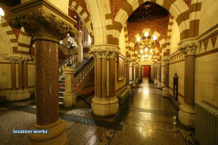
An older project I didn't finish a while back so I decided to finish it up in UE4. Textures are done butttt they are all in 1024!!!. So I have to work on that, but the bright side is I can experiment more with Substance Designer. Maybe integrate SubD in UE4 using the plugin.  Lots of tiling to do and updates coming soon!


References I'm using.


Enhanced ref


Replies

  • OBlastradiusO
    Offline / Send Message
    OBlastradiusO polycounter lvl 11
    Finished part of the the wall textures in Substance Designer. Now to make the expose parameters and try out the UE4 plugin.


  • OBlastradiusO
    Offline / Send Message
    OBlastradiusO polycounter lvl 11
    Finally got everything in place and I'm digging the lighting but it look like something is missing. Maybe more props? I put props on the floor like tools for plastering the wall in one of the screenies and tarp on the floor where the marble floor broken up in some places. I trying to make is look like there is some floor and wall repairs going on in the hallway area. Any other suggestion to make this any better? I'm open.


  • OBlastradiusO
    Offline / Send Message
    OBlastradiusO polycounter lvl 11
    Any suggestions?
  • hmm_rock
    Offline / Send Message
    hmm_rock polycounter lvl 10
    I really like the concept youver chosen and your block out is looking good. So far as lighting goes I think it may be a bit strong, or maybe the bloom is. I like the contrast and what's going on with the case light from the windows but maybe soften it a bit. Also it seems a bit cold and colorless, don't go too crazy but synthetic interior light like the concept tends to be warmer.
  • OBlastradiusO
    Offline / Send Message
    OBlastradiusO polycounter lvl 11
    Thanks for your input and i'll tweak that
  • OBlastradiusO
    Offline / Send Message
    OBlastradiusO polycounter lvl 11
    Here's a warmer tone.


  • samifira
    Offline / Send Message
    samifira polycounter lvl 10
    I'm digging the warmer tone! Some more reflectance on the floor would really help match it up more with the reference.
  • Jack M.
    Offline / Send Message
    Jack M. interpolator
    I personally think you could introduce a lot more color to the scene. The scene is a little drab for a Victorian piece.

    I think you could also use a little more AO in the scene. There's quite a bit of darkness in the crevices in the reference that's absent in your version.

    There's also a strange lack of shadowing throughout the scene. Maybe it's just me but it looks sort of weird where there's ceiling lights but no shadows (or maybe it's just the global illumination if you're using that). 

    However, if you aren't already using global illumination in UE4 it would probably be incredibly beneficial for this scene. 
  • OBlastradiusO
    Offline / Send Message
    OBlastradiusO polycounter lvl 11
    Thanks for your critique! I am using lightmass perhaps I should punch up the AO settings more in the world properties. U r right about the shadows coming from the lights too. I'll fix those right away.

  • OBlastradiusO
    Offline / Send Message
    OBlastradiusO polycounter lvl 11
    Here's an update. I tamped down the sepia tone a bit, bumped up the AO, and added shadows from the ceiling lights.


  • gsokol
    One thing that your images are missing that I really like from the reference image is that streak of specular reflection going along the floor from the light in the hallway.  Do you have much normal map variation on the floor material?  Your highlights suggest the floor is super clean and flat.  Some subtle warble will give the floor a bit more character and allow the light to have a little funner response.

    I think I actually liked the original ref with the overly warm tones, made the space feel a bit more inviting than what you have here.  Maybe add a little more color to the lights?  The sepia tone was helping a bit, but I think you could push it a bit more.

    You are also not getting a feeling of contact between the pillars and the floors.  You could grime up the bottom of the pillars a little bit to make them feel more seated.  Look at your ref, for example...it makes a huge difference imo.

  • OBlastradiusO
    Offline / Send Message
    OBlastradiusO polycounter lvl 11
    gsokol said:
    One thing that your images are missing that I really like from the reference image is that streak of specular reflection going along the floor from the light in the hallway.  Do you have much normal map variation on the floor material?  Your highlights suggest the floor is super clean and flat.  Some subtle warble will give the floor a bit more character and allow the light to have a little funner response.

    I think I actually liked the original ref with the overly warm tones, made the space feel a bit more inviting than what you have here.  Maybe add a little more color to the lights?  The sepia tone was helping a bit, but I think you could push it a bit more.

    You are also not getting a feeling of contact between the pillars and the floors.  You could grime up the bottom of the pillars a little bit to make them feel more seated.  Look at your ref, for example...it makes a huge difference imo.

    Thanks dude! I'll fix that. Also do you see anything out of scale?
  • TorQue[MoD]
    Offline / Send Message
    TorQue[MoD] polycounter lvl 19
    I don't think its lacking in detail because it fits with the amount of detail you'd expect in a building like that, but the one thing I did notice is that the textures are a bit clean. What I'd suggest is creating a series of decals that you can overlay on top of everything to add a bit of dirt/grime and cracks etc. to the building. It looks way too clean for a building of this age. Otherwise it looks great. Much prefer the new color tone.
Sign In or Register to comment.