Home 3D Art Showcase & Critiques

Old Roman Environment

polycounter lvl 2
Offline / Send Message
Xero3D polycounter lvl 2
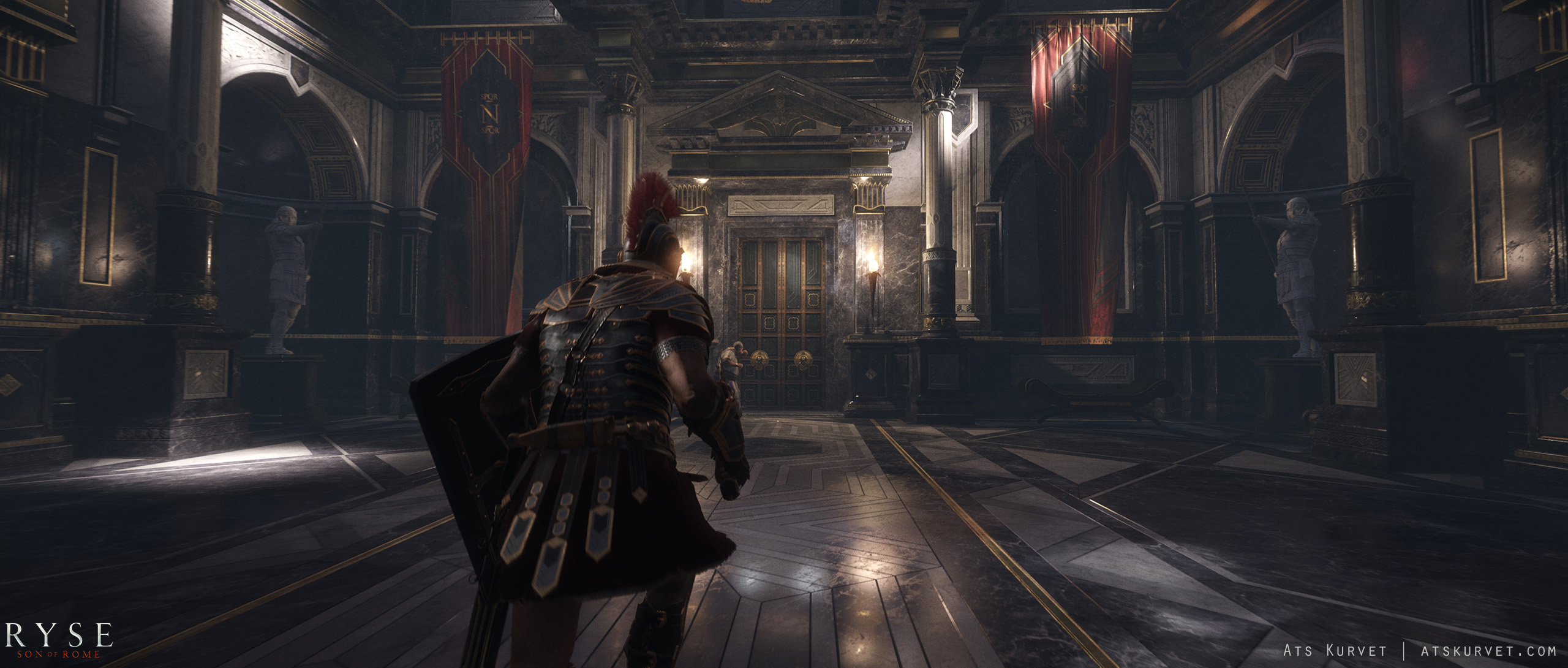
So here I am practicing with more environmental work in Unity 5 to test its power. I'm trying to make an old Roman environment like you would see in Ryse, since that is where most of this inspiration is coming, aside from a few other ones. Here are some of my quick references. The actual environment is at the bottom. When I finish this section, I do intend to add on to it and work on the outside of it more and continue from there. As much feedback as possible would be nice.

The current progress is VERY rough and still needs alot of work of course.

palace_int_1_.jpg

KARAKTER_Ryse_Palace.jpg

03emexj.png

joshua-tulloch-render.jpg?1431974371

Replies

  • felicitousArtisan
    This is a decent start! The thing that jumps out to me is that those gold bits on the pillars need a metalness map! It's a simple change that would immediately add to the scene. One of the big things about Ryse is that the whole game is kind of a tech demo, and one of the big things it shows off are PBR textures, including metalness maps. That's why nearly everything on that screenshot has some metal, like gold leaf inlays, contrasted with another, non-metallic material. Keep that in mind and try to incorporate those nice metallic touches to your own scene. Take all the gold parts, lower the roughness and make them metallic.

    You may also notice in the Ryse screencap, that thee's a lot of roughness variation going on on the tiles. Get a grunge texture in photoshop and try throwing that over your roughness map for the marble textures and see how it looks when you move around in the scene. After that, it's really just a case of getting confident adding in the little details and flourishes to break up the boxy look! Keep it up, you're off to a good start!

    Oh also, be aware that the Ryse image uses a lot of atmospheric fog and some post-process colour grading, which really adds to the overall look. If you're wondering why your work doesn't look the same as the screencaps, that's often a contributing factor.
  • Swarm22
    Options
    Offline / Send Message
    Swarm22 polycounter lvl 15
    Thing that stands out to me is the scale of your environment. Your references look very large and grandiose but your wip looks very small and confined.
  • Xero3D
    Options
    Offline / Send Message
    Xero3D polycounter lvl 2
    This is a decent start! The thing that jumps out to me is that those gold bits on the pillars need a metalness map! It's a simple change that would immediately add to the scene. One of the big things about Ryse is that the whole game is kind of a tech demo, and one of the big things it shows off are PBR textures, including metalness maps. That's why nearly everything on that screenshot has some metal, like gold leaf inlays, contrasted with another, non-metallic material. Keep that in mind and try to incorporate those nice metallic touches to your own scene. Take all the gold parts, lower the roughness and make them metallic.

    You may also notice in the Ryse screencap, that thee's a lot of roughness variation going on on the tiles. Get a grunge texture in photoshop and try throwing that over your roughness map for the marble textures and see how it looks when you move around in the scene. After that, it's really just a case of getting confident adding in the little details and flourishes to break up the boxy look! Keep it up, you're off to a good start!

    Oh also, be aware that the Ryse image uses a lot of atmospheric fog and some post-process colour grading, which really adds to the overall look. If you're wondering why your work doesn't look the same as the screencaps, that's often a contributing factor.


    I'm starting to do more of the texture replacement and lighting atm.
  • Xero3D
    Options
    Offline / Send Message
    Xero3D polycounter lvl 2
    Starting the replacement of assets. First the middle of the floor. Reflective marble tiled floor with some puddles for the fountain that will be put there.

    I'm also removing the columns and changing them to something else. Maybe just a different styled column

    6RpHeKA.png
  • EpicBeardMan
    Options
    Offline / Send Message
    EpicBeardMan polycounter lvl 8
    New materials look much better. I like how they reflect the environment.
    And, now, the color of the scene is much closer to the concept you have. Nice job so far.
    And as @Swarm22 said, it would be neat to just scale up the room a bit. It would look more "epic".

    Cheers!
Sign In or Register to comment.