The Monthly CHARACTER Challenge | December 2014 | Multiple Concepts

And hello again.
Polycount Main Google Hangout Link
Great way to stay motivated while you work. It's like a virtual office
1. Try to leave at least one critique per post. It makes you a better artist if you have the ability to give constructive critiques. Just because you're working on a different concept piece, doesn't mean you can't give feedback to others.
2. Challenge yourself.
3. Your final presentation should be posed and rendered in real-time. (Marmoset, or game-engine like UE4 or Unity)
4. Try your best to finish on time.
5. Post your work-in-progress in this thread.
6. Specify your own triangle count and texture size. Be reasonable and stick to your budget. Some suggestions are as follows:
Mobile: 2k Triangles, 512 Maps
Low Res: 8k Triangle, 1024 Maps
Mid Res: 16k Triangles, 2048 Maps
High Res: 32k Triangles, 4096 Maps
7. Similar to #6, you may pick an art-style yourself. You are, after all, an artist too. (Realistic, Stylized, Cartoony, etc)
8. Learn as much as you can. Share what you've learned.
For this month, we have just THREE concept arts to as options for you. And we will also try to give feedback to others working on different pieces too
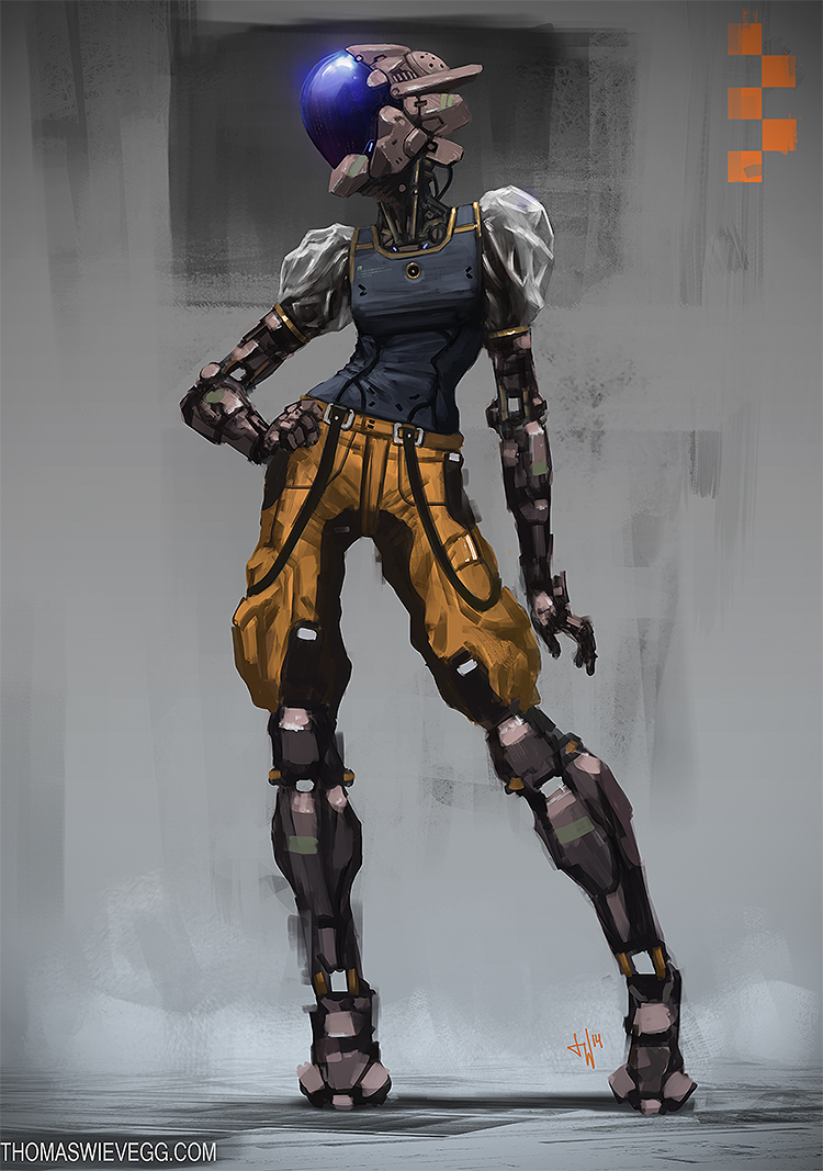
Looking Sassy by Thomas Wievegg

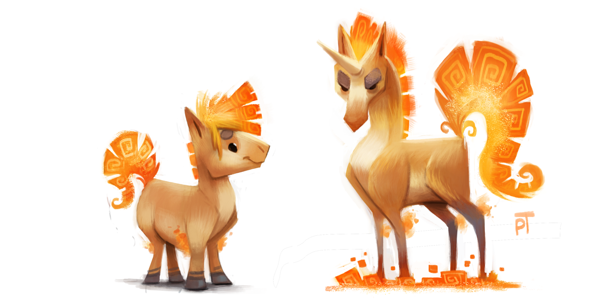
Creature by Piper Thibodeau

and Mwangi Female Warrior by Nemanja Stankovic

GOOD LUCK. AND HAVE FUN.
Looking Sassy by Thomas Wievegg

Creature by Piper Thibodeau

and Mwangi Female Warrior by Nemanja Stankovic

GOOD LUCK. AND HAVE FUN.

Replies
good idea. the hangout has only 10 people. my skypes mr.360 : ) i might join this month. (first scifi concept)
first look, looks good
@josh.0 - looks good man nice start
@PyrZern - nice block out as well
If I get some progress done on Graves, do my home work, my side projects and put the family to sleep I'll sneak in the group chat and start working on one of the concepts. I can't wait to see what you all do!
Did a rough sketch/sculpt before starting to have a place to prototype shapes and size of parts vs. perspective. I want to do the high res sculpt.
@ PyrZern. Good start, be sure the "face" has female proportions, right now her "jawline" and "chin" have the width of a male vs. the size of the head.
@ Kay-Vonlanthen. Good use of primitives and edge extrusion, the head looks a little too circular. Also I'd block in a very simple body before blocking out the rest of the mid-range details (like all the dodads on the head), Simple waist, torso, legs, arms, 8-10 primitives representing all the major limbs/joints. It will help you establish a scale so you know if things look "off"
[Edit]
I think I've got most of the blocking out done, going to start reto/pulling out the pieces.
I'm still trying to get it right.
So I'm going to take a crack at the mwangi female. I'm going to make it a goal to finish before the month is up, and hopfully bake it and texture it.
Anyway I started by doing a block in. This one looks simple enough, but its actually quite tricky.
Hamakua Thanks looking great, I should pose mine to get a sense what it will look like done, Did you sculpt your block in In-pose, with no symmetry?
@ PyrZern Dats a secksy lookin blockin you got thar
@oreoorbitz her shoulders are way too wide atm, I tihnk the upper body in general is much to wide for a female person
and you should scale up those hands
This is what I got tonight, will hopefully just do it better later.
(also shhh but here is a sneaky no-paintover version)
oreoorbitz
You should probaby lower your subdivs a ton and squish everything in horizontally a little-- she's a bit wide. Make sure to use a lot of (real life) reference!
PyrZern
Decent start! Watch out for those shapes in the Helm, they're a little wide towards the lower half but not bulky enough at the top. The shirt also appears to be reasonably skin-tight, you might want to thin out that a bit.
Hamakua
Wow, that block out is pretty darn cool. Looking forward to seeing more!
@Hamakua You are doing my fav concept here, and looks awesome!
@PyrZern I think you are in the way now, just try to smooth some parts a little, I was looking the concept and for me the trick is make the silhouette feels like human and the details not (I don't know if make sense for you, but maybe this can help ^^)
@oreoorbitz Hi! I think if you make the chest thinner it will make your model look more feminine, and be careful with the proportions
Keep work guys! It's going to be a good challenge!
I still need to re-shape the palm/Metacarples area and the thumb - but the thumb should be quick as it will just be a re-scaling of some pieces of a finger.
The rest of the progress are links below two more image sets
First pass of arm/hand - only the hand/fingers are being re-done, I am happy with how the upper arm looks/functions (this is the base mesh, once everything is together I'll go in and add and build up the various details)
General layout of major components/panels - I still need to go in and build the neck/clavicle area but want get further in the base mesh of the head first to see where we stand. Not show here is the progress on the head (about 1/2 done).
@ PyrZern, Fefs, BagelHero, and StephLee, thanks for the compliments!
@oreoorbitz - Thanks for the compliment- yes, I just sculpted it by pulling out shapes as I needed, it wasn't the cleanest process - towards the middle I start getting tunnel vision but remind myself to work on the larger shapes first- I had the concept art up on a second screen but would only look at it every once in a while, I primarily followed how "anatomy is supposed to work" and just used the concept work as a guideline for the pose -
I referred to it heavily when blocking out the finer details and the purpose was to get a good 3d base to prototype shapes and panels on before going further.- also for scale of components.
[ame="
It's kinda hard to see the details from the concept. Especially on her shoulders and arms. Still blocking things and will retop it later.
So I did more work on the block in, thanks to everyone who pointed out the width problem, I slimed her down so she's two heads thick now, and 7 and a half heads tall.
I worked on a face bit, still doesn't look like the concept, but its looking better. Next Up I'm doing the feat and hands (My enemies!)
@Pyrzern: Yeah, the details on the concept are slightly vauge in some areas, I think the most important aspect is to make sure all her parts look fashionable. Anway, your progress is looking good!
@BagelHero: My only thought would be to pull up her a head a bit so its proportional. Otherwise it looks good.
My update
Tried something new today, usually I make my bodies from zSpheres or a single dynamesh sphere, but I tried dynameshing a bunch of separate ones together today after watching the Danny Williams zBrush Summit recording. Super inspiring stuff, and this turned out alright. Easier to work with but took about the same amount of time-- caused me to actually feel lost on a few forms that I'm usually comfortable with (??? neck and clavicles why do you hate me now), but I suspect that's just a matter of comfort.
Side note-- what are smaller breasts and how do you make them? I feel like I should know how to make non-stylised non-blockout-y boobs but this is like the best I can do. Might do another pass on them just for practice because wow. Just... wow.
But yeah, whoo, blocking in the body.
@BagelHero I haven't really tried using that method yet. But it does seem interest. Stronger shoulders, thou ? Also, interestingly enough, I was just thinking this morning I want to make a female character with small/flat chest next...
No real update from me +.+ Still working on mechanic's legs and feet.
@bagelhero: Like I said previously, I think you should rise her cranium a bit so the distance between her chin and eyes is the as the distance between the eyes and top of the head. As for the breast, I have the same problem as you can see, one tip would be that, even in small breats, they will jet out a tiny bit to the side of rib cage, somthing I should include more in mine now that I think about it. I'll do that next.
You reckon? That's not what I'm seeing, unless you're counting the highest point of the hair sans-ponytail as the top of the head. I'm going to lower the top half of the face a bit, which should have roughly the same effect of making the distance between the chin>eyes/eyes>top of the cranium a little more similar, without making her head super long, but I'm still a tad unsure of what you're pointing to here.
@Pyr: Will do on the shoulder front.
[ame="
I finished the hands and arm - (I could work on them for twice as long but need to move on) and finished most of the leg. I've got the entire foot and ankle assembled and ready for rigging and the pivot points set I just need to clean up above the ankle but the hard parts are done. Next is the head which shouldn't be that difficult. After that will be the neck area then the clothing/underbody which should be the easiest (organic shapes, flowing lines, easy rigging).
I can see the light and am really excited to have the piece to play with in animation. It's mainly why it is taking so long to get a finished base mesh out, I am thinking about rigging/clipping along the way. One of the fun things about the arm is that there are more than a necessary amount of axial rotation points so the fore arm area can actually spin freely independent of the wrist and elbow and will look cool when doing it. It also, (from what I can see) stays in line with the concept art as far as silhouette is concerned. I'm looking forward to rigging and animating this part to even possibly tie it to emotion, like an annoyed flick/twitch of one of her forearms does a quick spin up then slow spin down, or something. Dunno, it will be interesting.
I'm especially proud of the ankle- everything theoretically works, given more time I could have even assembled a gearing system/etc. Also, just above the ankle I incorporated (or preserved if it was the artist's intention) a minor suspension system. The two rectangular supports framing the ankle void, the extend and retract into the lower calf area. This will be fun to play with in run animations/etc. And as a "practical" use it could be used so she could adjust her height on the fly to suit the situation (driving a vehicle for example).
I see the neck being not as complicated. -we will see.
@PyrZern - Liking the latest blocking out (especially the pose). I don't know if you use it, but "split hidden" or "split masked" or even polygrouping through similar functions really helps me define hard surfaces in the interim that way the [H] or Trim dynamic tool doesn't damage other surfaces you mean to leave alone, polygroup masking, backface masking, or just splitting out separate parts will really let you work quicker to define hard surface shapes.
I'm pretty new here and to 3d modeling in general but I decided to try out anyway. Critique and pointers are very much appreciated. I noticed that not a single person had tried the 'Creature' yet and it looked to be the model I could potentially get the most right so I'm giving it a shot. No texture or rigging yet just a rough pass.
@Arrise Good start there man. Make sure those legs are attached to its shoulders/collarbones. And not just popping out from its chest or belly. You don't want a T-Rex Effect.
@ljsketch You can do it
I made big change proportion-wise. Gonna split those pieces now to better refine em.
Okay, so here is the block in, at 8 heads, Looking at this I feel like I should thicken her legs a bit. Going to do a pose to see if it matches the feeling of the refrence. I really need to speed up my work pace.
Thanks for paint over PyrZern
@BagelHero: sorry for late reply, here is a paint over to illustrate my point, becuase I don't think I said it properly
I guess the head looked fine in the paint over you posted, and you don't have to change it you don't want to. Just my sugestions
Thanks for taking the time to clarify.
You're on the mark with making her legs a bit thicker. I figured out something that was making her feel stubby to me, that wrap around her waist should be lower. The top line of the wrap should be hanging off the waistline as opposed to under her breasts where you have it now.
my first wip, I was working on the last week and this last sunday.
Uh oh/
I hope u like.
@kosh_fotsirk- nice block in.
@renato.medeiroslooking good. nice bakes. Sword looks a bit to short though.
super lazy post by me at the moment but at least I started something. I'm working on the mwangi female concept. Just a really quick block in of the anatomy. Trying to nail down the proportions for now. I'll come back and really look at more of the work to give a more helpful critique
I finished my model with 9k triangles.
small update. Just blocked in a couple elements to see how they fit. I have some time this week so will shoot for finishing hi res and retopo. We'll see though.
@PyrZern-yeah, I think I made her forehead a little too large. I fixed the arms on the last past. I'll fix the head on the next pass.
As for me, Here is my blockout of the unicorn I'm working on: