Home 3D Art Showcase & Critiques

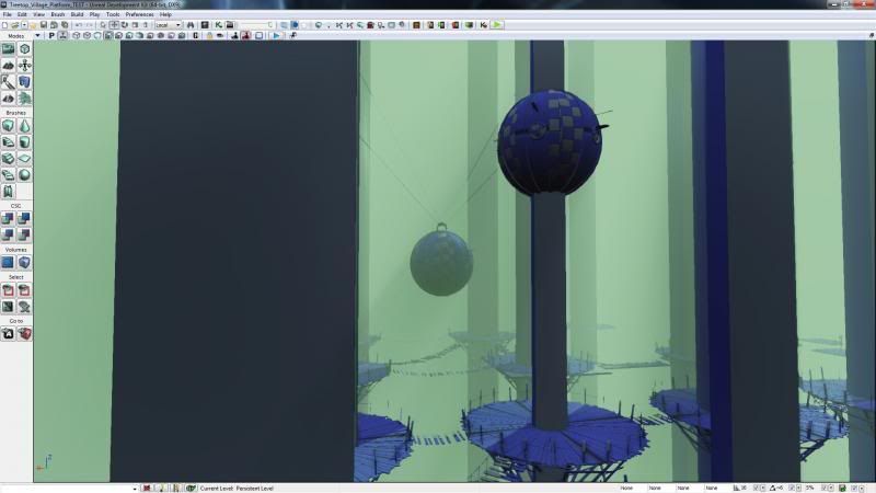
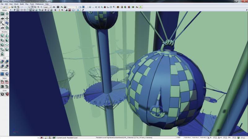
[UDK] Treetop Village

polycounter lvl 7
Offline / Send Message
DriveJunky95 polycounter lvl 7
Hey guys! I'm really excited to share my first official UDK environment with you all:) Over the past couple of weeks I've been working on a treetop village project for class. I've kept modularity in mind throughout my entire process and really tried to push the kit's flexibility. But enough talk, here is my progress!

SS_4_zpscb5c4a1d.jpg

SS_5_zps72f55a50.jpg

SS_7_zpscd850bd7.jpg

SS_6_zps402eca77.jpg

SS_2_zpsbd00f654.jpg

SS_1_zps242cbce0.jpg

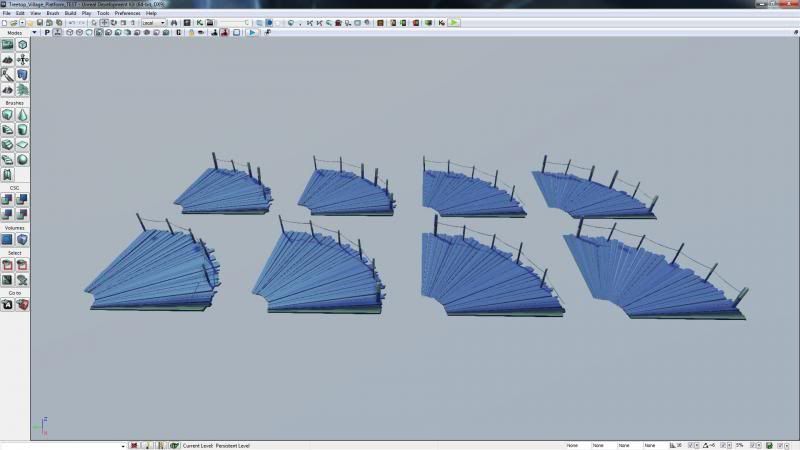
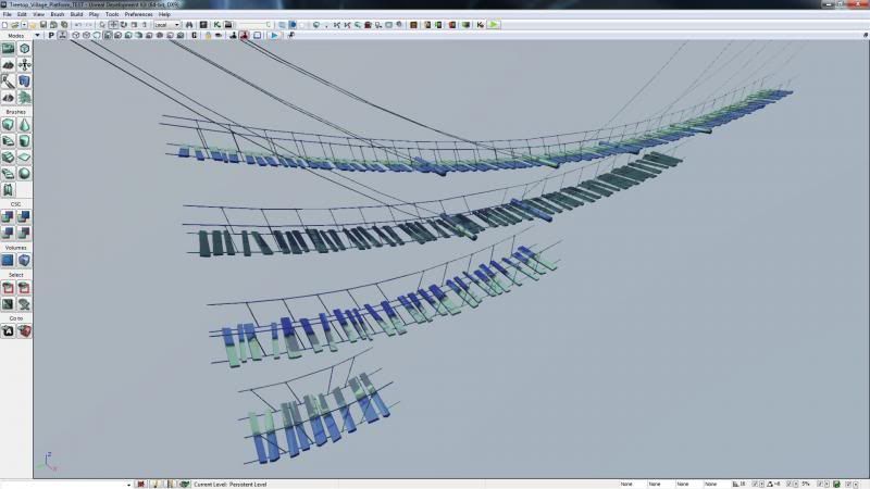
And lastly the grid system for the environment:)
SS_8_zps274f6f5a.jpg

Replies

  • DriveJunky95
    Options
    Offline / Send Message
    DriveJunky95 polycounter lvl 7
    Added buildings! These I split into quarter, half and straight sections. Also playing around with some possible building combinations and placements on the trees:)

    SS_5_zpsd0a6acc3.jpg

    SS_3_zpsac9f5c0a.jpg

    SS_1_zps5b4034a3.jpg
  • NomadSoul2501
    Options
    Offline / Send Message
    NomadSoul2501 polycounter lvl 10
    This looks FANTASTIC!

    I've loved tree top villages since Donkey Kong Country, I know most people will invoke star wars as their goto tree top villages but...

    You've put a great deal of thought into your process and it's really paying off :)
  • DriveJunky95
    Options
    Offline / Send Message
    DriveJunky95 polycounter lvl 7
    Some spiral staircases to let the player traverse a couple tiers of platforms soon to come....! These fit the small and medium-sized trees; staircases on the large trees were incredibly massive and awkward... :)

    SS_2_zps529cdf26.jpg

    SS_3_zps9897044c.jpg
  • DriveJunky95
    Options
    Offline / Send Message
    DriveJunky95 polycounter lvl 7
    Textures are underway - tiling roof texture, tiling bark texture and the buildings, platforms and bridges share a wood/rope texture. Playing around with lighting....all a bit too green still. The fog is still a bit dense as well. Added a placeholder tree branch to play around with silhouettes..! :)

    SS_03_zps050db105.jpg

    SS_02_zpsef8797c6.jpg

    SS_04_zpsba511cde.jpg

    SS_05_zps4f64800c.jpg
  • djoexe
    Options
    Offline / Send Message
    djoexe polycounter lvl 7
    reminds me of turok dinosaurs hunter's level :D
  • Rafferty_Eggleston
    Options
    Offline / Send Message
    Rafferty_Eggleston polycounter lvl 9
    You've done well with making everything modular. Looks awesome and I'm excited to see more!
  • Dubzski
    Options
    Offline / Send Message
    Dubzski polycounter lvl 11
    Very cool, enjoying the style & sensible approach to this project.
  • NomadSoul2501
    Options
    Offline / Send Message
    NomadSoul2501 polycounter lvl 10
    Personal opinion, but I think it's ok that the lighting is rather green atm.
    Once you add warm lights in the foreground spilling from the buildings it will generate a nice warm/cold foreground to background effect.
  • Snader
    Options
    Offline / Send Message
    Snader polycounter lvl 15
    It's a pity you post quite late in the development, because it would have been good to get feedback on your layout plan.

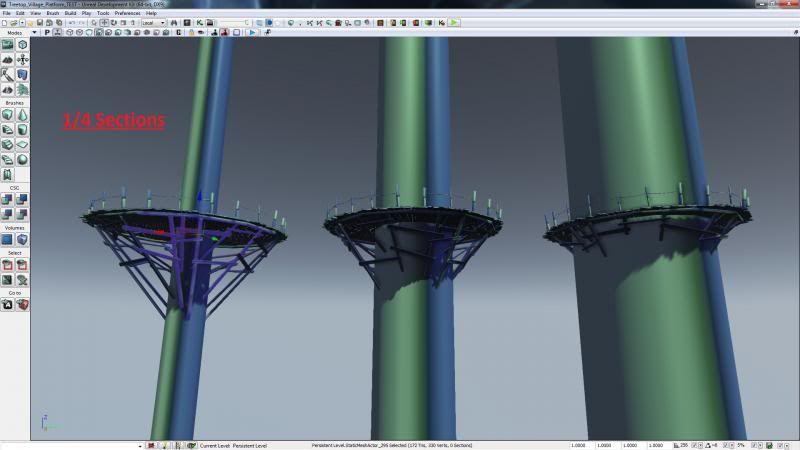
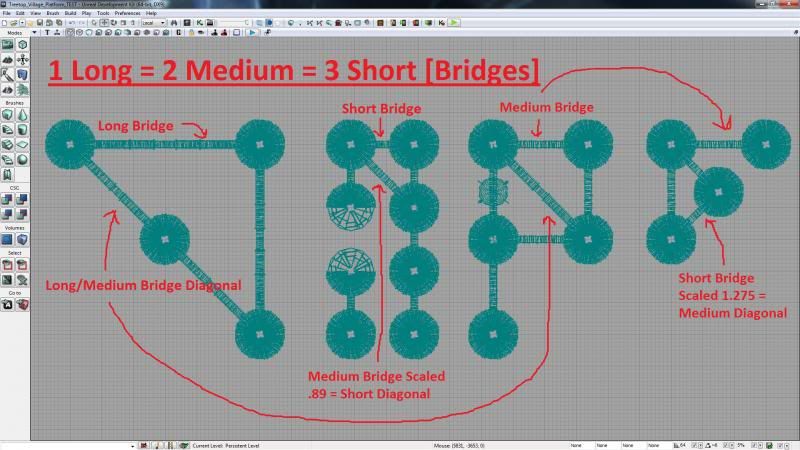
    I would have gone with a different kind of grid, either triangular or more likely hexagonal. That way you'd probably have a less noticable grid, and you would have less squish/stretch on the 'diagonal' bridges. 1, 2 or 1.7 (85% scaled from 2) units, versus 1, 2 and √2=1.4 (70% scaled from 2, double the squish.):
    3DHex5.jpg

    I'd also do the walkways different. Right now you have modules that are virtually identical. You have only one width of walkway and are intersecting with trees. This means that a thin tree actually has a wider (and thus heavier) load than a wider, stronger tree. Doesn't make much sense.

    I'd go for 2 narrow walkways with an angle of 120°, 2 medium and 2 wide, to give some variation, and then a few fence modules of slightly different length/curvature. I'd make the 'left' post of each module a bit bigger and the 'right' one a bit smaller so you could have them intersect and tile around the walkway. With the different sizes you wouldn't need to have a specific tile with an opening for bridges, you could just use two smaller fence modules on both sides.

    Why 120° instead of 90°? Because that fits very well with a hexagonal grid, and because 120° tiles very nicely around a cylinder, with much less visible repetition than a 90° module. Not only because of a larger texture, but also because our brains can't simply mirror the texture. (for the lulz, try reading text that's turned 120° away from you instead of simply 180° upside down.) Texture repetition doesn't matter horribly much in the case of wooden planks since there's not much unique detail there anyway, but every bit helps I guess. And of course it saves a few module-instances.

    CylinderThirding.jpg
  • rambooze
    Options
    Offline / Send Message
    rambooze polycounter lvl 7
    Great stuff but I liked it more without textures, lighting and fog. I don't see all the details, they disappeared :(
  • passerby
    Options
    Offline / Send Message
    passerby polycounter lvl 12
    think you should introduce more height variation into the postions of all the tree houses
  • DriveJunky95
    Options
    Offline / Send Message
    DriveJunky95 polycounter lvl 7
    NomadSoul2501: Thanks for the reply! I'd have to agree that when someone mentions 'treetop village' people will immediately envision those familiar fuzzy little bear men. As the project stands green/dark offset by warm/glowing buildings is one potential path. Like rambooze mentioned, it is hard to see the details which makes the piece look very flat. I believe the next step right now is to tinker with fog density, light direction and match the textures to the amount of light in the environment.

    djoexe: Spot on:) It was actually a youtube gameplay video of turok that started this whole project! lol

    Rafferty_Eggleston & Dubzski: Thank you both!

    There are others here that I want to respond to - as of right now I'm off to pay a visit to a classmate during his final Digital Forensics presentation. Thanks all for the replies, input and kind words! :)
  • NegevPro
    Options
    Offline / Send Message
    NegevPro polycounter lvl 4
    Looking good so far, it definitely has the Turok feel to it, although it also reminds me of Ocarina of Time haha.
  • thatanimator
    Options
    Offline / Send Message
    thatanimator polycounter lvl 6
    damn this is some Myst shit right here! nice!! keep going!
  • DriveJunky95
    Options
    Offline / Send Message
    DriveJunky95 polycounter lvl 7
    Some more updates. Crits? What do you all think? I like compliments - but anything that really pokes you right in the eye.

    SS_06_zps8dfc5b49.jpg

    SS_01_zps84ec053f.jpg

    SS_07_zpsb0e50720.jpg

    SS_02_zps196dcea6.jpg

    SS_05_zpseaae83ff.jpg

    SS_03_zps2e3e514f.jpg

    SS_04_zpse32f26b6.jpg
  • JustGarry
    Options
    Offline / Send Message
    JustGarry polycounter lvl 4
    The lighting and fog are the biggest issues for me, modelling and texturing is solid
  • Torch
    Options
    Offline / Send Message
    Torch interpolator
    This is hurting my brain......I don't even know how you managed to plan this, looks amazing!
  • DougClayton4231
    Options
    Offline / Send Message
    DougClayton4231 polycounter lvl 3
    Really cool idea! But like JustGarry said, the lighting and the fog need to be thrown out and re-evaluated. Keep going!
  • Higuy
    Options
    Offline / Send Message
    Higuy polycounter lvl 9
    Like others have said, the fog and lighting. There needs to be much more contrast I think in the lighting, and the fog is also washing a lot of stuff out as well.

    It also depends on the time of day your going for too I think, ex; will the scene be at night or in the middle of the day? Just general questions like this... because if it was at night, getting the contrast might be alot easier with using a bluer kinda fog and having alot of light sources (for example, look at this ewok picture :p -> http://www.bricksandbloks.com/wp-content/uploads/2013/05/Star-Wars-Ewok-Village-at-Night-e1369839229693.jpg) Also I can't tell exactly, but are the shadows from the masive trees missing? I don't see them on the water I don't think.

    Another thing you may want to consider is adding alot of leaves and smaller branches, they seem to be almost completely missing from the scene, which might help alot with the depth and also adding a cool looking canopy at the top.

    Either way though the scene is looking really impressive and I'm loving it, the way you planned out everything and put it together is pretty slick. The modeling is also rock solid along with the texture work :)
  • DriveJunky95
    Options
    Offline / Send Message
    DriveJunky95 polycounter lvl 7
    Been a while - but finally got some time to work on this a little bit today. Playing around with the windows, added some more ropes on the buildings, new trees, lighting, fog, etc. etc.

    Right now the entire environment uses 3 textures so I figure it's time to 'branch' out and add some more assets to make the place look lived in. Thinking some foliage would do this place some good as well, vines could hide some of the seams between modular pieces.

    Man is it tough to get a decent composition with all the trees in the way xP

    Treetop_Village_Update_zpsde3ce82a.png

    Treetop_Village_Update3_zps4e48223a.png

    Treetop_Village_Update2_zps1f6297e9.png
  • Fenyce
    Options
    Offline / Send Message
    Fenyce polycounter lvl 11
    Ambitious project! I'd love to see some greenery in here, since it's a tree top town and I can't see a single leaf on those renders.
    Anyway since you have so many beautiful lightsources (all that lanterns and windows!) you should maybe think about a night setting, to make that pop out even more.
  • DriveJunky95
    Options
    Offline / Send Message
    DriveJunky95 polycounter lvl 7
    @Fenyce Totally agree with you on the foliage and lighting! Scene is very dull and flat at the moment. I threw an ivy asset it as a placeholder and brought the lighting back full circle to nighttime again. Thanks for the feedback! :)

    Treetop_Village_Update4_zpsf64e9559.png
  • NomadSoul2501
    Options
    Offline / Send Message
    NomadSoul2501 polycounter lvl 10
    Tons better with this lighting.
    My critique would be that now we have illuminated areas in the image but they don't spill over onto the scene. There's all these bright dots but they don't do anything for you at the moment.
    Did a super quick paint-over to illustrate what I mean.
    8pr7.jpg

    Can't wait to see where this goes :)
  • genwu
    Options
    Offline / Send Message
    genwu polycounter lvl 7
    Ha this is a crazy ambitious project indeed, but your killin it so far! Really loving the idea of this one in general keep it up! Personally, I liked your daytime lighting with the fog better than your nighttime lighting. It allowed me to see more of the details that you put into your textures so far. It's hard to make out the details, and the emissive lighting seems a bit out of place to me in a treehouse setting, I'd imagine seeing more torch lighting, but thats just me :P Keep up the good work!
  • oxblood
    Options
    Offline / Send Message
    oxblood polycounter lvl 9
    this is coming along great, not often you see stuff like this.. but it needs foliage lots of foliage
  • BasicallyNormal
    Options
    Offline / Send Message
    BasicallyNormal polycounter lvl 7
    Looking cool so far dude, I would tone down the emissive in places. All those lights make the scene pretty busy, would be nice to have some key points of interest.
  • Fenyce
    Options
    Offline / Send Message
    Fenyce polycounter lvl 11
    Hey DriveJunky, I'd suggest you to look at some night time scene you like, and try to figure out what you could learn from them.

    And while you could see the textures better at daytime, I like images with atmosphere better. Through you surely could do a nice daytime scene, too. And for a Portfolio you can also show your texturework either on the texturemaps or with some closeup screenshots (like detail scenes)

    Sadly I haven't got into setting up lights by now, so I'm not really able to help you out with that, but right now it's looking a little flat. The Paintover you've got from NomadSoul sure is already an improvement, but I guess it could be pushed even more. Maybe you'd check out some tutorial if you want to make the scene really pop.
  • DriveJunky95
    Options
    Offline / Send Message
    DriveJunky95 polycounter lvl 7
    Soz I got the emisives and custom post process chain to somewhere reasonably well-lit/interesting. Gotta love the famous orange/blue color scheme ^^ Based on your responses here are some updated images. Genwu, I'll consider a daytime scene:) Thanks for the awesome paintover, Nomad! oxblood, foliage on the way! do you guys imagine moss/plants/vines/ivy and tree branches with leaves? I'm feeling it's got to be all or nothing at this point:) Basicallynormal/Fenyce, toned down the emissives and have something a bit more atmospheric, how does this feel? Spending some time over at GDC this week, but I'll be back at it soon after this round of durpdates!

    X4684cn.png

    8IJq8wZ.png

    AZlEphE.png

    4f9brws.png
  • NomadSoul2501
    Options
    Offline / Send Message
    NomadSoul2501 polycounter lvl 10
    Very nice update, liking it a lot :)
    There's still some areas that could use some light but it's getting there.
  • DriveJunky95
    Options
    Offline / Send Message
    DriveJunky95 polycounter lvl 7
    Getting the lighting down. Need moar assets!

    56iCNc8.png

    BPYLAI1.png

    G3BXpqe.png

    gFrQRNs.png
  • luge
    Options
    Offline / Send Message
    luge polycounter lvl 4
    the lighting looks pretty good, i'd say maybe darken the background a bit more to highlight your lights more.
  • locater16
    Options
    Offline / Send Message
    locater16 polycounter lvl 8
    Huh, pretty neat. Some obvious Star Wars mixed with a little Lord of the Rings going on. But for being that, it looks nice. The glowing pollen was an excellent choice.
Sign In or Register to comment.