The BRAWL² Tournament Challenge has been announced!
It starts May 12, and ends Oct 17. Let's see what you got!
https://polycount.com/discussion/237047/the-brawl²-tournament
It starts May 12, and ends Oct 17. Let's see what you got!
https://polycount.com/discussion/237047/the-brawl²-tournament
Bar/Tavern interior scene
Hello Polycount, I have recently started to pick up 3D again after almost 3 years out. I have went back to the basics and modelled a scene in Softimage based on a concept piece. I am in the later stages of my personal project and about to go on a weeks break so I figured now would be a good time to receive some feedback for when I return. Any comments and critiques are welcome.
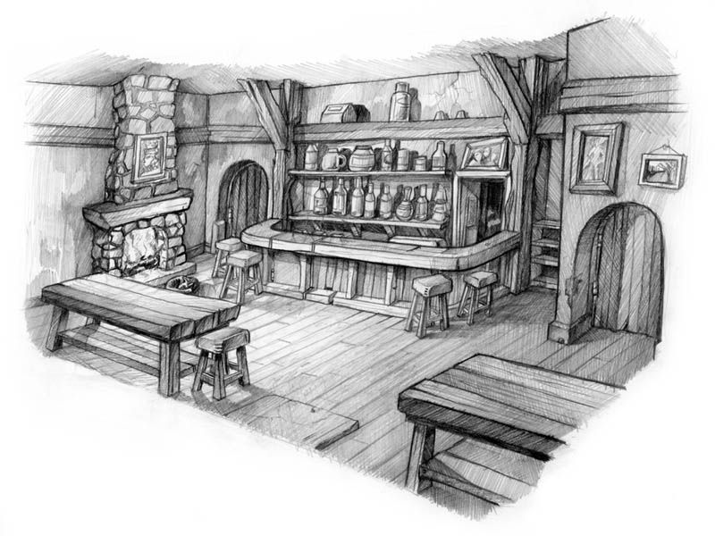
I have been working to this concept piece by Damian Buzugbe. The piece was created for the 2004 Xbox game Fable.
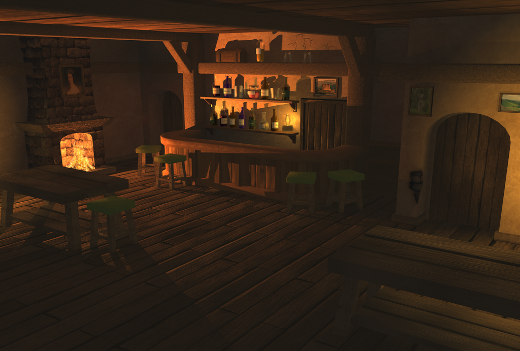
And this is what I have created so far. Again I have used Softimage and rendered using mental ray. There are some minor adjustments and still some tweaks to be made (lighting etc). I am open to any suggestions on how to improve.
I have been working to this concept piece by Damian Buzugbe. The piece was created for the 2004 Xbox game Fable.
And this is what I have created so far. Again I have used Softimage and rendered using mental ray. There are some minor adjustments and still some tweaks to be made (lighting etc). I am open to any suggestions on how to improve.
Replies
But it looks good so far, give it a go and see if you can break up some of those straight silhouettes
For starters, in the concept it looks like the two side doors have hinges on them, but on yours I can't seem to see any. This leads me to my next point, why not try adding some more lights?
It seems a bit dark and I think it should be somewhat dark, but maybe some candles on the tables wouldn't hurt.
The concept appears more "lived in" whereas the 3D environment appears more "abandoned" this is, as the above poster mentioned, because of the silhouettes. You can also make it look more "lived in" by adding some bottles/plates/etc on the tables and counter tops.
The walls on the left look a bit empty, maybe a good place to put a trophy or a rifle of some kind.
The concept makes it look like a "home/welcome/friendly" type of environment but iirc bars in Fable were filled with angry drunk people (I honestly don't remember haha.)
If you want to go for the welcome style, then maybe adding a mat/small carpets or the owner's pet dog/cat/bird/giraffe would make it look more family oriented.
If you want to make it look like a place where drunk people go to kick the **** out of each other, then you'd probably want to knock some stuff over (chairs, bottles, etc.), make the paintings crooked, etc.
Anyway, I love it so far, can't wait to see where you go with this. Good luck!
@NegevPro That's some good critique. The doors lack hinges ATM as does the bar. I have added some lights off the edges of the screen but I do think it needs more. I did think of having candles on the tables but i wasn't too sure whether I would begin moving away from the concept too much. Again with your other points they did cross my mind but I held back. Your points are definitely a step in the right direction and I will work on adding more clutter etc.
On a side note: the lights above the tables at this stage are placeholders for where candles will be.