"Unknown, Secret Laboratory" from Street Fighter IV Reinterpretation
Stage In-Game
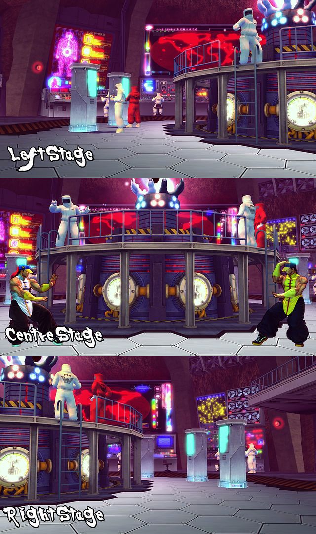
After a large amount of research into colour palettes, specific asset mood boards and the overall background of the stage, I have begun modelling high poly interpretations of some of the assets for the recreation of the Street Fighter stage, "Secret Laboratory".
I would love your feedback!
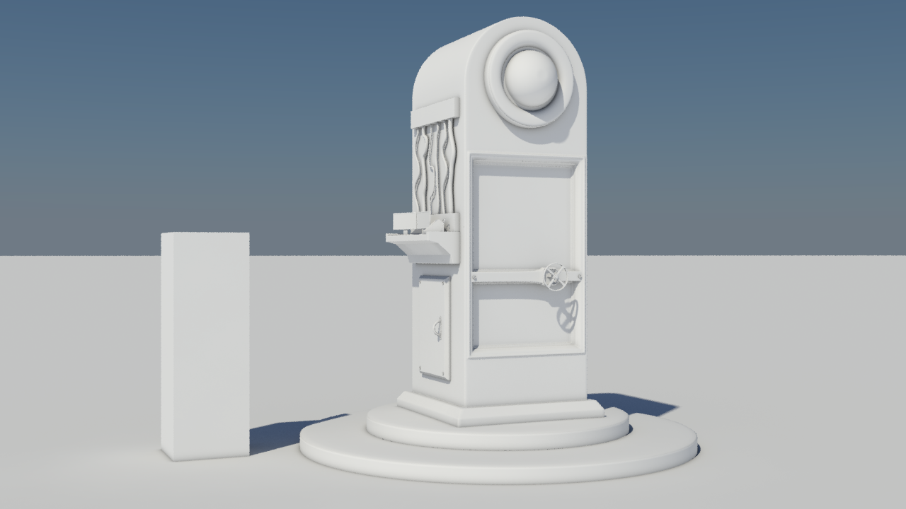
Cryo Chamber
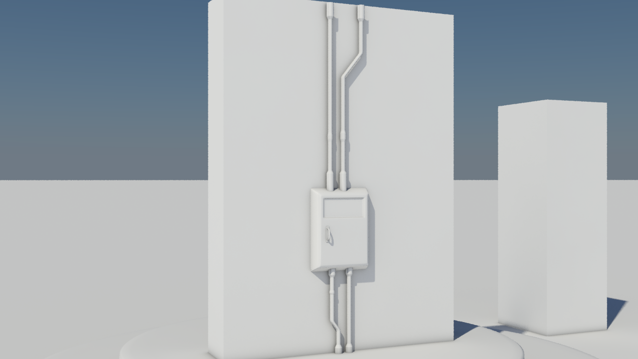
Fuse Box
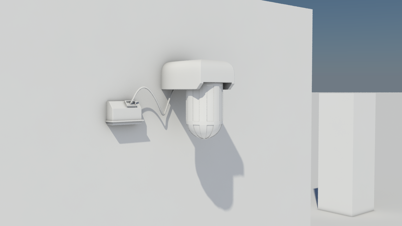
Alarm Light
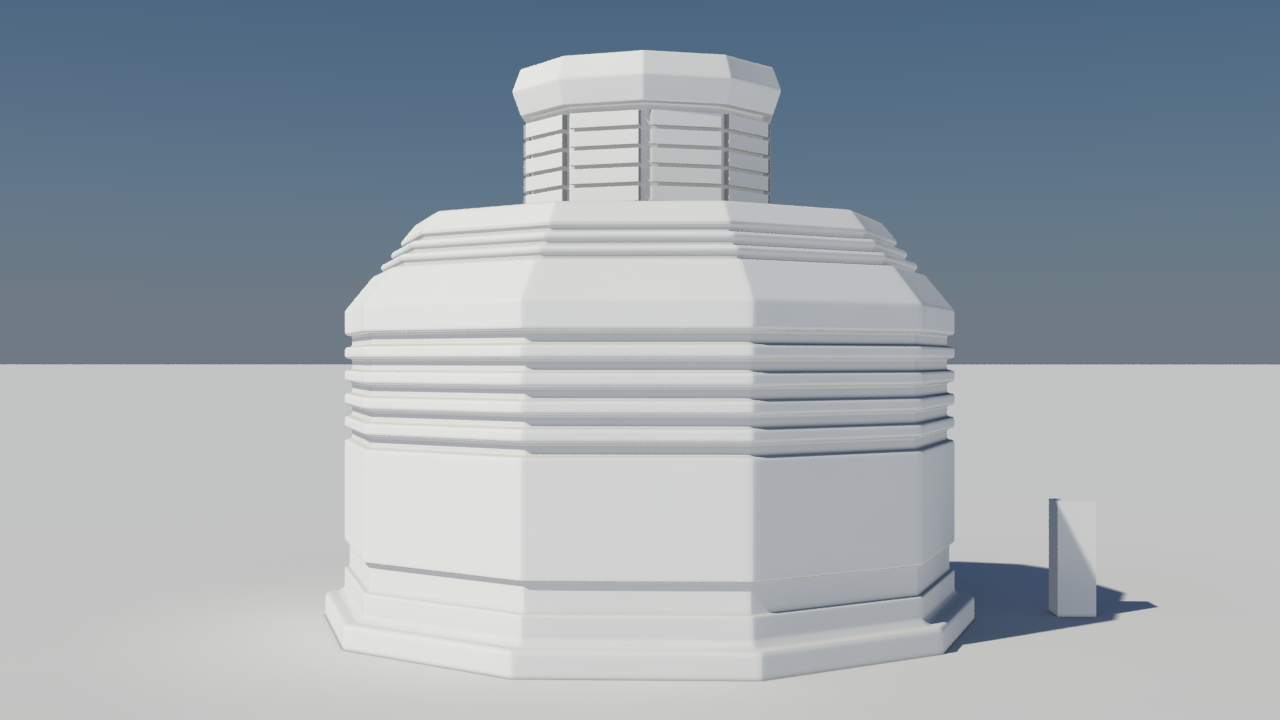
Centre Piece (Base)
After a large amount of research into colour palettes, specific asset mood boards and the overall background of the stage, I have begun modelling high poly interpretations of some of the assets for the recreation of the Street Fighter stage, "Secret Laboratory".
I would love your feedback!
Cryo Chamber
Fuse Box
Alarm Light
Centre Piece (Base)
Replies
Block Out in UDK
Looking forward to seeing your progression on this
I'm currently using the ambient / reflective occlusion mental ray material. I currently have been using a daylight system for speed, but will look into using an mr area omni / skylight combo that I've seen being used online to good effect.
Also here is an image showing how to get round Photobucket's poor image size
I have gone ahead and tried new material / lighting setup and I think the outcome is better, what do you think? (I have also made the changes to my Photobucket).
So from your improved render I can already see on the light, where the highlight is most prominent, there's a pinch from where it looks like the support loops from the extrusions you have made are altering the cylinder's natural shape.
You may want to revisit the amount of sides you are using or modify those control loops. See these for reference and also check out http://www.polycount.com/forum/showthread.php?t=56014 for more on general hard surface stuff.
Credit to perna for the images:
Hope this is helpful
http://wiki.polycount.com/Gamma
I was advised to start work on actual construction meshes for the scene such as walls and floors so that I could start putting the scene together properly.
I have created this 256 modular wall piece that will run along the bottom of the scene. It has been rendered with the original daylight system for now as I'm a bit strapped for time currently, will look into proper rendering settings soon.
From here you could try putting a warm orange light opposing the main light and it will contrast nicely with the blue in the model and highlight any remaining edges that haven't been picked up. You could also lighten the background up a bit, say values between 50-100 for the diffuse colour.
As far as the models go if you are planning to bake these down to a normal map you might want to check your edge width. Tighter edges could cause you problems, so zoom out to viewing distance and check they still look soft.
But yeah once again big improvements over the first ones
Credit to racer445 for the images.
Thank you Chandler, I agree with the wires now that you've pointed it out to me and will attempt to make them a bit more realistic providing I have the time to go back and change it. I'd like to maybe have them all fall into one tie then fall down as a group, much like the wires in your WIP Spaceship Interior scene.
Yes, some critique I've received - specifically for the wall piece - is that they are a bit plain. I'm trying to keep in mind the distance certain objects will be from the camera and thus some objects are lacking in detail but I would like to go back and add some details in places.
I created some very simple dev textures reminiscent of those in the Source engine. The numbers on the wall textures are indicative of the scale, not to be confused by future target texture map size (the same mistake my lecturer made hehe). You can use them if you like.
256 Wall
512 Wall
Alarm Light
Clutter - Papers
Cryo Chamber
Hero Piece - Stand
Powerbox
I set out to mimic the composition of the original scene as much as possible but alter the look by changing up some of the assets, while keeping the focal point of the environment pretty much the same.