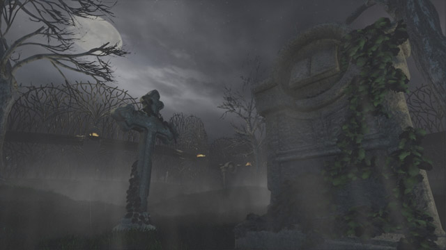
UDK Graveyard Shot
The Video

I posted this over at Epic's UDK forum, but I figured I'd post it here to for anyone that's interested. I created this as the first piece in a game portfolio I'm starting and I've built a new site for my self where I do a bit of a breakdown of everything: My site.
I'm looking for all sorts of feedback so fire away
I've also listed some of my blog posts related to the project below:
Scene WIP
Skull Grave Sculpting
Cross Grave Cloth
Cross Grave Sculpting
Cross Grave UV Work
Skull Grave WIP
Windy Grass
Software Clouds
Replies
Also in my opinion, to make the scene too creepy, the tree branch silhouette isn't helping much, you might need sharper kinda branches.
maybe something like this
Good going, just you need a point of interest (Contrast ?).
I don't watch the video previously ( 'cause I'm lazy
For the trees: like above, weld vertexs on the end of branches. Maybe you can remove that textures on the ends. That should helps.
Do you have more screens?
Also, add some specular to those stones. Stone can be pretty speccy at times. (especially when it's raining!)
@cmtanko: I'll add some more branches/trees that occlude the moon to help bring in more of their silhouettes.
@Mr Significant: You're right. Making those rain drops stand out a little bit more would help.
@Joopson: I had a few paint over's that looked similar to what you've done, but the blues weren't as saturated. I like how the saturation gives some good contrast and I'll keep that in mind. My original pallete was blue and orange, then I strayed from that.... quite far.