Home 3D Art Showcase & Critiques

Impreza Attack Vehicle

QkNlxlL.jpg

Hi this is what I have been working on for my university final year project.

It will be an Off Road, Subaru Impreza Attack Vehicle which should end up around 20,000 tris maybe slightly more. The final model will be fully Textured and presented in UDK. I don't have much experience with presenting work in UDK so when it comes to it any pointers would be awesome. I'll be using this thread to display the work on this project and hopefully receive some helpful feedback to improve my work. Any useful criticism and ideas would be much appreciated.

heres a quick concept idea for the vehicle
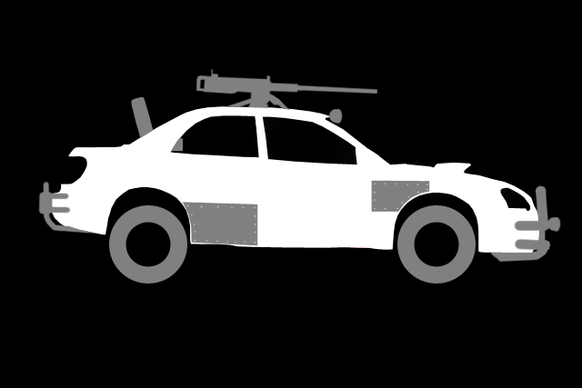
2004SideSilhouteAdd-ons.png


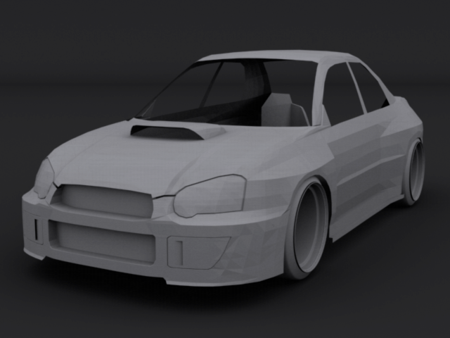
heres a start on the base mesh.
Render4-1_zps24f5b895.png

some of the high poly modelling done on the front 1/3 of the car
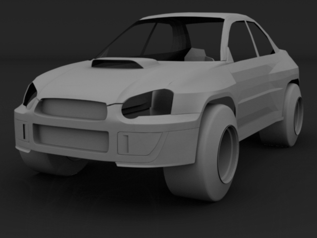
Render1-1_zpsa6bc2aa7.png

sorted out the standard size arches so they'd fit an off road size wheel/tyre
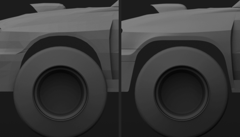
Render5-1_zpse342672a.png

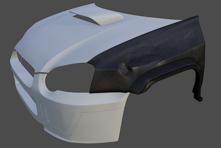
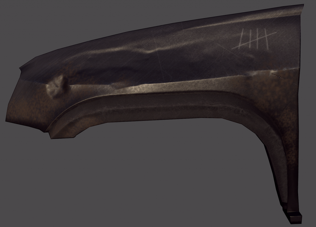
did a test for an idea of how one of the panels could look when textured and sculpted this is just with diffuse, normals and specular maps. (low poly)
Render2-1_zps80634a84.png

test panel with high poly so far
Render3-1_zps06f5de53.png

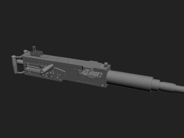
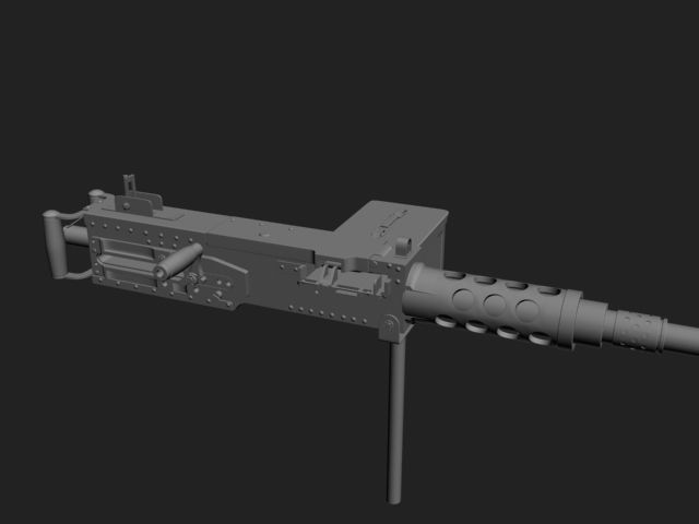
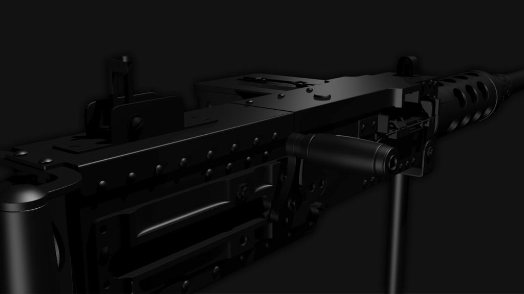
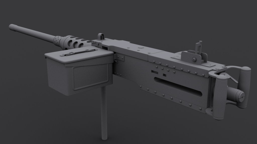
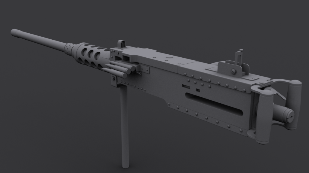
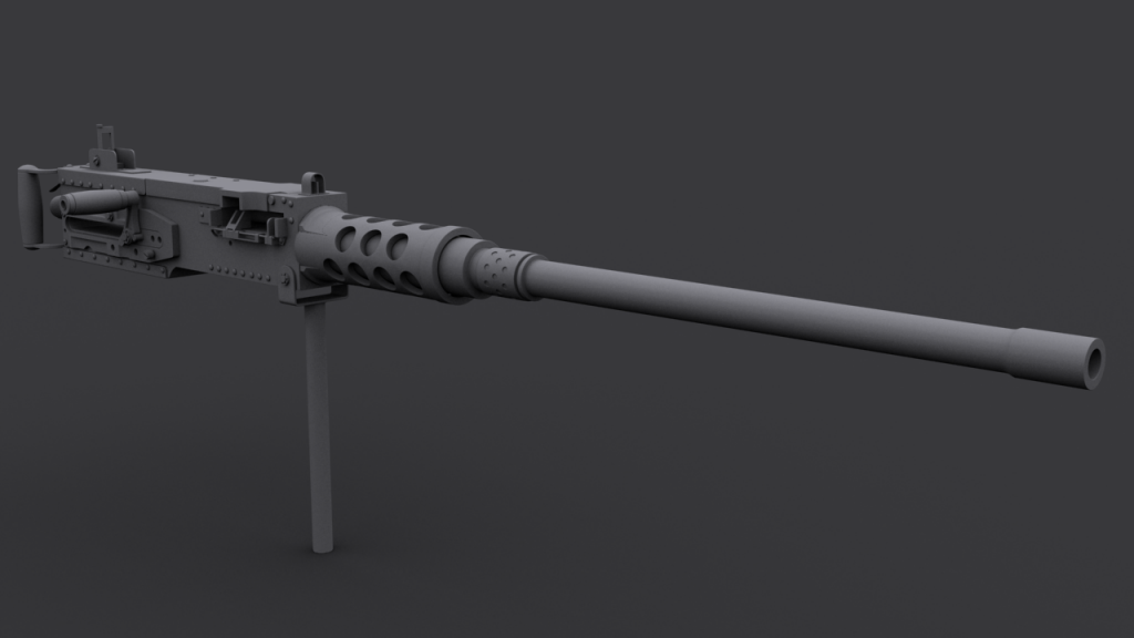
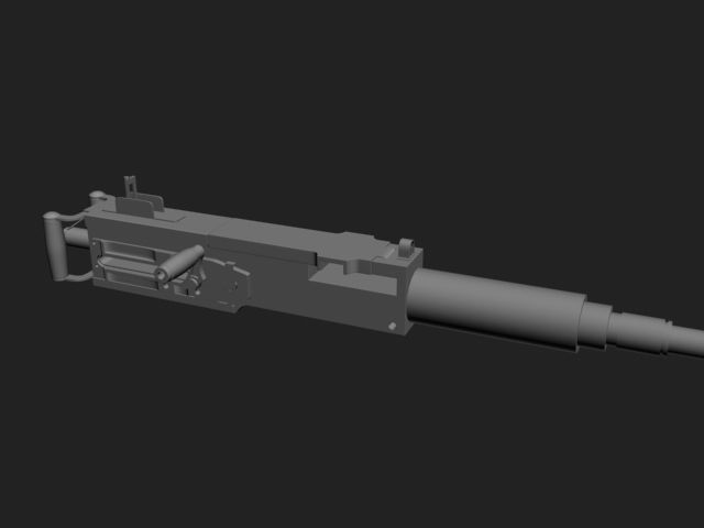
and here is progress on the roof mounted M2 Browning (high poly)
2-3_zps7f57a614.jpg
3-3_zpsd4bd1106.jpg
4-2_zpsfda7720d.jpg
5-2_zpsbb1017a7.jpg
Browning1_zps77070c6a.png
Browning2_zpse5ac2354.png
Browning3_zps86d70f32.png
Browning4_zpsf57ba551.png
Browning5_zps2367a6dd.png


If you want anymore info on the project or you'd like me to post some of my research let me know, cheers.

Replies

  • KnechtRuprecht
    Options
    Offline / Send Message
    KnechtRuprecht polycounter lvl 6
    I think the edges are way too sharp for baking purposes.
  • ReMiiX-
    Options
    Offline / Send Message
    I think the edges are way too sharp for baking purposes.

    is that just on the gun or both? cause I've been thinking the same about the gun

    Thanks
  • BubblegumTate
    Options
    Offline / Send Message
    BubblegumTate polycounter lvl 5
    You had me hooked as soon as I saw the car's body coming together.

    I'm excited to see this finished.
  • Shrike
    Options
    Offline / Send Message
    Shrike interpolator
    why always a boring browning which has been modeled 1000 times before ?
    There are so many options , and if you take a japanese car, why dont you try a japanese MG ? There are so many interesting shapes which could make your model really stand out.

    looks promising so far tho.
    (Tires look insane wide I have to say)
  • ReMiiX-
    Options
    Offline / Send Message
    haha I'm very sorry shrike, I mainly chose it for the fact it shoots 50.cal bullets and could tear apart what ever it was chasing. Though looking through Japanese MGs there are some interesting ones I could have picked!
  • DWalker
    Options
    Offline / Send Message
    A search for "technicals" leads to a wide array of cobbled-together weapon platforms, mounting everything from light machine guns to 23mm cannons. This is a personal favorite- notice the re-purposed office chair...
    800px-IraqiNationalGuardtechnical.JPG

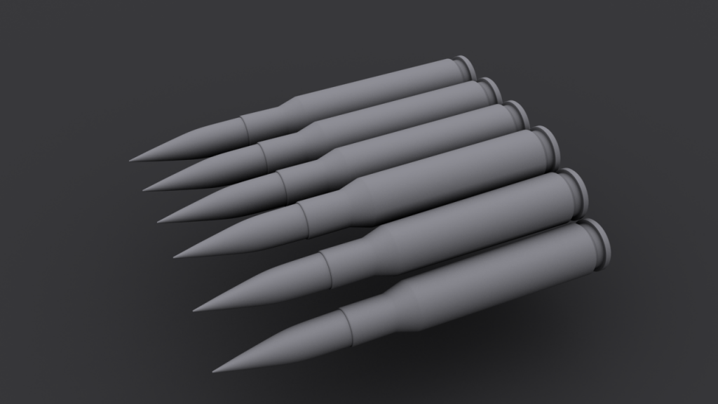
    If you plan on showing a close-up view of the weapon, you'll need to redo the bullets - modern bullets are almost always ogive, not conical.

    Keep in mind that an M2 and tripod weighs almost 150 pounds when loaded, and has quite a kick when fired - you'll need to have some sort of bracing beyond just strapping it to the roof. A straight rod welded to the floor, with some jury-rigged braces, would work well for a pintel mount. You might want to chop-off the rear windows (making it look not unlike an El Camino), giving the gunner a bit more freedom of movement.

    Armor can be as simple as a few sheets of steel welded to the body, not that a professional army would ever do such a thing to a HMMWV...
    PD_0025.jpg
  • ReMiiX-
    Options
    Offline / Send Message
    awesome stuff DWalker, thanks a bunch for all the info!

    I have thought of a few ways to reinforce the roof to support the gun as clearly production cars are not made for that sort of weight and recoil :P

    the office chair is great haha same goes for the armour plating.

    In my write up I have given the vehicle a sort of back story/location.

    The vehicle will be set in Africa, somewhere like Libya, Sudan or Somalia. Imported by an African Warlord. So I'm going to try and make it look abused and a bit of a DIY job.

    The entire boot (trunk) will be removed for the gunner seat and lined with aluminium tread plate and there will be no windows at all.

    and yeah you are right about the bullets, shouldn't take too long to fix :)

    Thanks
  • DWalker
    Options
    Offline / Send Message
    Given the background, have you thought about re-purposing a rally car? The beefed up suspension would let you have some fun in hilly terrain, and the roll bars would help support the roof.

    quentin-mitchell-challenge-rally01.jpg?w=300&h=200
  • ReMiiX-
    Options
    Offline / Send Message
    DWalker wrote: »
    Given the background, have you thought about re-purposing a rally car? The beefed up suspension would let you have some fun in hilly terrain, and the roll bars would help support the roof.

    yeah i've been looking at the rally version quite a lot. mostly thinking about getting the width of the arches in so the off road wheels would fit. Though i don't like the bodykit all that much i chose to base it more off a different one which still achieves about the same width and arch space

    mainly looking at the added width down the side of the car and nothing else.

    _DSC9420.jpg


    definitely raised suspension and i was thinking tyres similar to this Jeep Wrangler.

    22439400001_large.jpg

    or this

    flatfenderbluejeep.png

    as for the roll bars i was thinking possibly have them flow over the roof rather than inside the car also with a sheet of metal welded across the middle to give extra support for the gun.
  • ReMiiX-
    Options
    Offline / Send Message
    Just recently started working on this again as I had a hand in for another assignment, so I've had no time.

    2zeeypi.jpg
    mj3a55.jpg
    2valbo1.jpg
    xmo0li.jpg
    rw5ons.jpg
    2lddcsz.jpg
    2a8jm08.jpg
    2mu5s.jpg
    somkg0.jpg
    2ztefrp.jpg
    24oye74.jpg
  • Linfo
    Options
    Offline / Send Message
    Linfo polycounter lvl 11
    Looking good, you should try adding stitches to the seats.
  • ReMiiX-
    Options
    Offline / Send Message
    Thanks Linfo I'll have a go at that :)

    B0us4JJ.jpg

    KUQuNiZ.jpg

    any critique, comments and further ideas would be great.
  • Bruno Afonseca
    Looking good! I assume you have seen this? -> http://www.polycount.com/forum/showthread.php?t=86206

    I'm not a huge fan of the patches though, I can't see any purpose behind them, and they're too straight. Also one of them could block the door from opening!
  • makinmagic3
    Options
    Offline / Send Message
    makinmagic3 polycounter lvl 11
    Looking pretty good, one thing I would do is add some supports to the back of the seat (it is on supports I've noticed) but it looks like it would fall back if travelling at speed.
  • ReMiiX-
    Options
    Offline / Send Message
    @fonfa yeah i have :) one of the aims of my project is actually to finish up with a vehicle that would fit in with the Ravaged vehicles, also yes the plate is meant to block seal the door shut :P.

    @magic i see what you mean but it's not exactly made to be a vehicle which would pass any health and safety requirements, in fact I'd rather it was slightly dangerous and sketchy

    thanks for the comments guys :)

    more progress with the high poly

    5zmNIyO.jpg
    JmBaQo1.jpg
    9xKCSwR.jpg
    TWkGfFd.jpg
    gIwZEXu.jpg
  • Sage
    Options
    Offline / Send Message
    Sage polycounter lvl 19
    the only thing I don't like is the mount for the 50 cal. It seems to flimsy to hold that weapon. I guess you have to balance it to fit the Impresa though. to be honest i think you should make like a jerry rig version of a humvee turret that helps support the 50 cal. Well look at one for inspiration and make it fit the car.
  • ReMiiX-
    Options
    Offline / Send Message
    agreed i have looked at the mount a few times and thought the same. i have increased it from its original size but it's still not right.


    low poly is 12,994 tris at the moment though i'm fairly sure i'll be adding more back in to improve the silhouette
    zJBiREh.png
  • DWalker
    Options
    Offline / Send Message
    Here's an M2 mounted on a standard pintle mount. Notice that the rod and the support are both a great deal larger than your version - the post should be about the same diameter as the barrel sleeve.
    firearms_mg_m2.jpg

    This link, http://www.globalsecurity.org/military/library/policy/army/fm/23-27/Ch3.htm, is to a training manual about installing M2 mounts, and provides more detailed images if you need them.

    While you have spare gas cans, you seem to be missing extra ammunition boxes.
  • ReMiiX-
    Options
    Offline / Send Message
    Thanks DWalker thats perfect :) once I've finished unwrapping what i have so far I'll go back and sort it out


    there is currently one spare ammo box but do you think maybe add another on the left?
    RxsM5yC.jpg

    cheers :)
  • DWalker
    Options
    Offline / Send Message
    Missed the li'l bugger... :P More ammunition is always a good thing, though - the typical load for an M113 APC was 2,000 rounds - that would be 20 100-round ammunition boxes. That's probably a bit much for this vehicle, but soldiers generally like to stuff in as much ammo as they can - running out of bullets can lead to a really bad day...

    The Jerry cans seem a bit thin; do they conform to the standard size?
    portab1.jpg
  • A-N-P
    Options
    Offline / Send Message
    A-N-P polycounter lvl 6
    I think having the standard dash like that is a bit boring. If the car looks like it does at the back with bits and pieces bolted on, the dash would more than likely have been taken out. Replaced with some metal bars maybe? It would add to the 'wasteland' look a lot more I think.

    After all, it's not like you're gonna need air-con riding into battle is it :P

    Overall it looks good though, man :)
  • ReMiiX-
    Options
    Offline / Send Message
    Thanks again DWalker! I did look for a canister blueprint but had no luck.

    Final tri count is 12k.

    this is how the vehicle is going to stay for now while i get my write up and other work done

    UDK Renders

    Vzka2HT.png
    0sh7gz5.png
    rLlOxtv.jpg
    CzMIu4M.png
    OIb9FZg.jpg
    PvpSwVX.jpg

    Marmoset Renders

    EHKHdQP.jpg
    Wireframe
    8zxg2JL.jpg
    Tz2xbEr.jpg
    Wireframe
    DNw8ysX.jpg
    8Q1jtbg.jpg

    3DSMax Skylight

    3MbD9BA.jpg
  • ReMiiX-
    Options
    Offline / Send Message
    New updates on thisss, any comments and criticism would be great and really usefull for my FYP write up, Thanks!

    NHL2cxu.jpg
    OKqWADT.jpg
    EXUwHw8.jpg
    EXUwHw8.jpg
    tvXF87J.jpg
    zW0YQQZ.jpg
    PA6ElCC.jpg
    p7qt3LM.jpg
    dcMFXu2.jpg
    A9tXua4.jpg
    72VC9Am.jpg
    wYElZDW.jpg
    gaKHmCW.png
  • ReMiiX-
    Options
    Offline / Send Message
    any further feedback would be awesome, thanks :)
  • GOBEE
    Options
    Offline / Send Message
    GOBEE polycounter lvl 10
    I'd like to see this car with a different color applied. For me personally, the green isn't really standing out. There's no "pop" in your render. Could be your background color which lacks contrast to the vehicle. They're kind of blending together from what I can see on my phone. Maybe lighten up the background a bit to see if that helps. Did you already try playing with different hues before you decided on green?

    Also, can you post your texture maps? Specifically your spec map?
  • DWalker
    Options
    Offline / Send Message
    I'd have to agree that green doesn't seem to be the best choice, although it might be a case of a "field-expedient camouflage" (i.e. grunts deciding to slap some green paint on it). In that case, tan would make more sense for your chosen environment.

    Keep in mind that most techs are literally picked up off the street; they look almost identical to the other cars (aside from the massive guns, of course...) A truly dedicated builder might slap on a slogan or unit insignia, but they usually just leave them as-is. Take a look at this trio:
    z.hashemi20130428161501440.jpg

    The paint and the lights look much too worn; keep in mind that warlords tend to snatch up the best vehicles for their private armies.
  • ReMiiX-
    Options
    Offline / Send Message
    sorry i've been quite inactive on this as i've been focusing on my write up lately.
    I think you guys are right though i did originally want it green, the only other colours i really tried were impreza blue which looked awful and dark grey which i felt looked the best but i wanted to try and make something more saturated work.

    i'll have another go at finding a better colour soon.

    heres the specular map and the diffuse. must admit i have had a lot of trouble getting the specular right which i still haven't managed. any tips letting me know what i'm doing wrong or what i can do to improve it would be great.

    z6gRjzR.jpg

    v7ZRysQ.jpg
  • Shrike
    Options
    Offline / Send Message
    Shrike interpolator
    your renders are really dark and missing contrast. (also your shadow is strange) Also if you use that Red X on front, you need to bring balance back in by putting something red somewhere else. Backlights dont count, since you dont see them the same time. Blood, Decals, paint, something.
    You could make a decent red background aswell, thats what I probablywould do. Put the lime yellow of the ammo boxes down to a more warm tone, it stands out by having the wrong palette.


    I had a little fun painting over one of your images, red background works if you use it right, in this example i put the red away, and a hell more contrast but its not fine yet. Think about a new palette, its hard with the green main color.


    NHL2cxu.jpg
    Really bad crop and dont like colors but you see the difference
    Subaru.png

    Orange, red, make it go boom!
  • ReMiiX-
    Options
    Offline / Send Message
    really appreciate all the feedback guys. I've changed to background colour to a lighter one, and i've been messing around with some new colour schemes.

    firstly does anyone know why theres like an outline around the vehicle where there is no shadow? (UDK)

    please vote for the one you think is best.

    v1
    tfaqPR5.jpg

    v2
    Ewpv7L7.jpg

    v3
    QjZBFy1.jpg

    v4
    AQWGSUE.jpg

    v5
    6HXvTe5.jpg

    v6
    5qvgVxv.jpg

    Thanks.
  • mistermojo
    Options
    Offline / Send Message
    mistermojo polycounter lvl 6
    V4 stands out the most, I vote that one :)

    The shadowing looks like AO to me, sure there's a way to turn it off.
  • Shrike
    Options
    Offline / Send Message
    Shrike interpolator
    you need a better light setup. You seem to have changed nothing except removing shadows which is actually a downgrade.
    Get some stronger highlights, and try more out with the ground. Your car is like all 60% grey, there is no contrast. Get a strong light in 45° angle so you get a proper highlight on your side. If it dosnt work good enough in the render engine, you need to change your textures.
    If you dont manage to do it at all, then atleast increase contrast in photoshop.
    You can also use the curves on your diffuse btw.
  • nick2730
    Options
    Offline / Send Message
    i think it looks great, im not a huge fan of the green it covers alot up. Maybe a camo pattern would be kinda neat
  • Daves
    Options
    Offline / Send Message
    Daves polycounter lvl 9
    Its a bit too dark overall, dont know if its the texture or the light setup. And maybe the Proportions are slightly off too (shorter and wider then Photos) or are the tires that big? Push it a little bit more and you have a really great portfolio piece.
  • ReMiiX-
    Options
    Offline / Send Message
    thanks for the replies everyone :) i've been given a few pointers which have now been fixed and also used colour grading in UDK through photoshop.

    also made a better attempt at lighting hopefully, thanks for the tips Shrike.

    WBiRocL.jpg

    tzeltmj.jpg
  • Racer445
    Options
    Offline / Send Message
    Racer445 polycounter lvl 12
    the red design is quite striking, go with that one. the leopard print looks silly.

    you need to clean up your textures. they are visually noisy and have too many grunge overlays. this, in combination with no real material definition creates a dull, inactive texture. get rid of some of the overlays and focus on creating nice active materials, then add some nice, chunky localized details instead of flooding it with overlays.

    if you're not using a viewport shader, now is the time to start. you can get active looking materials much faster that way.
  • Shrike
    Options
    Offline / Send Message
    Shrike interpolator
    yes that looks a lot better, Contrast is good now. The red is a little too strong, but just turn down saturation of reds a little in photoshop if you dont want to do a new render. If you change diffuse, maybe put in the red on the X again for the red version. The shadow looks 5x better aswell. Just put out a lot of saturation of the yellow text, it distracts and dosnt have the right palette and so breaks your colors.

    I kinda like the leopard one aswell, it is cheesy ber definition but it fits with the raider theme, + the analogous color sheme works.

    If you dont know so much about color theory, check out online tools like adobe kuler. Complementary is most important to know, that yellow thing is like a trap, always care if its a warm or cold yellow, thats a big difference and really common mistake.
  • ReMiiX-
    Options
    Offline / Send Message
    @Racer445+Shrike thanks a bunch dudes.

    i went through my diffuse and specular, deleted or took the opacity of each overlay down to around 8%. changed the cubemap as that seemed to be adding a fair amount of noise. added some bullet wholes as thats the only detail i could think of that would suit it other than scratches.

    made the red slightly duller/darker. brought back the red cross on the front. made the yellow more orange and less saturated. Lowered saturation on the tires.

    QkNlxlL.jpg

    any further ideas or if you think i misunderstood any of you let me know :)
  • Shrike
    Options
    Offline / Send Message
    Shrike interpolator
    yea that looks good
Sign In or Register to comment.