Home 3D Art Showcase & Critiques

Church Environment

1
Hi polycounters! Nice to meet you! :)

I've been a (almost) lurker for a while but I figured that it was time for me to post something. I'm currently self studying to become an environment artist. I'm currently working on a church environment and I'd like to have some feedback so I can improve my skills. It's my first environment in UDK so with this project, I'm learning UDK, I'm also learning ZBrush and I'm trying to get a decent workflow.

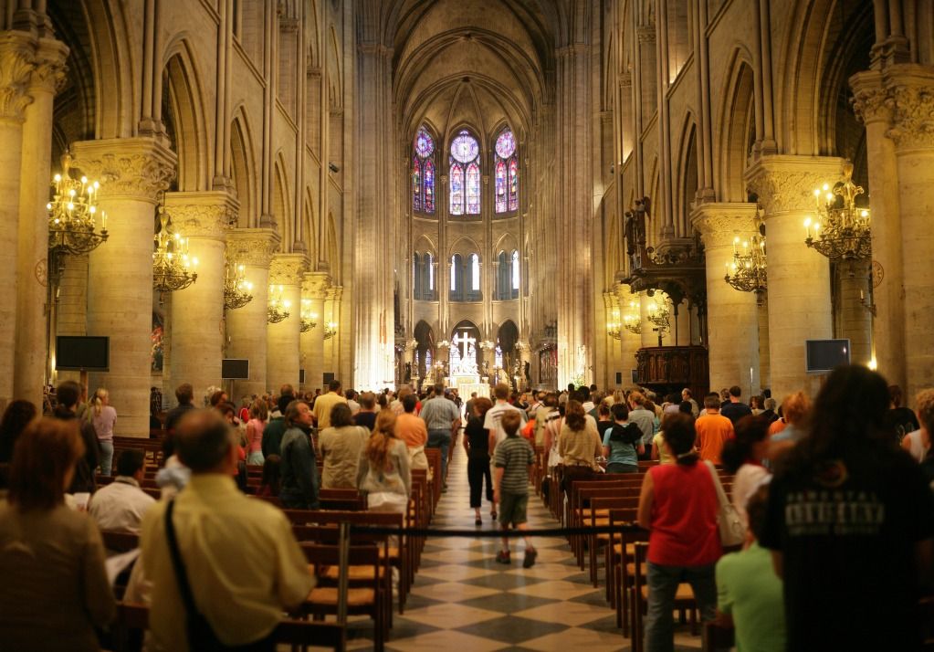
My main sources of inspiration for this environment are the chruch Notre Dame de l'Assomption in Evian (France) and Notre Dame de Paris.

27427-concert-agonda-evian-les-bains.jpg

Notre-Dame_Intrieur2.jpg


I'm not trying to do a cathedral, just a medium sized church, just a bit bigger than Notre Dame de l'Assomption.

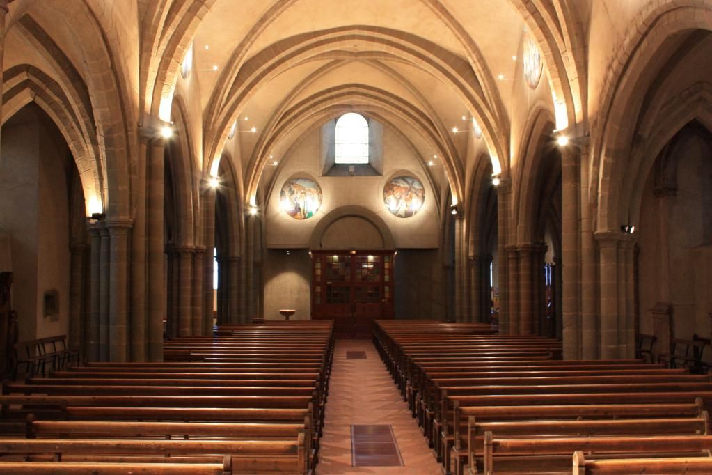
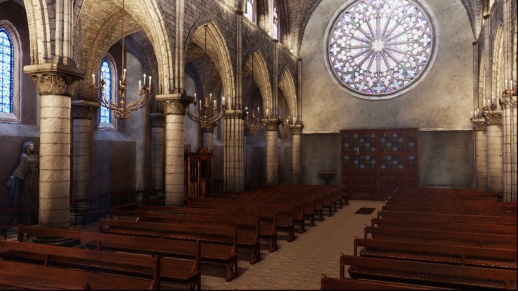
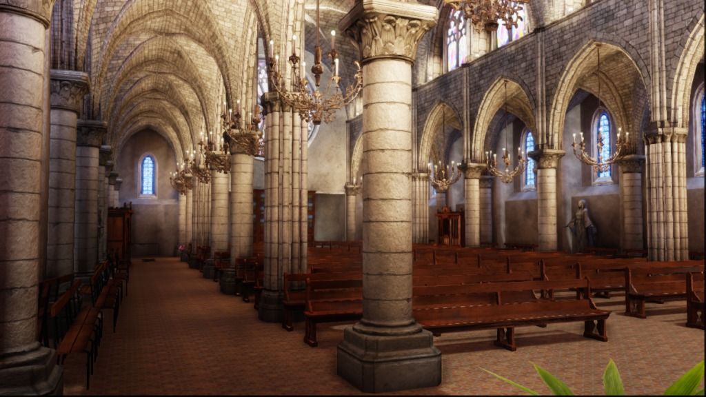
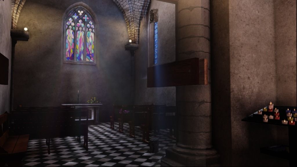
Finished environment:
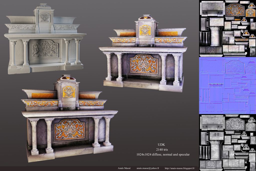
ScreenShot00032.jpg
ScreenShot00028.jpg
ScreenShot00036.jpg
ScreenShot00035.jpg
ScreenShot00034.jpg

Some assets:

Altar.jpg
fontaine.jpg
candelabre.jpg
Statue2.jpg
Cote-autel.jpg

Comments and critics are welcome! :)

Replies

  • Kyuuu
    Options
    Offline / Send Message
    It's my first WIP but here's what I have so far:
    1.jpg
    2.jpg
    3.jpg
    4.jpg

    Assets:
    Colonne1.jpg
    Colonne2.jpg
    Vitrail.jpg
    Vitrail2.jpg
    Rosace.jpg
    Entrance.jpg


    I also made this asset but the tricount is way too high for a small asset like that so I'll have to optimize it lot before putting it in the scene. I think of putting it in my porfolio nonetheless because I like it.
    candelabre.jpg

    I haven't done any vertex painting or any post processing but I'm definitely planning on doing it.

    Any comments and critics are welcome!
  • Ryno
    Options
    Offline / Send Message
    Ryno polycounter lvl 18
    It's a good start, and I'm liking the assets and overall composition. The lighting is just very murky right now. It just seems like it needs a few direct light sources, rather than the ambient glow coming through the windows. Some light fixtures maybe? Or maybe light cascading through a side window? Or both?

    Things are just running together a little in the mid-ground around the pews.
  • RogelioD
    Options
    Offline / Send Message
    RogelioD polycounter lvl 12
    First thing that comes to mind is a definitive lack of specular reflections as well as a lack of specular highlights in your diffuse channel. Don't be afraid to bump up that spec and even push your normals in your materials. Your modeling is great, but look at those reference images. The lighting is very dynamic and what you have there is very static. Just mess with some things here and there and don't be afraid to push that lighting/spec!
  • Kyuuu
    Options
    Offline / Send Message
    Thank you for the comments!

    @Ryno: I've tried to add some lights as if there were light sources on the pillars. It's a bit weird because I haven't modeled the light sources but the result is better already.

    11.jpg
    10.jpg

    "Things are just running together a little in the mid-ground around the pews." I'm not sure what you mean by that. (sorry I'm not a native English speaker)

    @RogelioD: Thanks for the tip. It's true that I'm a bit afraid of spec in general and I'd rather put it too low than too high. I'm definitely fixing that!
  • Ryno
    Options
    Offline / Send Message
    Ryno polycounter lvl 18
    The chairs (benches, or pews) were hard to see, but you've fixed that. I agree with a little more pop to the specular, maybe on the benches specifically. Notice the shine on the tops of the benches in the first reference image. This would be great.
  • Low
    Options
    Offline / Send Message
    Low
    Lots of those normals looks too blobby.

    The round stained-glass window looks like a sticker you put on the wall.

    The confessionnal's little glasses color are IMO very Easter-y, which looks childish.

    The arches should match the arch-line of the windows. Yours are not going high enough.
  • Kyuuu
    Options
    Offline / Send Message
    Thanks for the comments!

    @Ryno: Thank you for the explanation!

    @Low: When you say that my normals look too blobby, do you think it's a problem with the maps themselves or with my shaders?

    I agree with what you said. Thanks for the input, I'll fix that!
  • Ravanna
    Options
    Offline / Send Message
    that is one GOOOOD looking set of candles :)
  • JO420
    Options
    Offline / Send Message
    JO420 polycounter lvl 18
    I think your normals are too rough for the stone surfaces, ive been to quite a few gothic style cathedrals and the stone of the pillars are always smooth with minor chips and rough areas at places like edges.


    The floors suffer the same problem, they are too rough, if your cathedral is intended to be old then the floor elements will be smoothed away from the hundreds of years of people walking in and out of them.


    The colors of the wood are also too saturated,if your intention is to make the cathedral look new it may be fine but if its intended to be old,every type of wood bench i have seen in gothic cathedrals are dark and desaturated browns.
  • KazeoHin
    Options
    Offline / Send Message
    KazeoHin polycounter lvl 8
    You need LIGHT. With stained glass, you have every excuse to throw so much colour and vibrance into the scene. Put some strong directional light in there and watch the global illumination play with the environment. Also, the contrast in diffuse colour between the ceiling bricks and the pillars is too damn high! Most cathedrals are built from the ground up using similar if not the exact same type of stone for the whole thing. Lighten up your ceiling to match the pillars, this will also help bounce the light around and show off more light colours.

    Most importantly keep it up! Your doing awesome!
  • Kyuuu
    Options
    Offline / Send Message
    Thank you all for your comments and advice!

    I fixed everything. I softened the normals, boosted the speculars, fixed the arches and the round stained glass, saturated more the stained glasses and desaturated the wood.

    I'm trying to light my scene in a different way and here is the result.

    5.jpg
    6.jpg
    7.jpg


    I have light coming for the stained glass, lights on top the the arches and lights on the ceiling and the rest is Global Illumination. The problem is that I have the impression that Global Illumination is making my scene too bright and too saturated. Is there a way to reduce the light and saturation from Global Illumination because I've tried pretty much everything in the World Properties panel and nothing seems to work well enough.

    ... Help?
  • Alex Pointer
    Options
    Offline / Send Message
    An AO overlay will really help eliminate the flatness with the lighting too. I feel like the sides are too empty at the moment and in one of your references I see that there are seats in those areas-I think adding those will help the scene more too.
  • Kyuuu
    Options
    Offline / Send Message
    I'm already using the AO option in the Lightmass menu of World Properties or is there another thing I should do to get a better AO?

    I know for the seats but I haven't modeled them yet. I could use the benches I already have to replace them if you think it would be better to have them in the scene.
  • Alex Pointer
    Options
    Offline / Send Message
    I apologize for what little I know about it within UDK but I believe if your sample fraction is between .7 and .9. This should give you the dark definition in the corners. Also, if that still isn't working, you lighmap resolution may be too low? If I am using a term incorrectly I apologize but if my memory serves me, that should give you the look you want.
  • Kyuuu
    Options
    Offline / Send Message
    Don't be sorry! I really appreciate the feedback! It's just that I'm still struggling with UDK. I've started to play a bit with the settings and I can see a difference in the AO. I think I'm gonna test out a few things to see what looks best. Thank you very much! :)
  • Alex Pointer
    Options
    Offline / Send Message
    Also, if you can't get it just right, you can overlay an AO on you diffuse maps (around the corner). This should give you the definition you need. do you have xnormal?
  • Kyuuu
    Options
    Offline / Send Message
    Yes, I'm using Xnormal to bake my maps and I'm already using AO maps to create my diffuses. I know how to use AO maps for shaders in UDK so I might consider that option if I can't get the AO right with the world settings.

    Right now, I'm not sure if I'm going to keep this lighting setting because I don't like it but I'm definitely keeping the tips in mind.
  • Alex Pointer
    Options
    Offline / Send Message
    Cool, definitely hope you get the look you are wanting. Looking forward to the next update on this one.
  • GOBEE
    Options
    Offline / Send Message
    GOBEE polycounter lvl 10
    Is it just me, or are most of the normal maps inverted?
  • switz
    Options
    Offline / Send Message
    switz polycounter lvl 10
    Some of your wallmaps could use some more refining/definition, but I LOVE your candle holder. Awesome work.
  • KazeoHin
    Options
    Offline / Send Message
    KazeoHin polycounter lvl 8
    I think you need to enable lightmaps. right now you seem to be using vertex lighting, which simply doesn't cut it nowadays. In unreal, you can automatically create lightmap UVs within the editor, but its always best to make them yourself.
  • Kyuuu
    Options
    Offline / Send Message
    @GOBEE: Thank you for pointing that. I checked and only 3 maps had the red channel inverted. I fixed it and unless I'm missing something, I can't see other mistakes.

    @switz: Thank you! For the walls, I still have my 1024x1024 maps so I'll replace the 512x512 I currently have in the scene.

    @KazeoHin: Thank you very much once again for the very useful tip! I had heard about lightmaps but never tried it. Now, I just tried it on my scene and the shadows look SO MUCH better!

    I'm still not getting the lighting like I want it. I think I'm just going to re watch tutorials and start all over again. Thanks a lot everyone for the feedback!
  • GOBEE
    Options
    Offline / Send Message
    GOBEE polycounter lvl 10
    Ok cool, thought my eyes might have been playing tricks on me. Some looked fine, some looked inverted. Which was weird because they all seemed to look fine on the geo itself.

    Good idea with starting over on the lighting. Take what you learned the first time and try again. I bet you will get what you're looking for. Definitely play with the spec maps more too. Good luck!!
  • Kyuuu
    Options
    Offline / Send Message
    I'm finally feeling like I'm getting somewhere with my lighting. It's still not perfect and I'll need to refine it but I think it's a good beginning. Took me a while to figure out what I was doing wrong. I had to re watch a lot of tutorials and test out a lot of things. I learned a lot in UDK so I guess it was for the best!

    I also modified a few things. I added light sources, added some stained glasses on top of the side arches. I'm not too happy with those but it was just a test and I plan on making it look better.

    WIP1.jpg
    WIP2.jpg

    Now on to some modeling because I'm still missing a lot of assets!
  • KazeoHin
    Options
    Offline / Send Message
    KazeoHin polycounter lvl 8
    Very good! A huge improvement. Now you need to focus on the geometry and adding in details.
  • Kyuuu
    Options
    Offline / Send Message
    KazeoHin: Thank you very much! (Sorry I'm a bit late for that.)

    I'm updating the thread since I did a lot of things since last time. I had to re_do several things because I realized that I had too many unique textures for assets that really didn't need those: the stairs, the benches and the entrance. Instead I did a basic wood texture, a basic stone texture and a basic metal texture and put the all details I needed on another map. I also changed the lighting. It might still need some tweaking but I'm getting much closer from the look I want.

    Here are the screenshots of the scene:
    Screenshot1.jpg
    Screenshot2.jpg
    Screenshot3.jpg
    Screenshot4.jpg
    Screenshot5.jpg
    Screenshot6.jpg

    The assets I have done since last time:

    Altar.jpg
    fontaine.jpg
    Confessional.jpg

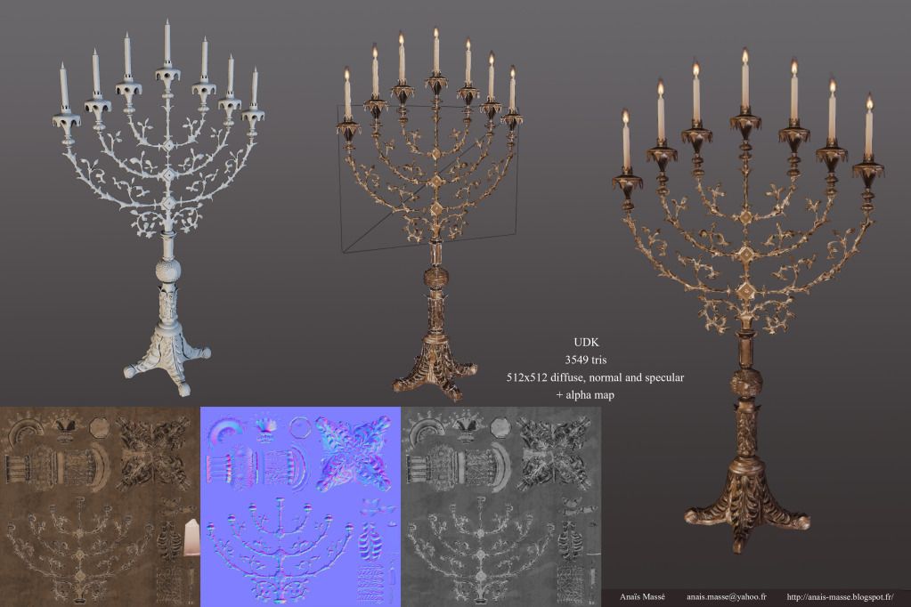
    I also modified the candle holder because it was too high poly and did another set:

    candelabre.jpg
    candleholder.jpg

    Other textures:

    Maps_Diffuse.jpg
    Maps_NM.jpg
    Maps_SP.jpg

    What I still need to do:

    - Working on more assets. I don't have what is on the sides of the altar and I'm still missing a statue, the organ and some other small details.
    - Doing some vertex painting.
    - Trying to get some rays of light coming from the stained glass. I have some right now but they are only visible if you look a the scene in some angles and I'm not really happy with how they look.
    - Post processing effects. I have changed a few settings in my world properties menu but that's all and I'm sure I can get a better result messing with the post processing chain.
    - Doing a Matinee sequence because right now my screenshots are of bad quality and using the "tiledshot" in game completely kills my lighting. From what I've read, there's a good way of avoiding this with this technique. I'll have to try it out. I also want to do a video of this environment once I'm done with it.

    And probably a lot of stuff I can't think of right now but I'm far from finished.

    Critics and comments are welcome! :)
  • GemmaSuen
    Options
    Offline / Send Message
    GemmaSuen polycounter lvl 9
    It's looking great so far! :D Can't wait to see the finished thing.
  • Benjam
    Options
    Offline / Send Message
    Benjam polycounter lvl 4
    Hey man, i like it. gotta love church scenes! i looked through the thread and seems you have come a long way. The main points for me would be to add more stuff to the walls, especially by the big circular windows it just looks like a whole lot of nothing and really brings a downer on the scene.

    The lighting as well, its good don't get me wrong but the roof and windows looks really bright and awesome while the ground looks epically dull. Brighten up pews and floor area, throw some spotlights in maybe from the windows. Experiment a little bit. Looks good though man. Can't wait to see it finished!
  • danpaz3d
    Options
    Offline / Send Message
    danpaz3d polycounter lvl 7
    Looking great! Agree with the above comments.
    Top half of all shots look good, but bottom half are dull. Also, in the third shot, the lights in the corners are a bit distracting.

    Keep it up!
  • Kyuuu
    Options
    Offline / Send Message
    Thank you very much everyone for the comments! :)

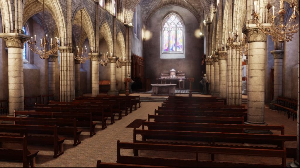
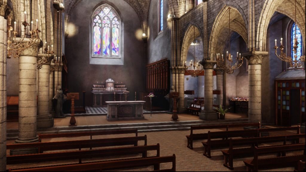
    Here's an update since I changed a few things since last time.

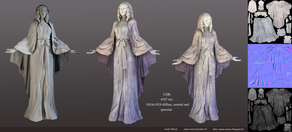
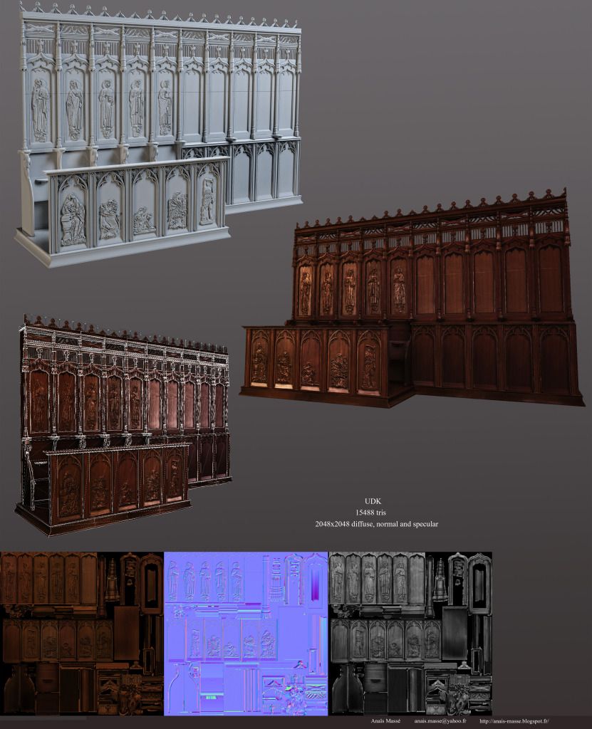
    Here are two assets with unique textures I did for the environment:

    Statue2.jpg
    Cote-autel.jpg

    I'm not too happy with the statue, I think I can improve the diffuse to get more detail on the face because it looks too flat right now.

    I also added some modular assets on the sides and near the entrance so it looks less empty.

    And the environment:

    ScreenShot00000.jpg
    ScreenShot00008.jpg
    ScreenShot00012.jpg
    ScreenShot00011.jpg
    ScreenShot00005.jpg
    ScreenShot00014.jpg
    ScreenShot00013.jpg


    I added some post processing effects and god rays. It might be a bit strong but I want to keep it like this. I think the lighting is getting better and I love the look I got but now it's too dark. I need to work more on the lighting.

    @Benjam I agree with you and that's something I wanted to fix for a long time. My current lighting is better but I still think it misses some lighting near the ground. Thank you for the feedback!

    Now, there are only a few more assets I need to do. At least, a few plants to add more life to the scene and a place where people can light candles.

    Also I still need some vertex painting, fixing the light and fixing my big stained glasses because I'm not happy with them. I hope I can finish soon!

    Critics and comments are welcome! Thank you for watching! :)
  • m1neh
    Options
    Offline / Send Message
    Awesome stuff!!! Agree that it's too dark now, really like the brightly lit version earlier, had a great effect. I think those multi-coloured windows inside need a bit of work too.

    Potentially intensify the normals on the floor mat too?

    Get some vertex painted dirt and normals on this and it will look amazing!

    New assets are awesome, good job...
  • Kyuuu
    Options
    Offline / Send Message
    I agree with you for the multi-colored windows. They don't look very good right now. I'll fix that. For the normals on the floor, I think the floor looks flat because my lighting is too dark. I'll fix the lighting and I'll boost the normals if it didn't improve.

    Thank you very much for the feedback!
  • Prtofdacrowd
    Options
    Offline / Send Message
    Prtofdacrowd polycounter lvl 8
    Wow, Im impressed, to be honest I was only scrolling to the bottom because I did pick up on the very high poly candle holder and was a little worried at the tri count and was gonna suggest that you could bake that detail to a plane, but you did it yourself!(?)

    The best suggestion I would make is go back to that first post and put up a current WIP section, its generally best practise, but it could save you turning some people off, and this is impressive work! Because I like everyone want to see the best work and sometimes if not always you got 5 secs to impress me and then your either closed, or followed.
  • Kyuuu
    Options
    Offline / Send Message
    Thank you very much for the feedback! I had seen people keeping their first post for the current WIP but I didn't think of doing it myself and now that you mention it, you're completely right!

    At first I hadn't thought about baking the candle holder branches into a plane but I did it later. That's why I posted it twice because my current version is the lower poly one!
  • gahpe
    Options
    Offline / Send Message
    gahpe null
    Hey the church is turning out great.
    Can´t wait to see it finished.
  • Kyuuu
    Options
    Offline / Send Message
    Thanks a lot! :)

    I changed the lighting so it's not as dark. It still needs some polishing but I think it's getting there.

    ScreenShot00004.jpg
    ScreenShot00007.jpg
    ScreenShot00010-1.jpg

    Next update will probably be the final version.
  • Ged
    Options
    Offline / Send Message
    Ged interpolator
    are those pillars just hanging over the stairs? I think you made the environment too bright now, also what time of day is it because the light doesnt seem to be getting casted down near the floor or even the side walls at all which is odd. Also the cieling looks like its made of brick? its a pretty good scene, just trying to help you make it future proof so that you dont come back to it in a year from now and think Doh! I shoulda fixed that! haha
  • Stinkhorse
    Options
    Offline / Send Message
    Stinkhorse polycounter lvl 12
    I don't know if it's intentional or not but those hot spots around the candles look and feel like direct sunlight. It looks great on the pillars, which look like they're getting splashed by the windows above, but not so great on the candles in the corners.
  • Kyuuu
    Options
    Offline / Send Message
    @Ged: You're right, a part of the pillar are hanging over the stairs. It's something that I had noticed a while back but I completely forgot about it. Thank you for noticing! The scene is supposed to be in broad daylight. Is it too bright? I guess I need to find a good middle between too dark and too bright. Considering how my lighting is made it's normal that all the light that get cast on the floor and the side walls but I'm thinking of changing a bit my lighting to solve that. I just need a new asset before going that. Yes, the ceiling is made of brick like a lot of the church ceilings I have in my pictures references. Does it look weird? Thank you very much for the help! I'd rather have people telling me that what I'm doing isn't good and tell me what is wrong with my scene than people who say "this is awesome" when it's not so don't worry! Any feedback is appreciated!

    @Stinkhorse Ah, yes this. I should probably tone down these lights a bit because they seem too bright.

    I'm having a lot of trouble with my lighting setup so any feedback I can get helps me a lot! Thank you both for your help! :)
  • Kyuuu
    Options
    Offline / Send Message
    Finished version of the environment:

    ScreenShot00008-1.jpg
    ScreenShot00000-1.jpg
    ScreenShot00007-1.jpg
    ScreenShot00013-1.jpg
    ScreenShot00017.jpg

    Comments and critics are welcome! :)
  • sybrix
    Options
    Offline / Send Message
    sybrix polycounter lvl 13
    Cool! I remember seeing this months ago when you were just starting this thing. Improved heaps. I think the lighting improved the most. The one thing I would have liked to see is some details littered around the pew area to break up the repetition. Like maybe a runner carpet leading to the altar, or some religious tapestries hanging from some of the arches?

    Either way, bang up job on this, it came a very long way. :)
  • cmc444
    Options
    Offline / Send Message
    cmc444 polycounter lvl 11
    wow the lighting is really helping bring this baby to life! Keep pushing the nice light in the main room.
  • tristamus
    Options
    Offline / Send Message
    tristamus polycounter lvl 9
    I thought the final pics were reference pics, lol. That means you did something right, good job meng.
  • sipher3325
    Options
    Offline / Send Message
    Loved seeing the progress on this one. Great job so far.
  • Ged
    Options
    Offline / Send Message
    Ged interpolator
    nice finish really good progress here :)
  • toolpaddz
    Options
    Offline / Send Message
    toolpaddz polycounter lvl 10
    Obviously contrary to the general opinion here, I think the lighting needs a lot more improvement. At present, it just doesn't convey the atmosphere because the scene is missing every kind of shadows and thus the contrast. You might consider using a direct sunlight, so that the windows cast direct shadows, increasing the contrast. Also, it seems to me you are using vertex lighting for at least some of the walls which is really counterproductive on flat surfaces. You would want to change that to lightmaps.

    A creepy church environment like this lives from the lighting. And your wonderful assets would be grateful for a better presentation!
  • Benjam
    Options
    Offline / Send Message
    Benjam polycounter lvl 4
    I like it but like @toolpaddz said the lighting is a little off. There are no shadows that i can see and it makes the scene look very flat and slightly lifeless. I would defo give the lighting another crack. Get some sharper shadows in there to give the scene more life.

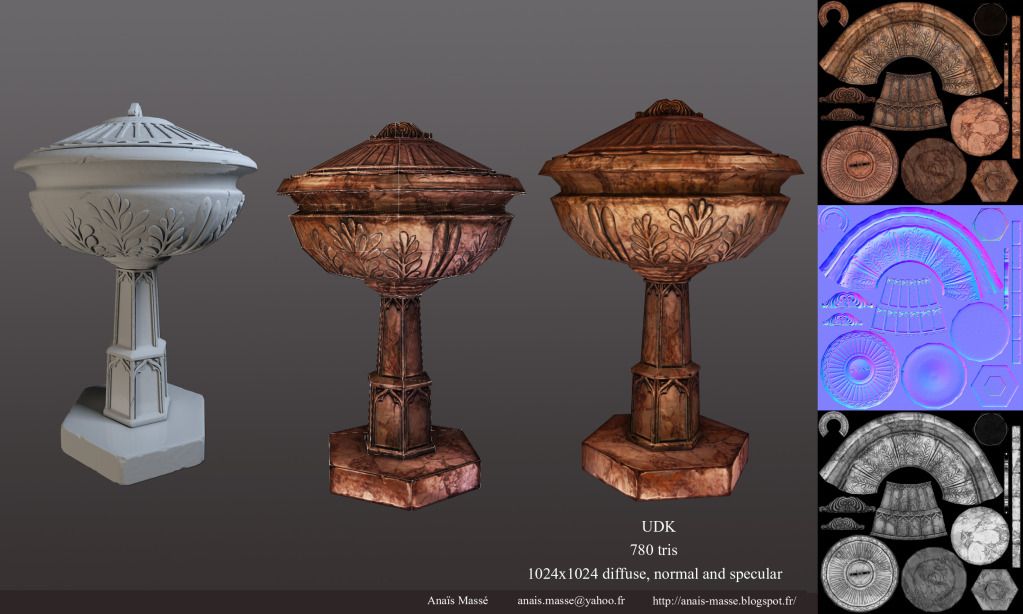
    That being said im still very impressed. How did you do the little cup and altar thingy. Was it a normal map bake because you have the detail on the diffuse map which is either an awesome impressive trick i dont know yet or im very confused about how you got it there
  • Prtofdacrowd
    Options
    Offline / Send Message
    Prtofdacrowd polycounter lvl 8
    Fantastic end result, and some very nice asset this environment has came a long way! You should be proud. I had one issue left to address with it and you cleared it up before I came across the thread again! Nice job!
  • Kyuuu
    Options
    Offline / Send Message
    Thanks a lot for your comments everyone!

    I have changed the lighting according to the feedback.

    ScreenShot00032.jpg
    ScreenShot00028.jpg
    ScreenShot00036.jpg
    ScreenShot00035.jpg
    ScreenShot00034.jpg

    @sybrix: I'm afraid I can't really add more to break the repetition. It's a church and it wouldn't make sense to add more especially around the pews or the arches.

    @toolpaddz Thank you for the feedback! There are two reasons why I use vertex lighting instead of lightmaps: I needed some vertex painting to break the repetitiveness of the texture and the walls aren't blocks, I need to have holes in them to fit the stained glasses. It would be possible to do it with BSP brushes of course but it's easier dealing with it with meshes. Right now, I changed the floor so it's a BSP because considering how I changed my lighting it looked bad with vertex lighting but now I don't have my vertex painting anymore.
    I know my asset presentation is bad and that's something I planned on changing once I got this scene finished for good. :)

    @Benjam: Thank you for the feedback! I don't understand what you mean by "the little cup and altar thingy". Are you speaking about my altar asset, a part of it or something else completely? I don't have any special tricks about my maps, it's just high poly baked into high polys and I get my maps from there. I also create the diffuse out of these maps. It's nothing special.

    Critics and comments are welcome!
  • Benjam
    Options
    Offline / Send Message
    Benjam polycounter lvl 4
    Looks much much better with decent shadows in there! Yeah i meant your altar asset thanks for the knowledge boost :)

    Looks great!
1
Sign In or Register to comment.