Marchwarden's Portfolio Work Thread
Hi guys, I'm Marc Thompson, 3D Environment Artist. Here's my thread for documenting my portfolio environment art projects. I want these pieces to be as good as they can be, so critique and advice is more than welcome. I'll be updating this first post with the most recent images.
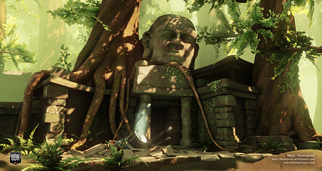
LATEST:
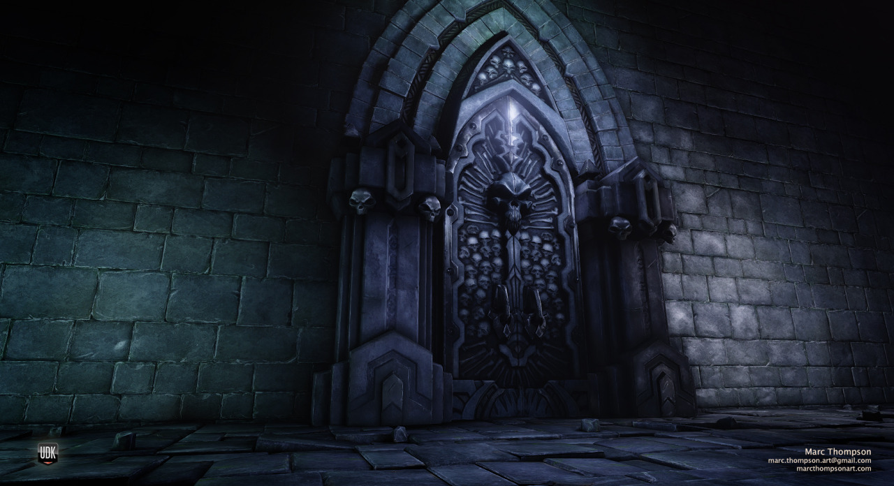
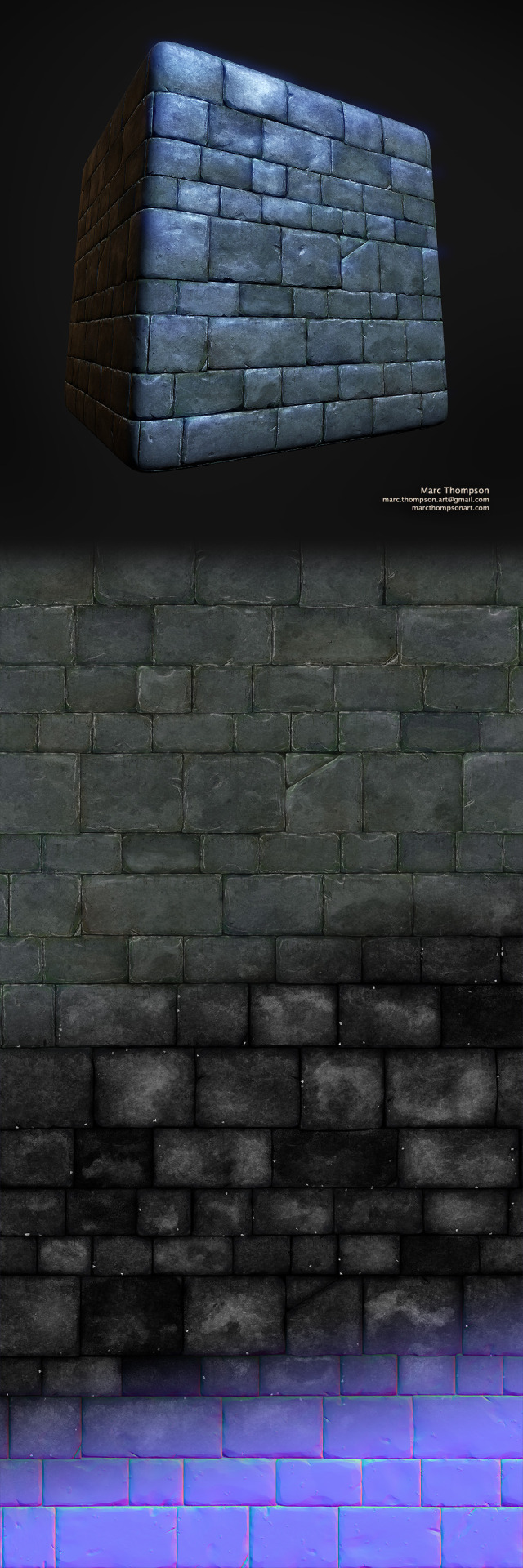
Low Poly Bake:

Hi Poly:

LATEST:
Low Poly Bake:
Hi Poly:
Replies
I just loved the look and feel and setting for this place. I feel like we don't see much of this kind of scene/time period in today's games, and it got me excited to make something a little unique.
Here are some exploratory sketches and reference I found. This is just a small portion of my research:
Here is a quick breakdown of some of the static meshes I have so far. As you can see it's very modular and allows me to make tons of variety. So far I've kept the texture use pretty low; I've generally tried to re-use existing textures before deciding I need to make new ones.
This is just the early stage of this project and I have a ton of work yet to put into this; keep an eye on this thread!
And you're right about the height of the curb, I suspect it's at least twice as high as it should be, so I'll fix that.
mryogesh123: Something like this will be my primary composition, it'll definitely change a bit as I progress. I'm keeping an eye toward getting a few good shots from different areas of the scene. As for the buildings, yea for sure. Actually I've been thinking a bit about how to approach the skyline. My main concern is that the buildings in the background will need to be unbelievably tall, but it might work out.
Btw, diggin' this!
//edit: well, actually, in the concept you don't even see the right side. But I'd even dare say that the concept artist wanted it to be a plaza...!
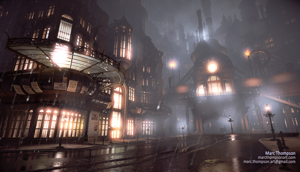
Not the prettiest update but I wanted to show a bit of progress.
I've been building modular elevated rails and blocking in the station. I also copied around some towers to give a better sense of the far cityscape -- I'll be building some more interesting unique assets for that farther down the line. I have a few other building sets in the works to add more variety.
In the meantime I've been giving thought to what to do with the middle of the large street. Large open squares like that weren't uncommon, but I don't exactly have dozens of interesting people to fill it with, like in the concept. My first idea is to turn the street into a round about with the middle being a sidewalk/park area with a few trees and benches. It would add a fair amount of production time if I start developing foliage though, I'll see how things go.
I also tweaked the colors a bit, I think they work a little better now.
Here's a good tutorial link about material blending for those interested:
http://www.chrisalbeluhn.com/UDK_Advanced_Vertex_Painting.html
For elements that are large and you can't do anything to break them up without creating seams in the lightmap, increase the lightmap resolution.
Like Marchwarden said, be sure that every separate surface has its own pixels. Overlapping on a pixel mixes the information.
Good luck!
What is the square shadows on the street? What light is causing those?
Also, for your lightmap problems: You say you want to use 32x32 for the one you posted, but that's way too small. Just take that image of your uv's you posted and scale it to 32x32 in photoshop, you'll see that there is never enough pixels to give each island space
I personally would either crank it up or simply use vertex lighting( you might be able to get away with it, there isn't too much lightmap detail on that particular mesh I think) Perhaps it's worth a try?
Good stuff and gl.
Vertex lighting could be the solution I need, these meshes should work fairly well for that. Anyway, yea my wording was confusing, I knew I definitely needed more resolution, I was just afraid of going to, say, 256x256 or more on a mesh that's instanced dozens of times.
Thanks
the only suggestion that comes to mind is maybe adding some plants, but i really don't know if they'd fit the mood
also, it might be a matter of camera angle but on the concept buildings feel more overwhelming.
@Blaisoid: Thanks for the feedback. I too really want to get that cool balcony in there, I just intentionally kept the more unique features for later while I worked on the pieces with the most re-usability.
And you're right about the height of the buildings. I honestly ended up being very conservative there mostly because the buildings I had in all my reference were only ever 10 stories at most. I had this sense that adding an extra 10 stories to these buildings would look wrong and unbelievable, but looking at New York skyscrapers from 1900 I'm more confident that I could pull it off. Conveniently it's just a matter of copy pasting a few floors and updating the prefabs in my scene.
Thanks guys
In the meantime here's some lamps:
loving the lamps!
Don't get me wrong your work is stunning and looks very cool but when I compare it to the concept art piece I don't get much of the ressemblance.
The concept art elements are made of long thin lines that gives a sense of elegance. Yours are more blocky which gives a cartonny feeling. The concept shows a very trendy place to be somewhere downtown while yours (with those chimneys and that wheel-type thingy) makes me think we are set near a port or and industrial-hood.
By the way, the lamp post in the concept is a very interesting idea. It is humongous, when looking carefully we see its base is something like 60 feet (20 meters) away from the point of view and still goes way up the top of the image.
I didn't want to sound rude in anyway and again your work is very good (way more than mine in any case) and I just wanted to point it out for you because you said
@Low: Thanks for the honest feedback. I think your point about the long thin windows and sense of elegance are spot on.
The scale of the lamp post is also an interesting point because I thought about that specifically. You're right that the lamp post in the concept looks absolutely massive, but I wasn't confident that I could sell the size of it without it looking wrong and goofy, you know? Actually, the first few times I looked at the image I read that lamp post as being normal sized, just very near the camera. My priority was making sure the buildings looked massive and impressive, so I chose to keep the lamp posts at a more reasonable scale in comparison.
But back to the industrial vs elegant elements, I think you're right and it's absolutely a balancing act. You could say that's one of the pillars of steampunk in general, that mix of Victorian decadence and mechanical practicality.
For example, the train station, though it has a very functional silhouette, will still have large glass windows on the front with a grand clock face above it -- think Grand Central Station. I also still intend to add the cooler elements to the left building, especially that glass balcony and the large entrance -- that will help alot. My goal is to strike that balance in the end.
Thanks for the feedback!
I'm going to replace those fat tall windows at the bottom with the new elegant ones. I will also model ticket booths to line the lower walls.
Let me know what you think of the bulbous awnings underneath the glass balcony. That ended up being a challenge from the design level up, because I honestly wasn't sure what their function is. I had a friend look at it and he said "restaurant with a view", kind of like the space needle in Seattle. I liked it and went with that. My main concern now is that it looks correct -- currently it has a strong reflection in the windows with VERY subtle light emmisive. If I give it too much light, like every other window in the scene, it just takes over and looks weird, so let me know if it works.
As far as everything else, I've got an eye toward wrapping things up quickly. Summer is coming to a close so I'm just crunching away, and at my current rate it should happen. The rail station is next, and it should be relatively quick with a little Ndo2 magic. Then I'll make a nice steampunk car and then miscellaneous props and decals and do a texture pass.
Wish me luck.
I added a bit of decal action on the buildings to add a bit of grunge. I also went into the textures and detailed them up to be less flat and more interesting.
I'm working non-stop on this thing, please let me know what you guys think as I start working on polishing things.
Here's the textures I used for the station:
And here's the current textures for the buildings in the distance; still WIP:
The two main things that catches my attention is the lack of a defined train station and lack of "roughness".
In the concept, to the left we have what seems to be a train station, big windows, big entrance which contrasts nicely with the small elements that populates the rest of the scene. Right now it's mostly small windows all over the place. It would add so much if you actually made an interior for the station or at least hinted at it. Would really add to the "less is more" effect.
As for the second point, the scene needs more imperfection and slight unevenness in the roads. This is the hardest point I think since it needs to look subtle and accidental and not made on purpose. Also streets usually rise to the center it seems, most likely to make water collect to the sides.
A bit of wall of text here, hope it makes sense and pardon if I've missed any explanation to the points already mentioned.
I actually have a third point which I think is the most important,
Don't get too tight yet. The more you polish the harder it will be to make composition tweaks as that's what you need to change right now. Props are looking great, now nail the structure of those buildings.
Looking forward to future updates!
First thing that caught my eye was the glass tubing that goes around the building on the left. I think it could use a bit more color variation, kind of like the area that's underneath the glass platform in the concept. There's lots of yellows and greens and purples that make it look vibrant that I think is missing from your glass tubing.
Another thing from the concept that I liked that you could try out is about that glass platform. In the concept, it almost looks like it's glowing, lighting up things around it. Maybe you can try playing that up in your scene?
I messed with the saturation of the window lights and strengthened it a bit. I looked at the main entrance of the building on the left in the concept and liked the saturation of that light and how it falls off, so I tried to take a little something from that.
You could try playing with having just a few really tall far background buildings, like some smoke stacks or like a clock tower. I think at least having just a few tall buildings back there can help the city feel larger and grander.
It kind of feels like the train station isn't fully done, at least looking from the main shot. I think when that gets roughly to the same level of detail as the big building on the left, that shot will look much better.
Last little thing I can think of is to make the rain more apparent.
Hope that some of this helps. Keep on going!
Anyway, UDK is great. One of the better ideas I had was to hook up vertex painting to the window glows to get complete control of the window lights and, most importantly, how they affect the composition. I think it added a ton to the scene.
As far as the lighting you'll notice it is a whole lot more moody and closer to the concept. I'll be honest and admit that committing to changing the lighting this much was hard because 1) I have to leave lightmass running over night at this point and 2) there is a 50% chance that my computer will BSOD before morning when running UDK. Needless to say it's a big pain in the ass, but what can you do? Wait for Unreal 4 maybe, heh.
At this point prop population and clutter will help the most, so I'm excited for that. I also intend to give that sunburst element on top of the train station a full high poly pass with a clock face and some fancy designs. It will make a cool focal point. Please keep the feedback coming
I'm going to get lots of telephone lines in there soon, that will have a pretty big impact.
Do you believe it's more worth it to have the alpha rather than the geo in that situation? Or was it more of just a preference on your part? I ask, because alphas can be quite heavy. I'm assuming this alpha was no larger than 256^2?
I am a little confused about the posters on the glass? Are they on the outside?or the inside? They look a little out of place imo. But this looks so awesome man! Excited for more!
@SaferDan: Thanks
Just some ideas
I think that your rain could do with being a lot heavier, such as in the concept.
How are you going about making the current effect? Alpha planes? Particles?
Epic uses a technique where a cylinder with a rain material is parented to the camera. Rotations are turned off and it works very effectively.
It also means that the rain essentially only creates one constant overdraw to the screen, rather than potentially loads if other methods are used.
Hopefully I'm coming across as helpful