[WIP] Insane Asylum, UDK
Hey guys!
I'm currently working on an environment level for my Master's project, and was looking for some feedback on what I've done so far. I wanted to do something special this time so I went for a greyscale/red outline shader.
The room is loosely based on the film One Flew over the Cuckoo's Nest:

Anyways, here's my level as it is now:
[ame="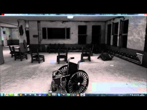 https://www.youtube.com/watch?v=otxEBZb536c&feature=plcp"]Asylum Level [WIP] 1.2 - YouTube[/ame]
It's a work in progress project, so there's still more models I want to add.
P.S.
The Shader isn't mine, I borrowed it from a user on this forum named Drachis
I'm currently working on an environment level for my Master's project, and was looking for some feedback on what I've done so far. I wanted to do something special this time so I went for a greyscale/red outline shader.
The room is loosely based on the film One Flew over the Cuckoo's Nest:
Anyways, here's my level as it is now:
[ame="
https://www.youtube.com/watch?v=otxEBZb536c&feature=plcp"]Asylum Level [WIP] 1.2 - YouTube[/ame]It's a work in progress project, so there's still more models I want to add.
P.S.
The Shader isn't mine, I borrowed it from a user on this forum named Drachis
Replies
The big thing I notice is that all of your reference is daytime but your scene is nighttime, might be necessary to collect more reference. I think Gothika had some nice night- asylum stuff if that's the route you want to take. Anyway, there are areas where beautiful highlights streak across the wall from exterior lights. The floors include reflections and also have a really cool highlight from exterior lights, giving the material a ton of depth from that angle. The ext lighting also casts nice shadows along the walls. I noticed you included the poker table? I think the circular pattern of chairs from the support group is a lovely composition as well.
Now regarding your work, I think your shader decision is hurting more than it's helping. Borderlands does an excellent job with the outline shader because their textures look hand done and the outline compliments it. You have what looks like photographic textures and an illustration-looking outline; the inconsistency hurts your final piece. The grey scale also hurts the image. Nothing in reality is ever white (nearly all the reference is composed of beige values) and the grey scale makes a lot of your diffuses look like they were made from pure white.
When you examine professional game environments, many great ones are defined by the story they visually tell without needing any text or context to supplement them. I'm not sure what story yours is telling. There are columns with pieces missing like a war went on, but the scene is pretty clean for chunks of concrete and plaster to be removed in columns. Blood text is laying about but I feel like dead bodies should be accompanying the text. Bloody text on walls is also pretty clique, I'd stay away from it. What's the last game you've seen use hand written text on walls? Better yet, what's the last good example of text on walls at all? If you want to place text anywhere, place stuff on a chalkboard or announcement board. Nothing too morbid, but just something that alludes to people now gone. Batman Arkham Asylum did an excellent job of illustrating the cells of mad men and telling the player which cell belonged to which villain without many inmates even appearing the game. Check out Calendar man's cell.
Too many environments are ruined by poor lighting. If I were working on your scene, I'd stop modeling for a bit and first focus on a good exterior and interior lighting setup with warm and cool lights. Then I'd figure out what direction I want to take this. Is this day/ night? Should general aesthetic be photographic or illustrative? Is it telling a story and if so, what?
Good luck my friend, and I'm excited to see more from this.
I haven't really focused much on lighting yet, just to say that.
Just to try it out I've added colors to my textures, to see how it compares to my grayscale theme, so what do you guys think?
Btw, I know the floor and ceiling texture doesn't look right, I'm working on it
EDIT: Lighting is just build with preview quality, going to do more work before I start working at production
Also the light on your floor looks a little low in detail, even for preview lighting. I suspect you're using BSPs with default light map values? I would go into the properties and drop it down a good bit. If you've never played with lightmaps before, Eat3D has a wonderful free tutorial on the subject.
Curious about the LOD problems though. Do you have LODs loaded into this scene? And what are you using to capture the images?
I can't figure out what makes the grainy effect, I've had a similar problem with a previous project...
Wall up close:
Wheelchair up close:
Thanks for feedback so far guys
Also got some weird shadows on the ceiling now for some reason.
Oh, and I was making myself the fool when I just screenshot it from the "play from here" instead of using TiledShot, since the grainy texture isn't there now
but I am wondering about something... how do I increase the resolution from just playing it in the editor? I'm going to place some cameras around and Fraps it once I'm done, and when I use "play from here" it shows the grainy texture again
Keep wkin on it. This is going somewhere.
Here's a quick image of what I mean and what should solve it.
The platform on the left has a lightmap resolution of 64, the one on the right has one of 1. You'll wanna change this to 1 or 2 and that should give you nicer shadows
Some of the patients would put glow-in-the-dark stars on the ceiling, so we got the idea to write and draw things on the walls with laundry detergent so it would glow under blacklight. You could have your scene change from a sterile institution in the light, to a nightmare house when the lights go out. Maybe have some lightning outside to reveal even more stuff in the shadows.
And about the strange shadows, do you use lightmaps? If not, that's definitely the problem with this weird lighting:
If you aren't using lightmaps then the engine is lighting this with vertex lighting and there aren't enough verts to properly distribute light and shadow. This can be fixed by rebuilding the whole scene in BSPs or applying light maps to your modular meshes.
Also, I learned recently that if you're using UDK after March 2012 then alpha masked meshes don't create any shadow at all. I know you're still working on getting the moonlight to highlight properly but the chains are never going to appear if you're in May 2012 or July 2012.
I did however manage to get better looking shadows for the window bars by changing out my moonlight from a dominant directional light to a regular point light, but it doesn't have the same look yet so I need to continue tweaking it.
As for lightmaps, all my meshes has a 2nd UVW channel for lightmaps, so that shouldn't be a problem. But I see what you mean by the corner there... if you see through the glass(nurse station) there's also a light coming through the walls. I might just place some BSP walls around to try to hide it, but would be nice to figure out what does it.
I agree about it being too dark at the moment, still working on it
I did have an original idea to have the level change as you walked though it, sort of like the Little Sister level in Bioshock 2 if you've played that. In that level it flashes back and forth from a pretty looking area to a old and derelict area. But... due to my time constraint on my project I don't think I have enough time for it, as I want to focus on lighting and perhaps add more meshes and decal for the few weeks I have left. Definitively something to have in mind for it, if I choose to do more work on it after it's handed in (This is my Masters project by the way).
I like your idea, but I think I want to keep to the way the film looks. And in the film it does get quite dark during the night:
Thanks again guys for the feedback I've received, you've been a great help so far!
1) Vertex lighting on modular assets.
2) The walls are a single sided plane so by being illuminated by interior and exterior light, the engine doesn't know how to consistently calculate the light and gets funny in corners.
3) The lightmaps are too low of a resolution.
Is it possible to post a screen of your lightmaps?
As you see, the walls are one solid mesh, I did it that way so I could get the insets for the doors and windows. I didn't spend that long unwrapping it since I was going to vertex paint it (can't vertex paint BSP as far as I know). The lightmap is basically just the unwrap copied over to channel 2. Probably not ideal, I probably could make the faces that you see in the level bigger...
It's set to 256, too low perhaps?
Obviously interior walls should be largest in the UV space and exterior faces can be tiny. Also, the amount of padding you have for all these UV shells is good for something probably as low as 16, but since you need an extremely high light map resolution, you can get those shells a lot closer together.
But the first step is to crank up the light map resolution to an ungodly number, maybe 2048? Just to see if it fixes some of the lighting errors. If it does, then I would play around with the aforementioned process and then the resolution number. The lightmap resolution video I cited earlier is great for lightmap resolutions but if you've never light mapped before, 3Dmotive can walk you through the steps better than me. The video's in max but the principals apply to all UV processes.
[ame="
The lighting is brighter in the video there than what I've set up now, still working on it. Nearing the end of my project period, but I'm still interested in getting feedback on it. I might not be able to fix all issues before my hand-in though
However, for some reason it appears that the Kismet event does not seem to start... It's almost as if it's still the editor viewport, not the Play from Here viewport.
I'm nearing my deadline for this project, and I would appreciate if I could get an possible solution for this
Thanks!
P.S.
Here's an image of my Kismet event:
You can also setup the movie render with the executeble outside of udk, here's the tut for that (unless that's what you are doing, haven't used the create a movie tool) http://udn.epicgames.com/Three/CapturingCinematicsAndGameplay.html
I'd give more info on the cinematic mode node thing, but i'm still at work so i ain't got nothing to look at lol, been a while since i made my last fly through environment.