Pirate Gun Deck - Feedback wanted!
This is my very first post on polycount!
In February 2012 I began to model in 3ds max.
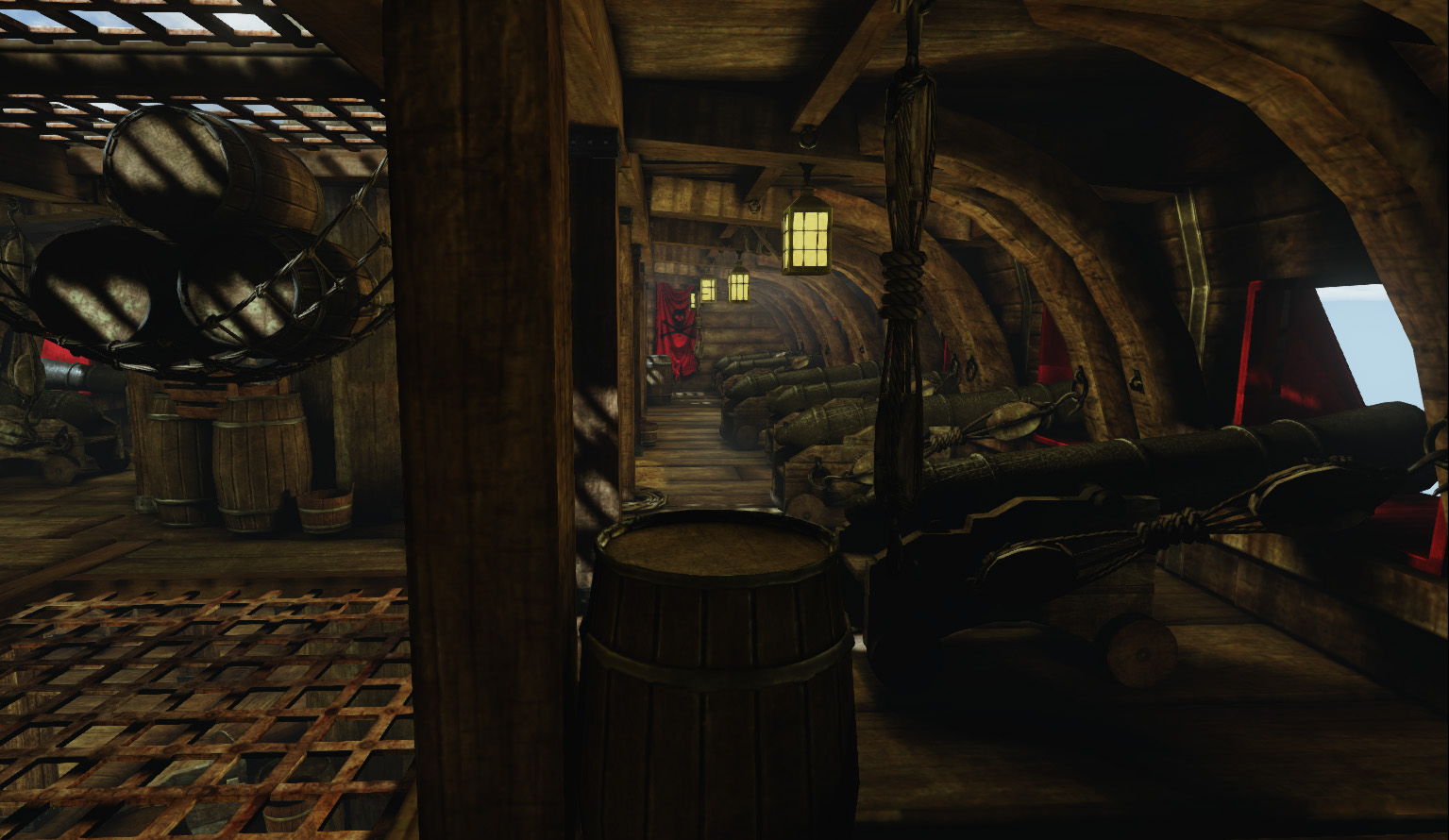
Originally, I wanted to have an entire pirate town, but as soon as I started modelling, I knew that idea was too crazy for my first project. I narrowed it down to a ship. I think eventually I will build the rest of the ship, but for now, I wanted to see how I was doing, and I completed this little gun deck.
This took me approximately 2 months to create.
You can view more screenshots and my progess at http://iriaterror.blogspot.com/
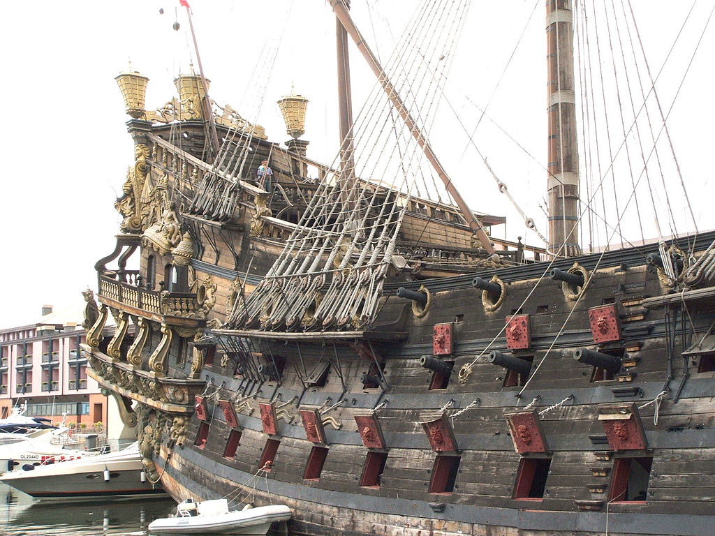
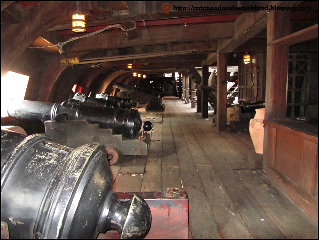
Concepts and ref:

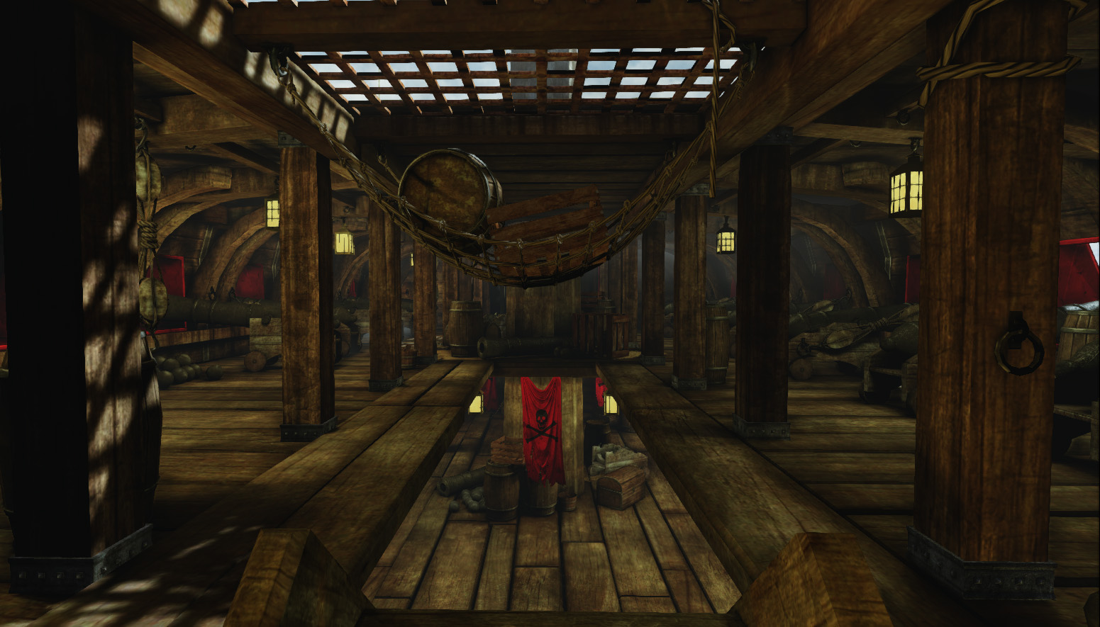
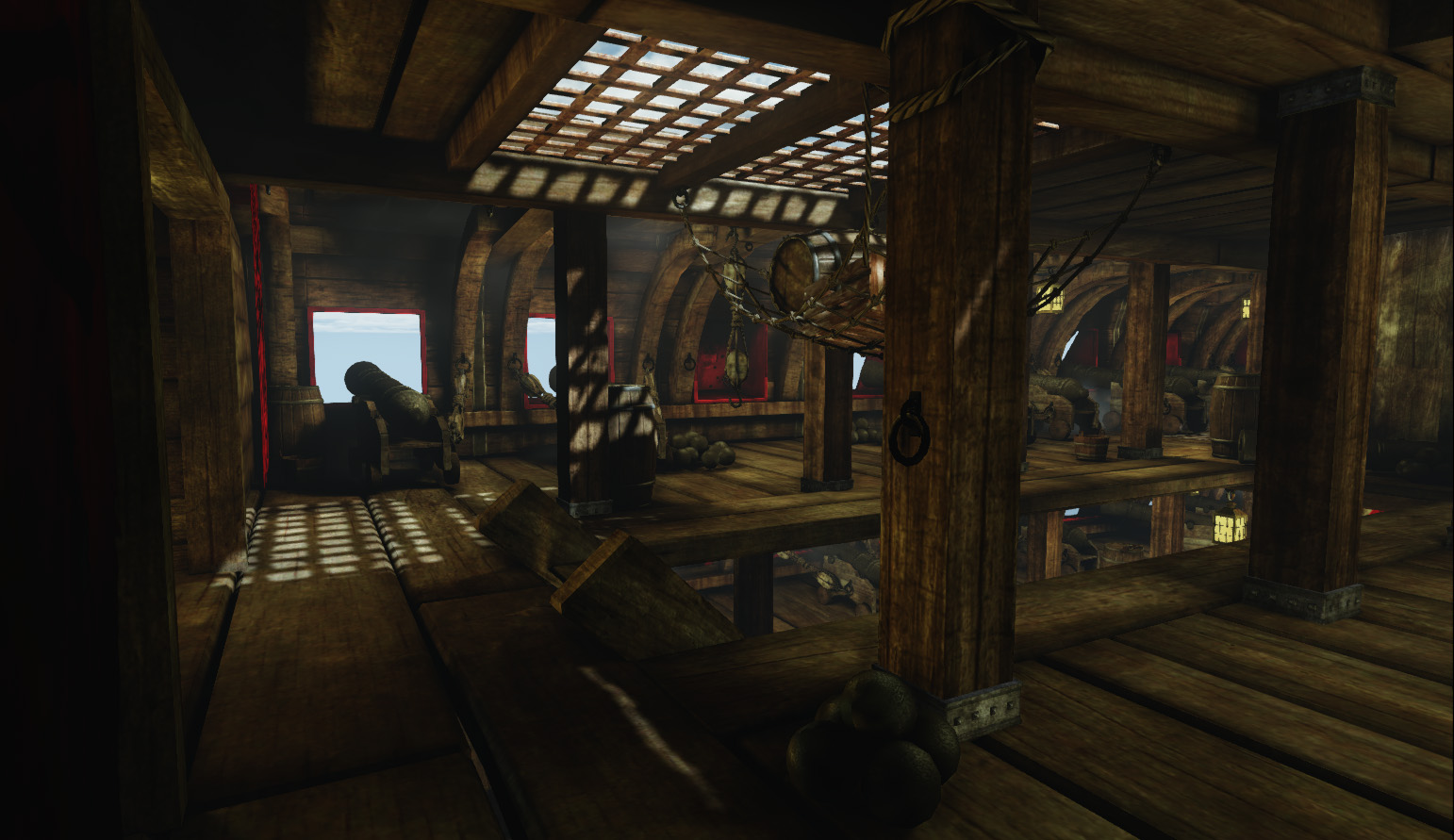
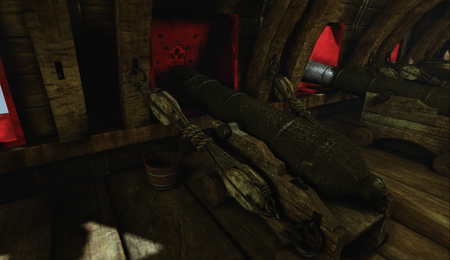
My gun deck -
In February 2012 I began to model in 3ds max.
Originally, I wanted to have an entire pirate town, but as soon as I started modelling, I knew that idea was too crazy for my first project. I narrowed it down to a ship. I think eventually I will build the rest of the ship, but for now, I wanted to see how I was doing, and I completed this little gun deck.
This took me approximately 2 months to create.
You can view more screenshots and my progess at http://iriaterror.blogspot.com/
Concepts and ref:


My gun deck -


Replies
Here's what I'd address-
* Those lanterns don't seem to emit light and don't look either lit or unlit. The texture needs work around the glass to look either lit or unlit and if you make them properly lit I'd make sure they are clearly light sources. Your refs don't show strong light coming from them, but they are also brightly sunlit where yours isn't.
* The red wood and banners look fake because they're too uniformly vibrant. The red wood in your second ref is a good example to go off but decide whether it's coloured, varnished wood or if it's painted, then put in details to show it.
* The wood is generally solid, which is important because there's so much of it. There's some real variation in resolution, though.
* The metal grills look a bit cheap and just like a flat rust texture with some slight rivets drawn on. I'd think they should look more like this or this
other than that level looks quite cool, it reminds me of that UT99 map.
Looking good btw. Modelling looks appropriate for the scene. Agree that the textures are a bit too low res.
IMO I'd make it a bit darker and gloomy, maybe put some dense fog or dust particles to give it a bit of character.
But, looking good. More progress!
I love the lighting on the last real picture you sent, perhaps trying to get that feel on your environment would work even better.
Overall, congrats for the environment, seeing you started to model this year makes me think I am too slow and need way more portfolio work
I have a couple critics for you. First I agree with what Kurt Russel and blaisoid are saying. Some dirt collecting around the edges of the glass would help. Just subtract this in your emissive map.
your texel density seems different across your meshes which makes some look low res. Try increasing resolution. If these are tileables, try tiling more.
You might want to choose a different texture for the arch. Get rid of the normal map on your arch, add a bevel, then tile a texture around it. The arch will catch the light better with a normal mapped edge, but I hardly doubt it will make that much of a difference in your scene. Also, use "flow connect" on your arch so that it isn't so faceted.
I like the first ref image for the cannons better than the second one. It has areas where your eye can rest and some smooth areas. It has lots of scratches atm across the mesh, and it would collect scratches more on the ringed sections.
The metal grill does look a little flat. Those bolts need to pop. You can get away with 1 normal mapped strip and just overlap the metal bars. Then tile a diffuse texture on top with a second uv channel in UDK material.
Or the more complicated way-
using 1 256x128 texture with 3 channels-
red- tiling noise texture,
green- ambient occlusion strip with 1 bolt,
blue- the cavity map strip with 1 bolt
then 1 normal map strip with 1 bolt. I hope this makes sense, if not I'll break it down for you.
I hope this helps. Overall good stuff and congrats for a new portfolio piece.
- Atmosphere and Mood: It feels like I am inside of a pirate ship, but just so. I think going for a bit more mood in the scene would help greatly. Maybe changing the time of day to where its dark outside, making the lanterns the most dominant light source, could make for a more dynamic feel inside of the ship (gloom and doom, similar to what danpaz3d stated, dust particles, ominous fog, maybe one of the barrels in the net is leaking, etc). Really just pushing the lighting more.
- Color and Texture: I like the accent of red splashed around to break up the mostly wood and dark metal environment. I do agree with KurtRussellFanClub that the red may be too punchy/vibrant. I think overall you could go a bit more dirty and used look. The banners could do with some dirt/stains, the wood around the cannon door areas could have gun powder residue, scuff and scratch marks on the wood where the cannons recoil, etc (I may be going ahead of you here, I know you said you are still working on it). I also notice the variation in resolution for the wood textures all around. In the ref, there are a few different types of wood that separate the deck from the cannon reinforcements and supports frames, maybe try breaking up the wood into more varying textures (not too much more but just a little bit more difference, like in the ref).
Overall I really like this and looking forward to where you go with it!
Kurt Russell Fan Club and Polygoblin - I was having trouble with my emissive maps for my lanterns. I got it working, but at the same time it seemed to completely black out the rest of the model, as well as having no shadows from the light emitting from the lantern. As a result, I decided to get rid of the emissive map and just hang some lights on either side of the lanterns. Is there any other way you could suggest? As for the red wood, iron bars and the weight to the barrels, I will work on this!
Blaisoid, L
I just wanted to point out what L