UDK River Canyon Scene [WIP]
[EDIT/Most Recent Update]:
Hey everyone, I've been a Polycount watcher for some time and I'd like to finally make my first post here. I'm working on a portfolio scene in UDK and I'd appreciate any feedback to help improve it.
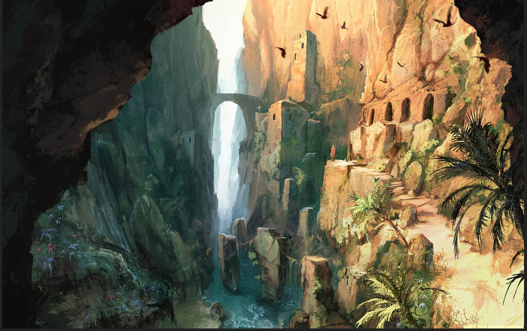
I based my scene off one of Maxime Desmettre's, or Max Island's, concepts from Prince of Persia 2008:
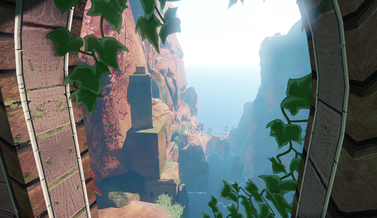
Here's some shots of the environment in progress:
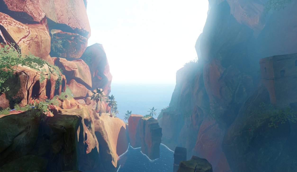
Right now I'm working on the terrain path on the right side next to the arched cave entrances. I'm trying to give the path more of an edge, since it looks kind of lumpy and soft right now. Any critique and comments are welcomed!
Hey everyone, I've been a Polycount watcher for some time and I'd like to finally make my first post here. I'm working on a portfolio scene in UDK and I'd appreciate any feedback to help improve it.
I based my scene off one of Maxime Desmettre's, or Max Island's, concepts from Prince of Persia 2008:
Here's some shots of the environment in progress:
Right now I'm working on the terrain path on the right side next to the arched cave entrances. I'm trying to give the path more of an edge, since it looks kind of lumpy and soft right now. Any critique and comments are welcomed!
Replies
As for new stuff to show for my scene right now, I've worked out a new large scale rock that I can use for the bigger cliffs. I'm not entirely happy with some of the rocks I'm using for the cliffs because some of their textures look a bit blurry when they're scaled that big.
Here's a layout sheet of the cliff rock:
I'd like to give thanks to Romy here on Polycount for the technique I used to make this, which basically boils down to using Dynamesh and the InsertHand Brush to combine several rock meshes together to create something new and varied. Here's Romy's post on this technique: http://www.polycount.com/forum/showpost.php?p=1546975&postcount=119
After combining a lot of my rock sculpts together, I did additional sculpting on top of that to fine tune the look.
On my next post I'll see if I can get more UDK screenshots of the scene as is, as well as a paintover to show how I want to proceed.
Im assuming the rocks you just posted on that sheet are different to the ones in the screenshots, they look much nicer. Keep going on assets like that and you'll have a great scene!
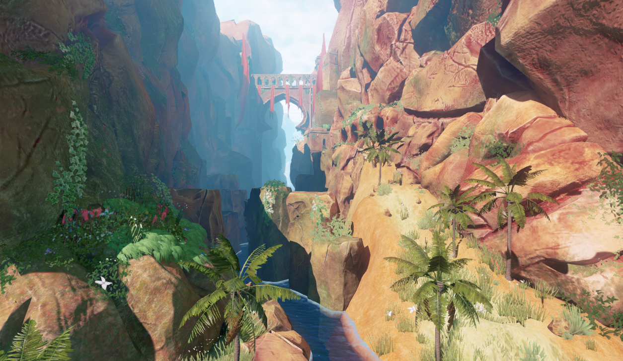
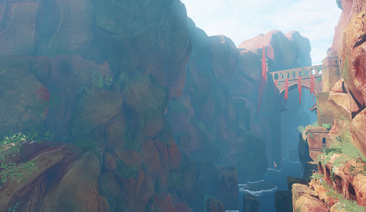
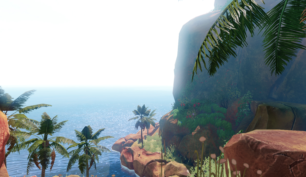
Here's a shot of my scene as is, I've implemented a few cliff rock that I posted earlier, and I played around with adding some more foliage in the foreground. I also made a sculpted a new terrain path on the right.
I'm not too happy with how the foliage looks in the foreground on the left. I'd like foliage on the foreground, but it's a bit too cluttered right now.
I played around with the colors and saturation in this paintover. I got a lot of suggestions from my instructors and classmates, and worked them through to this:
I'm all for a more saturated look, though for this I'm not sure how saturated is too saturated. So I'll most likely use this paintover as a guideline instead of a hard target to proceed.
A nice suggestion that I got that I'm going to try is having crumbled rocks around the edge of the path on the right. I've Zbrushed out a few quick small rock fragments that I'm going to spread out around the path to see how it looks.
Also, some of your textures seem low-res, or maybe we're just really close.
I like where this is going though! Subscribed.
It looks cool, but personally i think the rocks are to saturated, depends on the style you are after ofc. Anyways good job so far!
Here, I gave your paint over a paint over (just some adjustment layers):
I felt you had too much of a rainbow color scheme going on (and the saturation was making it worse) so I sucked most of the red out. I think the colors in the concept worked great, so I just followed those. The color range is alot smaller and more cohesive.
@Pampers, Paunescu.Daniel had it right on the money, I used a depth based alpha node in the shader network for the water edges. I broke it down from Phill Johnson's water flow map demo: http://phill.inksworth.com/tut.php
His tutorial includes a sample .udk file with all of the materials he used to make the water he makes. Part of his water shader includes a depth based alpha node setup, which he plugs into the opacity roll out of the material to fade off the edges of the water when it intersects with other meshes. I took this part of the network and modified it to get the water edges in my scene. I'm not the best expert at UDK's material editor just yet, but if you'd like, I can try to explain more or post a screen of how the node network looks.
There's some updated shots below. Most of the work was done on polishing the environment from the master shot. I messed with the saturation of most of the foliage and the rocks, and I placed a lot more foliage according to the paintover I posted earlier. I held back on the reds for the rocks, I have to agree with Marchwarden's point that the saturated red rocks in my paintover were taking over too much.
Here's some of the latest renders without further ado:
Some but not all of the major changes include:
-Foliage on the cliffs
-Updated textures, foliage and rocks on the path
-Foliage shaders that allow for backlighting
-The rock pillars that go out into the sea
-The fog color and density
From here I'd like to do a bit more work on the bridge area, since I haven't touched that in a while. I'm also still tweaking the fog color/thickness to get the cliffs on the left to be just the right color I want. One of the main things I want to drive is the difference between the warm, lit side of the cliff, and the cool, shadowed side of the cliff. I might do some other paintovers to further optimize the colors and elements too.
Any more suggestions and crit are welcomed as always.
The palm branch in the foreground is a good element, but the model isn't holding up at this distance to the camera. This would be a good opportunity to make an LOD for your palm trees. Give the first LOD some more polies to get rid of the texture bending in the leaves that's so apparent up close.
The rocks and foliage on the path are nice, I would just place them less randomly. Move most of them to the sides and leave the path a bit more bare to give more of a sense that it is a path.
The foliage at the top in the distance appears to be the same as the foliage in the foreground. Since their apparent size relative to each other is about the same it's really messing with the sense of scale. Maybe the distant foliage needs to be more dense or just have bigger forms, because right now the individual leaves must be huge.
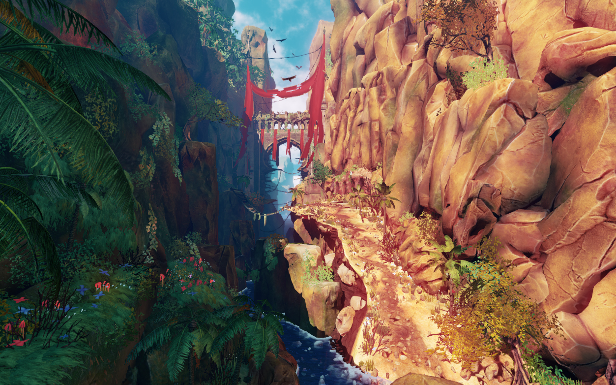
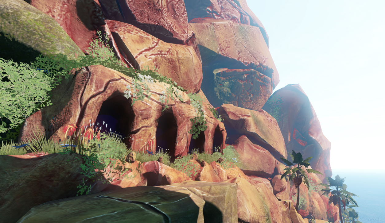
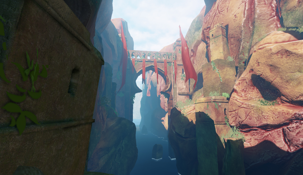
Shot 2: This one suffers from poor texture resolution on the cave mesh. I'm not sure it holds up at this distance.
Shot 3: The texel density on the cliff rocks in this one is way off and looks bad. This could be a really strong composition though, and I really like the flags.
Shot 4: This one feels pretty good.
Shot 5: Pretty good, shot 1 crits apply here.
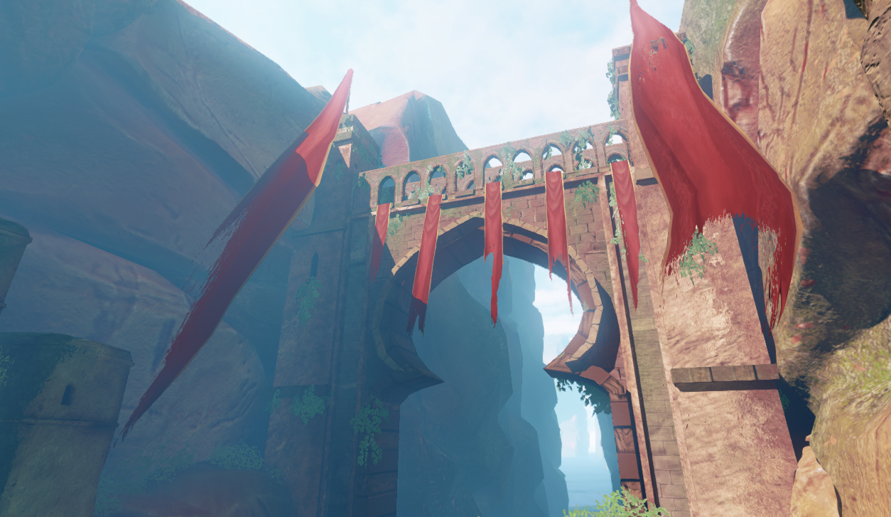
Shot 6: This one is the weakest shot, and you're probably aware since you said you're going to be working on the bridge mesh some more. Here's my observations anyway to give you some ideas: The texture mirroring is very apparent and there seems to be some weird uv stretching. It could also use a ton more polygons to spice up the silhouette and kill that polygonal look.
Otherwise it's looking sweet, keep it up.
By texture bending, do you mean how the leaves are a bit skewed in the white circle, or how it bends at an angle in the blue circle? Or even both? Some of the skewing in the white circle might actually look that way because it looks a bit bent in the texture, so I might be able to fix it there instead.
A bulk of the work was reworking the bridge so that it was easier to manage and make lightmaps for. I ended up splitting it into a couple of parts.
Some of the major changes include:
-Rescaled and redid BG foliage
-Extra and improved bridge elements (ropes, wood, flags, modeled trim)
-Higher res palm tree branches as a base LOD
-Path foliage rearranged
-Cave textures up-rezed
I also tweaked the scene saturation down just a little bit after seeing some of these images on other monitors. As for what's next, I think I'll experiment more with some paintovers to see where I can modify colors and mess with the placement of some assets in places to make this better. I was considering setting up lerp node setups for a lot of the foliage, that way I can vertex paint some color variation into all of the foliage. The bridge shots are still WIP as well, there's some fine tuning I still feel like I need to do. Got to keep going!
Thanks again!
3 crits.
I think some of the bricks are a bit flat.
Agree with that roof sagging idea.
Lastly, you could put some small waterfalls in there, main place I'm thinking is in the second shot on the left where you got that big rock wall.
The waterfall doesn't need to be too wide, but so it adds some variation to the rock.
That's it!
Awesome concept and ur doing a good job honoring it
@danpaz3d: I'm with you on the brick flatness. Taking from Rhoutermans suggestion, I think I'm going to incorporate some damaged brick/exposed rock into the bricks with some vertex painting work to see if that gives it a bit more depth. I also bumped up the normals on those bricks as well.
I like the waterfall idea, and I think it could look pretty cool, but I think getting that to look right would take quite a bit of R&D on my end. I'm considering other ways to add variation to that rock face in that shot though. It might be as simple as overlaying some other textures through a lerp node setup to get just a bit of variation, but I'll work on it and see where it goes. Thanks for the crits!
@Rhoutermans: You're absolutely right about those planks. I've got multiple materials going on those planks now to break it up. You also bring up a good point about the bricks, I'm going to see if I can do some vertex painting to introduce some damage in another material. Thanks so much for the feedback.
As already mentioned it's got a Prince of Persia feel and I think pulling back the saturation to something like this may work better:
http://s13.postimage.org/x066zmfg7/Prince_Of_Persia01.jpg
http://s11.postimage.org/ne51hov0z/Prince_Of_Persia02.jpg
Doing it this way the trees and flowers aren't fighting each other for attention and the rock and flags are able to stand apart.
I do hope you get the waterfall in there as it'll add a nice sense of motion that'll compliment the flags.
@whw: I think I might need a bit of clarification from your previous comment, but in general I agree that there's some color adjustment that is needed for the renders I've posted. I really like the first of the two images you posted from Prince of Persia, for me the part that's best about it is how the colors of the background assets and sky work with the green foliage in the front. I'm about to make an update that has some adjusted colors with this image roughly in mind. I toned down the foreground foliage and did some color adjustments to generally cool down the shadowed side of the canyon. You can let me know if this is a step in the right direction.
About the waterfall idea. Honestly, I'm still on the fence about adding a waterfall. While it might look cool, I feel like I should make everything else feel solid before I work on something like that. If I have time near the end and can't find a lot else to do on anything else, I'll see what I can do.
Thanks for the comments!
I did some additional color balancing using UDK's color picker tool, which basically allows for Photoshop color adjustments to carry over to UDK. Other assets and changes include:
-Foliage materials adjusted for stronger color varation
-Vines on the bridge
-Lots more dry foliage/twigs added
-New tree
-Added bloom
-Small wooden rope bridge added
-Bridge roofing variation
-Bridge brick damage
It feels like I'm in the home stretch of finishing this. Over the last few days I've tried a number of paintovers to play with the colors and assets in the scene, but not a lot of strong ideas have shown through. I'm not sure what exactly I should refine or add that would improve this in a big way. Some replies earlier have suggested a waterfall to go near the bridge, so perhaps I can do some UDK tests to see how that would look just to see if it'd be worth it. Another thing in the concept I could do are some mossy vines that go between the tall rocks in the river.
Other than that, I'm open to suggestions and critique for pushing this further. I'll keep working with paintovers and I'll play around with asset placement in the scene to help improve it.
Lastly, to give an idea of my timeframe, I want to have this environment finished before the end of the month. I won't have a lot of time to work on this when the school year starts, so I want to get it done soon.
Grass and stones makes a path full of chaos - it's so obvious path that only a dumb won't follow it. That's bad of course. Look on a natural path: http://localhs.com/images/natural_briges_path_lg.jpg
It's a different path material on the terrain. That makes your path visible with not making grass/stone chaos. If you want to make a natural path, try this one. If you want to make human-made path then overdraw it a bit but with easthetics.
The path is a straight line - maybe try to curve it a bit? There's a thing like "line of beauty" - very important when making organic stuff. Sorry for pointing such a stuff, I'm a landscape architect and I'm very sensitive for things like that
I don't like the unnatural, UDK-typical look of the fog - your aerial perspective is to big, it looks like milky fog and have no sense in that weather conditions. If you plan to make a game/scene a bit realistic think about how nature acts (just use reference). Still there are some effects that we need to pump up - we're making a game, not picture...
Hedera helix grows in shadows - another landscape architect bullshit
By looking on your lighting, the rocky wall is the main eye-catcher because the bridge on the corner of the sun light. It's OK but think about creating composition that will focus player's eye on the bridge and than on the road. Use light and detail to point things that player have to see. Examples: 1, 2.
If your goal is to create realistic scenes with a massive art touch, my feedback should point out some things to do. If you're making a carton-ish scene then no worries, it's not so important to have it realistic but remember that people always will real things from their imagination when looking on scenes that are only a bit realistic so all the proportions and composition should be right!
Try not to let it get too cluttered though, you've got a lot of foliage along the path / cliff edges, but the more it starts to stick out the more you lose that one long shot down the canyon. It's definitely a focal point of your scene so do what you can to not deter from it
Only crit I have really, is that the highlighted edges on the rock walls might be a tad too strong.
I'll see what I can do to address your notes on the terrain path. I think it would be easy to implement another material for the proper path with the terrain textures I have set up now. I can also play with some of the asset placement of the rocks and foliage so it isn't as chaotic and random.
I've tried playing with the fog settings to tone it down, but I've found that doing that removes a lot of the blue color from the shadowed side of the canyon that I wanted. I can keep experimenting with it though, I can see that the fog seems a bit thick.
Thanks for the ivy tip. I'll admit I didn't know the proper species name for that kind of ivy, and I'm happy to know now.
@Jack Ryan: Thanks! That is a good point. I'm realizing that some of the trees are blocking the bridge and aren't really helping that shot a lot. Should be easy to fix.
@Mr Smo: Thank you!
@Disting: Sweet, thanks! If it looks like a painting, then I think I'm on the right track. I can do some quick texture adjustments for those rocks to tone down those edges.
The red flag was making an "M" shape and was very symmetrical, I broke that up. I added a little variation to the holes in the cloth.
The boards poking out under the arch were uniformly spaced and sized and were unnatural, I added variation.
I guess the big change that will potentially be troublesome is that path and cliff face on the right. The nature of your light angle makes that area 1) extremely bright and saturated and 2) very flat and uniform. This hurts the sense of depth and makes defining those forms really difficult. My main goal in the paint over was to separate the path from the cliff and get a sense of depth with shadows.
My suggestion then is to rather than fight with lightmass to just vertex paint or use another UV channel to handpaint those shadow forms in. I think it could help alot.
Otherwise is pretty darn solid, great job.
Some of the major changes include:
-Path rework
-Decluttered Path
-Extra Ropes and Vines
-Cliff Shadows via vertex painting
-Birds!
I might not have as much time to work on this since I might be busy with classes for the next few months, and I might have to leave this as is for some time, but I'm still welcome to feedback and crit to help polish it. Thanks again to everyone who's helped me get this project this far. You guys have been a big help.
Only crit now is that I think its a bit over-saturated.
And in that last shot, the fern on the right. Is that a white specular map colour?
You're back in school which eats away your time, but I think a little more work on resolving placement and design elements will really make this piece badass.
You are currently lacking a sense of tightness. Like Chris mentioned, I'm seeing allot of clutter that isn't helping to reinforce the intentions of your composition. You need to knock out the random noise being caused by your modular rock meshes and flora placement in order to create some areas of rest.
The goal: Create areas of rest and concentrate detail where it matters in your scene. Detail should not be evenly distributed. Here's a paint over so you can see what i'm talking about, there's also some value tweaks here and there you might wanna look at.
For some rock solutions, here's a cool guide by Nathan Fawkes that always pops into my mind.