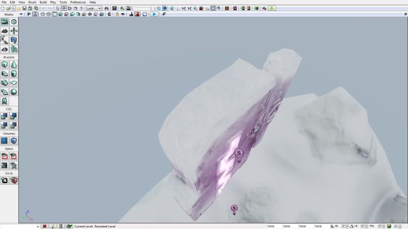
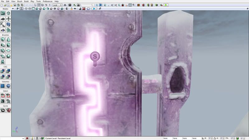
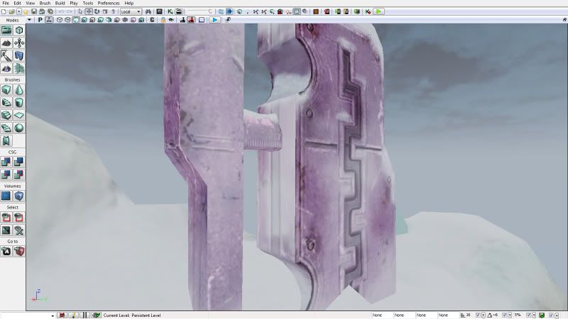
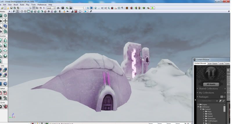
I am new to texturing and all been modeling for about almost a year and a few months. I am trying to find the right metallic base texture that will give me the look sci fi alien look I'm going for. I would love to have some honest crits I need them. I need to improve this and feel I hit a wall. I haven't done the spec map yet only color map (wip), ao map, and cavity map, and normal map so far.
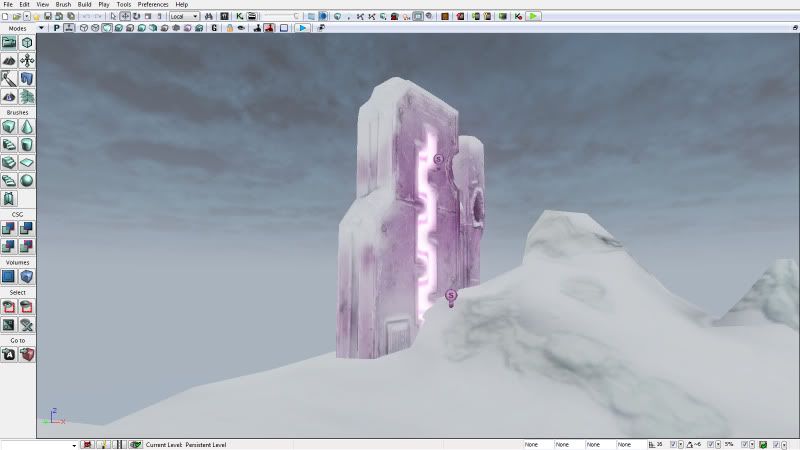
You might want to look into creating a subtle cube map too, metal can be really gorgeous if done right. Cube maps are fast, easy, and add lots of information to metal that may otherwise be boring.
Yeah a spec map is going to take you a lot closer to getting that metallic feel. If you don't want to paint it yourself, you can use the material editor to create a spec from the diffuse that can look almost as good (or better than) as if it were painted.
Scroll down to the "Material Editor" section header and you can see it talks about ways to create one just from the diffuse map and adding in a few nodes. From there it's probably a matter of tweaking variables until you get what you want.
gsokol: Thanks. I guess I am so fixated on finishing the color map before moving on to spec map because you duplicate your color map to make spec and adjust all levels of every layer until you have the right contrast. I mean base wise was looking to create something for my dome for example similar to the glittery shine in car paint but subtle since the dome is the main point of view.
Tiraldric: I'm unfamiliar with cube mapping but I will research it thanks. I'm learning UDK as I go moreless.
Johnicus: I honestly dont mind painting the spec map just completing the color map before I get to that point. I will experiment with that method though. Thanks for the link to the tutorial.
Also my scene in in unlit mode at the moment as well. I'm watching Eat 3d dvd intro to UDK currently but I am learning alot. Thanks I will try to digest everything and hopefully take another stab at this tomorrow.
I am almost ready to work on the specualar maps. I estimate tomorrow hopefully. Here is my progress. I need to work on introducing some more colors in this.
Sure here is a wireframe the tri count was 3k was the limit so I made the hipoly then retopoed in max to get thelow.. I am still not over my budget and I will add some planes for alpha map icicles and foliage glow.. I should have enough to revise the geometry though I'm all ears on how to improve this..
here is the hi poly
thanks Vernon glad you like it so far I feel the texture feels a bit boring at the moment personally.
Things I need to work on... Well first off I wish I knew more then I do now to help me with this project.
Anyway I messed up early on in the sculpting stage and put rivots on the outside frame on the igloo.. They aren't lined up right so I will have to be manually erase them out of my ao.
I wanted to bring the snowy mountains out more not sure if adding shadow to my color map is a good way to do this or not.
Need to work more on Window reflection but not sure if I do that in the color map not sure if it's a necessity to have a reflection map and transparency map for this piece then again experimentation doesn't hurt.
Maybe adding some alien like decals or symbols might help introduce more color.
The frost look takes away from my texture colors not sure if this is a good idea or not.
I messed up I imported this from max as one static mesh cause I was getting errors so I'm unable to adjust the individual meshes.
I wanted to add another walkway for the background all the reference I have seen had at least two.
I need to work on the power generator building in the bg and add a a fuse box to it possibly with wires.
There is also like a zig zag shape on the upper part of the tower I am trying to bring out more but not having much luck so far.
My polycount is 2566 budget is 3k. I think I should probably delete geometry on the bottom on the terrain since it will be scene in the final beauty shots. Then I will have more geometry to add to the buildings.
Wanted to do maybe a of painting for the bg with silhouettes of mountains in outerspace with maybe a red sun or something not sure how to achieve this may even sky map might suffice new to udk.. Or maybe bending a plane or project matte image on half a dome shape.
an experimentation fixed some things like the door rivots. realized the normals dont show in unlit mode in udk so had to add some lights temp placement for now. Added some spec but not my actuall spec map yet just a constant.(thanks Johnicus) I also realized my textures look alot different in lit mode as opposed to unlit mode. My mountains in my normals are coming out a blurry I assume from the lack of geometry. Is there any way to combat this?
Ok I'm so close to calling the diffuse done a few fixes here and there still need to be done and try to make things pop right now the tower looks a bit plain compared to everything else gonna try to enhance that. I don't see any reason why this wont be finished tomorrow though.
Enjoy these shots.
I think you need to do a better job of marrying the metal igloo piece to the snow/ground. Right now it looks a bit like its floating off the surface of the snow.
originally it was to do a 3000 tri project. That's why it was so low. I initially got carried away with the hi poly. Person project still. I may do a hi poly poly paint. I hate to see all that detail go to waste. Once this is done I'm gonna work on some sculpts though
Small update I added some snow at the base of the igloo so it doesn't have that floating look repositioned some things tweaked some colors. I am now gonna work on bringing the tower out more and then finally do the specular map.
Not sure if you are still working on this. I would advise redoing that igloo. What is your texture size restrictions? You should do more research on the structure of the building and get a lot of references of what your trying to create. Maybe added more shape or parts to the igloo would have a better result...
Also does everything need to be built in zbrush? If you have access to maya or max or any other 3d program and built it there first and get a solid foundation it would come out better. Right now it feels very muddy instead of something made out of metal. Also if you have a restriction on the texture size make sure you do some uv overlapping... Everything elase looks pretty good.
to help sell the snow, you might want to screen blend a noise texture with many bright white spots over your specular map, to simulate the reflections of snow crystals (just a suggestion)
I am enjoying the overall sci fi aspect to a snow level but do check out the above for inspiration on where the project could go to.
I would also say that the environment needs closed in, at this moment it is a rock in space, adding a boundry could close in the level and add some depth.
snake85027: I think I may move onto the spec map. I worked on the diffuse alot and I didn't uv this right was my first time really uving a whole scene I learned alot though. This is my first project I think for my next project I'll try to make just one asset and focus on that. Those bunkers are cool but they are mostly concrete it seems. thanks though.
cptSwing: thanks I was planning something along those lines
Prtofdacrowd: thanks for the link I'm a bit new to udk I understand the video demonstrates customizing a material instance not sure how I could use that though. The blending is pretty cool might use it on a future project when I become more comfortable. Thanks for the advise about closure I added somethings mountains in the background.
Here is a little photoshop comp I made not final but just playing with some ideas.
I added some spec first time making a spec map and using a spec map in udk haha I mean the spec is subtle but I guess it's ok. I may add the icicles but for now want to work on something else.
Replies
Metal is all about the spec map. Your going to need one to get this to read like metal.
http://udn.epicgames.com/Three/MaterialsTutorial.html
Scroll down to the "Material Editor" section header and you can see it talks about ways to create one just from the diffuse map and adding in a few nodes. From there it's probably a matter of tweaking variables until you get what you want.
Tiraldric: I'm unfamiliar with cube mapping but I will research it thanks. I'm learning UDK as I go moreless.
Johnicus: I honestly dont mind painting the spec map just completing the color map before I get to that point. I will experiment with that method though. Thanks for the link to the tutorial.
Also my scene in in unlit mode at the moment as well. I'm watching Eat 3d dvd intro to UDK currently but I am learning alot. Thanks I will try to digest everything and hopefully take another stab at this tomorrow.
here is the hi poly
thanks Vernon glad you like it so far I feel the texture feels a bit boring at the moment personally.
Things I need to work on... Well first off I wish I knew more then I do now to help me with this project.
Anyway I messed up early on in the sculpting stage and put rivots on the outside frame on the igloo.. They aren't lined up right so I will have to be manually erase them out of my ao.
I wanted to bring the snowy mountains out more not sure if adding shadow to my color map is a good way to do this or not.
Need to work more on Window reflection but not sure if I do that in the color map not sure if it's a necessity to have a reflection map and transparency map for this piece then again experimentation doesn't hurt.
Maybe adding some alien like decals or symbols might help introduce more color.
The frost look takes away from my texture colors not sure if this is a good idea or not.
I messed up I imported this from max as one static mesh cause I was getting errors so I'm unable to adjust the individual meshes.
I wanted to add another walkway for the background all the reference I have seen had at least two.
I need to work on the power generator building in the bg and add a a fuse box to it possibly with wires.
There is also like a zig zag shape on the upper part of the tower I am trying to bring out more but not having much luck so far.
My polycount is 2566 budget is 3k. I think I should probably delete geometry on the bottom on the terrain since it will be scene in the final beauty shots. Then I will have more geometry to add to the buildings.
Wanted to do maybe a of painting for the bg with silhouettes of mountains in outerspace with maybe a red sun or something not sure how to achieve this may even sky map might suffice new to udk.. Or maybe bending a plane or project matte image on half a dome shape.
Enjoy these shots.
I think you need to do a better job of marrying the metal igloo piece to the snow/ground. Right now it looks a bit like its floating off the surface of the snow.
Is this for a mobile game?
I like the idea and I'd love to see you carry on further with it
http://www.artificialowl.net/2008/10/abandoned-cape-may-giant-concrete-ww2.html
Also does everything need to be built in zbrush? If you have access to maya or max or any other 3d program and built it there first and get a solid foundation it would come out better. Right now it feels very muddy instead of something made out of metal. Also if you have a restriction on the texture size make sure you do some uv overlapping... Everything elase looks pretty good.
http://www.laurenscorijn.com/vertex-blending-snow.html
I am enjoying the overall sci fi aspect to a snow level but do check out the above for inspiration on where the project could go to.
I would also say that the environment needs closed in, at this moment it is a rock in space, adding a boundry could close in the level and add some depth.
cptSwing: thanks I was planning something along those lines
Prtofdacrowd: thanks for the link I'm a bit new to udk I understand the video demonstrates customizing a material instance not sure how I could use that though. The blending is pretty cool might use it on a future project when I become more comfortable. Thanks for the advise about closure I added somethings mountains in the background.
Here is a little photoshop comp I made not final but just playing with some ideas.
added mountains bg...
adjusted color
added some snow
added gradient overlay