Home 3D Art Showcase & Critiques

Blizzard Enviro Contest - The Book Crypt

greentooth
Offline / Send Message
pixelb greentooth
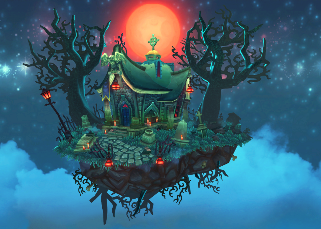
Hi all! I'm yet another long time lurker, first-time poster. I've been working on my entry for the Blizzard mini-enviro contest. My concept is a combination crypt/library...or something along those lines.

There's still a few days left to work on it, so I'm taking suggestions. Help me out?

7.png
wire.png

Replies

  • aajohnny
    Offline / Send Message
    aajohnny polycounter lvl 13
    This is fantastic! great execution.
  • Illusive
    Offline / Send Message
    Illusive polycounter lvl 8
    really nice! i don't know if i have any crits for you though sorry hehe
  • Jessica Dinh
    Offline / Send Message
    Jessica Dinh polycounter lvl 10
    Holy crap!! The modeling has so much character in it, and I love your composition too. Great branch/root alphas!

    However, I don't understand why the rimlights and clouds are blue, when your main light source is red. Imo, your tree branches could use a few more loops for silhouette too, as they are a little too angular right now. Adding small floating land chunks around the main island might be kinda cool.

    Can you post some texture flats?
  • pixelb
    Offline / Send Message
    pixelb greentooth
    Thanks Jess! You're absolutely right about the rim lights. My reasoning was that they were blue because the clouds were blue, but, as you point out, the clouds are lit by the moon therefore all three should be the same color.

    8.png

    I'll see about adding edge loops to the trees. Props for the floating islands! That's a good idea. I'll also post some flats sometime tomorrow.
  • Jessica Dinh
    Offline / Send Message
    Jessica Dinh polycounter lvl 10
    Daaamnn, there we go!! xD I think your island pops way better now with the red lighting. Smart idea making the moon red too, the cools and warms go great together :]
  • cholden
    Offline / Send Message
    cholden polycounter lvl 18
    I really like this scene. It's also one of those times I can quickly spot and articulate bugs.

    Circles and numbered the areas in this pic:
    http://imageshack.us/photo/my-images/834/pcrit01.jpg/

    1) Noticeable gradient lighting seam. Should be easy fix in texture.

    2) "Whispy", curved shapes, not planar. The tree on the left is an excellant standard of what's reflected all over this scene. However, the right tress is planar as is the base. A quick bend of the tree and FFD in max the base would solidify the composition.

    3) the transition of edge and hanging grass is ridiculously obvious all around every edge. Illusion breakers are scene killers. Double up those planes to cover that edge up.

    4) Some of these long hanging roots are too flat and polygonal. Scaling down could help as a quick fix.

    Also, the base rock silhouette is really polygonal. A few chamfers would go a long way.
  • jeremiah_bigley
    Offline / Send Message
    jeremiah_bigley polycounter lvl 12
    Well you are just getting all sorts of paintovers aren't you... :P

    I am not so sure about the red and blue.
    Blue/green and Yellow are closer to complimentary colors. I feel the yellow gives tons more visual interest.

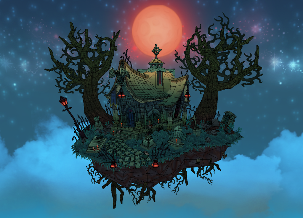
    That and you are seriously lacking some shadows/contrast. You should render an AO for this thing... When you look at the image from afar it lacks a focal point because you are using mostly your midtones. Find your center of interest and pull the eyes there through shadow and light (contrast). Look at the small thumb to see what I mean. I also added a bunch of highlights across the edges of your house.

    Blizzard-color.gif

    You can more easily focus on the house which is the main piece.
    Here is the larger version. Sorry for the shitty paint over. Just meant to get the mood/color/feel.

    7.jpg

    Edit: Didn't mean to get rid of the details in the moon. I actually really liked them. You could almost define them more than what you currently have it. Glad you changed the tree rimlight as well. I manually did it in mine. lol
  • Jeff Parrott
    Offline / Send Message
    Jeff Parrott polycounter lvl 19
    This is looking great! In addition to what has been said I would work on your value separation of surfaces some. The walls and the ground both have a very similar value. I would adjust that so the ground is darker than the building walls/roof or vice versa. It will help the player/viewer read what is a wall and what is a floor better.

    Post some closer shots too. Love to see some details in things. Looks like you have a pretty solid attention to detail though.
  • Oranghe
    i like the red moon and how vibrant it is, like a blood moon hehe. The paintovers are really nice but i like your original also its a bit different see this color combo allot less then blue and yellow so if your not breaking anything in your scene i think its refreshing. :) but your doing a great job will save this for inspiration later!
  • Jessica Dinh
    Offline / Send Message
    Jessica Dinh polycounter lvl 10
    I agree with cholden, those are some really awesome crits :0

    I'm with Oranghe on preferring the red moon. It seems a more fitting color for your subject matter, symbolically and mood-wise (it has more of an unusual and evil feeling to it, whereas yellow moons are quite common irl).

    I think you can make the red work, but something I really love about jeremiah_bigley's paintover is his sense of contrast and focused lighting. In his paintover, the viewer's focus is totally drawn toward the house, whereas what you have now has the eye looking all over.
  • sybrix
    Offline / Send Message
    sybrix polycounter lvl 12
    The first thing that struck me was the overall brightness and saturation of everything. I second the suggested to up the contrast a bit and to try to make the crypt (love the "book roof"!) stand out as the focus point.

    I absolutely adore the design, shapes, and color though. It's very beautifully done. Any chance we can see some flats, or a description of how you approached the texture work in general? ;)
  • pixelb
    Offline / Send Message
    pixelb greentooth
    flats.png

    As per request, here are my textures. Loads of space is wasted and there are lots of unique details that could've been tiled, but this is all about the beauty shot so I was wasteful wherever it saved time or lead to less distortion/seams.

    Also, none of these are at their actual, obscenely-high render resolutions. I figure it doesn't matter much if the textures are at true WoW resolution, but if I downsize them it'll be the very last thing I do.

    @cholden and jeremiah: These are both excellent paintovers, thank you! Jeremiah, I'm not sold on the yellow 100% but I'll give it a shot and see how I like it. You nailed the contrast though, and I'm thinking I can improve mine with a few tweaks to my postprocess chain. cholden, I'm with ya all the way. Brilliant stuff, I'm gonna go work on these things and be back later.
  • pixelb
    Offline / Send Message
    pixelb greentooth
    Well that took altogether too long.
    9.png
    9_yellow.png

    I admit the yellow looks more unified, but I just have a hard time committing to it.

    changes:
    -floating chunks, brought back the "post mortem libri sunt" sign (latin for "after death, there are books", or so my took-latin-in-high-school friend claims.)
    -added an extra grave
    -drippy candles!
    -color grading lookup table (really subtle, adds some warms into the scene)
    -reshaped ground
    -countless other minor tweaks

    detail1.png
    detail2.png
    detail3.png
    detail4.png

    There'd be more shots but unfortunately it doesn't hold up from various angles, the rim lighting in back blows everything out.
  • Artist_in_a_box
    Offline / Send Message
    Artist_in_a_box polycounter lvl 7
    I gotta get me some hand drawn stuff done. That is really nice, full of character.
  • Jessica Dinh
    Offline / Send Message
    Jessica Dinh polycounter lvl 10
    This is looking so great now haha. Awesome.
  • chrisradsby
    Offline / Send Message
    chrisradsby polycounter lvl 14
    Yeah that looks really awesome, great work!
  • KyleJensen
    Offline / Send Message
    KyleJensen polycounter lvl 12
    The textures + lighting is amazing. Great job. :)
  • Oranghe
    awesome thank you for flats this is really lovely!
  • floon
    Offline / Send Message
    floon greentooth
    Good choice to adopte Jessicas floating island idea and spice it up with the sign. Keep up the good work :)
  • Fomori
    Offline / Send Message
    Fomori polycounter lvl 12
    Excellent improvements. You did a great job on this. Inspiring. Wish I could paint like you!
  • Jeff Parrott
    Offline / Send Message
    Jeff Parrott polycounter lvl 19
    Very cool. Nice job taking crits and implementing them too.
  • sybrix
    Offline / Send Message
    sybrix polycounter lvl 12
    Thanks for posting the flats :)

    The improvements look great. I personally prefer the red scheme. :thumbup:
  • Josh_Singh
    Offline / Send Message
    Josh_Singh polycounter lvl 18
    sick bro. thought it was a painting at first. gj
  • pixelb
    Offline / Send Message
    pixelb greentooth
    Updating an old thread with some good news. My entry won! I get to fly to Blizzard's campus next month to meet my mentor and the other winners. Suuuper excited about that. Huge thanks to everyone who commented on this thread, your feedback made a big difference.
  • Jessica Dinh
    Offline / Send Message
    Jessica Dinh polycounter lvl 10
    Congrats, and see you in April ;)
  • Kushy
    Offline / Send Message
    Kushy polycounter lvl 9
    great work! Massive congrats on winning. What was the final poly / tri count for the image?
  • Hydrogen
    Very nice job. It really feels like Blizzard !
  • KennyTies
    Congrats on winning the trip to blizzard, this is really inspiring work here.
  • Slowtax
    Very cool you're gonna have a blast out here, Congrats! :D
  • pixelb
    Offline / Send Message
    pixelb greentooth
    Congrats, and see you in April ;)
    Jess, did you win too? I didn't know you entered.
  • KyleJensen
    Offline / Send Message
    KyleJensen polycounter lvl 12
  • Nina I.
    Offline / Send Message
    Nina I. polycounter lvl 5
    Congratulations pixelb, your entry work has a lot of personality! Happy to hear it even won you a trip to Blizzard's campus! Have a good time!
  • Isaiah Sherman
    Offline / Send Message
    Isaiah Sherman polycounter lvl 14
    The only crit I would have is reducing silhouette sizes on some of your models, they seem a bit over-exaggerated, even for the WoW style.

    Congrats on winning!
  • Nina I.
    Offline / Send Message
    Nina I. polycounter lvl 5
    By the way, would anybody have a link to a page where all the submitted entries (or winning entries) are displayed? If there is one? I did a quick search, but didn't find one, only the contest rules page on Blizzard's website. :)
  • pixelb
    Offline / Send Message
    pixelb greentooth
    Noted, Haiasi. I'll keep it in mind in the future.

    No idea when the winners will be announced. :( I'd like to see all the other entries as much as anyone else.
  • Macattackk
    Offline / Send Message
    Macattackk polycounter lvl 7
    wow grats! i guess thats what you get for posting on polycount lol
Sign In or Register to comment.