Moonshire - WoW Inspired environment
Environment Video:
[ame="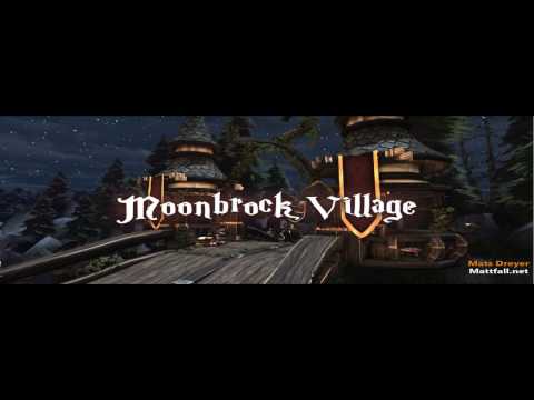 https://www.youtube.com/watch?v=LqrLRk8g8js"]UDK WoW Inspired Environment - Moonbrock - 1080p - YouTube[/ame]
Original post:
Hello guys ! After lurking here for about a year or more I desided to actually post something since I'd love some feedback and perhaps some help.
Currently making new environments for my portfolio so I can delete everything that on it atm since most of it is horrible")
Decided to do one Hand painted environment as a start.
Ill put together a texture sheet for my textures later on, I seem to keep going back and handpaint over as I get a bit better haha
I'll struggle most with lighting and colors in my scene
Here is some of my houses:


[ame="
https://www.youtube.com/watch?v=LqrLRk8g8js"]UDK WoW Inspired Environment - Moonbrock - 1080p - YouTube[/ame]Original post:
Hello guys ! After lurking here for about a year or more I desided to actually post something since I'd love some feedback and perhaps some help.
Currently making new environments for my portfolio so I can delete everything that on it atm since most of it is horrible
Decided to do one Hand painted environment as a start.
Ill put together a texture sheet for my textures later on, I seem to keep going back and handpaint over as I get a bit better haha
I'll struggle most with lighting and colors in my scene
Here is some of my houses:
Replies
Got most of it in UDK at the moment so I'll post screens from that soon, I just cant seem to get my lighting looking good like at all, been at it for 2 days lol. So hopefully you guys can help me out with that
Got a few more renders of some models (rendered these out in marmoset):
I can also post texture sheet once I'm done if anyone wants to see them, noticed alot of them needs to be redone and cleaned up. Anyway pics !
As for lighting, I've been learning a lot about that lately too, and here is some advice people gave me: Turn on self-illumination for your textures (between 50-70%, but you should totally experiment what value is best for you) and light with a warm directional light from the front. You can add a fill light too, if you want, like a weaker, cool one. Not sure if you know all this already, but this advice was really helpful to me!
I would love to see the texture sheets.
Edit: Jessica posted while I was typing.
Ill remember that for future renders, most of these images are also scaled down around 50-60% - not sure if people would like massive images :P
Yea I've done pretty much what you've said but it still comes off as really bad looking, taking a few screens now so should be up soon
(sized these down a bit too hope that's okey )
and excuse some of to overused bloom, especially to the right, no idea why that's happening
comments and crits very much appreciated, no matter how harsh it is
For the lighting if it's nighttime use a strong moon light to create some slight shadowing here and there for example.
The water is looking out of place in my opinion because of its realistic look.
Like ParoXum says there is no focal point with the lighting.
The individual assets are looking great. I really like your modeling on the bridge. It reads well. Some killer lighting will really help solidify it all together.
@Tokoya and marq4porsche - thanks
@Gannon - I will and thanks
@jsargent - odd that you mentioned it, I already have the beams for the buldings made, but I took them off before exporting since i wanted them pointy, but ill definitely try that out
@ParoXum jeffro - Thanks you ! Ill definitely do all of that
Anyway todo:
stronger lighting (focal point)
Get house roof back their beams
Fix water
Fix color on trees and value
Heightfog and perhaps fog planes
New skytexture
Thanks again, really helpful !
I kinda got stuck on how to improve my environment in its current
state, even with the feedback, so I just deleted my entire map and started over :P
I also buildt a few new models for it so Im going to leave these here and
post images from the semi finished envrionment in my next post.
Keep up the amazing work!
The one thing that bothers me right now is the size of the trees are all exactly the same. Get some size differences in there and things will start to look really natural.
Also if it's a semi night scene I'd expect maybe some more sunset-ish colors... just a thought. Can't wait to see more of this!
edit: Snader, I guess you mean my banners, where I could have modelled around the golden border to save some polys.
Thanks artquest, yea I changed the entire environment now, the trees have different size now and placed in layers so it looks better. taking some pics, hopefully up soon
These are the few small things I noticed:
1-the knot in the middle of the barrel is weird. too big, too centered. It just really draws the attention.
2-The ropes need to be one smooth group. Right now they have really sharp edges and look like cubes. (this is the worst offense imo)
3-on the blue banner at the bottom you can see the gold outline is stretched on the left side. If you turn that one edge it'll clean that up. (all banners could use an edge turn)
all in all not much to nitpick, I had to get pretty picky to come up with those crits.
So far I've redone the entire map with a nice composition and layout. a good amount of new models.
Fixed lighting to the best of my knowledge. also added specular maps (coloured) to most of my materials.
thanks for all the feedback, I noted them down, so I can be lookout for these kinds of stuff in the future, but i barrely finished this scene, so I most likely wont go back just for tiny updates. And they where my first cloth folds ever :P
I also barrely couldnt handpaint when I started this so learned alot
Sorry if these images are to big for some people when first loading!
More images on my portfolio and new renders of those houses
currently making a tiny video of it also so if people want ill put the link up here as well.
I'll just mention on the banners too. With the amount of polys used you really could just model the shape, even add a few tris to round the bottoms out nicely, and it would probably have better performance than including the alpha.
You'd really only need alpha for jagged edges, holes, etc...
@Tokoya - Ill try put something together, bit embarassed to show them as I know my handpainting skills are still very limited
@tehser07 - Yea Lighting is far from my strongest points, currently learning it.
@ParoXum - Actually wow terrain got these small spikes some places and its generally buildt in the same way so that's why I decided to keep it like that
@Baddcog - Thanks for that, does make sense
I updated first post with the super small preview video, nothing fancy and I was suppose to animate my bare trees and have floating books etc with Matinee but ugh :P
link here: [ame="
that is freaking amazing haha
I was about to mention this before I saw your post. Good call! Another thing I'd do is extrude some of those roof tiles out to add some depth. This will help quite a bit since the player will likely view them from below. Blizzard does this quite a bit in Diablo 3 too. Check out the rooftops in old Tristram for reference.
This wiki article goes into greater depth about what I'm talking about
http://wiki.polycount.com/ModularMountAndBlade?action=AttachFile&do=view&target=Modular_MountBladeMod_02.jpg
Really nice scene btw
and @Sayanora I love this tutorial! Such an awesome trick. Instantly favorited.
Thanks for that tutorial Sayanora, I was thinking about doing it similar to that and also add shingles/tiles at the end of my roofs sticking out, but i ended up keeping it low poly :P bookmarked anyway!
Thanks Seirei, yea I did go with a higher poly terrain at first with some soft hills, but it didn't look right at all, so ala spiky hills :P
and I've always wanted a mind=blown comment !