Genius Kids' Garage(img heavy)
polycounter lvl 18
Hey there, fellow polybros(and sises)! ")
Here's a little something I've been working on lately. It's an environment roughly based on an amazing picture by Arnold Tsang that I absolutely adore. I would like to thank Arnold once again btw for making great art and for letting me use it.
I didn't just replicate the thing in 3d though, but rather used it as a base to build upon. My story with it is that it's a garage of some genius kid, who built a robot working on(or making) soup for some sort of a school project.=) The scene has some futuristic stuff, though time is indefinite. I just combine things I see fit trying to keep a little childish feel through the whole thing.
Still plenty of stuff to do. I've gotta finish the robo arm under the ceiling, the ladder on wheels(how do you call it anyway?) and a couple of tool carts. Then a whole bunch of filler props to create an illusion of a really cluttered workplace of a genius kid(cardboard boxes, tools, toys, spare parts, pieces of paper, etc...).
I would really love to hear what you guys think especially concerning lighting and atmosphere. Once again please tear me apart - I desperately need to get much better. Srsly. So crush me - I'll love it)
Personally, I think that the robot head is really overblown right now, even though that's how the light would really work. I'm thinking about making a different lighting channel for the head and toning this down a bit. What do you guys think? Maybe just toning down bloom would be enough?
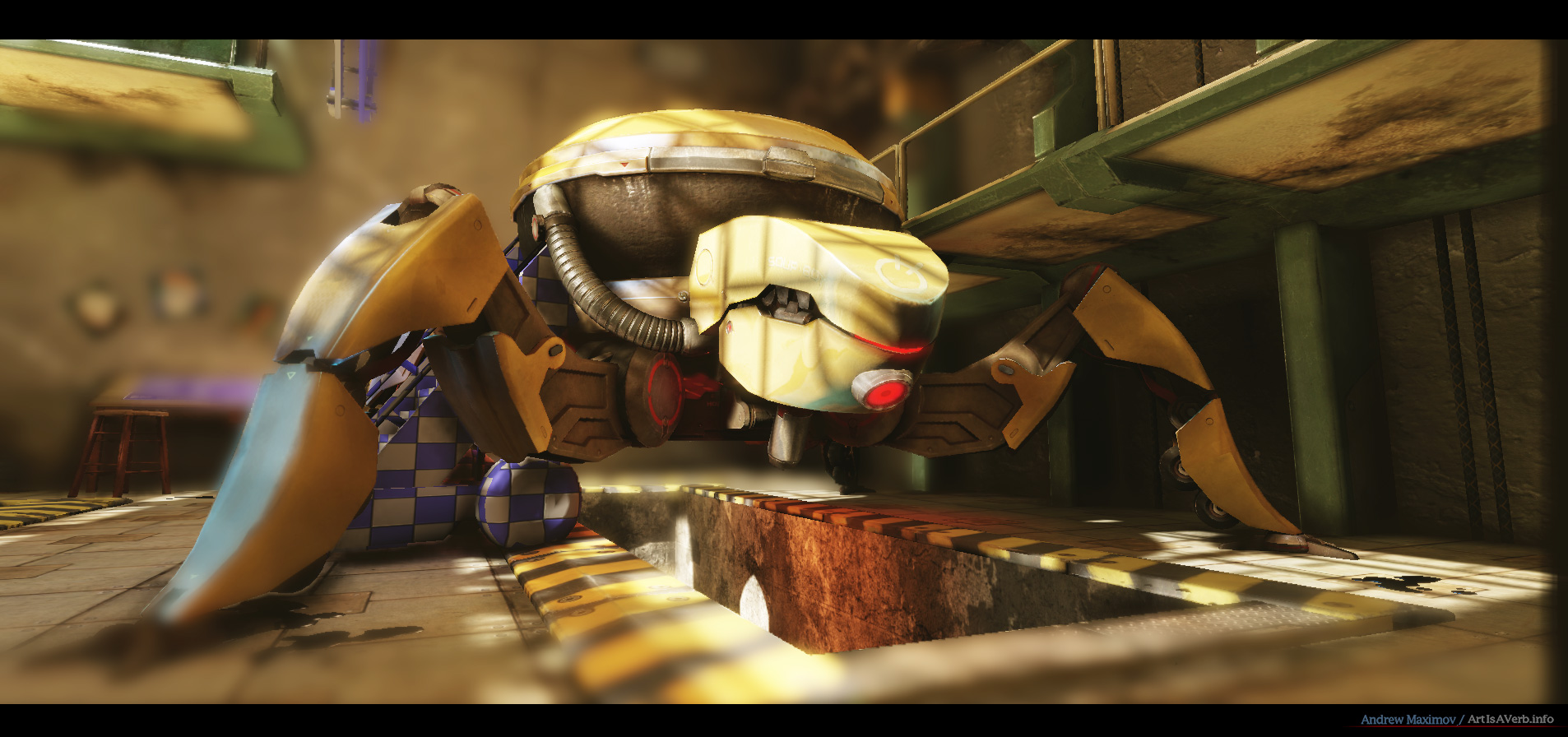
Oh and here's a render I did for Arnold a while ago. It's supposed to show the SoupBot highpoly to some extent:
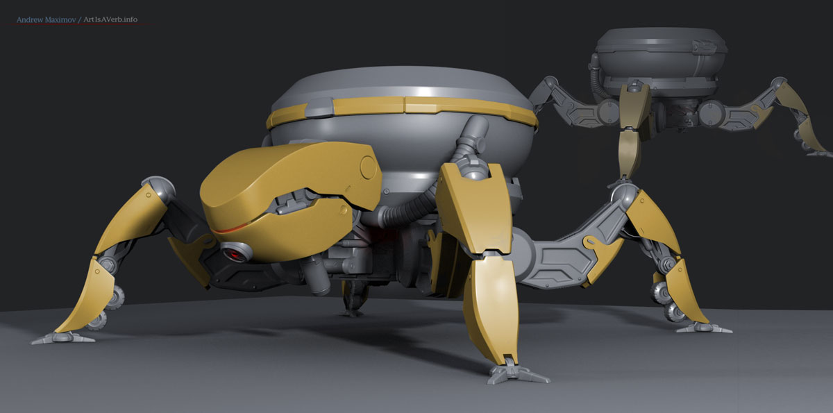
It really took a lot of restrain not to overload the poor guy with details.=)
I also a made a little PROGRESS ANIMATION in case someone's interested.
In the animation at day 12 you can see how the robot head is not so overblown - iroically it because I had a little issue with lighting.=) So when I fixed it became the way it is now.)
Oh and yeah there are some Epics' props that come with UDK here and there and tbh I don't really plan on redoing them. Do you think it's be okay? I mean I hope the sutff I did shows my ability to model and texture so now I want to display my ability to make a pretty environment with everything I have.
Anyway I thank you for your attention Have a nice day and I hope to have some update for ya soon.)
Cheers
p.s. don't forget to check out the full size.
Here's a little something I've been working on lately. It's an environment roughly based on an amazing picture by Arnold Tsang that I absolutely adore. I would like to thank Arnold once again btw for making great art and for letting me use it.
I didn't just replicate the thing in 3d though, but rather used it as a base to build upon. My story with it is that it's a garage of some genius kid, who built a robot working on(or making) soup for some sort of a school project.=) The scene has some futuristic stuff, though time is indefinite. I just combine things I see fit trying to keep a little childish feel through the whole thing.
Still plenty of stuff to do. I've gotta finish the robo arm under the ceiling, the ladder on wheels(how do you call it anyway?) and a couple of tool carts. Then a whole bunch of filler props to create an illusion of a really cluttered workplace of a genius kid(cardboard boxes, tools, toys, spare parts, pieces of paper, etc...).
I would really love to hear what you guys think especially concerning lighting and atmosphere. Once again please tear me apart - I desperately need to get much better. Srsly. So crush me - I'll love it)
Personally, I think that the robot head is really overblown right now, even though that's how the light would really work. I'm thinking about making a different lighting channel for the head and toning this down a bit. What do you guys think? Maybe just toning down bloom would be enough?
Oh and here's a render I did for Arnold a while ago. It's supposed to show the SoupBot highpoly to some extent:
It really took a lot of restrain not to overload the poor guy with details.=)
I also a made a little PROGRESS ANIMATION in case someone's interested.
In the animation at day 12 you can see how the robot head is not so overblown - iroically it because I had a little issue with lighting.=) So when I fixed it became the way it is now.)
Oh and yeah there are some Epics' props that come with UDK here and there and tbh I don't really plan on redoing them. Do you think it's be okay? I mean I hope the sutff I did shows my ability to model and texture so now I want to display my ability to make a pretty environment with everything I have.
Anyway I thank you for your attention Have a nice day and I hope to have some update for ya soon.)
Cheers
p.s. don't forget to check out the full size.
Replies
Since it's kinda futuristic -ish i think you need to add a computer of some sort. With a filled desktop.. And something that came to my mind would be ebay boxes, like scattered all around in different sizes..
So far it looks really good! Keep it up
sltrOlsson, thanks, mate! Yeah I've considered a computer but for now decided to go with the blueprint table. I thought that it would help keep things more "garage" then "laboratory".) I also thought it would create a funny contrast between the tools and what's been achieved with them. To sort of keep the viewer guessing how did he do that, so much with so little.
Now that I think about it, it's sort of like a lot of amazing polycounters.)
And yeah I've no idea what do ebay boxes look like(since it's a pain in the ass in our country to ever receive something from abroad) but I sure plan on a whole bunch of different cardboard boxes.)
SimonT, thanks a lot, man! I'm putting a lot of hard work into it.) And, well, you could probably say that my future depends on it to some extent.
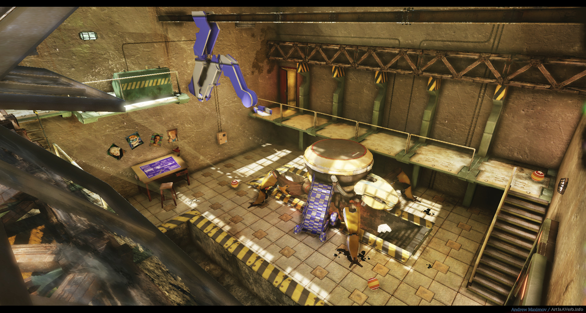
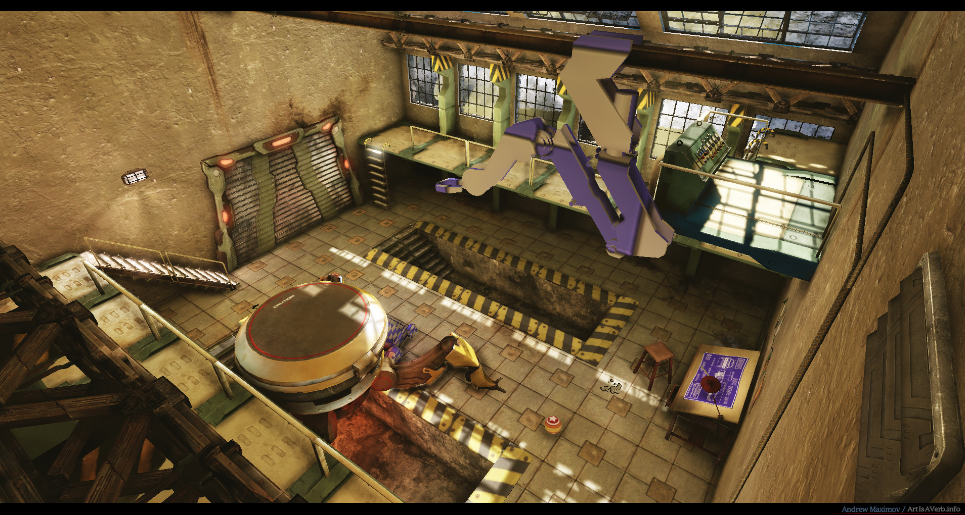
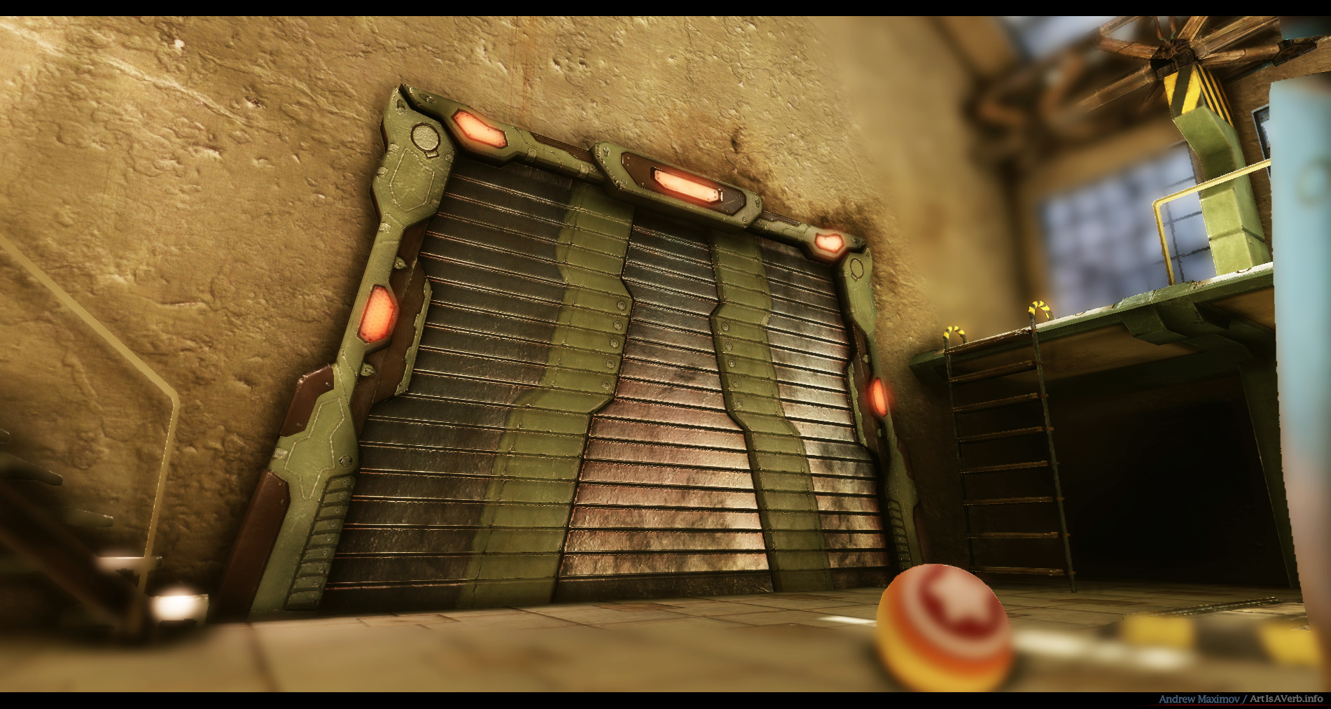
So, here's today update. I did the wheeled ladder thingy and finished up with the table area.
The ladder thingy is around 2000 tris and uses a 1024 map set.
I also decided to throw in the blueprint picture and ladderthingy HP render in case someone's interested.
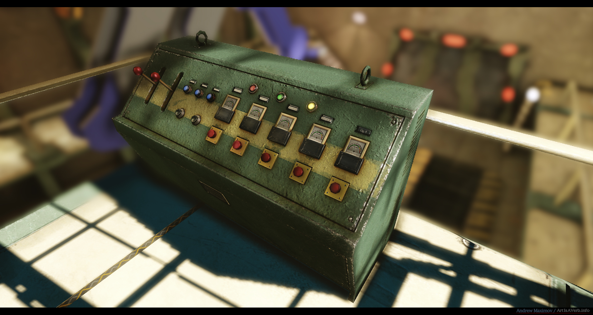
And yeah, here's the diffuse texture for the ladders and stuff you can't see on the pictures because of all the DoF=). And they aren't all that important to make a pic aboot 'em but their texture could be a good example of how my textures look.
Still a bunch of stuff to do. Up next will probably be the tool cart and misc. tools=)
Thank you for you time and have a nice day
individual assets and textures are lookin really nice. Overall scene is lookin kinda bland/empty in a few places but it's still wip so can't really comment yet
Would be awsome if you could get some of them blue/teal colours going in the shadow areas like in the concept
In the meantime, a little update:
I've been adding a few little things here and there. It was kinda strange 'cause they aren't like this important central pieces, so I had to strike a balance between wasting time on something people won't see and making things look nice. That's always a challenge in our line of work I guess.) Nevertheless, here's the highpoly for the tool cart:
Not the most smartest design I guess, but well, at least I enjoyed doing it.)And here's how the cart looks in game:
Here's other stuff, mostly boxes and cabinets:
And my favourite - the Donald Duck Clock:):
The clock actually works.) Since I do get bored sometimes, working so much, I entertain myself making stuff like this. Here's the network:
so in case someone's interested, all you need to do is make sure axis of rotation is right in the center of your texture(for the sake of convenience at least) and your clock hands are all in separate channels. The picture explains the rest, I guess(if not feel free to ask). I used a time node and multiplied it, so that you could adjust the speed of the time passing by(in case you want to show someone that the hour hand is also moving for example).
Oh, and yeah, apply a black outer glow set to multiply to your clock hands so that you have some shadow around. This really makes them pop out.
Hooray for next week, when I'm gonna do the robo hand. I'm really hungry for some nice highpoly work lately.
A couple of story props and some more junk and I guess I'll be calling it done. What do you, guys, think? I've heard opinions that I should not add much more details not to make the scene feel cluttered. But I kinda want to, so I'm interested in what you think.
Anyways thanks, for your attention and have a nice day.)
c ya=P
Textures and props got really nice details.
But what i noticed is that while the fill of the scene looks great, the overall architecture is looking quite basic now. It almost feels like a giant box.
U could break up the wall flatness by introducing few "structural" extrusion here and there for example. The big roolup gate could get recessed into the wall as well.
Some more support beams nt the ceiling would help as well.
Eventually some lighting adjustments would be good. Right now the room is quite uniformly lit. But the upper half would be darker normally
Also in your case sun beams dont help to see the center piece better. In contrast, it actually makes it harder to focus viewer's attention on it cauz the room is averagely bight but beams kinda overexpose the surfaces that they are touching.
But if u would darken the whole room lighting and especially the upper part the contrast of sunlight vs ambient light could become more obvious.
Oh, and maybe its only me, but the blur/DOF efefct is not helping. It is not natural becuase we r not looking at macro scene and sometimes feel annoying when the part of the scene is masked out by a blur. U need to make it easy to read without the "aid" of DOF
One thing I've noticed though is a lot of the pieces of the environment look noticeably dirtier than the floor, which looks relatively clean aside from some oil.
Whatever you do, just don't change the Donald Duck clock. It's perfect.
looking good so far
Those are called rolling ladders or rolling stairs.
The only major thing I am seeing wrong with the scene is that some of your objects lack functionality. Specifically that rolling ladder... it doesn't look like the wheels can turn at all, and in that small of a space you need it to turn quite sharp... also it looks like it is motorized, so put some levers or pedals in there for controls.
Also it looks like you are having some pixel density issues between the concrete and your caution borders for the undercarriage access areas.
other than that it is looking like a great piece.
OH. Fix that tape. It is giving me chills just looking at it... -_-
Hey,Heartless, thank you for your post! I grunged the floor up a bit. Nothing too crazy though, cause I really don't want the whole thing looking too messy.
MatthewS, you got me with my pants down, mate.) I really didn't think through the functionality of the rolling ladder, since it was pretty much on the pic I drew my inspiration from. My bad. My only excuse would be that it's made out of some light materials and can just be dragged around manually.) thanks again!
Vlad, thank you so much for the great ideas.
Yeah the architecture is pretty plain. I'll definitely try to pay more attention to the issue in my future projects.)
But most of your advices were pretty much spot on. The prolonged supports work great, the door got recessed a (little) bit and instead of extrusions I just put pipes along the walls. I tried to fiddle around with extrusions in the walls themselves with pipes running inside and stuff like that, but they overcomplicated the scene for me, so I had to drop them.
Tweaked the light a bit but still trying to keep a very bright and sunny day feeling.
And, yeah, I was easier on DOF this time.) I never really played with it so I guess I just got a bit carried away with the new toy :-)
Anyway here are the pics:
still some DOF, but it got better from there.)
I also redid the SoupBot pic with all the assets now in place. You can see the first prize ribbon from the science fair proudly glued to it.=)
Billy waited a really long time for it!
It's quite messy in the garage.
Oh, btw, did you notice, I actually did manage to put some greenish hues in the shadows. It's pretty subtle but I'm still very glad about it.)
I'm close to calling this done, but I can't really do it before hearing what poly bros and sises have to say.
I'm tired as fuck)
Cheers! Love you all.
you could not have missed that
I'm very glad you like the whole thing and if there's any specific prop you'd like to see a breakdown of - feel free to ask. If not I'll just post a couple of random wirez and textures later on.
Thanks, Cooljay! Yeah I love those=) too bad they don't show them around here anymore. Dexters Lab was probably my favorite series when I was a kid and though my english wasn't so good back then it was quite enough to understand "DEEDEE, GET OUT OF MY LABORATORY!!!" X)
ShootandRun, thank you very much! I'm glad you like it.)
arrangemonk, sure, man. I didn't miss it. It's just that I wanted a pointer for seconds' too, but Donald Duck with three arms would be more of a fallout thing I guess.) Thanks for noticing though.
So, now a tiny update. I was just messing around with lighting here, trying to make things better.
Here are the changes:
I'd consider it a failure not to squeeze everything there is from this project, so any ides and opinions are still very much appreciated! What do you think about the lighting now, guys? Here's a fullsize version of the shot but as you can see the quality is pretty damn poor right now since baking takes sometime on my rusty machine.
Thanks for your patience and I hope you had a great weekend!
Cheers!=)
if anyone else has any more comments, please comment...
good night
Did you have to make a high poly for everything? You could have probably made the robotic arm's normal map using floating geo.
Looking forward to more progress!
Love that award badge on the spider robot, nice touch. Maybe it could be even bit bigger to notice it more...
Textures r great as usual here.
Maybe some hanging wires from the ceiling...
No I didn't make a highpoly for everything.) The little stuff here and there doesn't need it. And from the bigger stuff the green cabinet from this pic and similar green cabinets didn't have any.
But other than that I did a highpoly pretty much for everything. I got pretty quick with it, so it's no trouble.
I actually challenged myself once to make a scene where no object had a highpoly and some didn't even have normal maps and it looks like you can survive just fine that way.)Feel free tocheck it out here, if you're interested.)
And yeah, thanks you, I use floating geometry extensively. In fact if it wasn't for it I think a lot less objects would have a highpoly:) working without it would be a torture now. You don't see them as floating on the render because they don't cast shadows. Just a nifty little trick:
Thanks a ton, Chris! Yeah, man, no budget) Just making stuff pretty. Many things could be optimized here, but, hell, thats what day job producing videogame art is for.) Thanks for the lamps thingy. I've thought about it too, but unfortunately they won't even bee seen on the final shot so I din't even bother.=(
Hey, Vlad, thanks a lot!
Yeah, it's the little things...:)
And thanks for the wire idea. Originally I was planing to do some fuel hoses coming down from the top, sliding on tubes that go through the whole room, much like the beam The Claw is attached to. But later on it felt like it'd be too much.
But I added a little one for the sake of composition anyway.=)
Soooooooooo. After fiddling around a little more I'm finaly FINISHED!(drumroll) at least I hope so.) Here's the final image:
No jagged lines anymore, hooray!
As you can see, Greevar really got to me, so after some depressed ruing I decided that Stewie Griffin deserves a place on this wall of fame!
Allright I kid.) Actually, Karmageddon just pointed out to me that photo realistic pictures could create some dissonance and remind the viewer that the whole thing is unreal. That made sense, so I had to take them down. Thanks again, Jami.
I also did a new SoupBot highpoly pic for my website:
And now some breakdowns! Here are some selected textures.
I also used detail maps and cube maped surfaces extensively.
The Claw Wires:
And a really sloppy SoupBot wires that I threw together quickly 'cause I'm lazy :P
No tri count, 'cause, as you can see, I didn't really optimize the whole thing properly. But if you're still interested it's around 4k tris for the leg, 5k tris for the head and 6k for body.
So.....Huge "thank you" to anyone who has been following this. I greatly appreciate it.
Btw I might be able to pimp my website soon too. Currently I can't, due to some issues but I'm trying to solve them.
Thanks again and have a nice day!
Cheers
U definitely put tons of work in it and it looks quite great - consistent, good attention to details, beautiful textures.
Probably u could show more scene shots for the final presentation as that "top" view is ok for the overview but not really promoting the scene. The first-person shot or two with closer look at the scene would help
Also as for the future u might think your lighting a bit better. It still works fine here, but seems a bit too uniformly bright. Well, anyways, that is minor thing here i guess.
Good job once again!
Congrats on finishing it!
yeah, definitely. I was planing on using most of the images I've posted so far, but having looked through them again, I think that redoing some with a full scene assembled and maybe making a couple of new ones would is definitely something I should do. Thanks for bringing that up, so dumb of me to miss it:) Expect a few more shots!
And yeah lighting is definitely something I'm looking forward to tackling in future projects. I'd gladly do something with a different mood, where you can really play with contrasts. Because here I just wanted a bright lit room from the start and a bright lit room I got. But Art(and game design) demand more pronounced focal points with lighting supporting the mood and guiding your eyes. So I'll try to make sure my next scene is built around that.
Thank you again, Vlad! You've given me very valuable advices along the way.
Thanks for the kind words, Pedro! Means a lot to me, especially coming from such a veteran polycounter. Huge Thanks!)
Thank you, Mad Man. Yeah I guess it could've been. But, well, art is about making choices and I made mine. Anyway, glad you like it.
You know how they say, that shit happens?) well it did. Last night, just when I was about to upload final images to my website, hosting went down. And stayed down all night. So I fell asleep while waiting.) But now I'm wide awake and here are a couple more shots:
Fullsize please!)
Hey, no DOF:)
And here's how the whole thing looks on my website.
Thank you once again for your time. Have a nice day!
My only critique is that the robot arm doesn't look long enough to reach the ground to work on anything.
billy blaze approved