Colonel Duke
Soooo, I recently joined polycount, mainly because when I looked for help/advice/tips on google, I'd often end up here. Since this site has a lot of nice, experienced members willing to help in a constructive way I though I'd join in on the fun...:)
I just finished a 3D character for my portfolio, and hopefully it'll help me get a job in the video game industry. Here's a quick video presentation of him.
Like stated in the video, visually the goal here was to have a next-gen level model with stylized proportions (like TF2) but with realistic, detailed textures (like Gears of War, Crysis, etc). Basically Brink but with more exaggerated proportions.
As for the character's personality, I invite you to take a look at the short film he is based off of to get a feel of his personallity. Colonel Duke is basically a Buzz Lightyear for adults, hahaha.
What I'm looking for here is some advice and constructive criticism on the model, especially on the technical side, so I won't repeat any errors on my next project.
I followed the basic workflow:
Here are the specs of Duke:
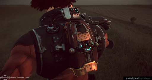
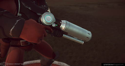
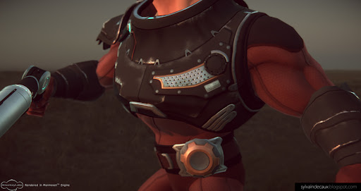
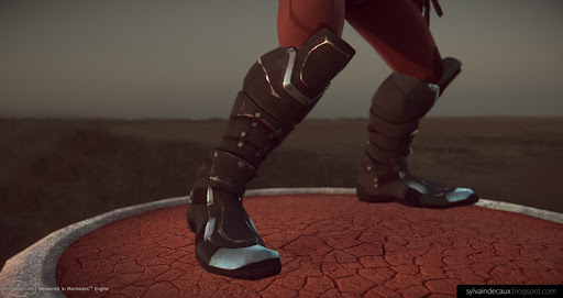
And here are some Marmoset renders:
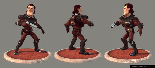
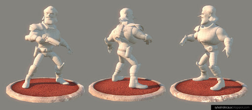


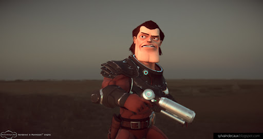
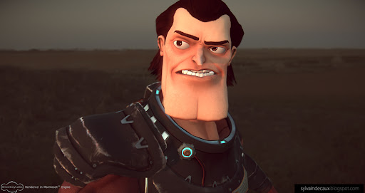
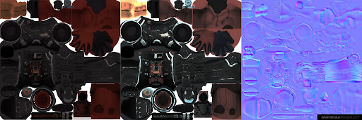
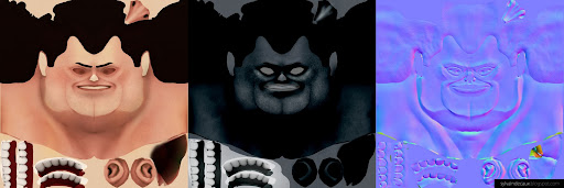
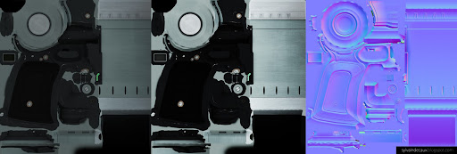
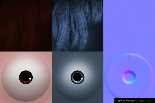
The textures:
The body
The head
The gun
Eyes and hair
So that's it, tell me what you think.
I just finished a 3D character for my portfolio, and hopefully it'll help me get a job in the video game industry. Here's a quick video presentation of him.
Like stated in the video, visually the goal here was to have a next-gen level model with stylized proportions (like TF2) but with realistic, detailed textures (like Gears of War, Crysis, etc). Basically Brink but with more exaggerated proportions.
As for the character's personality, I invite you to take a look at the short film he is based off of to get a feel of his personallity. Colonel Duke is basically a Buzz Lightyear for adults, hahaha.
What I'm looking for here is some advice and constructive criticism on the model, especially on the technical side, so I won't repeat any errors on my next project.
I followed the basic workflow:
-Base mesh in Max
-Sculpt in ZBrush, hi-poly hard surfaces in Max
-Retopo in Topogun
-AO and normal bake with xNormal
-Texture work in Photoshop
-Rigging in Maya
-Sculpt in ZBrush, hi-poly hard surfaces in Max
-Retopo in Topogun
-AO and normal bake with xNormal
-Texture work in Photoshop
-Rigging in Maya
Here are the specs of Duke:
-Character: 15,676 triangles ; 2x2048 maps (diffuse, normal, glow) specular is a 1024
-Gun: 3,530 triangles ; 1x1024 map (diffuse, normal, glow) specular is a 512
-Gun: 3,530 triangles ; 1x1024 map (diffuse, normal, glow) specular is a 512
And here are some Marmoset renders:


The textures:
The body

The head

The gun

Eyes and hair

So that's it, tell me what you think.
Replies
Its..Amazing, Great style
my mind blew up
The boots and breastplate are quite delicious though. And a bit offtopic: I like his expression on the texture map.
@Snader: Initially he had a shorter, flatter nose, but I went for the pointy one because I liked its more aristocratic look. That being said, it's true that it doesn't work from all angles, I'll watch out for that. I still like my Poop-pose though,hehehe
And also, I think your texture work is better if the UV layout smiles at you, hahaha.
Technically, I think you could optimize this alot. Especially if this is going to be a portfolio piece for games, I think you could knock a few thousand tris off your current count - on top of that, your texture looks very blurry(especially around the chest and upper back) when you concider the map size and number
But again, stylewise I am completely loving this. GJ man.
My one comment would be the edge wear - i think it looks best on the boots when it is clean, not faded, and a little more subtle. I think you lose some of the solidarity on the torso and arms form them being a little fuzzy.
@moose: I started the texturing with the chest, and there I went for a "primer-fading-off" kinda look. Later, I moved to the boots with a "paint chipping off" approach. I didn't realize I did this until you pointed it out, and I think you're right, it make the shapes crisper and stand out more.
@moof: Thanks
Keep the advice coming, I love it !
@EVIL: I'm glad the boxy chin's working out for you hahaha !
@haikai: Thanks a lot, it means a lot from a talented artist like you ! The short WAS hard work but thanks to support from my loved ones it got finished.