Home 3D Art Showcase & Critiques

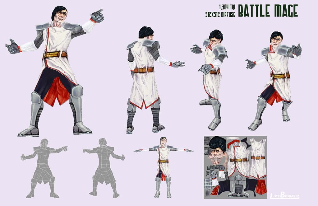
Low-poly Battle Mage character

polycounter lvl 9
Offline / Send Message
Shiniku polycounter lvl 9
Tried imposing some limitations on myself and made a low-poly model with one 512x512 diffuse texture.

I wanted to keep it under 1K tris, but I got greedy and wanted fingers.

Modeled and rigged in 3DS Max 2010, Textured in Photoshop CS4 and Mudbox 2010.

Comments, critique? This is my first time trying a character with these kinds of limitations.

magelout_web.jpg

Replies

  • Clintus Maximus
    I like him. The texture work is pretty good. The only thing to me is that nothing about him says "battle mage". Maybe in context with other characters or something this would be different but right now (to me) he looks like a senator from Star Wars or something. Futuristic but nothing makes me think spell caster when i look at him.
  • KyleJensen
    Offline / Send Message
    KyleJensen polycounter lvl 12
    White + red colors are more characteristic of a healer-type character (blame Final Fantasy for that)
    With that being said I think you should make his top a different color scheme.

    (EDIT: Post below explains the origin of that particular color scheme better. So don't blame Final Fantasy. lol.)
  • Mark Dygert
    Looking pretty cool.

    I agree about the color scheme, its not just FF that uses those colors just about every hospital, doctor, nurse, ambulance and game use those colors to indicate healing.

    I also think you could soften up the features of the face and inject a little more color, right now he looks kind of sickly, old and frail.
  • BlvdNights
    Offline / Send Message
    BlvdNights polycounter lvl 8
    Is this for the new Davey Havok game?

    745d1125424568-dude-thread-davey-havok-2.jpg
  • Shiniku
    Offline / Send Message
    Shiniku polycounter lvl 9
    Ah yeah, I see what you guys me. Overall I think I should have spent more time on the concept phase.

    My intention was to make a kind of evil looking dude in a primarily black and white outfit. The red was a bit of an after thought because it needed a bit more punch, but yeah, it doesn't seem to fit.
  • SpeCter
    Offline / Send Message
    SpeCter polycounter lvl 14
    This somehow reminds me of Anachronox xD
  • Skamberin
    Offline / Send Message
    Skamberin polycounter lvl 13
    Oh God, now I can't stop thinking about Sacred 1 and all the hours I spent in it.
    Echoing the colour change, I always felt gold and dark red fit a battle mage.
  • GarageBay9
    Offline / Send Message
    GarageBay9 polycounter lvl 13
    The white of his tunic is so blown out that it's very difficult to read some of the forms and shape of his clothing. Try muting it some, do a lighter gray or a light, faint cream, with more subtle color modulations added to break up the mass of lightness.

    Adding faint bounced light saturation (bluish from the top for the sky and reddish from the ground) may also help bring out some of the form. That could also benefit the boots and legs significantly.


    Last... I gotta say it...

    picjp.jpg

    There's some serious family resemblance there. :poly114b:
  • Shiniku
    Offline / Send Message
    Shiniku polycounter lvl 9
    GarageBay9 wrote: »
    The white of his tunic is so blown out that it's very difficult to read some of the forms and shape of his clothing. Try muting it some, do a lighter gray or a light, faint cream, with more subtle color modulations added to break up the mass of lightness.

    Adding faint bounced light saturation (bluish from the top for the sky and reddish from the ground) may also help bring out some of the form. That could also benefit the boots and legs significantly.

    Thanks for the feedback, much appreciated. That goes to everybody.

    Anyway, I tried to make some adjustments:

    battle_mage_reworked.jpg

    He's very disappointed. Or blowing his nose. Or something.

    And yeah, heh, few people are willing to sport a hairstyle so horrendous.
  • GarageBay9
    Offline / Send Message
    GarageBay9 polycounter lvl 13
    ...can you post a picture without his hands in front of his face?
  • Shiniku
    Offline / Send Message
    Shiniku polycounter lvl 9
    GarageBay9 wrote: »
    ...can you post a picture without his hands in front of his face?
    Yeah, sure. Sorry about that.

    Well, I didn't think the face was important there because I hadn't changed it at all. I went ahead and did some editing though, not sure if it's really an improvement.

    Here's a before and after, showing how he looked at the beginning of the thread to now.

    comparisonMage.jpg

    Edit: actually the one on the left is a version slightly before the first post. Close, though. And I'm sorry they're merging at the arm.
  • GarageBay9
    Offline / Send Message
    GarageBay9 polycounter lvl 13
    Definitely improved. The tunic is still feeling a little blown-out to me. If you're using pure white as the 'top' point of your highlights, you need to bring it down about 10-15% still (at minimum).

    The other thing I'm noticing is that the loops on his tunic that the belt goes through aren't really reading as belt loops very well. I know you're working with limited texture resolution, but experimenting with some tweaks there might help.

    I like the subtle light saturation you worked into the armor and the deeper shading of the tunic, that turned out pretty good.
  • n88tr
    his skin is so white he looks vampire-ish
  • achillesian
    Doesn't it seem kind of dumb posting a character with predominately white clothing on a white background?
Sign In or Register to comment.