Making the Perfect 3D Tutorial Site
polycounter lvl 17
Hey all,
I'm currently working on the second version of 3dCodex.com. Basically this is meant to be "the finest source of 3d graphics tutorials in the world."
I'd love to hear what people think of when they imagine the perfect place to find 3d tutorials. With the new system being built in ASP.net, the odds are if you can dream it, we can build it.
You can see some mocks below:
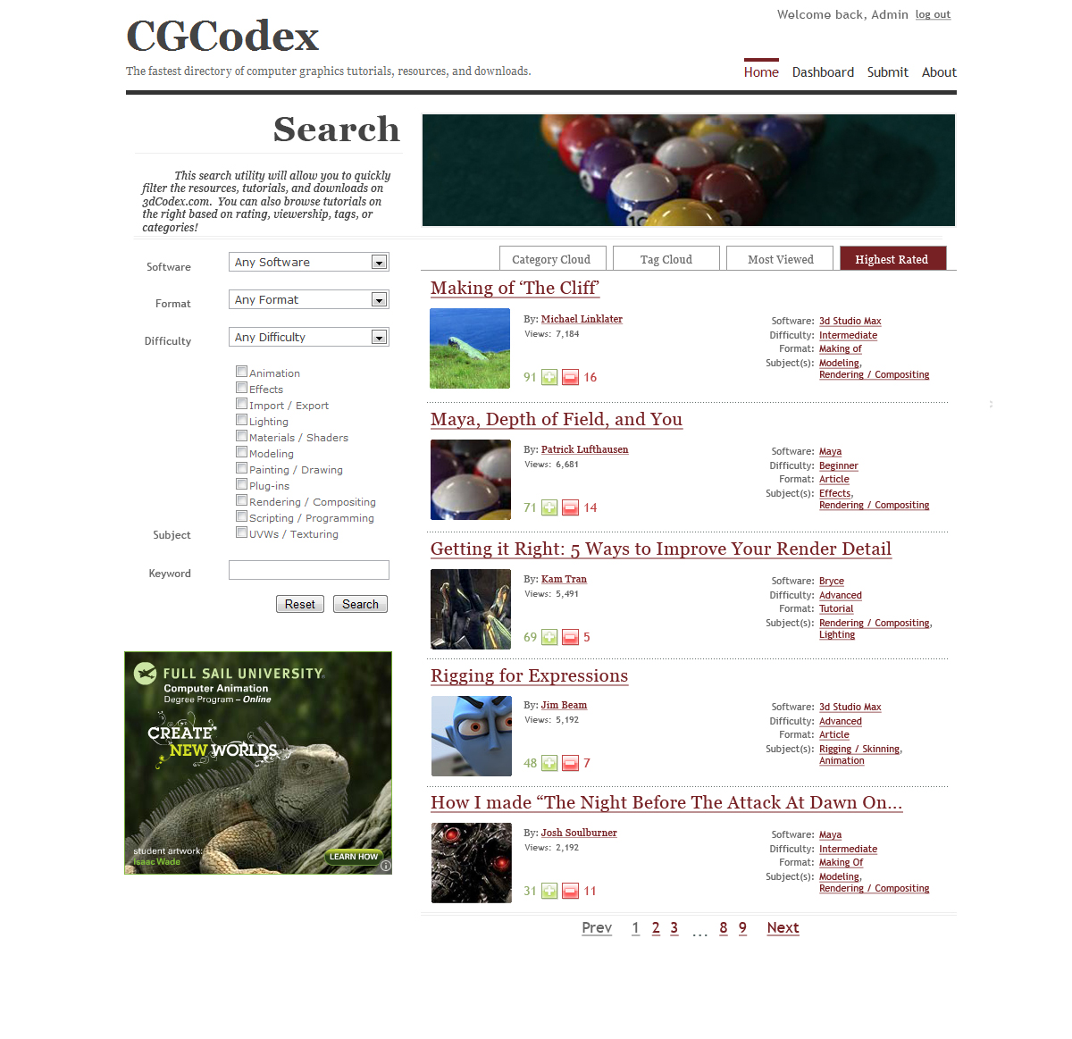
Replies
Right now I'm focusing on some of the submission pages & login stuff so this is the perfect time to get some more feedback!
make it easier (not more than 7 options to click)
the " perfect place to find 3d tutorials" would be a place where one person or a group of persons have made a "standard" for their tutorials and also they would make their own tutorials.
like the guys on http://www.guerrillacg.org/
@TNO- I can see what you mean. On the one hand, we'd want to provide full access to the flexibility of the robust categorization system the site will have, but on the other hand we have to be able to cater to users with partial queries (i.e. "give me anything for Beginners with Cinema 4D") or browse-directed users (i.e. "give me whatever's popular"). Let me hammer out a new mock.
Also, I'm considering a sub-domain called "fast.3dCodex.com" that'll be just a few search tools & search results. It'll be crazy fast and accessible from any browser- mobile or otherwise.
If you come to the site looking for something specific, like how to edit camera settings in Maya, then you can try to find it using the tag cloud or search. However, if you are coming to the site for an education starting with fundamentals and the moving on to more advanced topics that deal with those fundamentals you may not know what is most important to learn first.
Having a visual representation of how fundamental (basic), intermediate, and advanced topics are and how they relate to one another would be really nice.
These could be as simple as just listing tutorials out on pages (for example have a page that lists a path for new animators to follow), or it could be as complex as some sort of visual hierarchy or diagram that shows that regardless of which path you decide to follow you should probably understand the information offered in a specific number of fundamental or intermediate videos.
Now, its important to note I'm not suggesting making things complicated, this should be dead simple to understand and you should also focus on the number of clicks someone has to make up on entering the site before they get what they want/need. It should be as few as possible.
So, in summation, make the number of clicks as low as possible, and don't assume people coming to the site will know what they want, or that they want to browse through hundreds of tutorials or tags to figure it out.
+ The home page description and title was replaced with a super-simple-search box. It has focus on page load.
+ The left column was replaced with a tab mechanism, with Guided Search selected.
+ When you click on a link, that block of categories disappears and the results are updated.
+ Show All will make the column longer and show all the categories in that group.
It'll be tough to visually represent each category in the UI without getting cluttered. What if I have descriptive hints that show up when you hover over a category link I.E. "Making Of resources guide you through the creation of a specific work. They can provide screenshots or stages of development, but not necessarily step-by-step guidance like tutorials."
I see that you've been visually improving it a lot since I last saw it. I must say that I like it
I can't really give any good crits right now but I'll be back after some thinking
[Stretch] Ok- that's enough work for one morning. Grabbing lunch.
I really like the layout you have so far, but I think it may help to add in some background color to certain elements of the site. Right now it is one big white sheet with all this information on it, so I can see how some people may be a little confused as to where they should be looking at first. I think it may help define the sections a little better to add something as simple as a gray behind the search section, or the results. I hope you don't mind I saved your image to kinda show what I mean.
Just an idea
and the option with Show [10] is great
you could also use small icons for the programms and for the difficulty something like stars
the things that has been written by sXe Seany are also usefull
@TNO: Let me ponder that. I'm kind of shying away from icons right now but I'll add it to the ideas board.
yeah, should try for something more like this
+ The fastest,
+ The simplest,
+ The most comprehensive.
Those are both valuable and quantifiable, but the question of how to do it is still pretty open-ended. It'd be great to hear what you think would make for a good (hopefully- a "best") tutorial site!
Perhaps you could try and get permission to use some artists work for a header of the site?
I really like what you are doing though and have used the old site a bit. Keep it up and more power to you!
@Muzz- Are you referring to Paperpunch or the white/red one on the first page? I admit- I took some images as placeholders, but have no intention of using them without permission on the live site. The trouble with having lots of images is that it chews up user bandwidth and slows down the site. Goal #1 of this resource is to make it absurdly fast so I'm limited to one decorative image per pageload.
Give the impression that you're there, too. Throw down a forum, try to build a community, etc.
I'm reluctant to build yet another forum because it'll just be a carbon copy of what's already out there. 3dTotal, CGTalk, Polycount, and the rest of them almost all use vbulletin and hammering out another one probably isn't going to move the industry forward. For what it's worth, there'll be an easy way to submit feedback on the site so it's not like requests will go unheard.
As for the visual style, please understand that the graphics must be kept to a minimum. They're bandwidth intensive and the #1 goal of the site is speed and simplicity.
@Purplepaint: Right on. The feedback I've gotten so far will greatly reduce the number of clicks to get at the desired tutorials. The biggest factor in how many clicks it will take to find what you're looking for is how specific it is. Finding "3dsMax Modeling Tutorial Videos for Intermediate Users" will be a little deeper than "3dsMax Modeling".
Still trying to figure out where to put that Sort/Show pulldown set...
@Tekmatic: I see w hat you mean. What about a little color variation in the blue links? Something like...darker = greater importance? I did something similar along the top links, maybe I can carry that throughout.
Can I get a little more feedback from the people that requested changes? Otherwise I'm going to start putting this into production!
That being said, I think the search results should be MUCH more concise.
eg; The google way of having at least 10 results per page by default, and no thumbnails. strain out the extraneous details even further than you currently are. It's great that you can expand an entry to see more details, but take that as far as you can. If I can see 10 results per page without having to scroll, then you are kicking ass.
CONVENIENCE IS KEY!
* Think more visual! For instance, per entry instead of listing tags, you could use icons that represent application (3dsmax/maya/etc), media type (image/video/text), etc....
* Consider letting registered users configure the site to their tastes; eg: choose a light or dark theme, choose an even higher amount of default search results, etc.
* Consider ditching the serif font. sans-serif = modern = cutting edge = awesome! Honestly, this is subtle but impacts people's perceptions more than you might think. Your serif font right now really screams "Classy, sophistamacated, stodgy, etc"...IMHO
Not a big fan of the thumbnails either.
Otherwise, I think it looks promising.
Ratings are good for just quick appraisals, but comments(maybe not quite comments, but reviews, recommendations) would be even better to separate the wheat from the chaff, the good from the bad.
@Sean: Can do. It'll be up in the next revision this evening.
@CMan: Let me reflect that back to make sure I understand...
+ Tighten up the results. Make it at least 10 entries above the fold (~800px or so). Sounds like a plan!
+ Remove thumbnails from the front page. Not sure if I'm with you on this one- they're virtually the only images on the screen. Any fewer and you'll have trouble telling it's a 3d site. I could make them smaller though as part of item 1. Would that work?
+ Tighten up the results with icons instead of written categories. I'm reluctant to give up text-based navigation for SEO reasons, but I could be persuaded if it looked really sweet. I'll draw something up and get back to you.
+ User-selected styling would help. It's not core functionality, but it's definitely something for the roadmap. Shouldn't be too hard with this templated theme either.
+ Pick sans-serif fonts. Well, I do like classy, but I guess I can see your point. Let me root around for something more appropriate. One trouble is that the navigation font is Trebuchet MS which is sans serif, and that helped separate content from navigation. Any suggested solutions would be appreciated.
>> P.S. Looks like you're in Los Gatos. We could meet up for lunch and talk about it if you want.
@Elyaradine: Yah, the difficulty levels are rather subjective, but what I'm trying to avoid is just throwing people into tutorials without guidance on how difficult they are. Does the crowd at large think this might be an under-used feature? Remember- the more we can remove from the to-do list, the more time I have for other (more important) things.
My reasoning stands on the thumbnails. There should be some kind of visual clues to what the site is about and what each resource is about on the results page...
@Calabi: There's a system for user ratings, but nothing for comments at the moment. The trouble with comments is that:
a) I don't want my interface being muddied with "ZOMG DIS tut iS the SicK NESS".
b) Browsing some of the other tutorial sites show that virtually no one uses the comment feature. We're talking...whole pages of zero-comment tutorials. This is a nice, easy, one-click you did or didn't like it.
http://www.scriptspot.com/
is a good example of all the things we like around here....and it supports comments too.
Can you be more specific, cman? I can see that they have a strong comment community- might be worth a second consideration for that feature...
Also, if you asked me to describe everything I want ina tutorial site, I would describe CG Tuts+ with less ads. CG Tuts gets just about everything right in its design and presentation, I love it.
Probably the only thing I don't like about cg tuts+ is the large font size for the title but a minor nitpick.
What do you two think of the prototype posted above? Does it look like something you'd use?
http://www.scriptspot.com/search/apachesolr_search/uvw
They definitely have more clutter than they used to, and two-above-the-fold kinda sucks. but when you do scroll down to the entries, you can fit like 8-9 on screen at once, which is better than 3-4. It doesn't seem to me that the entries are verbose, just that there is a lot of clutter on the page.
They have more of a two-tone theme, which is a direction you've already started to take. They also have a visual logo that kind of makes them distinct as a 3D site, which is a good thing.
Those are the big things I was alluding towards I guess. Their general functionality is pretty good, and they have grown a decent community. You'll notice how their searches mix archive results with forum results, which is an interesting feature.
I was more a fan of their old design personally, but this new one isn't so bad either. One of the great things they used to have though was their search bar very prominent and "center stage" on their front page, ala google. They've changed it now though to showing news entries, which I don't particularly care about.
I would say in general though to be the best archive, focus on the making your archive the most easy to use, readable and reliable. Whatever means to those ends. Seems pretty reasonable to me.
I'm considering doing away with the expand/collapse "details" link and just making it click through to a new page with comments and the snippet. Thus, the purple "Comments" icon and the "Details" button will go to the page where you can leave comments, while the thumbnail image and title will take you to the resource.
Does that sound useful?
That sounds great