Thanks everyone!
I'm almost done with the base, just have to make the legs. I'm hoping I get the base done tonight... I'm going to be out of town tomorrow until Tuesday
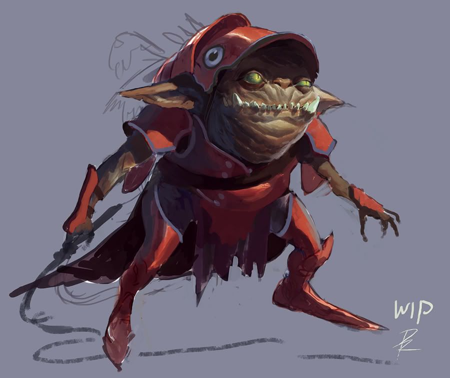
Yeah thanks Zipfinator. I know what you mean, the hair's more so a place holder. I'm going to have his actual hair long, sparse, and in strands. Like Smeagol's hair, except more of it. By the way, Mr.Delicious made the concept, not I
Achillesian, yeah, his stuff is amazing
Yamo, ha, pretty much. His concept's image file is entiteld "fishgoblinarmor," so I'd imagine so xD
I would rather see the back of the helm flow down his back like the scales of a fish. That way it would better go with the design on the top of it. It would be very cool to see his full body armor create the look of a fish as he swam under water. it would give him a nice backstory and reason to be wearing that.
Hey Thegodzero, thanks, I'll try that out
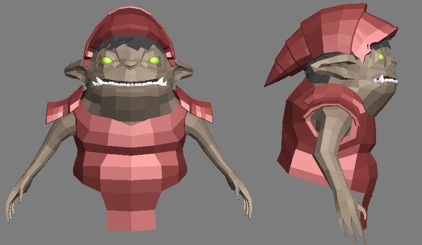
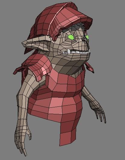
Finished the base mesh for the most part. I'll probably change the arm armor later as I just kinda quickly did it for time's sake, getting rather late
Looking good. One thing that catches my eye is the way the arm goes into the armor. It makes it look like the arm is a separate mesh when it's actually connected to the body (At least I think it's the same mesh as the body). You could open up the arm holes a bit more to fix it.
Aww, I kinda liked the red colour scheme ;P but I suppose this one looks more realistic. I also feel like his proportions are stumpier in the concept, which might just be him hunching? idk
Also wondering if he's wearing shoes or greaves. Some detailing would be cool, but it's still WIP so I'll wait for your update
For an interesting character that is a very uninteresting color scheme. The reason why the red worked so well in the original was because it is a complimentary color that really made his green eyes pop.
If you want to keep it realistic you don't have to go quite as vibrant with the colors, but I would definitely make it less brown and more red, with hints of blue/purple on the skin and armor in dark areas.
It's looking really good though, don't let my comments deceive you!
Thanks crasong and vcortis!
Is this an improvement? I know it's still not really red (and not too much of a change), but I want the red to be more implied than one big solid color
As for the feet, I'm going to do something with them... I just have no idea yet. But I think you're right in that they're greaves so I'll do that
I call them the pointy metal slipper thingamabobs.
Agreed about the sabatons, they fit the bill nicely, and the colour could be hinted at too i suppose, in a worn out way maybe? It's your call at the end of the day!
good on vcortis for highlighting the importance/usefulness of learning specialized terminology. as in anatomy, as in firearms, as in armor, as in fashion, you name it; producers and experts and high end users know specialized terminology that allows them to articulate more specifically on the subject (just as we can on 3d art).
it's not always necessary to learn all the terminology for anything you end up modeling, but if it's really central to what you're working on, sensitizing to the terminology will help you in turn to pay attention to all the small stuff you never noticed before. that kind of perceptual awareness is one of the key differences between novices and experts.
anyway, impromptu digressions aside, i like the oldschool fantasy illustration feel to the character's proportions. personally i'd like to see the top of the armor overhanging his face a bit more than seen in your last update. additionally, given the sketchy nature of the concept i think you'd be well within your rights to add a few more greebly bits or extra detail that would otherwise remain absent. keep it up.
Replies
Anyway the concept looks nice! I'm not sure about the hair on the low poly but everything else is looking good.
I'm almost done with the base, just have to make the legs. I'm hoping I get the base done tonight... I'm going to be out of town tomorrow until Tuesday
Yeah thanks Zipfinator. I know what you mean, the hair's more so a place holder. I'm going to have his actual hair long, sparse, and in strands. Like Smeagol's hair, except more of it. By the way, Mr.Delicious made the concept, not I
Achillesian, yeah, his stuff is amazing
Yamo, ha, pretty much. His concept's image file is entiteld "fishgoblinarmor," so I'd imagine so xD
Finished the base mesh for the most part. I'll probably change the arm armor later as I just kinda quickly did it for time's sake, getting rather late
Once its done you should pimp this to Mr. D
Took him into ZBrush and started sculpting the face and such
(Oh and after I looked at this image, I realized the mouth was off and adjusted it accordingly)
Here's an update, also worked on the face
I'm going to add in some asymmetry to the gear
Okay, here's the color scheme I think I'm happy with
Opinions?
Also wondering if he's wearing shoes or greaves. Some detailing would be cool, but it's still WIP so I'll wait for your update
If you want to keep it realistic you don't have to go quite as vibrant with the colors, but I would definitely make it less brown and more red, with hints of blue/purple on the skin and armor in dark areas.
It's looking really good though, don't let my comments deceive you!
Is this an improvement? I know it's still not really red (and not too much of a change), but I want the red to be more implied than one big solid color
As for the feet, I'm going to do something with them... I just have no idea yet. But I think you're right in that they're greaves so I'll do that
Okay, I just sculpted the feet. Look suitable?
MAN! How do you know those things are called sabatons?
Haha, research and reference. A while back I looked at a lot of armor when I was creating a character/statue. Also from years of playing rpgs
Agreed about the sabatons, they fit the bill nicely, and the colour could be hinted at too i suppose, in a worn out way maybe? It's your call at the end of the day!
Keep on keepin on!
Sorry if my updates are going to be a little belated, I just got Mass Effect 2 and want to try it out :poly128:
it's not always necessary to learn all the terminology for anything you end up modeling, but if it's really central to what you're working on, sensitizing to the terminology will help you in turn to pay attention to all the small stuff you never noticed before. that kind of perceptual awareness is one of the key differences between novices and experts.
anyway, impromptu digressions aside, i like the oldschool fantasy illustration feel to the character's proportions. personally i'd like to see the top of the armor overhanging his face a bit more than seen in your last update. additionally, given the sketchy nature of the concept i think you'd be well within your rights to add a few more greebly bits or extra detail that would otherwise remain absent. keep it up.