Home 3D Art Showcase & Critiques

Glenn-Brando Illustrations

Valentine.jpg

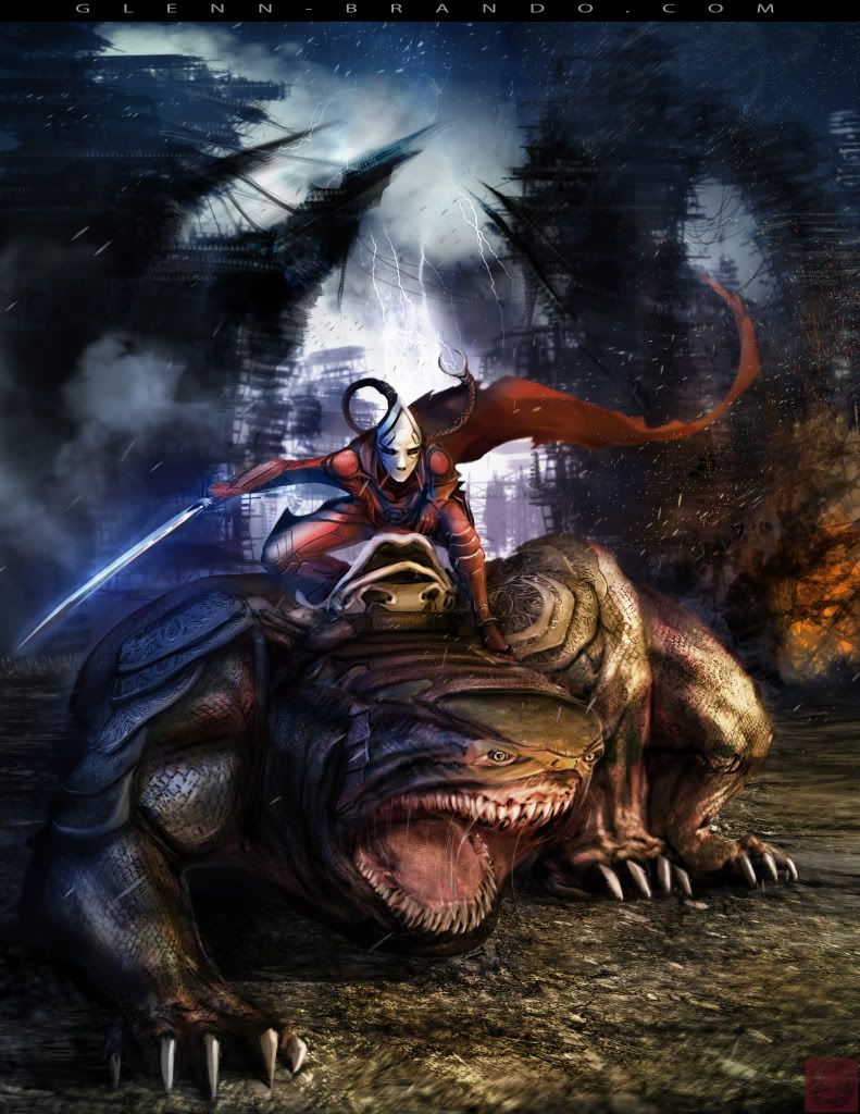
Shear character and Puppy (think I'll name him Valentine) illustration. Done over two days, day 1 for Shear and Valentine greyscale render, day 2 for background, colors and final composition.

This is also in my sketchbook, but this is pretty complete, so I thought I'd put it up here. If this goes against the rules, let me know and I'll remove it :)

Oh also, I'm still working on the website as of 02/16/2010. Officially goes on-line in approximately 3 weeks!

Replies

  • Steve Schulze
    Options
    Offline / Send Message
    Steve Schulze polycounter lvl 18
    Haha. Wonderfully over the top image you've got going there.

    If you're still interested in crits at all, the stance of the lizardy guy is a little confusing. I can see what he's doing, twisting around so his front and rear legs are close to eachother but reads a little oddly. Hard to know exactly what to suggest here to rectify the situation in the least destructive way possible.
  • illadam
    Options
    Offline / Send Message
    illadam polycounter lvl 14
    wow looks great!

    One think you may want to look into is changing the color on Valentine's armor right now it's blending in a lot with his skin. With a color change you may be able to pop it out a bit more.
  • cadyw
    Options
    Offline / Send Message
    the face of Valentine is wicked. Somehow still cute, but mean and terrifying too.
  • Glenn-Brando
    Options
    Offline / Send Message
    Glenn-BrandoShockTrooper01.jpg

    Future suit. I'll go into details some other time.
  • crazyfingers
    Options
    Offline / Send Message
    crazyfingers polycounter lvl 10
    That looks wicked Glen! I think you could jazz up the shoulderpads, maybe the kneepads just a TAD to match the helmet. The shoulderpads especially seem just a little out of place. Amazing concept nonetheless dude, keep the updates comin'.
  • Shogun3d
    Options
    Offline / Send Message
    Shogun3d polycounter lvl 12
    Dude, I want to model that future suit!
  • conte
    Options
    Offline / Send Message
    conte polycounter lvl 18
    looking really cool!
  • Joseph Silverman
    Options
    Offline / Send Message
    Joseph Silverman polycounter lvl 17
    scifiguy is fucking awesome. Wonderful personality and badass design.
  • pior
    Options
    Online / Send Message
    pior grand marshal polycounter
  • wester
    Options
    Offline / Send Message
    wester polycounter lvl 13
    Dude, glenn that suit came out SO much better than my paintover. You really took that guy up about 4353464 levels more than the last time i saw it. damn good job man.

    i want to model him so bad!!!

    putting him in my "things to model" folder.
  • wester
    Options
    Offline / Send Message
    wester polycounter lvl 13
    Ok now that i've stared at it for awhile, and gotten over the initial shock of its badassery.

    I would say the only crit i have on the soldier guy is his feet dont seem to match his perspective. I would make it so that you can see more of the top of the feet, and have them in more of a perspective view...and not so much orthographic. It'll help sell the idea that he's standing in 3d space.
  • Glenn-Brando
    Options
    Offline / Send Message
    Wes - great discussion ibefore class about the differing needs of different studios on how concept art should be done.

    Thanks for all the positive feedback everyone, I really appreciate it. I would LOVE to see any of my stuff modeled out, PLEASE FEEL FREE (do it Will, before Wes gets a chance to haha j/k Wes)! Just link me so I can enjoy it along the way as well! It would be so cool that someone would actually want to model something I concepted.

    And wow, Pior, I'm honored, your work has been examples in classes at The Art Institute of California - San Diego! You have so many different styles! Thankyou so much!
  • duoxan
    Options
    Offline / Send Message
    duoxan polycounter lvl 17
    chevrons are a nice touch, i dig your style. may have to model that gun when i get better haha
  • woogity
    Options
    Offline / Send Message
    really impressive stuff!
  • Shogun3d
    Options
    Offline / Send Message
    Shogun3d polycounter lvl 12
    do it Will, before Wes gets a chance to haha

    Hey Glenn got any detailed concepts of the rifle?
  • Glenn-Brando
    Options
    Offline / Send Message
    The "chevrons" weren't actually supposed to be rank, they were more placeholder graphic elements that I neglected to update. I was going to put up some rank insignia, but it was too complicated in my mind on deciding what rank he'd be. I'll have to at least edit the image though, since the chevron orientation is indicative of a naval petty officer third class (my exiting rank haha), and yet there is a marine symbol. Hey, maybe he's the corpsman heh (but then I suppose I need to add the cadeuces).

    Will - I'll work on the rifle for you tomorrow, today I was planning on doing an environment piece. I've always been leery about weapons both in the 3D and 2D realm because I know someone more knowledgeable with real weaponry would see blatant and obvious flaws in design. I'm gonna need to do some weapon studies. Point me in the right direction for reference man!
  • Glenn-Brando
    Options
    Offline / Send Message
    Glenn-Brando_IronMan.jpg

    Modeling orthographic of an Iron Man redesign. The most difficult thing was trying to come up with an Iron Man design that was different. It's pretty near impossible, since Iron Man's been around for so long, there's already been so many different permutations. After a bunch of weird and off the wall versions, I finally decided to come back to a more conventional design. I knew I needed to keep his face and power source on his chest, as they are iconic elements.

    There was a scene in the movie that bothered me enough to remove me from my suspension of disbelief, and that was when Tony escapes the cave and crash lands head first from maybe a mile up, unhurt. So I decided to make an Iron Man with a reinforced neck area. There are also wing stabilizers on his wrists (not in ortho) that I plan on making a close up of. During non-flight, the top portion of his armor shifts downward and his neck unlocks, allowing for freedom of head movement (present in plan sketches).
  • Ged
    Options
    Offline / Send Message
    Ged interpolator
    the head/chest is interesting but the legs and arms are a bit boring
  • Glenn-Brando
    Options
    Offline / Send Message
    Thanks for the critique Ged, I've got a plan for the arms but I forgot to incorporate them lol I guess I got caught up with the rendering.

    Close up. I'll see what I can do for the legs after I get some sleep.

    Glenn-Brando_IronManOrtho.jpg
  • Gallows
    Options
    Offline / Send Message
    Gallows polycounter lvl 9
    That re-design on Iron Man is looking pretty awesome. The breast plate reminds me of the walkers from war of the worlds for some reason. Maybe try breaking up some of those armor bits, like the feet a bit more inset than the shinguard? But then again it wouldn't have the same flow. Just a thought, great work though.
  • ScoobyDoofus
    Options
    Offline / Send Message
    ScoobyDoofus polycounter lvl 19
    Hey. Looking good, but if I were to be critical I'd say I think things are all reading just a little flat to my eye. I think I'd like to see more work in grayscale and you establish your values to define the planes a little better everywhere.
  • Glenn-Brando
    Options
    Offline / Send Message
    Thanks for the critiques, I'll have to implement them after GDC (or after graduation in 2 weeks, rather).

    Cleaned up the Widow a bit.

    Glenn-Brando_BlackWidowcopy.jpg
  • ES_139
    Options
    Offline / Send Message
    im really enjoying seeing your art.
  • Ged
    Options
    Offline / Send Message
    Ged interpolator
    that last one of the widow is good but your red strip goes right across her hair. This could be personal taste but Im not a fan of the name and email branding your putting on most of this work its just costing too much screen space and feels a little disjointed to me, get your letters closer together with a neat font and keep it near the corners of the image rather than over the characters head.
  • Joseph Silverman
    Options
    Offline / Send Message
    Joseph Silverman polycounter lvl 17
    Tight, dude. But what's the point of all of the color variations? They don't really communicate anything visually different from the original, except the idea that you can adjust hue/sat sliders, which im pretty sure any potential employer/client would already know. Why not minor costume variations or something?

    If there's a specific reason behind it i'd love to hear it though, you're definitely more educated on this stuff than me so i'm not about to argue if you've got a point.
Sign In or Register to comment.