First Post & Scholar's Garden
Hi Polycounters, I'm new!
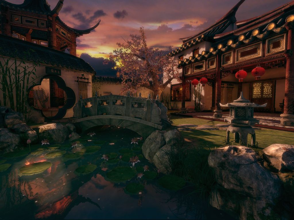
I'm a game art student getting ready to graduate and I'd like to get some critiques on my senior project to take it to the next level. The concept is a traditional Scholar's Garden. Rendered in UDK.
UPDATE: new render with critiques applied. any comments on this or the prop sheets below would be appreciated!
Replies
Everything looks really good, but I would like to see some sort of more dynamic / interesting lighting going on. Maybe some of those red-ball-hanging-light-things have a light on in them, or a light source coming from the top of the tower-structure in the upper left. Or from inside that room on the left. Something to make me wonder "what's going on in/over there?"
I would personally scale that tree in the back up by about 25% or so just to make it stand out a tad more. The ground grass texture doesn't really seem to hold up resolution-wise IMO.
Good looking stuff. Good to hear about AISD students using UDK
A ton of us at AISD troll polycount like mad. We tried getting UDK on the computers at school but that's not happenin' anytime soon due to license costs etc.
Anyhow, hey George glad you posted up your work. The water looks dope!! I'm with OTT on the lit lanterns hanging to the right. That would be interesting, and would create some cool lighting with UDK's new emissive lighting.
Needs more high contrast lighting IMHO, especially the sky.
Gcochrane: The cherry tree looks a little lost, it may not be accurate, but maybe you can bump up the saturation on the flowers, also the rocks on the left looks a little rushed, Really nice piece though! Good work!
Not commercially however, this includes educational institutions.
Each student individually however, can legally use the UDK, as long as they don't charge anyone anything for what they make.
Just a sneaky suggestion!
Ditto on the grass although it wasn't immediately obvious.
@Ott & BeserK: I'm new to UDK but between UDN and Hourences I'm loving it. A decent free engine is a godsend for students.
@Ben & Jackwhat: I actually desaturated and knocked down contrast in the post process volume but now I'm thinking it was too severe
@GCMP: You're right that water is too saturated, the pillars are actually engraved but I see they're not reading right. Did you mean the grass foliage was too saturated also?
@3DLee & Andybozo: Wireframes coming up! I'm pretty sure the vegetation tri count is too high, but I look forward to feedback on it.
@kaburan: Thanks!
- the scene render is a lighting preview build, so there's some nasty shadow artifacts. pretend you don't see those...
EDIT: just realized tiledshot is not capturing the real time reflection in the water. anyone know a work around for that?