[Portfolio] Nick Ward - Environment & Prop Artist
Recently finished my university course in computer games modelling and animation and put together this show-reel of the work I have been doing over the past 8-9 months. I am looking for critiques on my work,show-reel and my portfolio. I would also be interested in any ideas anyone has on work I could do to improve the quality of my portfolio as a whole.
I am currently looking for full time employment as a junior environment artist so any information on developers that are hiring for this position would be much appreciated.
Here are links to my work. I am looking for as many critique as I can get so please let me know what you think.
Show-Reel: [ame=" https://www.youtube.com/watch?v=r9OzyY4q9nc"]Nick Ward - 3D Environment Artist Showreel - YouTube[/ame]
Portfolio: http://nickward3d.weebly.com/
I am currently looking for full time employment as a junior environment artist so any information on developers that are hiring for this position would be much appreciated.
Here are links to my work. I am looking for as many critique as I can get so please let me know what you think.
Show-Reel: [ame="
 https://www.youtube.com/watch?v=r9OzyY4q9nc"]Nick Ward - 3D Environment Artist Showreel - YouTube[/ame]
Portfolio: http://nickward3d.weebly.com/

Replies
Everything is well presented and clear.
I missed the place where you currently live and if you are able to relocate. If I would hire you, I would be interested on that.
And your resume has no experience with games. I suggest you work in some mods or indie projects to add some extra experience related to games. This would help.
Good luck in your job hunt!
Just a couple of thoughts. In your Research Unit environment, you may have already tried this, but the computer screens are blending a bit too much (blue on blue). It looks good, but I'd be interested in seeing what it would look like if they were yellow or orange. Kind of like your screens on the 2nd floor, but brighter.
The website itself, I was disappointed your screens were not thumbnails. I wanted to click on them to see a larger image. Might want to look into that. Add more to the Props section too. Take some of the props used in your scenes and render them out by themselves, throw them under the props so we can get a closer look.
I'd also like to see your two main images up top and center, with your demo reel at the bottom. Since you're applying for Environment Art positions, and you're not showing off any crazy animations in the demo reel (even though you probably worked really hard on it) it's just not needed. Have your screens up top, right below your name for an awesome first impression. Employers will go to your site and it's like, BAM! I'm Nick bitch! Hire me. Orrrrr something along those lines. Your screens are most important IMO.
And being picky here, delete the 'Create Free website' from your html/xml whatever it is you used and the WIP placeholders.
Cheers!
@bugo Ill be adding the large images this weekend so hopefully that will help me with my job search, Thanks for the feedback and the kind comments.
Really appreciate this feedback, Working on some new props and an environment which will hopefully blow my other stuff away. Keep it coming guys =]
Right now the Research Unit 06 scene looks unlit because everything is flat blue. You need lighting to extract the forms, highlight your materials, guide the eyes, and paint a color palette. Same thing with your Library scene. The lack of lighting is giving your work a late 1990s feel - which is bad if you are trying to apply for a "next-gen" game art role. There are some pretty interesting forms in your Research Unit scene that are being let down by the lack of lighting. Play around with warm/cool relationships.
Avoid cliches like warning strips, random diagonal shapes, tiny lights on every surface, panels, signs with scifi font that say the word "Research". I have seen similar looking sci-fi environments so many times now.
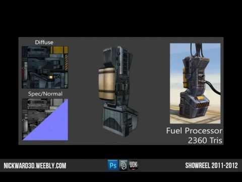
The concept for the Fuel Processor prop has some really interesting shapes in it that you failed to capture in your 3D interpretation of it. Your textures and materials are also letting it down.
Your website is good; simple and clean. I'd ditch the 2D section though.
Also, what is the name of the song in your reel? Loved it!
@Darkmaster Your comments are similar to pauls and have been taken into account, my lighting is obviously something that needs a lot of work and I will make sure it is my main focus in all of my future work.
Here is a link to the reel music: http://www.youtube.com/watch?v=YRzN9jiiQnQ
@alphajayel Thanks very much mate, ive seen my showreel and cv to around 7-8 companies now and have my fingers crossed.
Thanks for all the comments they are much appreciated.