Armadillo Barbarian
Hey everyone
So the college I graduated from has this group going on Facebook where we have a weekly art jam. Someone states a game/style and gives specifications and you have a week to do it. This last week I chose Allods and to make a character that could fit in the universe and match the style. I didn't have time to finish it, but I'm going to continue working on it and make him badass.
I chose to go with a Armadillo race, and more specifically a barbarian style class. Not sure if he would *really* fit in the universe, but doing my best to match the style. Here's the current progress
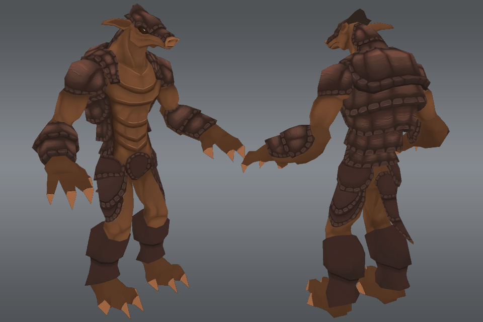
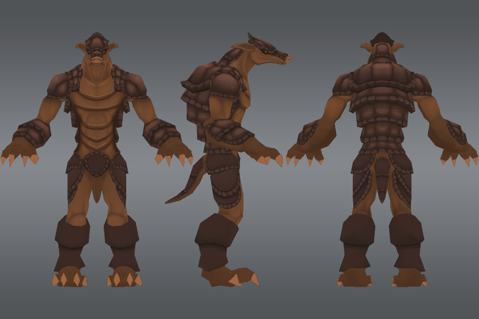
Armor design
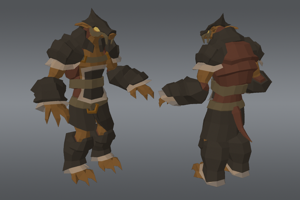
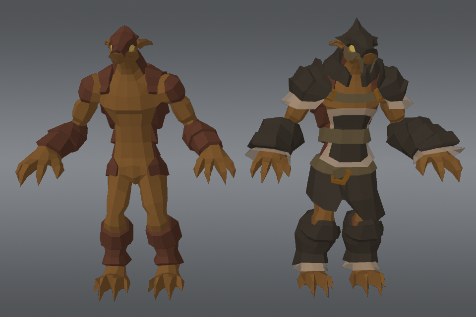
weighs in at 2400 tris without armor, and 3900 with armor
I tried doing a lot of research on different caricatures of Armadillos, and as you would expect I didn't find much. This is mainly the reason I wanted to do an armadillo character, simply because you don't find many armadillo's in video games, let alone as an actual character. I started him last Wednesday, and have put about 15-20 hours into him so far from concepting the idea and getting to this point.
I'll be updating this as I progress along, would like to finish him in the next day or two (armor maybe by Friday, not really sure how I want that to look just yet). Feel free to leave some C&C
So the college I graduated from has this group going on Facebook where we have a weekly art jam. Someone states a game/style and gives specifications and you have a week to do it. This last week I chose Allods and to make a character that could fit in the universe and match the style. I didn't have time to finish it, but I'm going to continue working on it and make him badass.
I chose to go with a Armadillo race, and more specifically a barbarian style class. Not sure if he would *really* fit in the universe, but doing my best to match the style. Here's the current progress


Armor design


weighs in at 2400 tris without armor, and 3900 with armor
I tried doing a lot of research on different caricatures of Armadillos, and as you would expect I didn't find much. This is mainly the reason I wanted to do an armadillo character, simply because you don't find many armadillo's in video games, let alone as an actual character. I started him last Wednesday, and have put about 15-20 hours into him so far from concepting the idea and getting to this point.
I'll be updating this as I progress along, would like to finish him in the next day or two (armor maybe by Friday, not really sure how I want that to look just yet). Feel free to leave some C&C
Replies
Look at some concept art of armoured characters and you may see my point.
Cheers
Thanks everyone! More highlights will come too
Have you given any thought to putting in some kind of bright accent color on the armor?
I have thought about a bright accent color and definitely plan on it...I'm really not sure what direction I want to go...armor is currently unwrapped and messing around with base color ideas for a color scheme
I really like the middle one; I think the Copper Brown look works well for him
One of my favorite places is colourlovers.com
Progress of actual texture so far
currently tweaking the color variation between the armor and the skin, so don't worry I know to address it
Totally have to stop here for the night, exhausted from a long day
and just in case that doesn't link
http://youtu.be/Ik-L2FL9Yik
bleh wish it would load up as an embedded video...oh well
Starting up on his buddy the Lizard. It's a previous guy I've worked on before, but i decided to stylized him in the same manner as the Armadillo. I'm going to use him as a bit of practice to figure out how to do proper shine and highlighting/shadowing. What do you think so far?
update!...should be able to finish him before the weekend...just depends if I want to go out and be social tomorrow or not
Also, since this thread is about the Barbadillo (as a coworker dubbed him lol), here's a very small update on him. Added some shine to his armor and some studs that I'll add a bit more detail to
I'm also going to add a metal ring to his chest and some leather straps that connect to it and go underneath his shell
Going to try and finish him tonight. I'm sick though and I doubt the wife is going to let me stay up late
So I plan on these guys being 100% hand painted, so I guess the top down lighting idea?
I'm a total noob to that short of thing, so im trying the best I can
In that case I'd suggest doing some research into color theory and how light works. (light shifts in hue AND saturation as it's intensity goes up, dark blue to teal/green dark red to yellow, and the "brighter" it gets, also the less saturated it gets.) The gnomon video from Jeremy Vickery is great for learning that sort of stuff. Usually the best hand painted textures keep these facts in mind.
Good luck, I'm sure the result will be great.
I agree about the color hue variation from bright to dark.
One way I found usefull is painting the occlusion and shadows (or bake some and paint over) in grayscale on a different layer, same for brighter areas in aother layer. Then get those layers as mask and do some adjustment (hue, saturation and lightness) This way you can have total control over the ilumination.
I don´t know where I´ve seen that before, but worked for me.
Multiply and overlay modes don´t give the right control and paint over sometimes is very time consuming in detailed areas.
Not sure if that make sense, but I hope it helps.
Artquest and Fabio I'll definitely look into that and see what I can do to improve upon these guys. It's 3AM though and I'm still sick, so I really need to get to bed
After doing the lizard and looking at the Armadillo, I'm really not satisfied with how he looks, but eh, I'll try and sleep on that before re-adjusting him
so with that being said, pew pew
The reason I posted the renders in segments like that, is IF these guys were used in a game or something, that this would be the order of armor upgrades. so last being the peon worker, middle being the standard soldier, and first being the elite warrior
oh! Might as well post the texutre flats; havent posted any of my textures yet
still things im fixing up obviously, but yea. Plan on downrezzing to 512x512
T.
@TaylorMouse, yea I know what you mean. Personally it's a style that I'm wanting to do, however, I may end up going back and adding some damage to the armors (not like massive, but the standards dents and dings you would see from a battle hardened warrior).
So after taking a bit of a break from these guys, I totally feel like they appear almost velvet like. That, as some of you have pointed out, is probably because I don't have enough highlights on them. I'm still trying to decide if that's a kind of style I want to keep, or if I want to revise it and fix it. I'm not ignoring you though, I want to be painfully clear about this
ANYWAY, I've started work on the final character of this 3 piece trifecta of pain. I've never done a female model before (well...sort of one somewhat recently,), and I wanted to challenge myself to create not only a differently proportioned character, but also a female! Can you guess what type of animal she is?
OH, also felt like I should post this up here too
So, it's going to be kind of a huge project for a side project, but I'm currently trying to get a game proposal and demo done for work to pitch. I've decided to take these characters and create a universe out of them, for a really fun game for iOS. That's all I'll say about it, but I'm working on blocking out an idea for the first level/demo project. Not really much to see or anything, just showing it off
Croc is closer than Dragon...at least, geographically
Armor is modeled, wooo
dare i say.. Boneriffic?
As for the texture and highlights, it sounds like you're agonizing over choosing one or the other. This is digital man, there's nothing stopping you from making a copy of your texture file and painting over it to try out a different style. Sometimes it's hard to tell if you'll like something before you try it
Not really agonizing, just trying to spend my time wisely and just trying to decide what kind of style i want to establish...im having a ton of fun with these characters, and thats all that matters to me...as long as im having fun i dont mind experimenting when it feels right
Ill post some renders in a bit when i get back to the office
Also, here is hoping she doesnt come out too furry
maybe a bit obsessive with how many renders I'm posting, but w/e, it's my thread and I can do what I want!
And to clarify if I haven't yet, she has an Egyptian Theme (Lizard is Aztec, Armadillo is Mongolian, though I will be going back over him and making him look more theme relevant) She is also going to be a cloth melee class
so to kinda expand on that, each character will have 2 roles. Lizard = Warrior, Ranger; Armadillo = Barbarian, Shaman; Hyena = Battle Mage/Monk (staff melee fighter), Voodoo Doctor
Each role will have it's own specific armor, and this is to serve the purpose of giving each character a melee and range option
If I'm lucky, she will be unwrapped and rigged tonight. This, however, will probably not happen
Could still use some more shading and highlighting; also the hair texture doesn't really show up on her thigh, so I'll have to fix that