The BRAWL² Tournament Challenge has been announced!
It starts May 12, and ends Oct 17. Let's see what you got!
https://polycount.com/discussion/237047/the-brawl²-tournament
It starts May 12, and ends Oct 17. Let's see what you got!
https://polycount.com/discussion/237047/the-brawl²-tournament
UDK Envinronment - "Alone in the Dark" concepts
Hello everyone! So this is my first post here and to be honest I'm still a bit nervous after seeing how talented some of you are lol. This is a semi-WIP since every scene is pretty much stand-alone, and I'm just working on one more.
So I happened to stumble upon some of Pascal Casolari's concept art for the game "Alone in the Dark" and loved his style. It really reminded me of Myst in the sense of a beautiful environment that also feels so desperate, lonely, or even haunting in some regards. So I remade a few scenes that I liked the most and would love some feedback for what I have so far.
Exterior Shot:
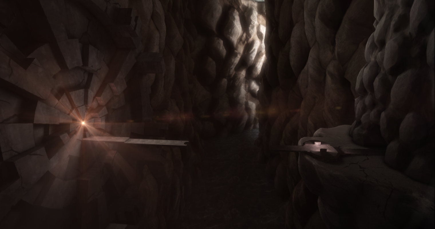
Room 1:
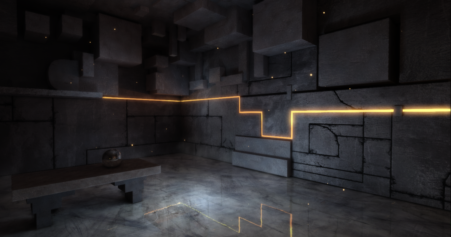
Room 2:

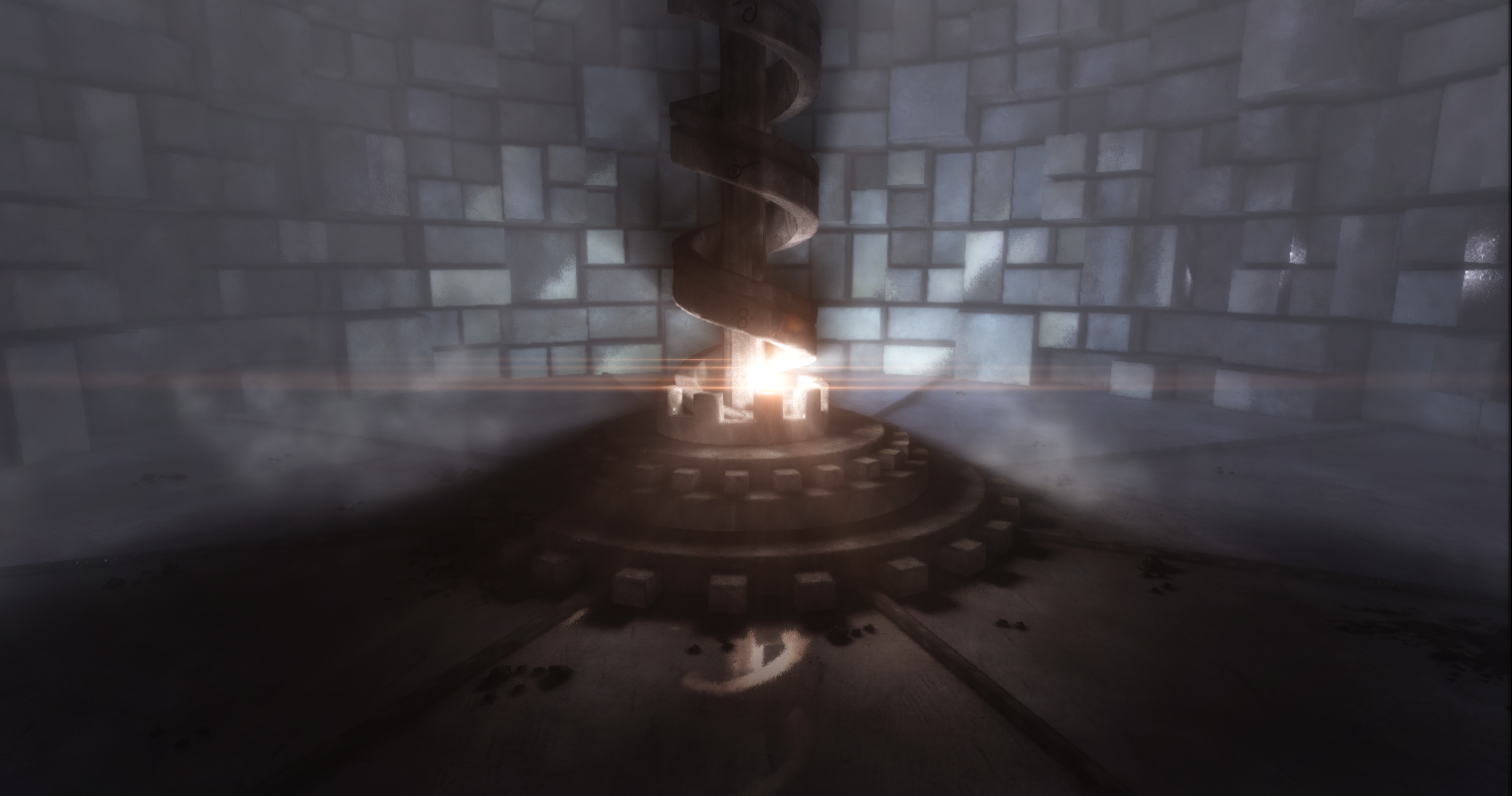
I also made a fly through which can be found on Vimeo
So I've gotten some ideas from other people about things to do for the exterior. I'll start by modeling a few individual rocks to put in and vary up the design. I also want to add in a few more elements to really emphasize the scale of the environment compared to the player. I'm not sure about adding vegetation or not, part of me thinks that would actually detract from the feel of the scene.
Anyway, I would appreciate all your thoughts and would love to answer any questions you have
So I happened to stumble upon some of Pascal Casolari's concept art for the game "Alone in the Dark" and loved his style. It really reminded me of Myst in the sense of a beautiful environment that also feels so desperate, lonely, or even haunting in some regards. So I remade a few scenes that I liked the most and would love some feedback for what I have so far.
Exterior Shot:

Room 1:

Room 2:


I also made a fly through which can be found on Vimeo
So I've gotten some ideas from other people about things to do for the exterior. I'll start by modeling a few individual rocks to put in and vary up the design. I also want to add in a few more elements to really emphasize the scale of the environment compared to the player. I'm not sure about adding vegetation or not, part of me thinks that would actually detract from the feel of the scene.
Anyway, I would appreciate all your thoughts and would love to answer any questions you have
Replies
I do feel like you could be rounding off or beveling those edges though, especially in the second room; they're too sharp currently.
Thank you very much
I kind of feel what you are talking about regarding the edges, but at the same time I think that the sharpness is partially what gives it the feeling of being futuristic, which also lends itself to being mysterious in this setting.
Still, I was thinking about maybe not beveling, but perhaps adding a few chips in places to give the impression it wasn't always abandoned?
I'll update again tomorrow after I can work on it a bit more
I keep going back and forth on the diffuse texture, but I think it's looking good so far
edit: Does anyone have any critiques? I feel so lonely lol
I think the big cracks in the exterior shot look a bit odd any chance modelling those in a bit would be better or maybe a normal/displacement map?
The interior cracks on the edges look really good.
The cracks on the exterior one do look a bit odd I agree. I didn't have much time, so they were done rather quickly (and rather cheaply lol).
Thanks for your thoughts though, I'm kind of putting this one on hold while I work on something else