Home 3D Art Showcase & Critiques

Jungle + small village environment {WIP}

polycounter lvl 10
Offline / Send Message
cmtanko polycounter lvl 10
Hi everyone,
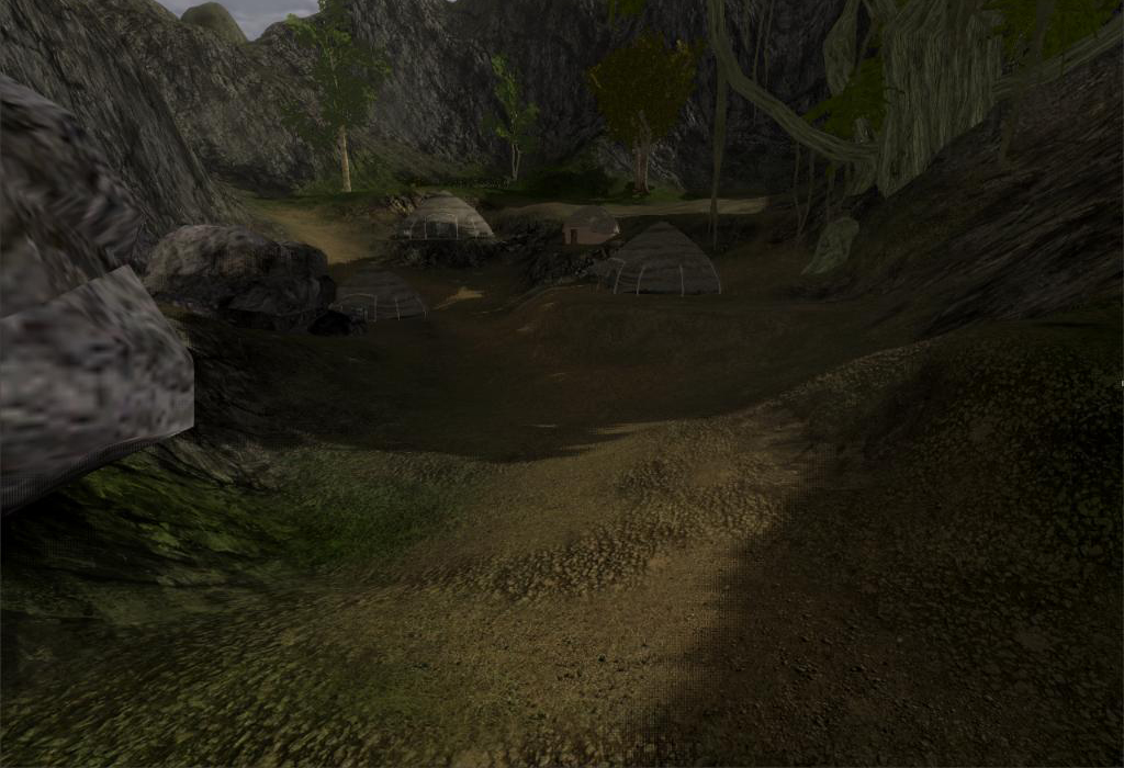
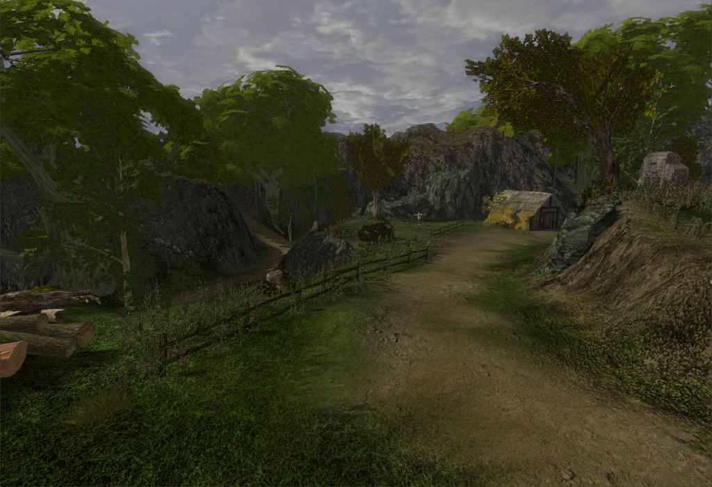
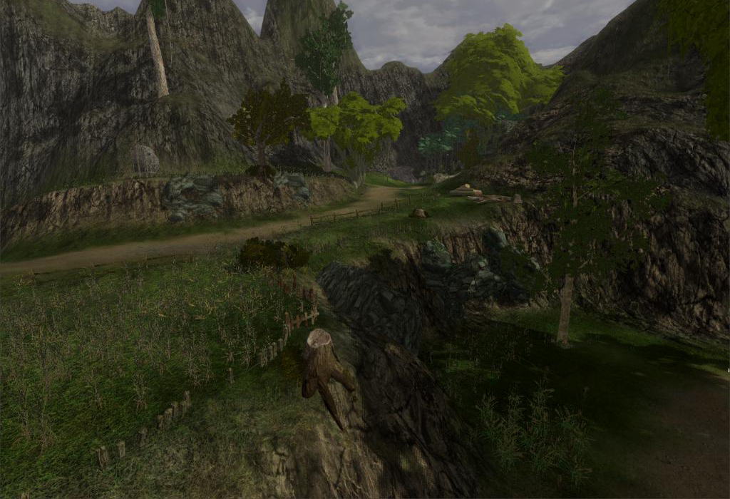
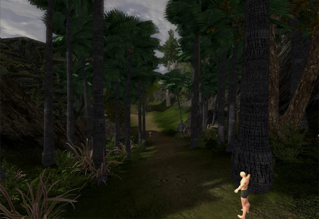
I had been working on this environment for quite long, which is basically a jungle,farmland,ruin,small village and a enemy base camp... Its based on medieval age and dark theme. I'd like to share some of the screenshots for the review..
Comments and suggestions highly appreciated.
a1.jpg
a23.jpg
a5.jpg
a8.jpg

Replies

  • cmtanko
    Offline / Send Message
    cmtanko polycounter lvl 10
  • ivanzu
    Offline / Send Message
    ivanzu polycounter lvl 10
    Why are trees so massive?
  • jmt
    The lighting makes the scene looks flat and it isn't bright enough. You've got some clashing low res textures, such as the rock on the left in the second image. The leafy, green trees in the 3rd and 4th images would look better with some AO because they're currently looking too flat. The same goes for the huts. You should at least paint in some AO, whether its done during rendering or not. The overall scale for this scene is kind of confusing. The fence at the bottom of the 4th image looks very small. The guy in the first image looks tiny as well.
  • Ghostman511
    What engine are you using to render this?
  • Tobbo
    Offline / Send Message
    Tobbo polycounter lvl 11
    I believe this is the Esenthel Engine? I have been working with the Esenthel engine as well over the past year. It's a great engine, one of the best in my opinion. (The screenshots on the website, etc. do not do the engine enough justice though, so I think many are easily overlooking it.)

    Cmtanko, I like the overall terrain layout, etc. However, your lighting could be pushed much further. I'd make the light more brighter. Always try and use photo references. There are some scaling issues as has already been mentioned as well.

    Also there is some very noticeable texture resolution problems, most notable in the 2nd pic.


    Good start.
  • cmtanko
    Offline / Send Message
    cmtanko polycounter lvl 10
    seems like I'll always have proportion issues, starting from my modeling career where all characters used to be out of proportion usually :S .. Anyways, thanks for the suggestions guy... I'd be needing lot of those..
    btw, I forgot to mention its intended for like action RPG.

    @ivanzu : Most of the game ref. I saw had big trees.. so I also did that. For me it consumed bigger space, so could populate the area quickly . shaiya-13.jpg


    @Jmt: Lighting, I wanted to create a dark look (though in day).. Yeah, looks horrible though... Any suggestion what can be done to make it fit in darker theme.. AO I had enabled in rendering, and for textures, lets see If I can do anything..

    @Ghostman511: yeah as Tobbo said, Esenthel Engine.

    @Tobbo: Thanks man, I'll try to fix them and post some work, later tonight..
  • jmt
    Here's a quick paintover. I mostly just changed the levels to make everything brighter, removed some of the overly noisy detail in the textures and painted in some ambient occlusion. It's a bit blurry, but I'm using a mouse.

    Paintover:
    kH15a.jpg

    Compared to the original:
    FfiIh.jpg
  • cmtanko
    Offline / Send Message
    cmtanko polycounter lvl 10
    @Jmt: Thanks alot for your suggestion and time.. I am fixing them ., not able to work properly due the the frustrating load shedding.. Anyways., I'll soon post the updated map.
  • cmtanko
    Offline / Send Message
    cmtanko polycounter lvl 10
    @Jmt: I saw your portfolio work.
    Village900.jpg?__SQUARESPACE_CACHEVERSION=1310862184790
    Howwwww did you do that ? It looks simple,clean yet elegant.. COOL... esp. the grass+path texture... how did you do it ??? :))
    also before starting of the map, do you make a color palette (or something like that) .. everything looks so consistent or say everything blended so well.. what's the secret ?? :)) very very eager to hear :)..
  • jmt
    Thanks, cmtanko. I made that scene years ago. I created an early version of it for an environment modeling class, and then redid the composition and lighting for my portfolio (this version). It was all created in Maya and rendered with mental ray. The ground was just made with a poly plane divided into a grid, then raised/lowered with geo added where it was needed. I duplicated the faces for the dirt patches and path and raised them up a bit with an alpha channel. The rest of the ground is just a tiling grass texture I believe. I'm not sure what to say about the color palette. The textures and lighting in it are all fairly simple. I tried to keep things looking authentic, but I see several things that could be improved, such as the thatched roof on the house on the left and the rendering on the grass planes close to the camera. The trees in the background were rendered out to a flat image and put on a poly plane.
  • cmtanko
    Offline / Send Message
    cmtanko polycounter lvl 10
    @jmt: thanks for explaining, Niceee.... I also wanted to make my terrain look like that, also the grass texture raised above the road....I wish, I could make something like that in my terrain . hehe :) (If you dnt mind Can we have a look at the diffuse/nrm/spec map ? ) :)

    here are few tweaks I did last night , brighten the light, changed the textures, and tried to make a clean texture...
    b1.jpg
    b2.jpg
    b3.jpg
    b4.jpg
Sign In or Register to comment.