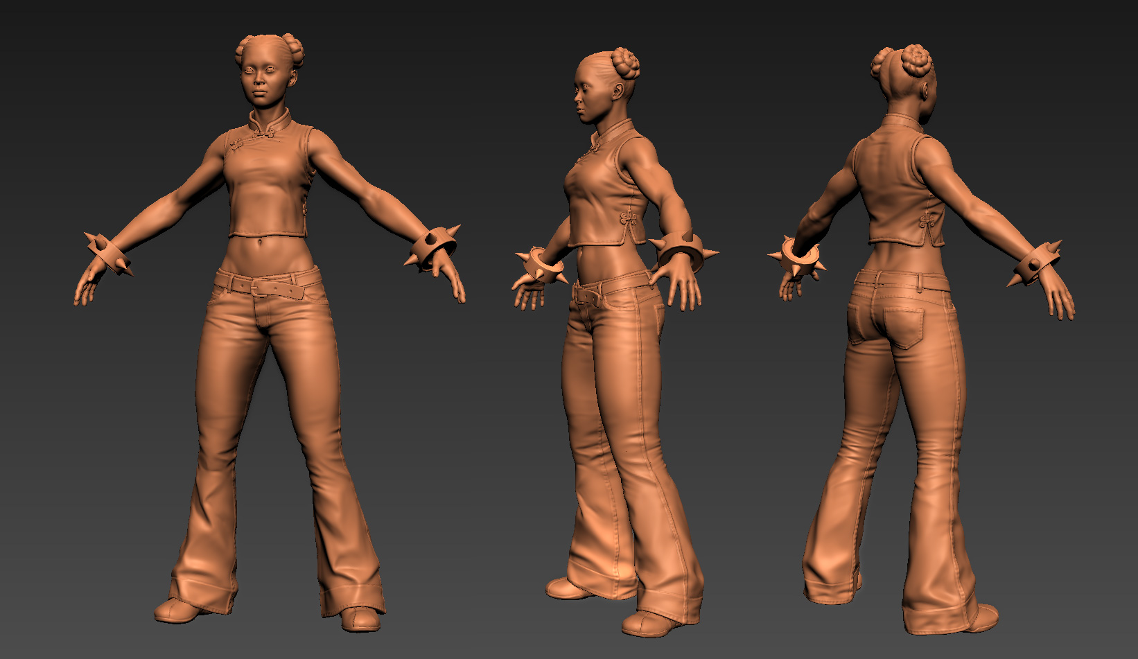
Looking sweeet, only thing looking off right now is the wristbands they fit nicely on the cartoony exaggerated concept, but this seems a bit more realistic. Maybe try making them smaller almost like goth/punk spike bands or remove the inside spikes (so she doesn't stab herself every time she puts her hands at her side) and fiddle about with some sort of strap or buckle perhaps.
I like the way you are going. Great work so far.
yours is stronger and more realistic than the concept. I like it.
I would suggest just some work on her face, the way it is now doesn´t remind me ChunLi.
Sorry I can´t tell why. :P
Looking good, although I agree her bracers should be smaller and that the bottom of her pants are too wide. I'd also say her crotch area sits too low; if you picture where her obliques would come to an end under her jeans, her lower abdominals are going to look crazy narrow/long.
Sweet start though.
Hey thanks everyone. I tweaked the face a bit and here's a closeup of the head -
With the pants I was sort of trying to go with a bell bottoms look, I thought that would look cool with the white swirl design around the cuffs. But if that isn't reading too well I may change it.
Also changed her abs up so they'll read better. Still need to do the hair and tighten up some details on her shirt. and yeah, I plan on texturing her and putting her in udk or something eventually.
She's currently just under 10k tri's. Still plenty of geometry to add in hair planes and some other details. I'm debating on how to do those little ties on her shirt, if those will look alright just on flat geometry like I have it or if it's worth giving them some depth with geometry.
I'll probably spend another day or so on the sculpt and some baking tests then onto texturing.
Still a lot of stuff to do. The hair planes are placeholder, the shaders and spec haven't been tweaked at all, the shirt has barely been touched and the swirls there are just slapped on for now. She's getting there though.
Oh and on my last post I don't know what I was smoking but her tri count is actually around 8k not 10... yeah I dunno, must've had something else in the scene or something.
Hey, thanks LRoy.
I'm not too sure what you mean with the pit of the elbow? Like where the bicep meets the forearm? any suggestions as to what is making it look off?
Nice work so far man, it's looking really great. My only crit is that the biceps feel just a tad too short in relation to the forearms. However, that could be the bulk of the wristbands throwing me off. It would be worth measuring though.
Nice work man. Oddly enough I've been working on the same character for the past week or so. Not quite as far along as you but getting there. A couple small observations, her face, though patently more asian in your work doesn't have quite the angular feel of Chun Li. If I'm not mistaken she's actually half asian half something else. Second, the shoes look a little bit like bowling shoes whereas in the concept they look more like those square toe leather sneakers they sell at sketchers and the like. Otherwise great work. Do you happen to know who did the original concept per chance?
Looks pretty great so far. I'm loving her physique and the outfit looks pretty fantastic already as well. I must admit I'm not a huge fan of her face, though. I realise you're going for a more realistic look, but I don't really think any of her features help make her recognizable as Chun-Li - without the hairstyle she reads more or less as a completely generic Asian woman. I think if she had a slimmer jawline, smaller nose, more prominent forehead and more vertically slanted eyebrows, she could read a lot more like Chun-Li while still retaining a realistic look. Even when drawn in different styles there are usually some features that stay consistent... Here's a couple of Chun-Li drawings by various Capcom artists that hopefully help illustrate my point: Akiman Kinu Nishimura Shoei Ikeno Bengus Edayan
I realise it may be too late for any major revisions, but I hope you find the feedback useful in some way.
As for the bracelets, I definitely see why you'd want to keep them beefy as it undeniably does add something interesting to the silhouette. I do think it's hard to make it work well with the style you've gone with for the model though, because when the character herself has less extreme size variations in her body proportions (+hair, outfit,etc), the relatively huge bracelets kind of stick out like a sore thumb. I think they should probably be slimmed down a tad either way, but perhaps if you slimmed down the arms a little as well maybe you could kind of keep the cake and eat it too.
Completely agree with damageINC on the sneakers. These SkechersCompulsions actually look like a pretty good match!
It's funny at first I was going to use Kristen Kreuk from the Chun-Li movie for reference and then part way in I thought she didn't look asian enough. But she's sort of the polar opposite of those Capcom drawings that were linked to.
I also agree about the shoes. Currently they're pretty plain and originally I started sculpting in those straps across the top... until I realized the pant cuffs completely cover that part of the shoe, so you wouldn't see that detail unless I change the cuffs, which I think are a more important, and cooler, detail than showing off the sneakers.
and the bracelet size... I dunno, I tried some smaller sizes and I still much prefer the larger bracelets. I'm just chalking that up to personal preference.
I'm almost ready to call her done. Need to clean up a few things along her hairline, and I'm not entirely happy with the bangs. I think they might just need a better set of normals. I've got a few other things to work on this week but I'll come back to her for the cleanup and to pose and render her.
Replies
yours is stronger and more realistic than the concept. I like it.
I would suggest just some work on her face, the way it is now doesn´t remind me ChunLi.
Sorry I can´t tell why. :P
Those pants are a bit too wide though, it's gonna make it hard to do those lightning kicks.
Sweet start though.
And agreeing with the face, would like to see a close up. I think her eyes 'pop' out too much or it could be something else.
With the pants I was sort of trying to go with a bell bottoms look, I thought that would look cool with the white swirl design around the cuffs. But if that isn't reading too well I may change it.
The wrist things at first I was going to go with something more bracelet'ish like this -
http://img5.mmo.mmo4arab.com/news/2011/01/20/chun_li_cosplay/chun_li_cosplay_s01.jpg
but then her silhouette starts becoming really plain... and I like the spiky wrist bands.
Also changed her abs up so they'll read better. Still need to do the hair and tighten up some details on her shirt. and yeah, I plan on texturing her and putting her in udk or something eventually.
She's currently just under 10k tri's. Still plenty of geometry to add in hair planes and some other details. I'm debating on how to do those little ties on her shirt, if those will look alright just on flat geometry like I have it or if it's worth giving them some depth with geometry.
I'll probably spend another day or so on the sculpt and some baking tests then onto texturing.
Still a lot of stuff to do. The hair planes are placeholder, the shaders and spec haven't been tweaked at all, the shirt has barely been touched and the swirls there are just slapped on for now. She's getting there though.
Oh and on my last post I don't know what I was smoking but her tri count is actually around 8k not 10... yeah I dunno, must've had something else in the scene or something.
pit of the elbow reads a bit off to me.
I'm not too sure what you mean with the pit of the elbow? Like where the bicep meets the forearm? any suggestions as to what is making it look off?
Akiman
Kinu Nishimura
Shoei
Ikeno
Bengus
Edayan
I realise it may be too late for any major revisions, but I hope you find the feedback useful in some way.
As for the bracelets, I definitely see why you'd want to keep them beefy as it undeniably does add something interesting to the silhouette. I do think it's hard to make it work well with the style you've gone with for the model though, because when the character herself has less extreme size variations in her body proportions (+hair, outfit,etc), the relatively huge bracelets kind of stick out like a sore thumb. I think they should probably be slimmed down a tad either way, but perhaps if you slimmed down the arms a little as well maybe you could kind of keep the cake and eat it too.
Completely agree with damageINC on the sneakers. These Skechers Compulsions actually look like a pretty good match!
damageINC: The picture comes from the cover to the 2004 UDON Summer Special. It was drawn by Arnold Tsang.
also, Jigsaw's ref links, so useful
Hey thanks for the feedback everyone.
It's funny at first I was going to use Kristen Kreuk from the Chun-Li movie for reference and then part way in I thought she didn't look asian enough. But she's sort of the polar opposite of those Capcom drawings that were linked to.
I also agree about the shoes. Currently they're pretty plain and originally I started sculpting in those straps across the top... until I realized the pant cuffs completely cover that part of the shoe, so you wouldn't see that detail unless I change the cuffs, which I think are a more important, and cooler, detail than showing off the sneakers.
and the bracelet size... I dunno, I tried some smaller sizes and I still much prefer the larger bracelets. I'm just chalking that up to personal preference.
I'm almost ready to call her done. Need to clean up a few things along her hairline, and I'm not entirely happy with the bangs. I think they might just need a better set of normals. I've got a few other things to work on this week but I'll come back to her for the cleanup and to pose and render her.