[WIP] Character - Hand painted textures
Hellows everyone!
My first project thread on here.
I'm Making a victorian steampunkish character for a game design I'm working on. At the same time I wanted to do a little exercise on hand painted texture.
Any feedback is welcome!
Oh, and I still have to give him a melee weapon but I can't figure out what so any thought on that is welcome too!
Latest version:
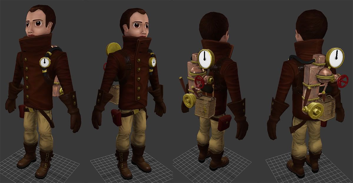
Original post:
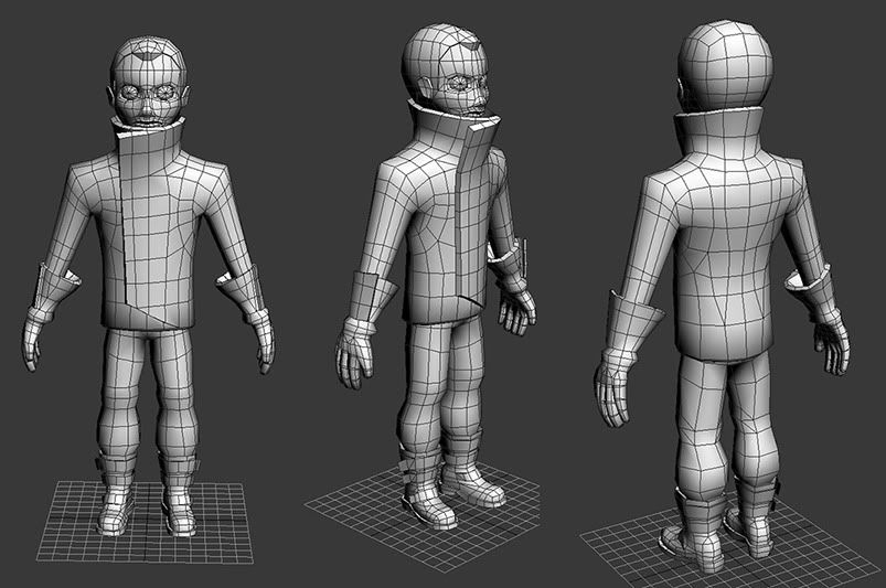
3D Low Poly:
(screengrabs in 3ds Max)


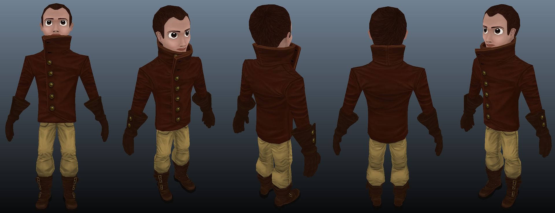
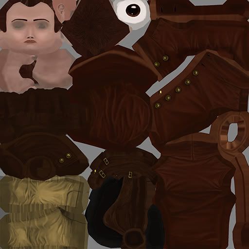
Diffuse so far:
(screenshots from 3D-Coat without lighting)
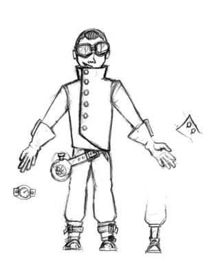
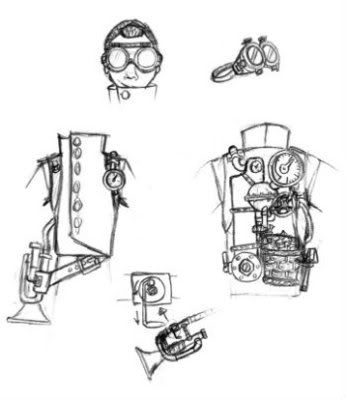
My concept sketch:
My first project thread on here.
I'm Making a victorian steampunkish character for a game design I'm working on. At the same time I wanted to do a little exercise on hand painted texture.
Any feedback is welcome!
Oh, and I still have to give him a melee weapon but I can't figure out what so any thought on that is welcome too!
Latest version:

Original post:
3D Low Poly:
(screengrabs in 3ds Max)


Diffuse so far:
(screenshots from 3D-Coat without lighting)


My concept sketch:


Replies
But there are a few things you could do to improve your character:
-I don´t know the total polycount but you can optimize a bit more the polycount
-push and pull some polygonas to improve his overall silhouette.
-Add some shadows on the texture in places like: top of the pants (from his jacket) inside arms and chest (from the arms itself) and around neck (from the head and jacket)
I hope it helps
and did you have some specific points in de silouette in mind or just overal?
I was thinking he needed a clear elbow, although now his arms are straight, if they are bended (wich will be most of the time) it should be clear
feedback always welcome!
next is ao shadows improvements
thanks again fabio for pointing that out!
Btw, what color to his pants have with you guys?
cause I got two different monitors and on one it's beige (like it should be)
but on the other it's way to yellow,
trying to figure out wich screen to use for color correctness
@lluc: put more color into the shadows you mean, make it less grey?
i'll try it out, though the setting is a victorian industrial like city, not very healthy environment, so i was thinking the grey resembled that,
but thannks for the feedback!
to join you.
@Back8: thanks! ^^
@Dnna1: I'm asuming that's a compliment? so thanks! what the "to join you" means, i'm not to sure of though
EDIT: ow, misunderstood you a bit there, i thought you meant the top part.
Indeed, wasn't really necessary, but I have several things i would have done different now if I would start over.
Learning is more important then a perfect end result!
And now for a little update:
Made a spec and gloss map and did some minor changes to the diffuse.
Screenshot from the 3ds max viewport using the xoliul shader with half lambert setup:
and now I really have to start with his gear!
I had a hard time with the red copper but i think it work out really well.
Feedback and comments welcome as always!
Btw, I'm first gonna texture everything and then take another look at the silouette. Just to say I'm not ignoring the comments on that.
comments please! xD
maybe slightly changing the hue of hair or eyes would help.
also, copper and gold parts look very bright, they lack darker tones.
gauges seem too bright on the other hand.
another thing is his lips, they are very red which makes them look feminine.
also his pupils are really dilated, making him look like he's on some hard drugs.
And if you mean the white of the gauges? I still need to do that, putting in color and numbers and stuff.
It's gonna be backlit though, beceause it's the HUD and it's need to be readable in dark areas, so it's gonna be very bright anyhow.
and I could say he's dutch, then the pupils are fine xP