'The Dragon's Perch' Tavern
Hey,
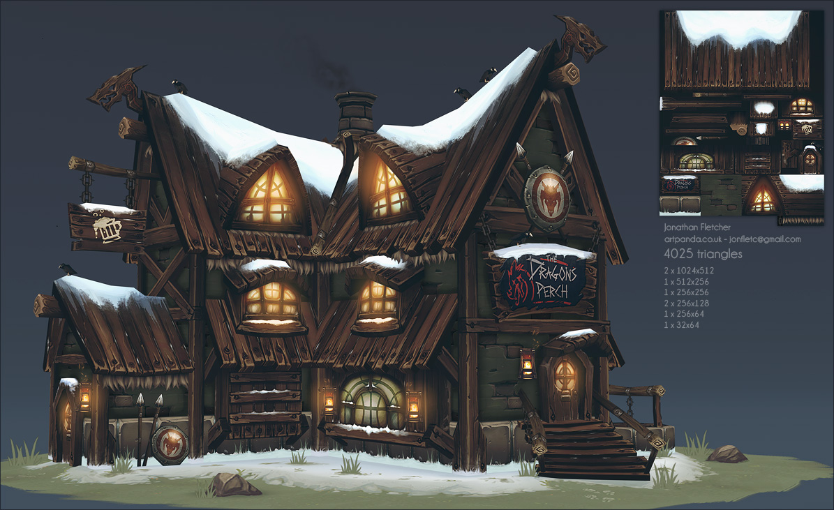
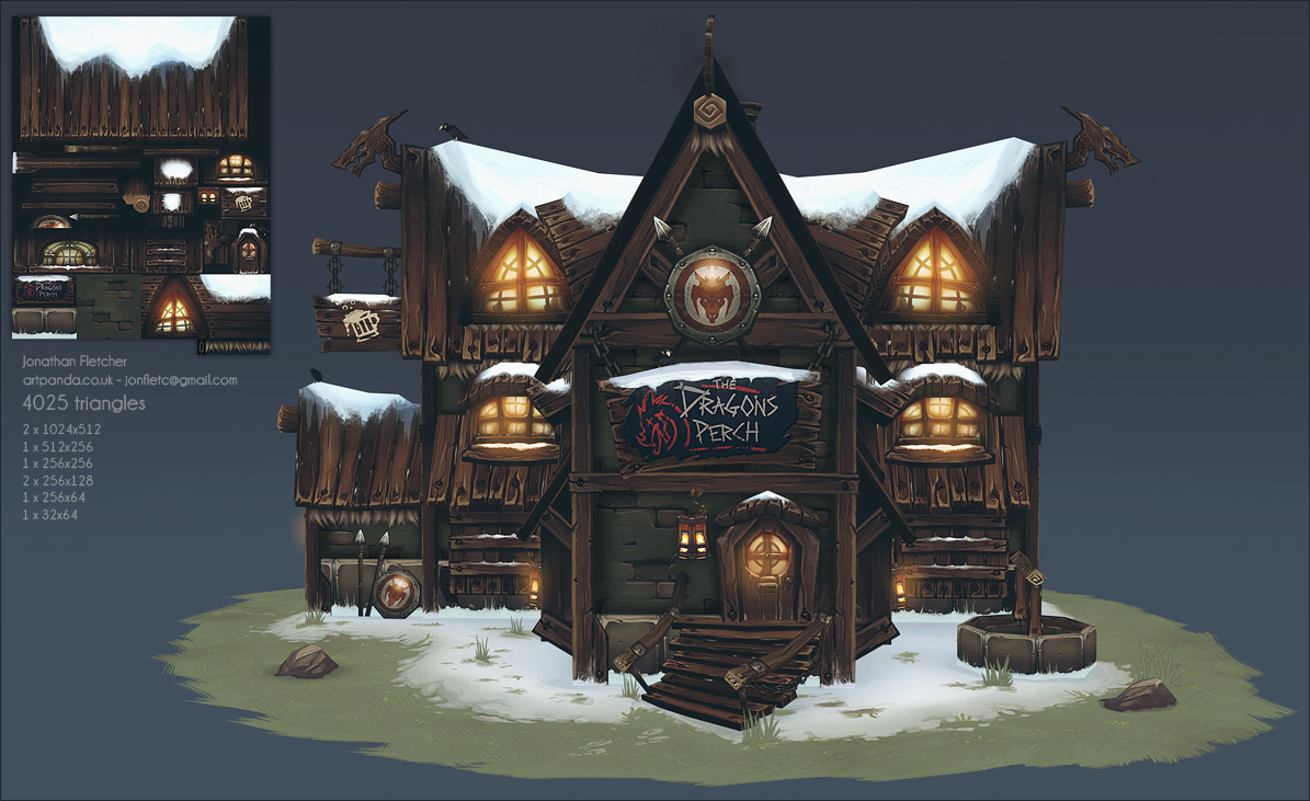
I made this some time at the end of last year, it's a painted, diffuse only tavern which I made specifically for the Polycount book that Ryan is putting together at the moment. Seeing as people actually know about the book now, I guess I'll post this!
I fucking love dragons and northern themes, So this was a no brainer for me as I was pretty much just asked to create a painted texture building similar to that Zeppelin tower I did ages ago. (which I wont show because it looks crap now)


It's not super duper stylized as it could be but I think it came out kinda nice yet gritty. There are many things I'd do differently now but my main regret is that I probably shouldn't have wasted all that texture space on the roof, hah.. (that said the texture is used in a lot of places) Also I think there are some major readability issues but meh.
Looking back at the earlier stages I had a real problem with making textures too dark with low contrast, I'm beginning to get out of this habit now, which will hopefully show in future painted stuff.
The creation of the textures is covered in the book, which I hope we will all get a chance to dig into sometime soon. Hopefully it will help some people, although it pales in comparison to a lot of the other segments, hah.
Anyway, hope you like it.
I made this some time at the end of last year, it's a painted, diffuse only tavern which I made specifically for the Polycount book that Ryan is putting together at the moment. Seeing as people actually know about the book now, I guess I'll post this!
I fucking love dragons and northern themes, So this was a no brainer for me as I was pretty much just asked to create a painted texture building similar to that Zeppelin tower I did ages ago. (which I wont show because it looks crap now)


It's not super duper stylized as it could be but I think it came out kinda nice yet gritty. There are many things I'd do differently now but my main regret is that I probably shouldn't have wasted all that texture space on the roof, hah.. (that said the texture is used in a lot of places)
Looking back at the earlier stages I had a real problem with making textures too dark with low contrast, I'm beginning to get out of this habit now, which will hopefully show in future painted stuff.
The creation of the textures is covered in the book, which I hope we will all get a chance to dig into sometime soon. Hopefully it will help some people, although it pales in comparison to a lot of the other segments, hah.
Anyway, hope you like it.
Replies
I like the greenish cement/stone wall, it's definitly not a colour I would have gone for a stone wall and that kind of building but it kinda works well !
Nice job on the snow, I personnaly always have a hard time painting it and yours definitly read like thick snow.
I don't dig the chains. They're too flat. Maybe some real geometry could look better ?
I think the blue "mist" on top of the picture kills it a bit..
I agree with the readability problem but it's not that bad
I think there a few things that you could do to improve that.
The end of the wooden roof looks pure black ? In fact it's the first thing I noticed when I looked at the picture. I'm pretty sure a brighter wood texture would improve the readability of the building.
A stronger "baked" top light would improve that too. At the moment, everything has kinda the same value except the stones where a directionnal top light is noticable. The wood planks on the roof almost looks darker than the verticals "pillar" planks, which doesn't help.
Maybe the sign on top of the entrance is a bit disturbing. You add 2 strong, new colors there, a flashy red, a white typo and dark blue which adds a lot of weight to the image, if that makes senses.
That's all I have to say, pretty good job :poly121: !
May I ask for a wireframe ? :poly122:
Keep it up !
Vert lighting? UDK? What's the specs with this Fletcher?
Love the reuse of the textures. That can go a long way.
Looking forward to when you think this looks like crap like your awesome zeppelin tower. You killed this man! Really love the color scheme and overall love you poured into the textures and silhouette.
That, I can't wait to see the break down in the book.
another great reason to wait for the book (there is like 10000 reasons)
Great art! really inspiring!
- BoBo
Wires and asset break down please?
The only thing that personally doesn't fit with me is the detailing of the wood ends compared to the stonework. It seems more detailed or contrasty while the stone is more well-balanced?
Looks awesome, man
I know I've been living under a rock for a while but whats this about a book?
Thanks for the crit, I agree with a lot of it. I think it's too old of work to go back to it now but I will remember for the future from the mistakes made here.
the breakdown is in the book so I wont post that here.
Also, thanks for taking the time to do something for the book. (And everybody else involved with the book of course!)
There are some wasted edges in some places and N-gons but they just go into the poles already.
Anyway, should probably go finish my M4, heheh.
Thanks for the feedback guys
When you said you wasted some edges, I assume you were referring to the planks on the roof? You could still take advantage of them by pushing the planks up and down, if you were so inclined. :poly121:
I rest my case! ^^
Also, I've seen a Polycount book mentioned in 2-3 different threads now. Is there an official post for it? I can't find anything specific anywhere! XD
The rest looks great!
The tone of colors really works well for me, I like that the place has a logo with character and its optimized without looking cheap, brilliant work all round.