Home 3D Art Showcase & Critiques

Next Gen Spaceship Project

mikey3d
polycounter lvl 6
Offline / Send Message
mikey3d polycounter lvl 6
Hey Guys, so I am working on my first next gen item for my demo reel. I made changes to it, which were suggested by a polycount member konstruct in an older post of mine. Comments and Critiques are welcome.

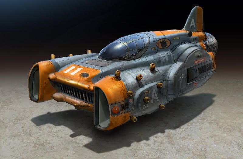
Here is the concept art.
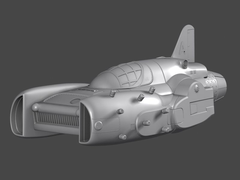
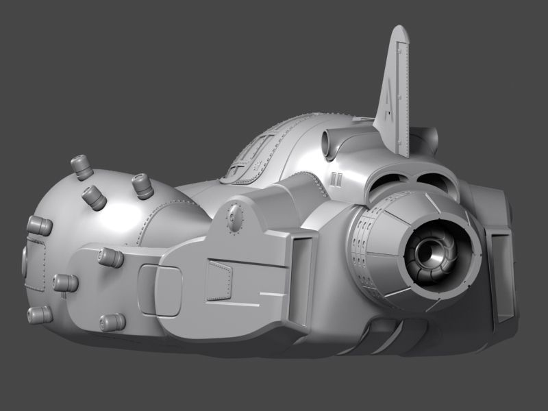
ben_mauro_9.jpg

High Poly Renders:

Helios_HighPoly_Presentationshot_editedModelREVISED.jpg

Helios_HighPoly_Presentationshot_editedModel_BackREVISED.jpg

Helios_HighPoly_Presentationshot_editedModel_SideREVISED.jpg

Replies

  • dpadam450
    Options
    Offline / Send Message
    dpadam450 polycounter lvl 9
    The openings at the front look too squared. Looking harder at the shape you see the 3d model looks like 2 half circles, where the concept has a different shape with more rounded edges at the corners. It wouldn't matter to not follow the concept but I think that it looks better in the concept.
  • AlexCatMasterSupreme
    Options
    Offline / Send Message
    AlexCatMasterSupreme interpolator
    Some of those things look like you poorly auto-gridded them on, might wanna straighten them out to match the curvature of the ship better.
  • zbyszko
    Options
    Offline / Send Message
    zbyszko polycounter lvl 7
    Good start i can't wait to see the textures.
  • mikey3d
    Options
    Offline / Send Message
    mikey3d polycounter lvl 6
    Thanks dpadam450 I guess I missed that area. Changed it.

    Helios_HighPoly_Presentationshot_editedModelREVISEDrounder.jpg

    @AlexCatMasterSupreme- are you talking about those floating A's? (those are just place holders) not meant to be a mesh. If not can you point out what you mean?

    @zbyszko- thanks dude
  • mikey3d
    Options
    Offline / Send Message
    mikey3d polycounter lvl 6
    I'm trying to match the concept as best as I can so if you see anything off please let me know.
  • burtonyang
    Options
    Offline / Send Message
    The cockpit area looks longer and slimmer than what you have. The two front openings on the side are wider from yours. Most of your pieces look too tall and not beefy enough. The tail wing is also too big as well as the engine in the back. The panel on the side behind the cockpit isn't so circular too on the top.
  • Lucas Annunziata
    Options
    Offline / Send Message
    Lucas Annunziata polycounter lvl 13
    The 'D' shape on the front where the curve meets the flat, that corner seems a bit sharper than the slightly more rounded portrayal in the concept.
  • konstruct
    Options
    Offline / Send Message
    konstruct polycounter lvl 18
    I think The engines are better, but I think you need to emphasize them looking more puffy and rounded. They still look pretty rigid.

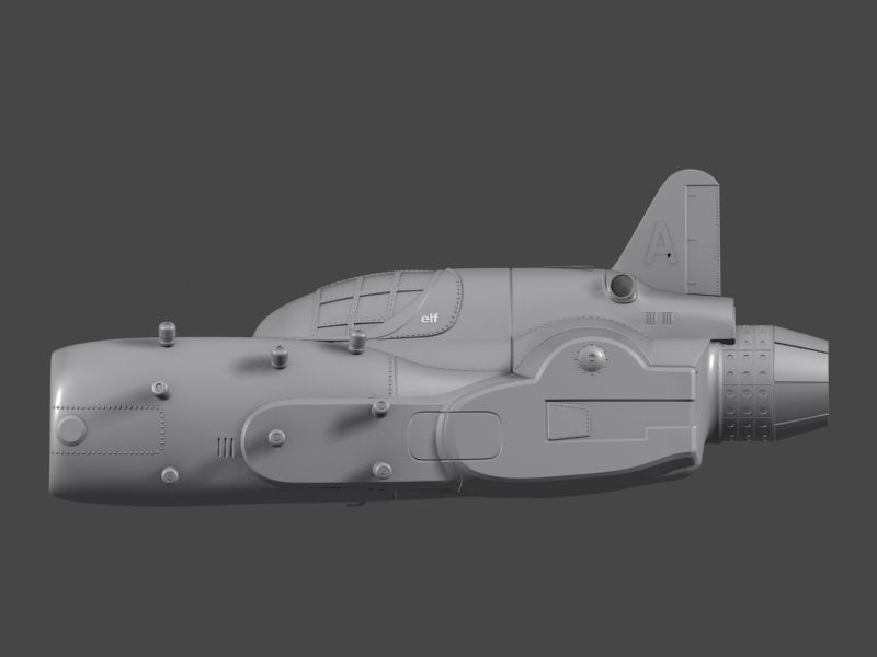
    Also I think the main reason you are loosing a lot in the transition from concept to 3d, has to do with the lack of the aggressive and boxy looking "hood" shape at the base of the window. If you look close, you`ll also notice the puffy engine shape mentioned earlier can be clearly seen transitioning into the central area right below the window. Yours is an entirely different object. Perhaps its too high?

    po2.jpg
  • mikey3d
    Options
    Offline / Send Message
    mikey3d polycounter lvl 6
    burtonyang wrote: »
    The cockpit area looks longer and slimmer than what you have. The two front openings on the side are wider from yours. Most of your pieces look too tall and not beefy enough. The tail wing is also too big as well as the engine in the back. The panel on the side behind the cockpit isn't so circular too on the top.

    @ burtonyang-

    What pieces look too tall and not beefy enough? if you could point them out that would be great.

    are you talking about this piece here in blue

    sidepanelscreenshot.jpg
  • burtonyang
    Options
    Offline / Send Message
    The engine area that konstruct said wasn't beefed outwards enough. And here are still some of the scale and shapes that need to be fixed.

    oPpsZ.jpg
  • mikey3d
    Options
    Offline / Send Message
    mikey3d polycounter lvl 6
    @ konstruct the piece that you said " Yours is an entirely different object. Perhaps its too high?" are you talking about that piece circled in red. I added that because I am allowed to have some creative freedom with it and I thought that would be interesting to have

    HoodscreenShot-redcircle.jpg

    for the hood I think i understand what you mean now, the green part is raised and boxy and on the side it transitions up to it?

    HoodscreenShotboxyhoood.jpg
  • burtonyang
    Options
    Offline / Send Message
    Yes I meant the hood should be raised like the green area, and i was also talking about the red area in his painting too, but you changed it.
  • mikey3d
    Options
    Offline / Send Message
    mikey3d polycounter lvl 6
    okay so I did a quick mock up of the hood in 3d from what you guys are telling me to get a better visual before I go and alter anything around that area. Its the green mesh. I think it's more boxy now.

    mockhoodgreenboxy.jpg

    under it in red mesh is the old hood shape, with blocked out green mesh outline above

    underlayingshapeoldhoodbody.jpg
  • konstruct
    Options
    Offline / Send Message
    konstruct polycounter lvl 18
    The green hood looks much better- Also take note in my paint over that the red turbine engine part is attached to the green hood.
    po3.jpg
    Yours is not, and is still a separate piece.
Sign In or Register to comment.