A scene from Legend of Sealed Book----UDK
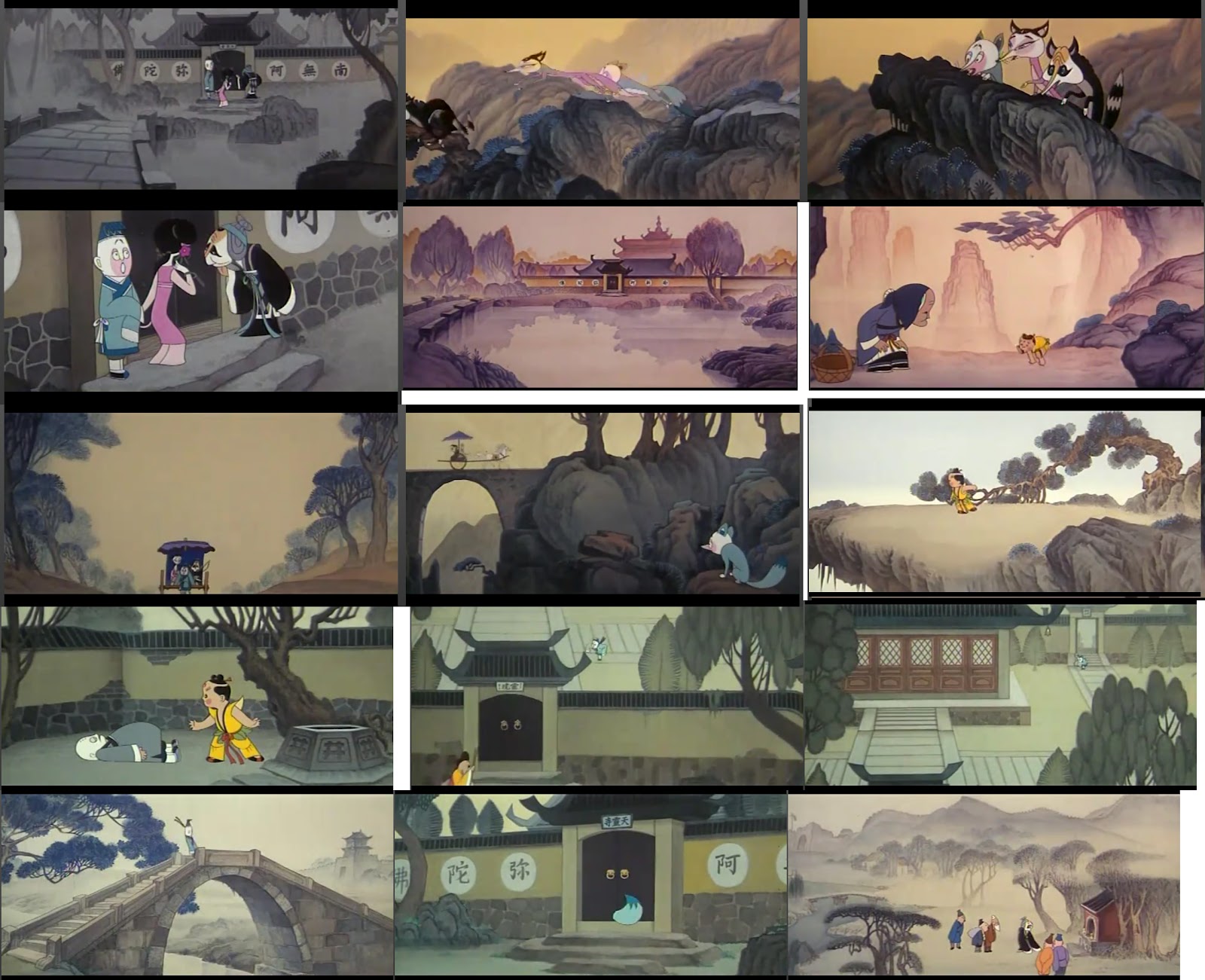
Hi guys, have been a long time since my last cartoon style enviornment work,this time I want create a scene from one of my favorite Chinese cartoon:Legend of Sealed Book.
It was a 1983 cartoon movie that truly masterpieces.Fromthe character design to enviornment design,fill up wiht triditional chinese painting style that I grown with.
is shame don't have english version, here is a full movie link from youtube
[ame=" https://www.youtube.com/watch?v=GgF8t233Dtc"]?????? HQ? ???? / ?????? / ??86?? - YouTube[/ame]
and here is my moodbord

It was a 1983 cartoon movie that truly masterpieces.Fromthe character design to enviornment design,fill up wiht triditional chinese painting style that I grown with.
is shame don't have english version, here is a full movie link from youtube
[ame="
 https://www.youtube.com/watch?v=GgF8t233Dtc"]?????? HQ? ???? / ?????? / ??86?? - YouTube[/ame]
and here is my moodbord

Replies
[ame="
[ame="
Other than that it's a great start. Looking forward to see more.
I know its all still early stages, but the texture on the rocks looks really blurry at the moment.
thanks
I removed trees, because it was a quick test,I will do a better version .
Final Video 01
Could be nice to bring in some more contrast, perhaps lower the tonemapper in post? Idk if you were still looking for crit
In fact for the floor, the sky is quite flat and empty ,is the original idea from Chinese tridition painting, is call Liu Bai, means leave white on paper. is kind of make more contrast between detail and background,and I want keep it
and for the overall Tonemaper,I think little bite over, maybe my monitor is too grey now, I should turn it little down. Thanks you comment
[ame="
thanks! really good idea, why i forgot that, just did quick test, way better with little bit emmisive , update shortly, thanks again
not sure what have to do next, maybe polish some stuff
[ame="
http://www.youtube.com/watch?v=2rxp32wW4uw&feature=youtu.be
after I put little music in last video, I think maybe I will go further do some more in my scene and make it more cinematic, here I did a little dragonfly, and with simple animation.
So you know you pretty much have one of the most unique looking things that's been made in UDK. I hope someone from Epic sees this and gets behind it. It's more than worthy.
I thought I'd quickly throw together some ideas for you:
It's definitely not the most polished paintover but I hope I got the idea across. It's a great piece of artwork you have there and I feel it's a bit underepresented right now with the bland lighting and the lack of sky altogether.
You may want to look into "kung-fu panda" and "road to Eldorado" for some sky and clouds reference. Road to Eldorado concept art had some awesome stylized clouds.
Anyway this is already very-very good. Best of luck:)
cheers
Leave sky and floor quite flat is the original concept and my idea from Chinese painting (Liu bai)
I will put little more layerd fog in background.
I really love the whole style of your environment, congrats & keep posting.
Hey man, no sweat. I see the point. In fact I even enforced it in other conversations a while back.) But just in case I'll share with you what I realized for myself later on and you can decide what to do with it.
The basic question here is does your audience care as much for your inspiration as you do? One of the things I've had to learn over time is to treat my artwork as a completely independent, self-sufficient piece because that is the way the audience generally perceives it. No one cares how close you are to the source if the work is not good enough. In fact no one ever cares about anything about your work, but it making an impression completely on it's own.
I've neglected some things in favor of the original sometimes and generally it came at the expense of beauty. Which now seems utterly irrational for me as an artist. I also now don't think that changing the original to make it prettier is defying it, but rather refining it and building up on it. And that is nothing but a good thing.
I can totally see how you might want to leave things the way they are. It also has to do with motivation, because when you think you've wrapped the project it's pretty hard to make yourself come back for another chunk of work. So I just thought I'd give you an opinion that might come in handy if not now then sometime later)
cheers. and congrats on a job well done:)